
twitter.com

See All Stories
Site default logo image

Hate the new Twitter web redesign? This Safari extension might help

Twitter

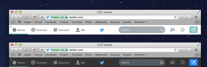
If you’re not a fan of the new iOS 7-like design on Twitter.com, this Safari extension transforms the massive, white tool bar into a less distracting, dark tool bar. It still keeps the simple, flat look and color matching, but it’s much less distracting. Now if only iOS could toggle back and forth as easily…

[tweet http://twitter.com/chrkirk/status/431105681102344192]

[tweet https://twitter.com/chrisfholm/status/431105399635206144]

[tweet https://twitter.com/bowiesongs/status/430418029814366208]

You can download TwitterDarkBanner here.

Site default logo image

Twitter reveals how it painstakingly overhauled mobile Web client [Photos]

Twitter recently released an update to its mobile effort, and rival client Tweetbot followed the frenzy by making its public alpha for Mac available today, but the microblogging service is not ready to share the limelight.

Coleen Baik, a designer at Twitter, took to the network’s blog this afternoon to fully detail how it meticulously overhauled mobile.twitter.com.

“We had about nine weeks to design, prototype, develop, test, and calibrate mobile.twitter.com for launch. There were a handful of challenges we took on,” wrote Baik.

A few of the challenges included:

  • Support more than 13 different browsers on thousands of different devices, each with their own rendering idiosyncrasies
  • Accommodate input methods with dissimilar requirements
  • Build layouts with pre-CSS3/HTML5 standards
  • Optimize for browsers with javascript turned off
  • Scale gracefully from resolutions as small as 240 by 240 pixels all the way up to widescreen views on the desktop
  • Minimize page sizes for slower networks
  • Make it look and feel like Twitter, even without images.
  • Pave the way for even more feature consistency with other twitter.com clients

The design team sketched plans for primary views and navigation, “fleshed out details like the Tweet anatomy and interaction flows for tasks like tweeting, searching, and writing direct messages,” and then delved into HTML/CSS wireframes. They even collaborated with Twitter’s mobile engineers to “build out main views like ‘Home,’ ‘Connect,’ ‘Discover,’ and ‘Me.'”

Twitter eventually tested three different versions across 300 devices before making a final decision. After two months of work, the pristine version finally rolled out earlier this week. It immediately met a slew of positive responses.

“Change is always difficult because it means, among other things, having to relearn what was once comfortable and familiar,” Baik contended. “But we hope that the initial pains of readjustment quickly lead you to appreciate this faster, more comfortable and easier-to-use mobile.twitter.com on feature phones and older browsers.”

Visit the Twitter Blog for the entire redesign breakdown.


Expand
Expanding
Close