More images of an iPhone 6 mockup have recently been published via NoWhereElse. At this point, publishing these dummy models has become somewhat of a daily ritual, but they are definitely interesting to look at.
If it means anything, these are definitely the most detailed iPhone 6 dummy models that we’ve seen to date. Like previous mockups, there’s nothing special to see here, but if these models are designed around the rumored specifications, it may give us an idea of what’s coming down the line later this year.
This will be good news for a lot of graphic designers on the Mac. Bohemian Coding today released version 3.0 of its digital design app Sketch bringing new features and improvements. Here’s the list of features from Sketch 3:
NEW IN VERSION 3: – Symbols, for reusing elements in your design – Text Styles and Layer Styles, redesigned and unified for a better experience – Redesigned inspector, giving you quicker access to everything – Automatic Slices, export layers directly, without needing to set up manual slices – Export multiple resolutions from a single slice, at any scale – Improved PDF, EPS and SVG importing and exporting – Speed, bug fixes and polish all around – Presentation Mode, go full screen and hide all controls, perfect for showing off designs – Improved bitmap editing with Magic Wand, Crop, Invert and Vectorize tools
The app is a paid upgrade so you won’t be able to move from Sketch 2 to Sketch 3 for free. Customers who bought Sketch 2 on the Mac App Store after March 1st, however, can email Bohemian Coding with their receipt and receive Sketch 3 at no cost.
Sketch 3 will be on sale from today until April 21st at $49.99 on the Mac App Store before it returns to its full price of $79.99.
Following friction between top Apple Human Interface Vice President Greg Christie and Senior Vice President Jony Ive, Apple’s hardware and software design is being dramatically shaken up, according to sources familiar with the matter. After adding human interface design direction to his responsibilities in 2012, Ive will soon completely subsume Apple’s software design group, wresting control away from long-time human interface design chief Christie, according to sources briefed on the matter. Previous to this shakeup, all Apple software design has been led by Christie, who has reported to Craig Federighi, and Ive has been attending interface design meetings and providing instruction…
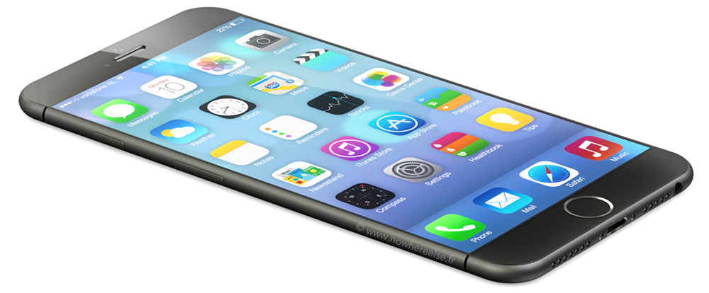
Martin Hajek has been busy this week: after iPhoneclub commissioned him to create concept images of an iPod Nano-inspired design of the iPhone 6, French site Nowhereelse asked him to use the Japanese sketches mentioned in that piece to create something far closer to the existing iPhone 5s design.
With many of our commentators criticizing the square corners of the previous concept, this latest one returns us to the rounded corners we know and love. More controversially, perhaps, we also see a return to the glass back. More images below the fold …
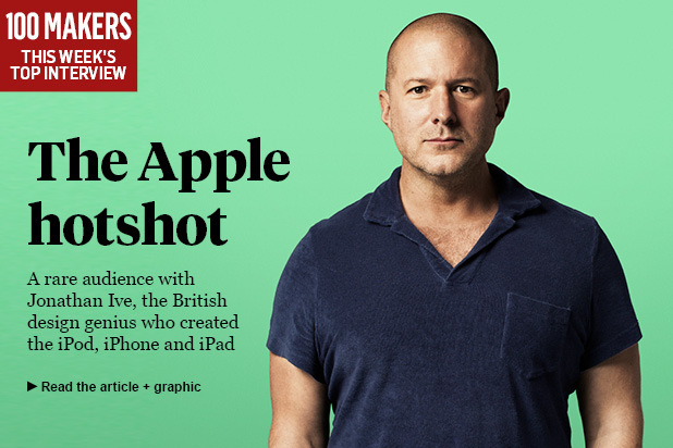
The UK’s Sunday Timespublished a massive, five-page interview (paywall) with Apple SVP of Design Jonathan Ive today that takes a look at the history and future of Apple from the perspective of the man who designed some of the most iconic devices of the past decade.
In the interview, Ive discusses (among other things) his approach to designing new products, which allows a device’s function to dictate its form:
Ive starts a new project by imagining what a new kind of product should be and what it should do. Only once he’s answered those questions does he work out what it should look like. He seeks advice in unlikely places. He worked with confectionery manufacturers to perfect the translucent jelly-bean shades of his first big hit, the original iMac. He travelled to Niigata in northern Japan to see how metalworkers there beat metal so thin, to help him create the Titanium PowerBook, the first lightweight aluminum laptop in a world of hefty black plastic slabs.
With regard to manufacturers like Samsung “referencing” Apple’s design in their products, Ive called the practice “theft” of “thousands of hours of struggle.” Expand Expanding Close
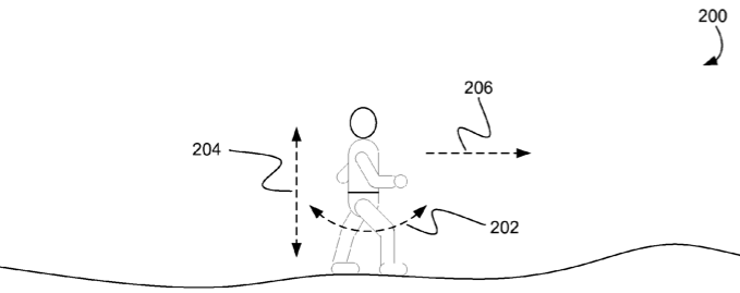
With Apple’s iWatch looking set to have a major health and fitness angle, and likely to be bristling with sensors, it seems likely that a pedometer will be one of them. Patently Apple reports on an Apple patent designed to allow steps to be accurately tracked using a wrist-mounted device. Or, in patentspeak:
In some implementations, optimizations for detecting steps when a pedometer is worn at a user’s wrist are described. In some implementations, a threshold crossing step detection method can be enhanced for wrist locations by counting the number of positive peaks between comparison threshold crossings, adjusting a minimum peak-to-peak threshold for qualifying threshold crossings, and inferring a second step based on the amount of time between threshold crossings. In some implementations, the pedometer can automatically determine that the pedometer is being worn on a user’s wrist.
Jawbone’s design lead Yves Béhar, meantime, has been imagining how “a wearable kit of sensors” could enable us to effectively take our doctor with us wherever we go in a piece written for TIME … Expand Expanding Close
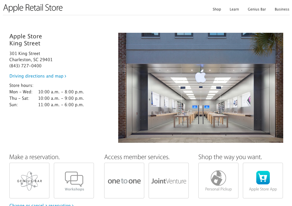
Apple quietly updated the retail section of its website today with a new look that more closely resembles iOS 7. Where the previous version of these pages used content boxes, borders, textured backgrounds, and gradients, the new page instead utilizes ample whitespace and thinner typefaces.
The change is probably best illustrated on the section’s home page, where images previously constrained by content boxes now fill the entire page. On the “Learn” page, buttons with heavy gradients have been replaced by thinly-outlined, lighter versions of the previous design. Gradient-filled headers have disappeared from every page, now replaced by unadorned text.
Oddly, the “Make a Reservation” button that allowed users to quickly create a Genius Bar appointment has been removed from the site’s navigation. Appointments can only be made by navigating to the Genius Bar page and clicking a link in the first paragraph of that page’s content. The Concierge page has not been updated to the new design yet.
You’ll find a bunch of before-and-after comparisons and take our poll on the new design below:
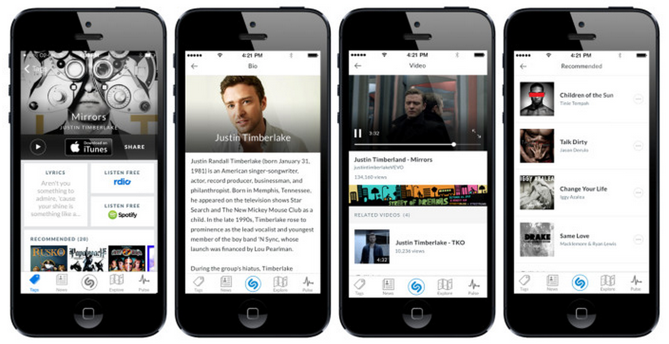
Update Feb. 25: The redesign we told you was incoming today started rolling out to iOS users globally. The updated app is available on the App Store now and the company notes that other new features are coming soon, including:
· Quick access to lyrics with a preview as soon as a track is matched, and with direct access to the music video and additional videos related to a song;
· Recommendations unique to Shazam;
· Lightning fast access to the most important information about any show broadcast on over 160 TV channels in the US: music in the show, cast and crew, and more;
· More engaging biographies and discographies, making it easy to go from discovering a great track to learning about and experiencing more from the band.
Shazam, the audio recognition app that lets users find currently playing songs and more, today announced that a redesign of its iPhone app is rolling out ahead of a larger change to the experience coming later this month. Today’s update replaces much of the light, baby blue color theme Shazam has long used and also introduces new features for accessing content and getting recommendations:
Over the coming weeks, Shazam’s more than 150 million iPhone users will see a new tag result experience as it is rolled out, with Android users getting it shortly thereafter. The new experience means Shazaming becomes the beginning of a journey, giving users effortless access to:
· A brand new look and feel for music and television results with easy access to previewing, buying, and sharing a track;
· Quick access to lyrics with a preview as soon as a track is matched;
· Direct access to the music video and additional videos related to a song; and,
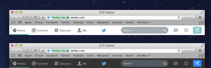
If you’re not a fan of the new iOS 7-like design on Twitter.com, this Safari extension transforms the massive, white tool bar into a less distracting, dark tool bar. It still keeps the simple, flat look and color matching, but it’s much less distracting. Now if only iOS could toggle back and forth as easily…
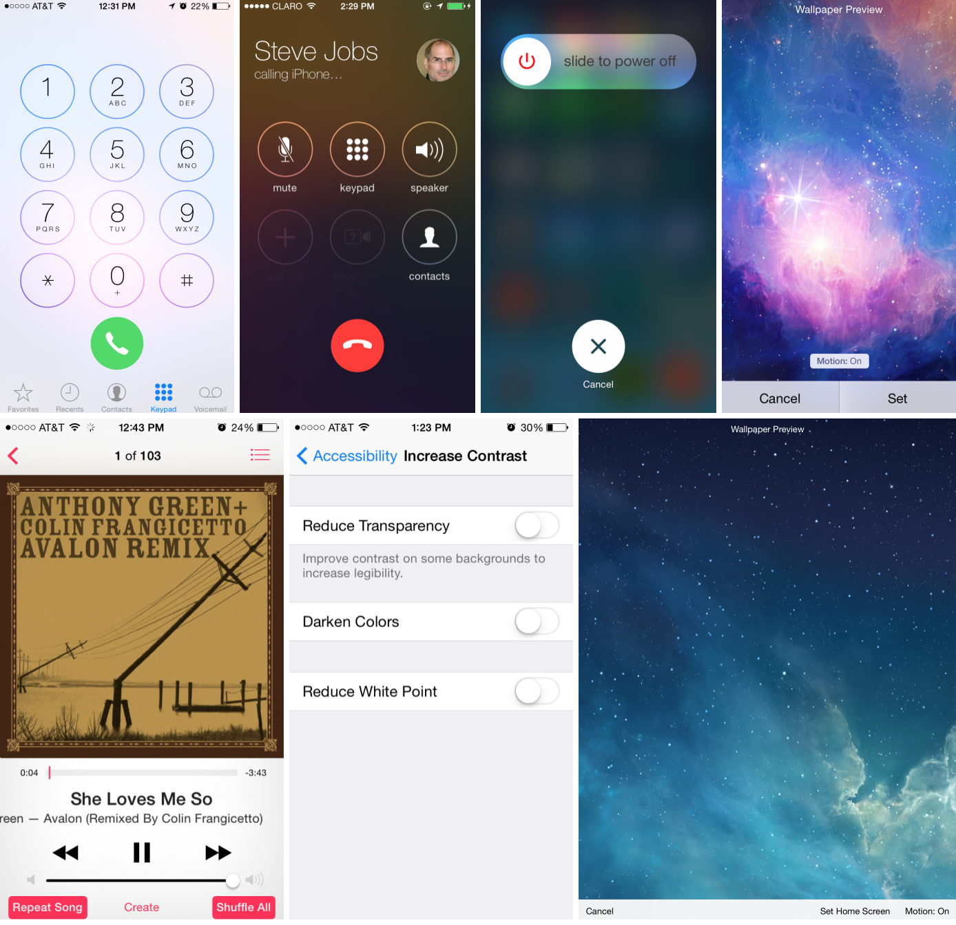
Yesterday, Apple issued the third beta of iOS 7.1 to developers for the iPad, iPhone, and iPod touch. Like the original beta track for iOS 7.0, these iOS 7.1 betas have slowly been introducing some user-interface tweaks to the iOS Device experience. While not significant, changes to the Phone application, system sliders, some icons, and the keyboard slightly alter the way Apple’s products are used. Many of you sounded off in the comments about the changes, but we’ve compiled a poll (below) for you to vote if you like each new change over the iterations in the current release of iOS 7:
Facebook has updated its Pages management client for iOS. The new app has been redesigned for iOS 7 and now more closely resembles the mail Facebook app. The updated app also allows page administrators to tag other pages and people in posts and comments.
Apple has recently updated its online support portal on Apple.com with a more modern look and feel. The new design puts easier access to support for each of Apple’s products, with large images and clean lines. The older design (screenshotted below) was much more boxy and cluttered.
In the old layout, customers would have to click through to ‘All Products’ to get help about more obscure products. With the new design, the infinitely scrolling carousel puts everything on the portal homepage. It is also much clearer where to find the Apple communities and access phone support as other aspects of support have been removed completely from the page.
Microsoft has released a major update for its Bing app for iPad. The new app features a revamped interface to match the aesthetic of Apple’s latest OS along with a host of other features and improvements. Users are now able to save the daily image found on the search engine’s home page to their camera rolls for use as a wallpaper or whatever other purpose they decide.
Images and bookmarks can now be saved in the app and synced via Mirosoft’s SkyDrive service to other devices. Search results can now be shared to Facebook, Twitter, and other social platforms. Improvements and updates have been made to maps results, the Bing logo, and other graphics throughout the app.
Plex, the popular media player for desktop and mobile devices, has been updated to version 3.3 today. The update introduces an updated look based on Apple’s iOS 7 design along with a new media player screen for music and videos. The iOS 7 design isn’t entirely new, but a tweaked version of the existing design. The update also includes miscellaneous bug fixes.
You can get Plex for iOS now on the App Store. For new users, the app is $4.99. Existing users can update to version 3.3 for free.
As regular readers may have noted, I’m a great fan of wood as a material. The ifrogz case I reviewed earlier in the year was wonderful in terms of aesthetics and build quality, but was essentially designed as a semi-permanent enclosure, which isn’t always convenient.
Others, like the iWood cases reviewed in the same piece, are more convenient but don’t feel as special. The Kerf Case is designed to bridge the gap: a genuine, all-wood case with the convenience of slipping it on and off in a second or two. Cases are available for the iPhone 4/4S and iPhone 5/5s … Expand Expanding Close
The Foaster is a new novel charging dock for your iPhone and the creators are currently running a Kickstarter to put this neat dock into production. As you can tell from the video, the novelty here is the fact it resembles a toaster. The creators say that the kitchen is one of the most common places where people charge their phones, so they thought they would design a dock to suit.
Context, the photorealistic way to preview your Illustrator designs, has finally left beta, with an official release now available. We reviewed the beta version of Context back in March, but today you can get your hands on the final version…
Redesigned icons for iPhoto for iPhone, iPad, and iPod touch and Garageband have appeared in the iCloud Storage Management function in the iOS Settings app. The new icons are simpler, flatter, and is designed with iOS 7’s new icon grid system in mind. They are a stark contrast from the colorful, 3D-like icons used in the current versions of the apps.
In line with the app redesigns for all of Apple’s bundled iOS 7 apps, it is likely that the new icon will come as a complement to a completely redesigned version of the iPhoto app. When Apple released iOS 7 last month, the designs to Apple’s App Store apps went noticeably unchanged. Besides iPhoto, Apple has a slew of other App Store apps (like iWork’s Pages, Numbers, and Keynote & iLife’s iMovie). However, there are yet to be any solid indications of redesigns for the other apps…
Apple has lured away top Nike design director Ben Shaffer, according to a source at Nike with knowledge of the details behind Shaffer’s departure. At Nike, Shaffer was the Studio Director of the Innovation Kitchen. This is Nike’s research and development lab where new product designs are created. Under Shaffer’s lead, Nike was named the most innovative company in 2013 by Fast Company. Nike’s Innovation Kitchen has been connected to wearable products like the popular Nike Fuel Band, and most recently, the Flyknit shoe.
In light of the upcoming launch of iOS 7, designer Stu Crew and other designers have imagined what a version of the OS X operating system with iOS 7 design principles could look like. Crew’s design matches iOS 7 by removing the heavy, metaphoric textures from OS X. The image above showcases a look at a desktop with many of the apps, and you can see how Finder, Calculator, Contacts, and iTunes received inspiration from iOS 7.
With iOS 5, iOS 6 and OS X Lion, OS X Mountain Lion, Apple moved to unify both the feature-sets and user-interfaces of its mobile and desktop operating systems. This fall, due to a leadership change at Apple, iOS and OS X will see different design philosophies. iOS 7 is “flat,” lacks heavy textures, while OS X retains its long-existing silver/metal design, keeps the green felt in Game Center, but drops the leather in Calendar and Contacts.
With integrated experiences and uniformity embedded into Apple’s DNA, it would not be surprising to see OS X look like iOS again in coming years. Below is a full gallery from Crew (in addition to some more mockups from other designers) of what an iOS 7-inspired OS X could look like.
An online poll conducted by Polar compares key user-interface elements from iOS 7 to the iOS 6 counterparts. Despite the outpour of criticism from some of iOS 7, these results show that an overwhelming amount of poll responders prefer the design of iOS 7 to iOS 6 and other previous iOS versions…
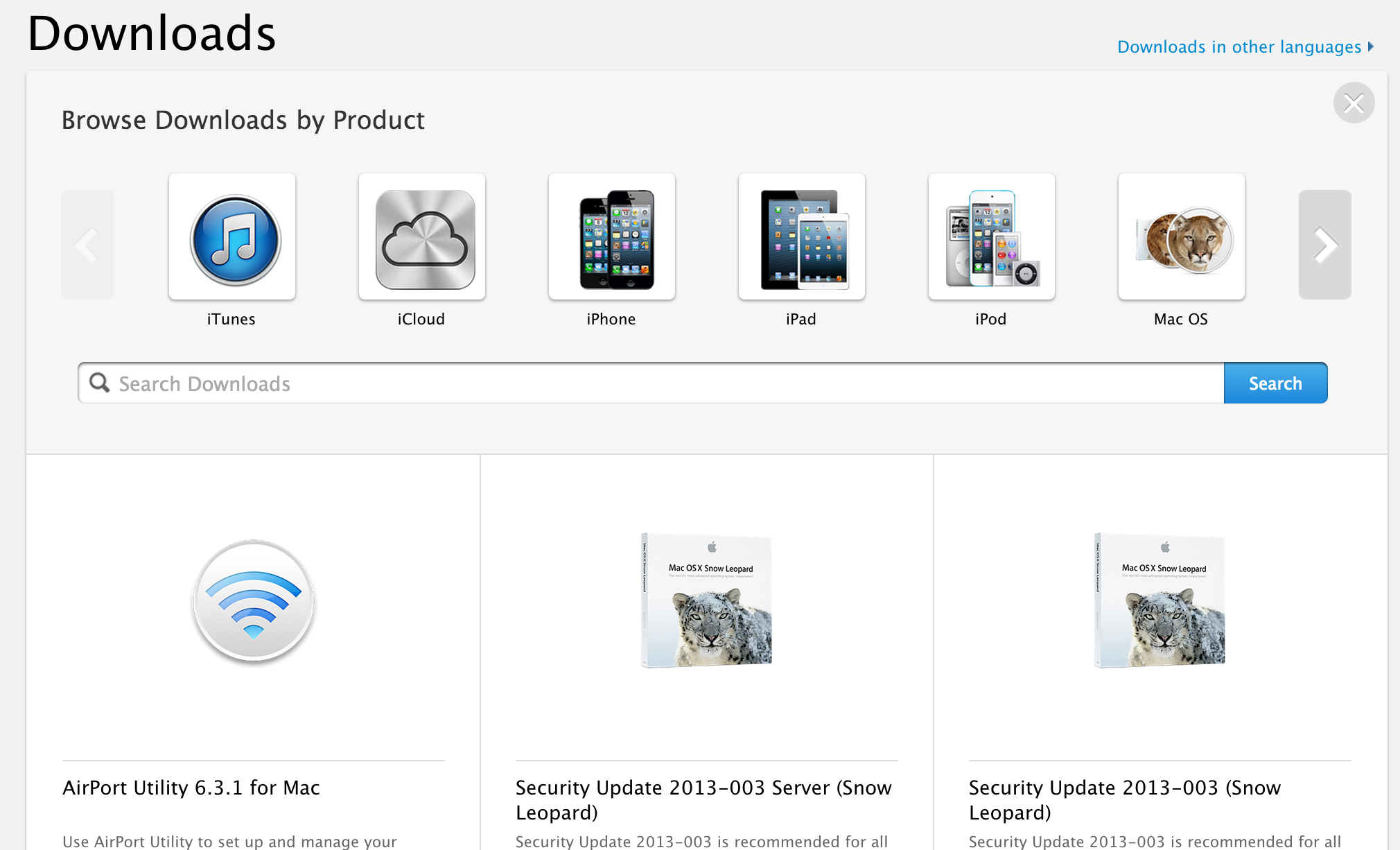
As noted by several 9to5 readers, Apple has just recently updated its Support pages through Apple.com to better reflect the redesign the rest of the site has been receiving in recent months. Today’s update provides a new design for the majority of support pages available through Apple.com/support, including: Videos, Manuals, Tech Specs, and Downloads.
Apple used to present these pages using a design that was a few generations behind the rest of the site and displayed links in a search result style list. Today’s update brings a flat grid style layout that allows users to select or search for a product in order to find related manuals, videos, tech specs, etc, but also displays search results by product in the grid layout.
Apple.com’s search result pages also get a cleaner look today to match the recent Apple online store design (pictured below). Expand Expanding Close
The introduction of iOS 7 brought forth a new era of iOS design: one that discards old thinking and draws little inspiration from past designs. While Apple’s included applications in iOS 7 have all been updated for the new design aesthetic, their App Store apps haven’t. Installing any of Apple’s other applications alongside iOS 7 reveals a huge discrepancy between the old, skeuomorphic design, and the new, flatter look. Obviously, Apple will have to redesign all of their App Store applications. So, what will they look like?