
The introduction of iOS 7 brought forth a new era of iOS design: one that discards old thinking and draws little inspiration from past designs. While Apple’s included applications in iOS 7 have all been updated for the new design aesthetic, their App Store apps haven’t. Installing any of Apple’s other applications alongside iOS 7 reveals a huge discrepancy between the old, skeuomorphic design, and the new, flatter look. Obviously, Apple will have to redesign all of their App Store applications. So, what will they look like?
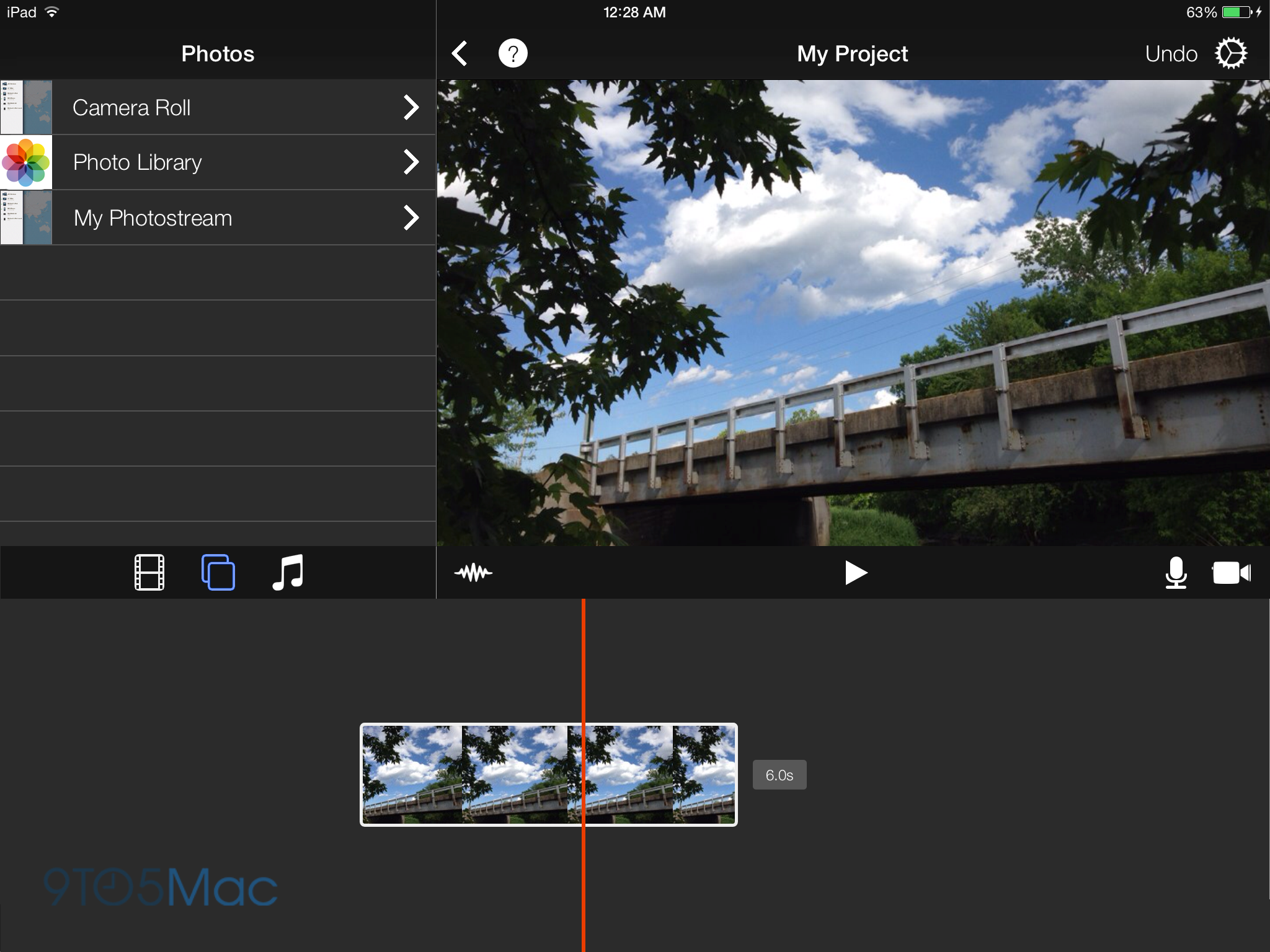
How iMovie could look with a flatter interface. (Click any image for a larger version.)
iLife
iPhoto, iMovie, and Garageband, the three applications that make up the iLife suite on iOS, are some of Apple’s most popular apps. They also have the most character. In an operating system where textures and buttons aren’t emphasized, Apple has to rely on animations to add character to apps. Some apps will likely be easier than others to redesign. For example, iPhoto is a relatively straightforward app that can take on a sterile look without losing much character. Apple can remove the fake paintbrushes and filter palettes in favor of something simpler without any real impact on the functionality of the application.
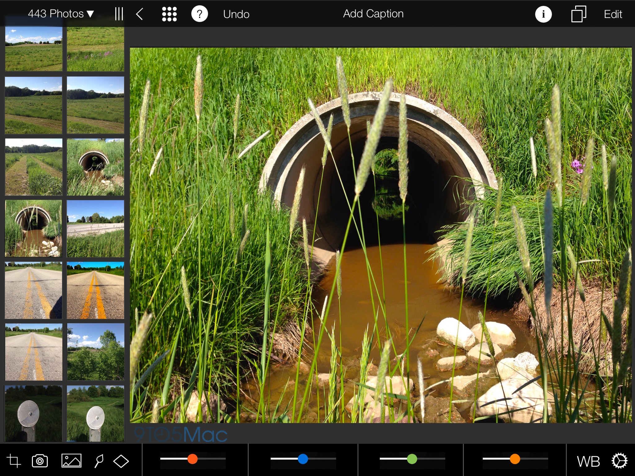
iPhoto reimagined with a flatter user interface.
Other apps, however, like Garageband, will take much more work and careful consideration to preserve the character that people love. It’s not as easy as removing a texture, adding transparency, or turning a button into plain text. The depth and realism that were once added through skeuomorphism and gradients have to be replaced with a new sense of realism through the use of animations, transparency, and the parallax effect. This presents a tough challenge for Apple. Obviously, a 3D rendering of an electric guitar or a vintage organ aren’t going to fly anymore, but what is the digital equivalent? Perhaps the closest example we have today is iOS 7’s calculator app. Although the interface doesn’t try to emulate the plastic buttons and LCD screen of a real calculator, the use of animations make it feel real. Pressing down on a button doesn’t just darken it, the entire button elegantly depresses, behaving like a real world object. The developers of OnCue have put together a video showing how UI Dynamics like this can add realism to interfaces.
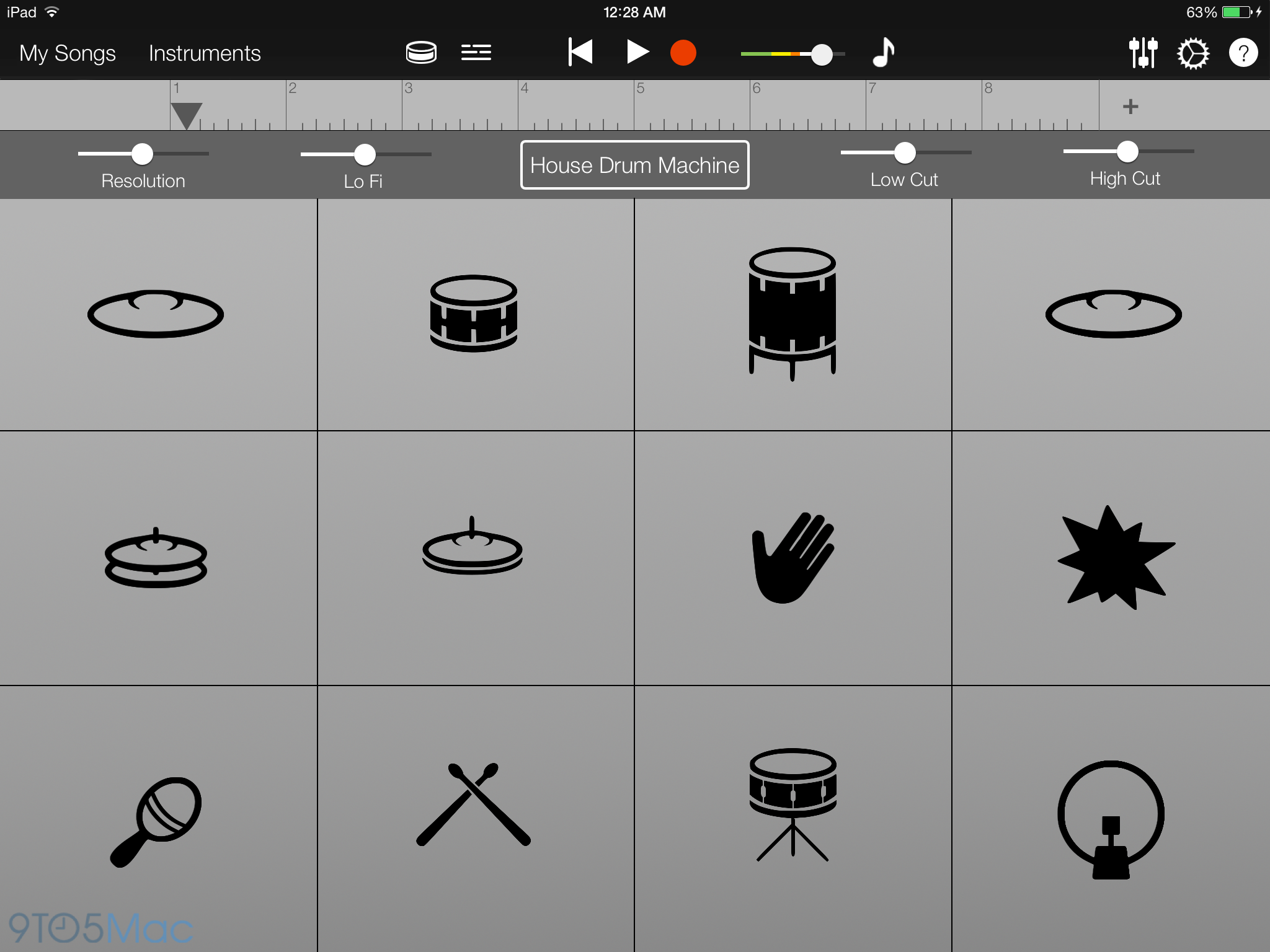
GarageBand could use subtle animations to feel more realistic.
The final app in the iLife suite, iMovie, won’t have to change as drastically. Much like iPhoto, it will likely just shed unnecessary details and textures. Notably, I expect the welcome screen facade of a movie theater to fall.

iWork
When Phil Schiller demoed iWork running on the iPad in 2010, he called the varnished wood ruler in Pages “the most beautiful ruler you’ve ever seen in an application.” The mentality today has changed. iOS 7 is about giving your content a higher priority than the interface. The iWork applications in iOS 7–Pages, Keynote, and Numbers–will likely emphasize this approach. When you’re working on a document, presentation, or spreadsheet, you want to focus on your work, not the user interface. This is why distraction-free apps such as iA Writer have become so popular.
The iWork applications in iOS 7 could take this approach, perhaps not so drastically, by reducing visual clutter and toning down user interface elements until they blend into the experience. Through the use of transparency and minimalism, this can easily be achieved. Since applications like those in iWork have only existed in their current form in a digital world, there aren’t many real-world metaphors that these apps cling to, making it easier for them to adapt to Apple’s new design aesthetic. What might be difficult, however, is redesigning the iWork icons for iOS 7. When considering a new design, Apple has to keep familiarity and consistency between the heavy, detailed Mac icons, while still making the design consistent with the rest of the OS.
-

- A redesigned Podcasts app in both a black and white color scheme.
Podcasts
Apple’s original Podcasts application, which launched last summer, quickly became the poster child against skeuomorphism. Its detailed reel-to-reel playback interface and analog controls were the epitome of Apple’s former obsession with realistic interfaces. Toward the beginning of this year, Apple released an update to the Podcasts app, dropping many of the details and metaphors found in the original version. Even with this overhaul, however, Podcasts will still need a complete redesign to conform with iOS 7’s new look. It would make sense for the application to pick up the design qualities of the all-new Music app in iOS 7, perhaps with a darker color scheme, as a way to unify the applications. It would also be wise to assume that Apple will drop the radio dial inspired Top Charts interface in a future update.
Find My Friends & Find My iPhone
Both Find My Friends and Find My iPhone are unique applications. Both perform relatively limited functions, yet both sport completely different, custom interfaces. Find My Friends has been criticized from day one for its leather-themed interface, which provides no real functional advantage. Expect this to disappear when the application gets updated for iOS 7.

We’ve already gotten an early look at the new icon for Find My Friends, pictured above (thanks, Brandon). Neither of these applications require a special interface to function properly, and would perhaps be better suited to look similar to many of the stock applications in iOS 7, with plain white and black user interface elements, and simple glyphs.
We also got a quick look at the updated version of Find My iPhone during the WWDC keynote (thanks, Leo).


iBooks
If Newsstand is any indication, we already have a basic idea of how iBooks might look in iOS 7. The two apps shared a very similar appearance in older versions of iOS, so it stands to reason that they might look similar in iOS 7 as well. Besides the wooden bookshelf, also likely to get cut from iBooks are the paper edges and page curl animation that are currently present. It’s not a stretch to assume that books will appear more like PDFs do in the current version of iBooks, simply sliding left to right like slides in a presentation. During Apple’s WWDC 2013 Keynote, Craig Federighi showed off a version of iBooks running on the Mac which lines up with the this design aesthetic. Additionally, the new iBooks icon is already present in iOS 7.

Of course, the mockups above are just that- mockups- and Apple is known to change direction at any given moment. Given what Apple has shown off so far, it’s likely that we’ll see something close to this when these applications get updated closer to this fall.
If you’d like to see concepts of what other applications might look like when redesigned for iOS 7, this Tumblr provides a look.
FTC: We use income earning auto affiliate links. More.


Comments