WIRED has posted a new story on the Apple Watch, which revolves around interviews with Apple human interface designer Alan Dye and Apple’s VP Technology Kevin Lynch, who heads Apple Watch software. The piece shines new light on the foundation of the smartwatch project at Apple as well as some new details about the product — which ships later this month.
Amusingly, Lynch did not know what he would be working on when he accepted the Apple job. He walked into the role with the project already underway; early ‘experiments’ from the iPod team with click-wheels and such. Dye says that the idea for a watch blossomed during design meetings for iOS 7, Apple’s major software overhaul.
Naturally, Apple reworked the iPhone software to fit the new form factor. Early prototypes used a top-to-bottom timeline interface apparently, reminiscent of what Pebble is showing with the Time. However, this idea was dropped. Lynch says that long interactions with the Watch were simply uncomfortable.
“It was all very understandable, but using it took way too long,” Lynch says. Also, it hurt. Seriously: Try holding up your arm as if you’re looking at your watch. Now count to 30. It was the opposite of a good user experience. “We didn’t want people walking around and doing that,” Dye says.
The software was refined in three main iterations to focus on actions that could be completed within a matter of seconds. Some features were cut completely because they didn’t fit this paradigm. The Short Look, Long Look user experience is a clear example of how this philosophy transpired into the final product.
For hardware, the Taptic Engine was a particular focus with engineers refining the haptic feedback for over a year under Ive’s command. Weekly meetings would review the feelings a user felt from an incoming phone call, for instance.
Apple tested many prototypes, each with a slightly different feel. “Some were too annoying,” Lynch says. “Some were too subtle; some felt like a bug on your wrist.” When they had the engine dialed in, they started experimenting with a Watch-specific synesthesia, translating specific digital experiences into taps and sounds. What does a tweet feel like? What about an important text? To answer these questions, designers and engineers sampled the sounds of everything from bell clappers and birds to lightsabers and then began to turn sounds into physical sensations.
The WIRED piece also highlights that the customizability options, variety of bands and screen sizes, were an important focus from the start of the project. Unlike Apple’s usual practice, Dye says ‘personalization and beauty are everything’ when it comes to watches. The combination of interchangeable straps, body materials and software complications (widget-like additions that feature on watch faces) allow users to have ‘millions’ of possible variations of the Apple Watch.

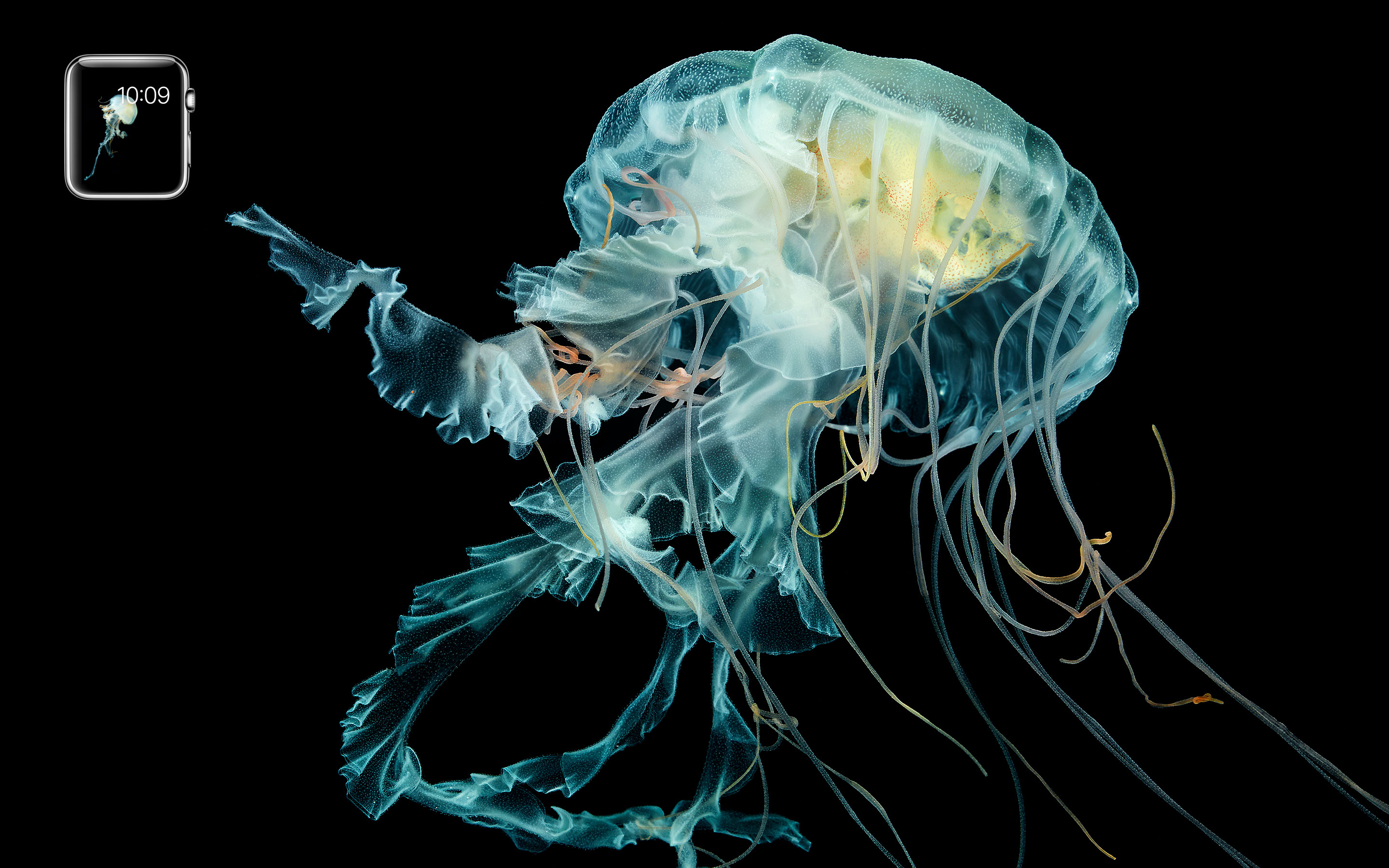
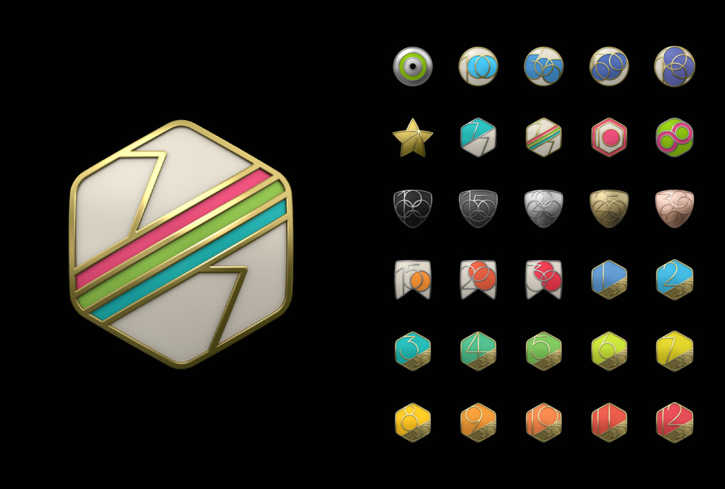
The WIRED interview also includes some new imagery provided by Apple which show off Watch assets. This includes a look at some of the watch face options, like the different clocks, solar visualizations and iconic jellyfish. You can also see a glimpse of further animated emoji and Mickey Mouse artwork. You can also see an overview of every achievement from the Activity app.
The interview concludes with Lynch reveling how the Watch has changed his own life: ‘about how grateful he is to be able to simply glance at his Watch, realize that the latest text message isn’t immediately important, and then go right back to family time; about how that doesn’t feel disruptive to him—or them.’
You can read the full story over at WIRED.
FTC: We use income earning auto affiliate links. More.


I can see Sanskrit yantras, Nordic and Celtic runes, Arabic and Hebrew talismanic seals, I-Ching glyphs and suchlike becoming very popular watchfaces and app/widget icons… worldwide.
For me, the very last paragraph makes it all worthwhile. It’s one of the driving factors in why I’ll be buying the AppleWatch.
Lynch gets it, but their messaging has barely touched on this huge Watch benefit. It seems they’re too afraid of depicting the iPhone in any sort of negative light. But the basic premise of getting your mind, eyes, and hands back from your devices is something anyone in the developed world can get onboard with.
confirms ios 7 was a total rush job.
I like the bit about why notifications come in at two stages. Didn’t realize the second stage only happens if you are still looking at it and that it was intentionally broken up in two to give you that moment to not get too invested in it.
The key question will be does the watch do the right mix of functionality to be a good experience. Most people are looking at it and jumping that it’s already too much.
“The team had to build software that presented everything you needed without being overwhelming. Fall short of that goal and users might start taking their Watches off”
I think what is important is that not only is it not overwhelming but it also has to do “everything you need.” If you think to start a task, like setting a timer, but when you do it’s not as fully featured as the phone, you won’t go back to using the watch. It will set up an expectation that this thing is so limited you are better off just pulling out your phone. That will lead to failure just like trying to do something and it being too complicated for a small screen.
“As the testing went on, it became evident that the key to making the Watch work was speed. An interaction could last only five seconds, 10 at most. They simplified some features and took others out entirely because they just couldn’t be done quickly enough.”
If this is true then even though there are a lot of functions, they are all quick.
Here’s to hoping Apple found the right balance.
I dunno. All I see, is that they put some guy from Adobe in charge, and all of a sudden we have an Apple software product with those tacky badges and equally tacky giant emoji’s. I don’t think there is a coincidence.
Could you be any more annoying with your constant whining avout those badges? I actually think they look beautiful for what they are, which is NOT UI chrome but a specifc piece of content that shows up at a specific time.
I think they will look more appropriate in their physical context. Even the big emoji smiley face will be no larger than one inch tall…Ive is still in charge of design, it’s not like they would go through the trouble of redesigning iOS 7 and Yosemite to go back to unnecessarily cheesy graphics.
I think it’ll be just fine when it’s actually on your wrist.
I can see why the emojis are controversial (they are a bit reminiscent of 1990’s instant messaging) but I think the badges are pretty. They have light shadowing and depth to help convey a mediaeval Olympic tone whilst remaining modern. It’s not just there for its own sake.
Well, according to roofigan the resident police officer, I have talked about this too much. So I will only clarify my statement by referencing the fact that the badges are 100% “skeuomorphic” which is supposedly forbidden by Apple now, and that the colours used are clashing pastels mixed with neons, blacks and fake finishes. I don’t see how they could be worse really.
My concern is why they’re all shaped like “69”s
I think it’s going to be a huge success
Loved the WIRED article and graphics. Honestly, Apple needs to improve its website regarding the Apple Watch promotional material. I was expecting something more like the images in this article like the extreme closeup on the watch face or the jellyfish. Truly beautiful awe-inspiring.
Really? I actually had a lot of trouble with the article. Like their developers did a pretty mediocre job. The scrolling was pretty janky and that was running on desktop safari.
It was like they designed it for “mobile only” instead of “mobile first.” Everything just got larger for desktop. 28px paragraph font is huge and hard to read. It’s fine for headlines, but not for blocks of text on a computer screen.
I guess the product shots were nice but kinda more photoshopped than the ones on the site.
I see what you mean. You are right. Graphics was the wrong word. I meant the images. They are fantastic and am now appreciating the Watch for completely new reasons than I was before. How Apple does not talk a lot about the new typeface, watch faces, design layouts on that screen, is strange. They are all beautiful and a great reason to buy an Apple Watch.
That jellyfish is my new wallpaper. Just gorgeous. Prior rumor stories quoted people saying it was the best display they’ve ever seen on a smartwatch. I think this is how Apple Watch will stand out from the crowd.