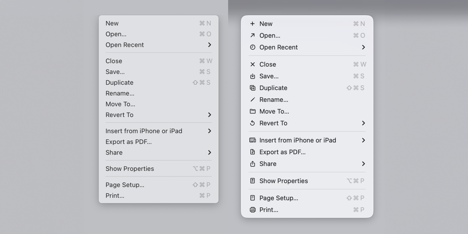
macOS Tahoe icons do exactly what Apple said designers should never do

macOS Tahoe app icons came under fire late last year with commenters describing them as “terrible” and “objectively bad.” In our poll, 9to5Mac readers had exceedingly mixed views.
Software engineer Nikita Prokopov has now drawn attention to the icons used within menus and pointed out that they almost exactly mirror the approach which Apple’s Macintosh Human Interface Guidelines advised against back in 1992 …
Expand Expanding Close