Doppler for iPhone and Mac is the popular music player designed for those who prefer to buy and own their library – with hi-res support. Now for iOS, Doppler 3 has arrived with a number of improvements like Library customization, Album Collections, Queue Grouping, a simplified tab bar with new icons, and more.
The major Doppler update for iPhone arrived on the App Store today and developer Brushed Type shared a detailed look at what’s new in a blog post.
Here are the major changes:
- Album Collections
- Library screen customization
- Queue Grouping with shuffle by album
- Redesigned tab bar with new icons
- Improvements for albums with multiple discs and search/filter across the library screen
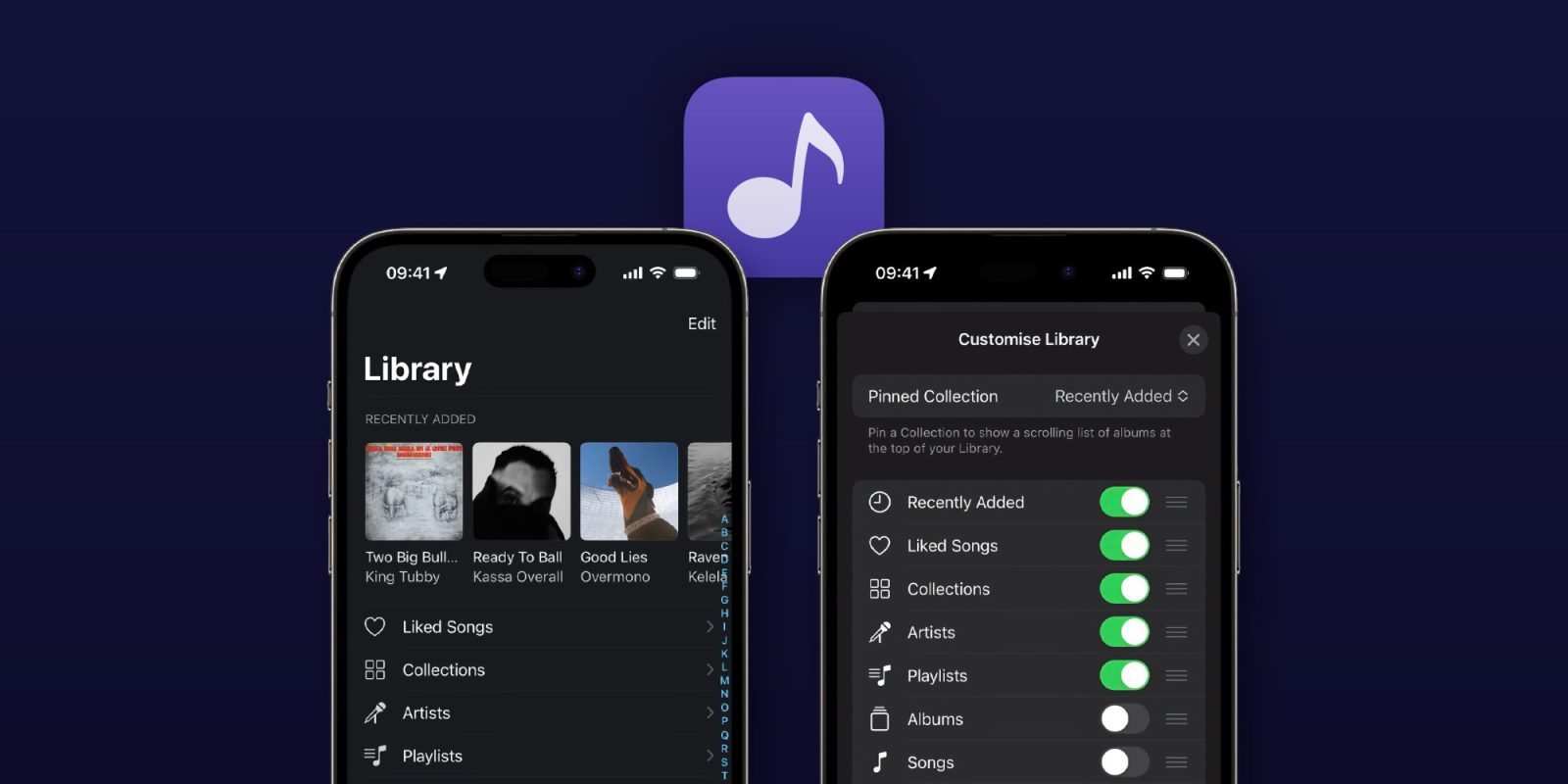
The handy new Library screen customization lets users add, remove, and change the order of the pinned collection at the top of the Library screen (shown above). You can pick from some available presets or go fully custom.
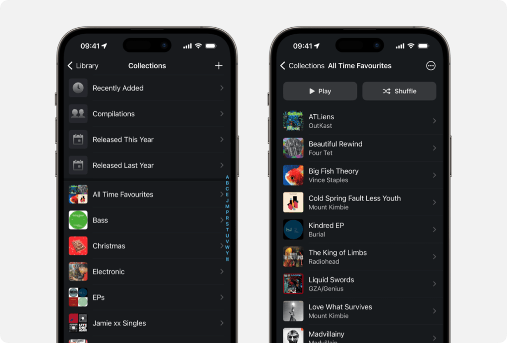
Album Collections lets you group content into custom lists so you can organize your music by any criteria with four preset Collections to get started.

Meanwhile, the new Queue Grouping feature brings a new mode for playback that allows music added to the queue as albums instead of individual songs.
The new Doppler is a free download from the App Store. As noted by Brushed Type, Doppler 3 for iPhone is the first paid update since 2020 and runs $8.99 as a one-time purchase. Those who purchased Doppler on December 1, 2022, or later will get version 3 for free.
Full Doppler 3 release notes:
Album Collections
—
Group albums together into custom lists with Album Collections. Create a Collection for your favourite albums this year, keep a list of albums in your library you want to tell someone about, or organise albums together by mood or season. Collections are customisable and flexible, so use them however you want.
You can also pin a Collection to the top of your library for easy access when you open the app or when using CarPlay.
Customise library screen
—
Doppler 3 adds new ways to customise your main library screen. Select between Artists, Albums and Songs for your library list. Change the pinned collection at the top of the screen to one of the presets or a custom album collection that you’ve made. Edit and re-arrange the options for viewing different parts of your library.
New queue grouping option
—
The playback queue gets two different modes in Doppler 3. You can use the classic “No Grouping” mode where songs are added to the queue individually, or the new “Group by Album/Playlist” mode, which will group songs by their album or playlist.
Using the Group by Album/Playlist” mode, you can shuffle your library by album, and re-arrange your queue by whole albums at a time — instead of song-by-song. The new grouped mode is perfect for people who listen to albums start to finish.
Design improvements
—
There are lots of design improvements throughout Doppler 3, including a simplified tab bar with new icons, design improvements for albums with multiple discs and Search/Filter inputs across the main library screens.
You will notice improvements and refinements to smaller details across the app too, like a new button in the library screen for quickly playing your entire library, easier access to sorting options and more.
Support for compilation albums
—
When editing album information, you can now mark the album as a compilation. Albums marked as a compilation will show up in the “Compilations” collection, and track artist names will always be shown in the artist list.
** Fixes **
– Fixed an issue when reading some MP3 files
– Fixed some issues when updating your library
—
If you’ve liked these recent updates, please leave a review on the App Store. Reviews help Doppler reach more people and it means a lot. Thanks!
FTC: We use income earning auto affiliate links. More.


Comments