While all eyes this week are on Apple’s new software, including iOS 15, watchOS 8, and macOS Monterey, the company is also bringing some new features to its web apps as well. More specifically, the web version of iCloud Mail is getting a redesigned interface, which is currently available in beta.
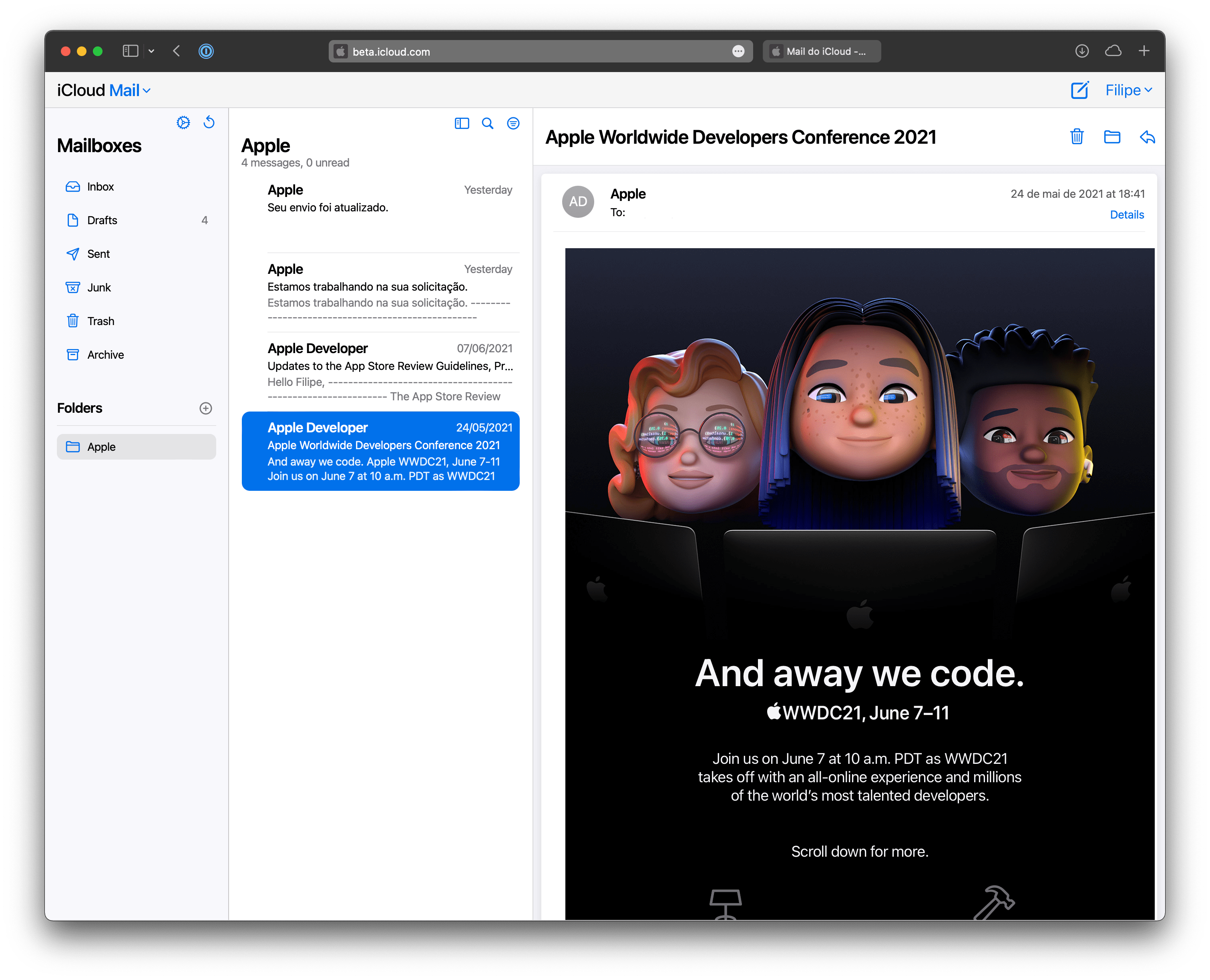
When entering the iCloud beta website, users will find a refreshed version of the Mail web app. The new design looks more similar to the current Mail app available on the iPad and Mac, as it features a cleaner interface with thicker icons.
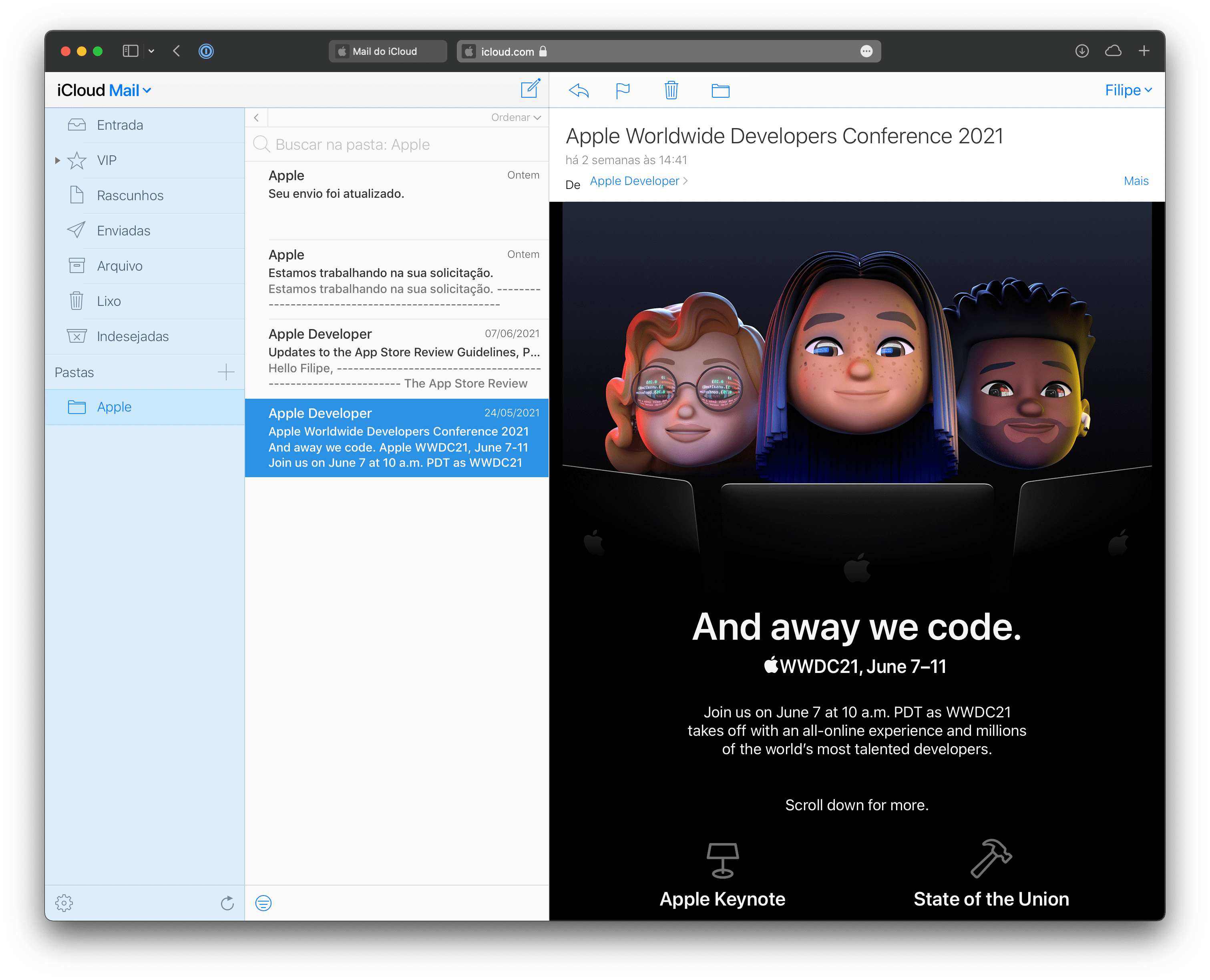
The previous Mail web app, which remains accessible through the official iCloud website, still has remnant elements of the iOS 7 interface with super thin fonts and icons. Now it seems that Apple is finally bringing a more modern look to iCloud web, starting with Mail — other iCloud web apps are still with the old design even on the beta website.
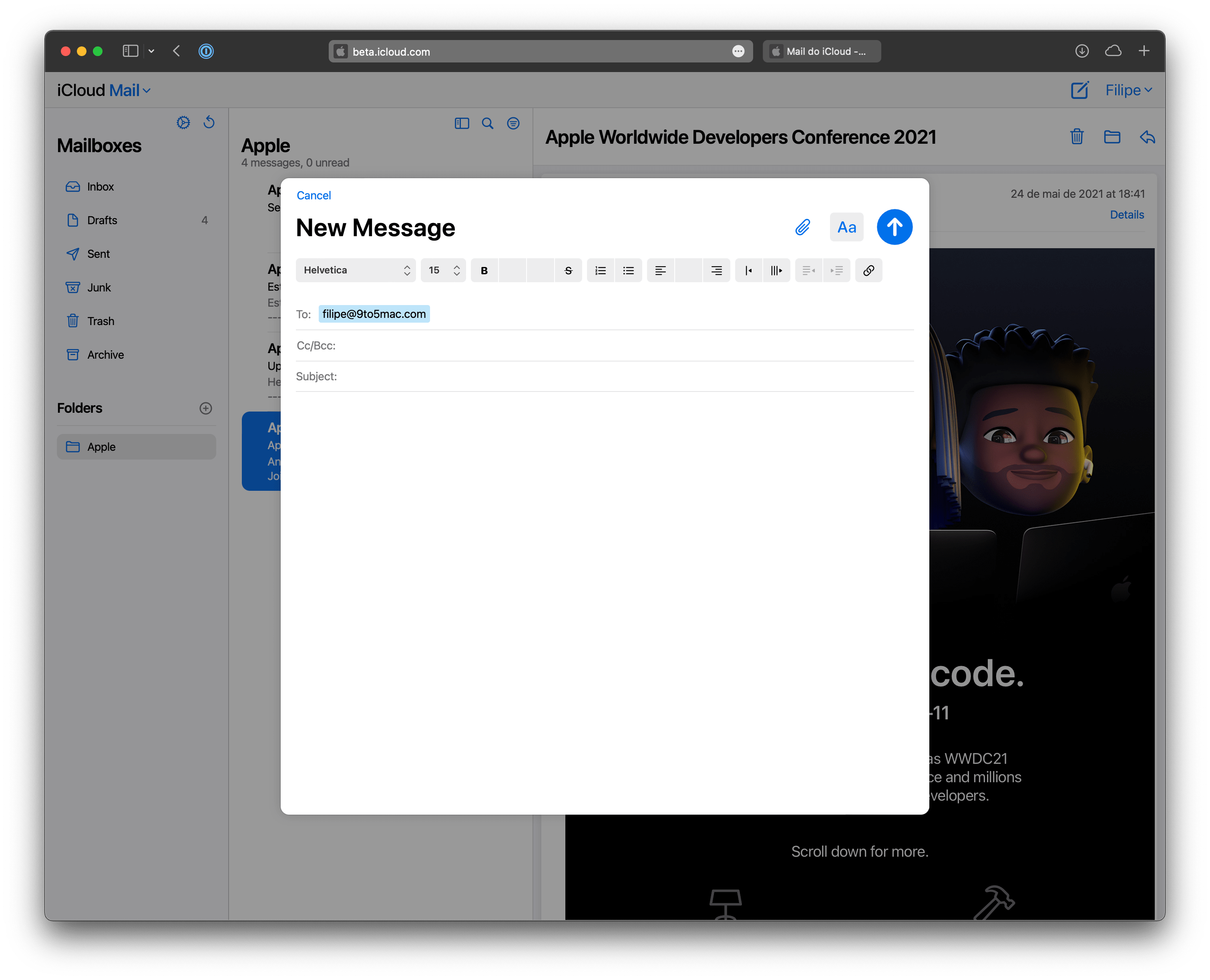
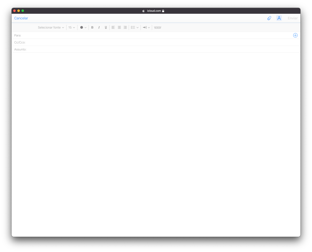
Another difference between the old and new iCloud Mail on the web is the mail composition panel, which now pops up in the same window, while the old one brings the composition panel in a separate window.
Check out some screenshots below comparing the two Mail web app versions:
While there’s no word on when the new iCloud Mail on the web will be available to everyone, Apple will likely switch to the new design later this year with the release of iOS 15 and other updates. If you want to try out the new iCloud Mail web app, just log in with your Apple ID at beta.icloud.com.
Read also:
- Hands-on: Here’s how iPhone’s Live Text OCR works in iOS 15
- iOS 15 tidbits: AirPrint overhaul, live locations in Find My, more
- iPadOS 15 and macOS Monterey bring Low Power Mode to iPad and Mac, here’s how to enable it
FTC: We use income earning auto affiliate links. More.


Comments