If you’ve ever used a MacBook Pro with Touch Bar, you’re probably familiar with one common convenience. Love it or hate it for everything else, the Touch Bar is really good for two specific things. Now that it’s gone, there’s an opportunity for macOS to learn from the Touch Bar.
Touch Bar no more
Apple debuted the Touch Bar on MacBook Pros in 2016 as a new input method on macOS. Function keys and media controls were replaced with a touch panel that spanned the width of the keyboard and dynamically changed which controls were presented.
A number of issues contributed to the ultimate demise of Touch Bar including a ship-it-and-forget-it approach by Apple. New MacBook Pros replace the Touch Bar with full height function keys, and everyone seems to be totally OK with that choice.
Priced out
You could argue that the Touch Bar is better suited for consumer laptops and not higher-end Macs used by professionals. Pros tend to hate it, but casual users find something to love about it.
For example, learning video editing with iMovie or Final Cut Pro is easier for beginners, thanks to contextual buttons for common tasks that more experienced users do with keyboard shortcuts. It’s the added cost of the OLED touch panel that would make the Touch Bar unappealing for MacBooks priced around $999.

Beloved features
Utility and economics aside, there are two features that users often cite when finding something positive to say about the Touch Bar: Tapback reactions in Messages and fast access to frequently used emoji.
Tapback and emoji access doesn’t require Touch Bar, but access is way more discoverable with it. Click on a specific message in Messages and the Touch bar will let you react with a Tapback in one tap.

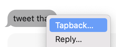
The non-Touch Bar method is just clunky enough to feel bad about using. It’s not difficult to right-click or long press the message, click Tapback, and click the reaction you want, but it’s just not as smooth as the Touch Bar method.
Emoji access is a bit more discoverable in Messages, thanks to the smiley face button next to the message field. Other apps like Slack include their own emoji picker button near the text entry field.

There’s also the function key, which now features a globe icon and opens the emoji picker when clicked twice. The situation is improving from the days of control + command + space as the keyboard shortcut for invoking emoji.

Tapback and emoji selection are just better with the Touch Bar, and Apple could use that data as reason to enhance how we interact with emoji and message reactions without the touchscreen panel.
Post-Touch Bar opportunities
Now that Apple is moving beyond the Touch Bar, macOS has an opportunity to improve features people actually liked about Touch Bar but for all Mac users.
For example, hovering your cursor over a message could invoke the Tapback reactions above the message. Swipe up and over to the reaction you want and click for a fast input method.
Expanding the emoji button in Messages to a horizontally scrollable slider is another interesting idea. Outside of the Messages app, a mouse gesture like click and hold could pop open the emoji picker for quick character selection on the web and in other apps.

In thinking about how I personally benefited from Touch Bar Macs, I installed the app Touché that lets you run a Touch Bar window on your Mac. I’m instantly reminded of what I miss: text and emoji suggestions while typing.
Some Touch Bar features (like this one probably) cannot be easily re-created on macOS, but Touch Bar was primarily about providing easier ways to access commonly accessed user interfaces contextually. As Touch Bar fades out of the MacBook Pro lineup, its lasting legacy should be that there are ways to improve how we interact with the macOS user interface regardless of Mac model.
What’s something Touch Bar made easier for you that you would like to see improve in macOS?
FTC: We use income earning auto affiliate links. More.


Comments