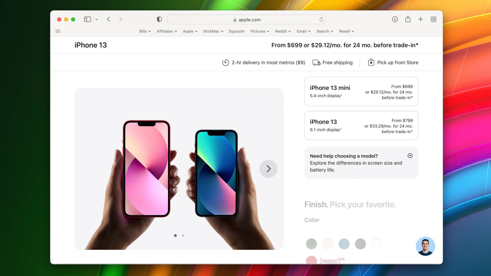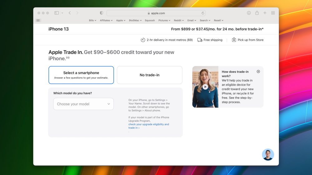
Apple has given the iPhone checkout page on its website a major overhaul. The new design features larger images, quicker access to shopping assistance, and more. There’s also a bigger emphasis on trading in other devices as well.
The previous design for the iPhone checkout process featured a two-column view with static imagery on the left and configuration options on the right. This new design focuses much more on large imagery and more refined experiences for things like choosing a smartphone to trade in.
This new design still relies on two separate columns for imagery and configuration options. The imagery, however, is significantly larger. This is a nice change, especially when looking at the different color options for the iPhone.
As you make your way through the configuration process, you’ll see new videos from Apple employees, including one explaining how to pick your storage configuration. There’s also a static option in the bottom-right to instantly open a chat with an Apple Store employee.

One of the biggest changes with this redesign is that there is a larger emphasis on trading in. After you configure your iPhone, you’ll be asked whether or not you have a device to trade in. There’s a new video explaining the trade-in process and a fullscreen interface for checking values.
Other changes include new comparison details between different iPhone models, updated frequently asked questions, shipping information located at the top of the webpage, and more. You can check out all of the changes for yourself right here.
As of right now, this new checkout process is only available on iPhone purchases. This includes the flagship iPhone 13 lineup as well as older models like the iPhone 12.
(H/t Saif)
FTC: We use income earning auto affiliate links. More.


Comments