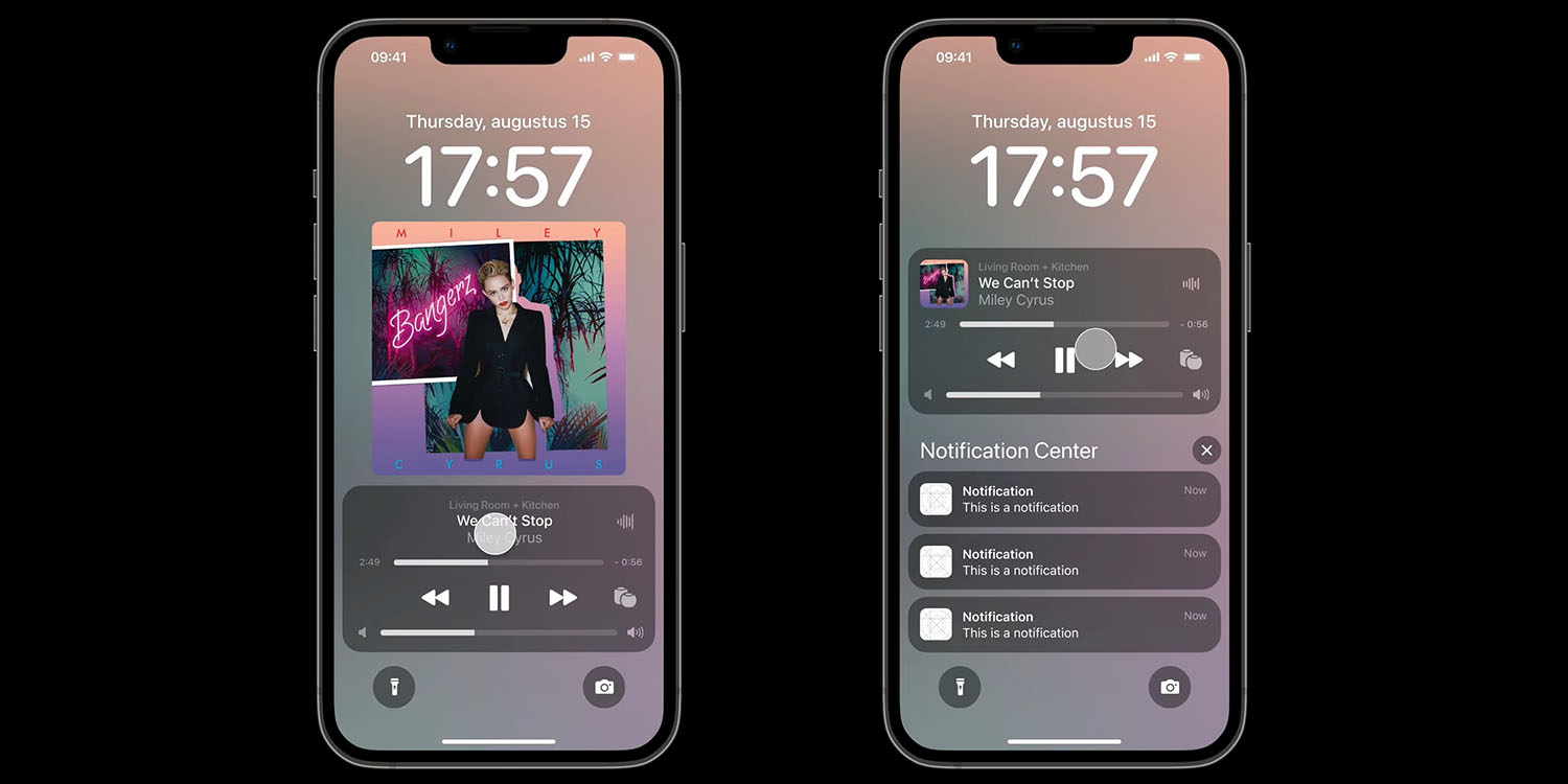
The iOS 16 Lock Screen sees a new user-interface for the music player, most notably letting you see full width album art, like the gods intended.
But things get messy when notifications are shown, something a design student set out to correct …
Dutch UI design student Hidde Collee welcomed back the larger album art last seen in iOS 10, but noted that notifications push up the media controls so that they cover the art. He also wanted to see slicker animations.
I think it’s very good improvements, but I still have some comments. For example, the notifications overlap the album art (as you can see in the image above right), this looks very busy and I think it could be done differently. I also think the animations can be a little better, especially for the album art expanding/minimizing in and out of the Media Player component.
Collee’s concept achieves three things:
- Album art actually expands/minimizes in and out of the Media Player component instead of random fading in and out.
- Notifications do not overlap the album art. When you get notifications or scroll up to the Notification Center with older notifications, the album art actually minimizes in the Media Player. When you hide those notifications the album art expands full screen again.
- New smooth animation for the AirPlay menu.
You can see the interactions in the video below. When notifications arrive – or you swipe upward to reveal them – the large album art smoothly shrinks and takes its place in the media control panel.
To me, this is a simple but very welcome improvement, and just gives a much more considered feel. Apple, take a look …
What do you think of this iOS 16 Lock Screen concept? Please share your thoughts in the comments.
As for the Music app itself, Apple did make a small number of improvements in iOS 16, including the ability to sort playlists.
Apple Music on iOS 16 lets users sort playlists. Traditionally, all playlists in the Music app have been sorted by the order in which the songs were added to the playlist: the first songs added at the top and the songs added most recently at the bottom.
With this new feature with Apple Music on iOS 16, you can sort your playlist by Title, Artist, Album, and more. In addition, when you open a singer/band profile, there’s a new Favorite toggle that you can “keep track of the artists you care about most with new music notifications and improved recommendations.”
You can read about the other changes here.
FTC: We use income earning auto affiliate links. More.


Comments