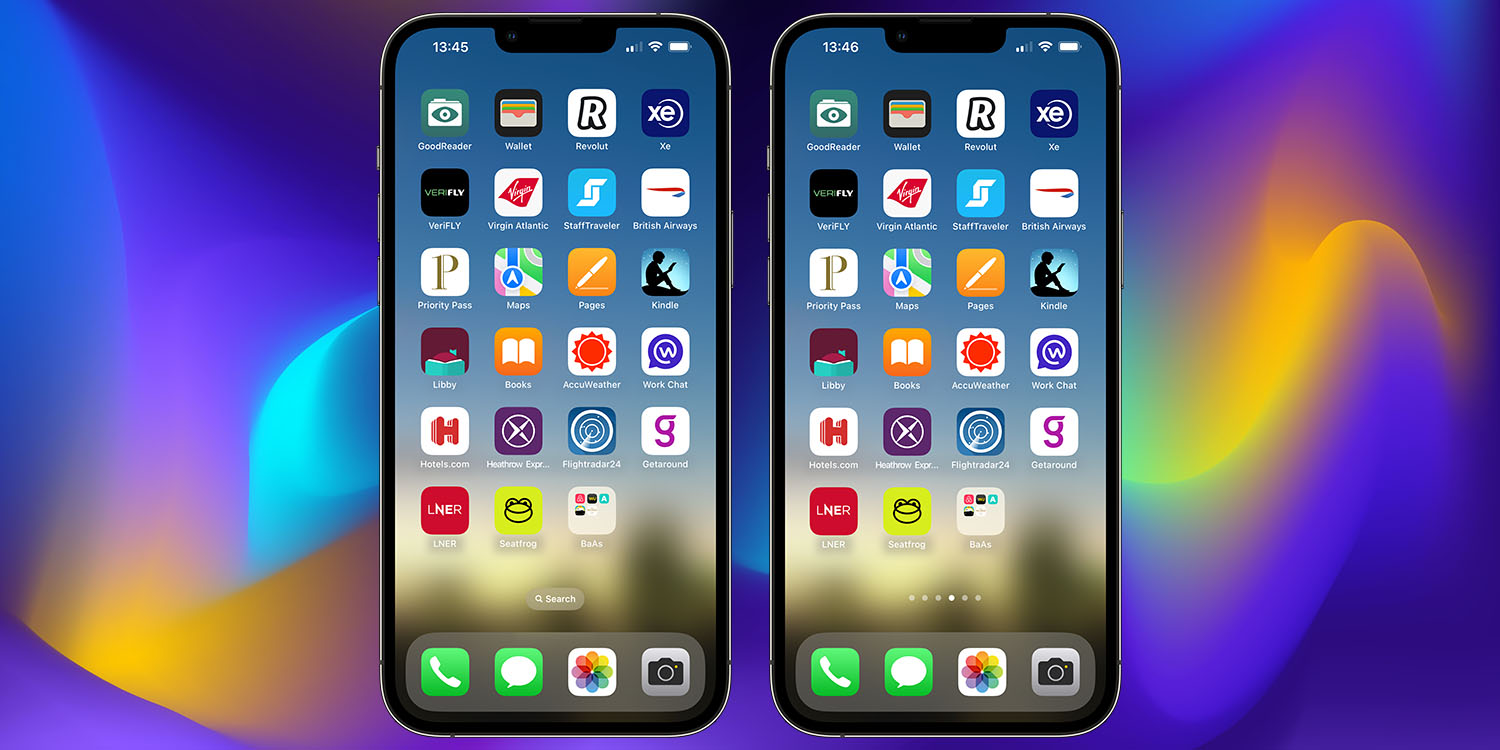
Virtually the first thing I did upon upgrading to iOS 16 was search how to remove the Search button from the Home Screen. I totally understand Apple’s logic in adding it, but for anyone who already knows how to search on an iPhone, it’s just a completely unnecessary distraction …
You’ve always been able to search your iPhone by pulling down somewhere on the Home Screen, and that behavior hasn’t changed in iOS 16.
What has changed is that Apple added a Search button just above the Dock. The reason is perfectly understandable: The gesture for searching is not very discoverable, so Apple wanted to give non-techy iPhone owners a very obvious and visible means to do so.
For the typical 9to5Mac reader, though, it’s just visual clutter.
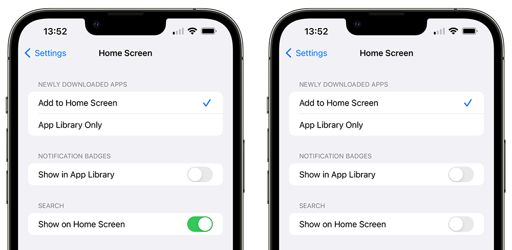
Fortunately, Apple made it very simple to remove. Just open Settings, search for Home Screen, tap the main Home Screen option, then toggle Search to off.

FTC: We use income earning auto affiliate links. More.


Comments