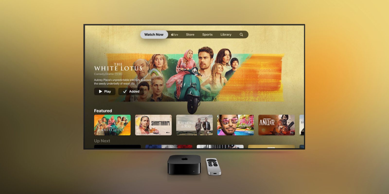
The Apple TV app is taking a page out of the playbook of other streaming services and pushing “Featured” content over the more useful “Up Next” aggregation. With a change rolling out starting today, the first thing you’ll see when you open the TV app is a dedicated row for “Featured” content…
This new dedicated row for “Featured” content replaces the new previous top-level row for “Up Next.” The Up Next row aggregates the next episodes of TV shows you’re watching from any app that integrates with the TV app, which is essentially any streaming service app other than Netflix.
This change appears to be a server-side update, although right now the majority of users noticing the change are running the tvOS 16.2 beta. The redesign spotted by Jon Maddox, one of the creators of excellent live TV, streaming, and DVR apps Channels as well as MadXD on Twitter.
This change matches what many other streaming services have done, such as Netflix and Hulu. Those streaming services have explained that moving the “Featured” content to the top-level helps users discover new content that might not otherwise know about.
Of course, it also helps those companies increase engagement by requiring them to scroll down to view the content they actually want to continue watching.
This is a disappointing change seeing that the Apple TV app was one of the last streaming service apps that actually prioritized helping you find the content you actually want to watch. Ideally, Apple could add a dedicated tab for “Up Next” that made it easy to find everything in one place, but that seems unlikely as of today.
What do you think of this change? Do you prefer having the “Up Next” row at the top, or this new “Featured” row instead? Let us know down in the comments.
FTC: We use income earning auto affiliate links. More.


Comments