Some Apple product names are simple and timeless – like MacBook Air or AirPods – while others are, uh, less so. I’m looking at you, iPhone 14 Pro Max.
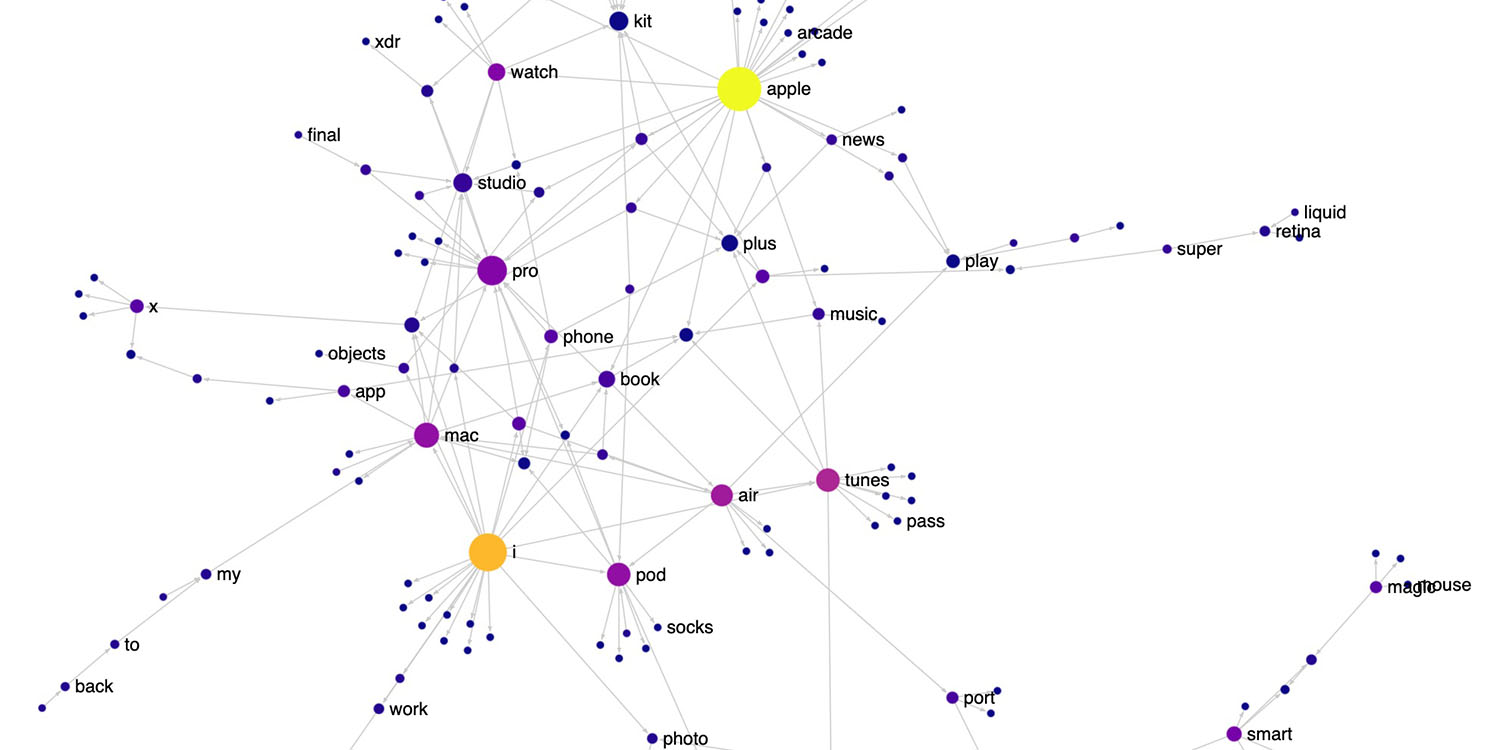
If you want to get a feel for how Apple names its products, data visualization researcher Nicolas Kruchten has put together a cool interactive map, showing how Apple mixes and matches different core elements in its product naming …
Kruchten said that he came up with the idea for the project after reading a biography of Apple cofounder Steve Jobs.
I love the way Apple names things: FireWire, App Nap, iPhone, iPod, EarPod, AirPod, AirPlay, FairPlay etc.It’s playful and there’s a lot of reuse of words and sounds. Having just finished reading the biography ofSteve Jobs, I decided to visualize various Apple product and feature names as a network to see this reuse in action. I got the names from Apple’s public list of trademarks.
There’s a static image version in mind map form, but it’s easier to make sense of it in interactive form. Kruchten recommends viewing this on a Mac rather than iPhone or iPad.
You can scroll to zoom, click-drag to pan, click on nodes to focus.
Nodes are name fragments like “i”, “phone”, “pro”, “max” in the name “iPhone Pro Max.” An arrow from “i” to “phone” means there is a product name or trademark that contains “i phone” or similar (e.g. “iPhone”).
Nodes are sized by how many arrows go in or out, and colored by how many arrows go out, from dark blue for few, through violet, to yellow for lots.
When you click on a node, it isolates only those links. For “i” for example, we see this:

Sometimes you need to pinch-to-zoom to see all the labels. Click anywhere else on the screen to return to the full view.
Parts of it are a trip down memory lane, revisiting things like iDisk, iSight, and iLife. Have fun here.
What gets your vote for best and worst Apple product names? Let us know in the comments.
FTC: We use income earning auto affiliate links. More.


Comments