Apple broke the internet, or at least some people’s muscle memory, when it moved the search bar on Safari in iOS 15. Fast-forward a couple years, and now Chrome is adopting the same design change.
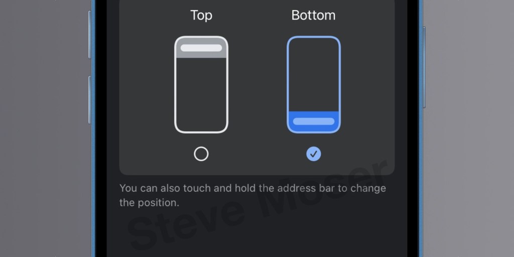
Steve Moser first shared a screenshot of the new address bar setting that has been added to the pre-release version of Chrome for iOS.
For Chrome, Google is including the setting to choose between a top or bottom address bar. A touch and hold gesture will also fling the address bar from the top or bottom.
Here’s how it looks on the current version of Chrome through TestFlight:

Adding the ability to run Chrome on iPhone with the same search bar position as Safari helps users who switch between the two browsers. Full-time Chrome browser users will also be able to enjoy the same popular option that Safari picked up in 2021.
As of iOS 17, Safari lets you switch the default bottom search bar to the classic top position in Settings > Safari > Tabs. Previous versions included a similar shortcut to Google’s touch and hold gesture. The functional difference for Safari is that the bottom search bar lets you swipe through tabs or swipe up to see an overview. The top search bar requires tapping the tabs button on the toolbar to see an overview or switch between tabs.
If you happen to be on Chrome’s TestFlight build for iOS, Steve Moser posted instructions on how to summon the Safari way of doing things here.
FTC: We use income earning auto affiliate links. More.


Comments