iOS 18 is expected to be a pretty significant release in terms of the number of changes and new features. While artificial intelligence capabilities will be the big theme of the update, we are also expecting other enhancements.
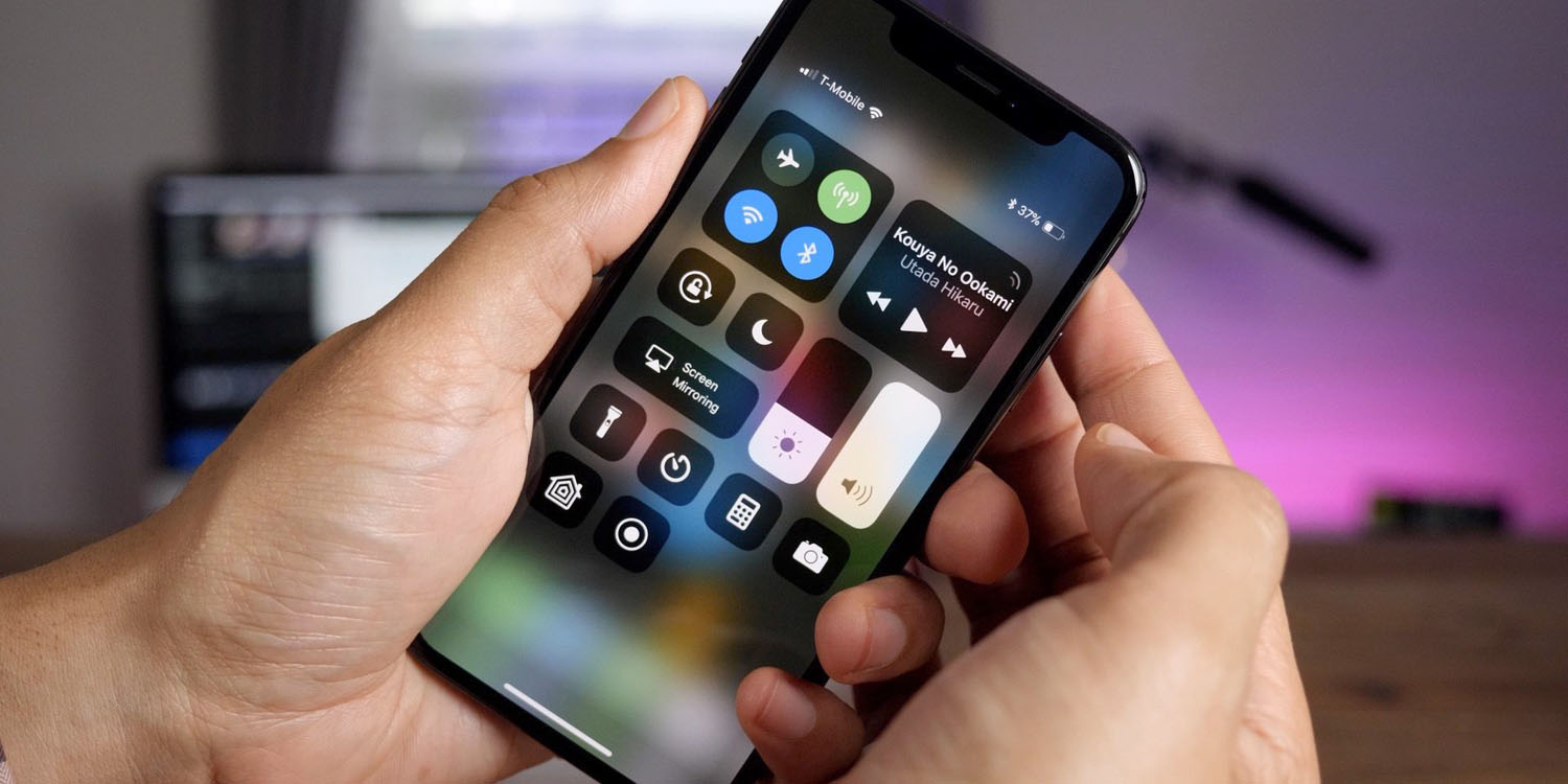
Today, Mark Gurman writes in his Power On newsletter that Apple is preparing to overhaul the iPhone Control Center as part of iOS 18. The new design will include updates to the ‘now playing’ music widget and the HomeKit smart home controls.
Specifically, Gurman says:
In other iOS 18 news, here are a few additional tidbits: The Settings app is getting revamped with a cleaner interface, better organization and much-improved search (this is coming to macOS as well). Control Center, meanwhile, will be upgraded with a new music widget and improvements to how it operates smart home appliances.
The current incarnation of Control Center hasn’t changed much since the launch of the iPhone X back in 2017, so giving it some love is a bit overdue. Gurman doesn’t detail exactly what will be different, but we can speculate.
Currently, audio controls are exposed in a small 2×2 square platter in the top-right of the screen. As controlling the currently playing audio is such a common use case, a long-requested user feature has been to make the Now Playing UI much bigger, perhaps to include album art and progress bar by default. In iOS 17, you have to long-press and wait to reveal those additional elements.
Regarding HomeKit, currently, the iOS system ‘intelligently’ selects up to six accessories to display in the Home section of Control Center. You can also click on the double-width Home tile to reveal a mini-version of the Home app, with your favorite accessories organized by the room they are in.
What is pretty frustrating is the automatic layout is often not what the user wants. The layout can also move around and changes seemingly at random, making it hard to learn muscle memory for common controls like your living room lights or thermostat.
It would be much nicer if you could simply manually choose which accessories to include in the Control Center explicitly, and have a fixed layout of what you want to be there always visible. Making these tiles larger — like they are in the Home app itself — would also improve the ease of use. In this particular case, users would welcome less ‘AI’, not more, for the iOS 18 update.
Follow Benjamin: @bzamayo on Threads and Twitter.
FTC: We use income earning auto affiliate links. More.


Comments