http://www.youtube.com/watch?v=cO3rsfE7GM0
Apple pushed a new ad to their YouTube channel today showing off the design similarities between iOS 7 and the soon-to-be-released iPhone 5c. The ad is colorful and animated, much like iOS 7 itself, and features various parts of the hardware and software merging and morphing to show that they were designed with each other in mind. Oh, and if you like the song on this ad, you can get it on iTunes right here.
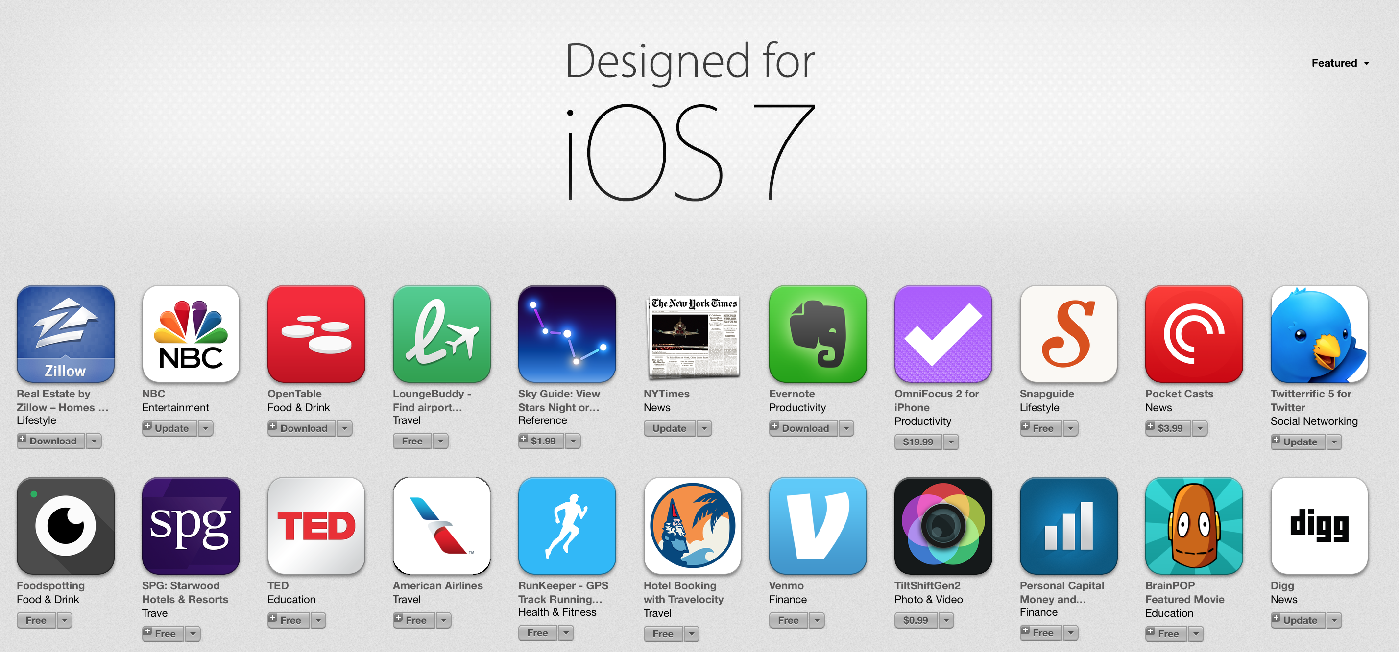
A new section in iTunes has also appeared which showcases apps that are ready for iOS 7.
FTC: We use income earning auto affiliate links. More.
You’re reading 9to5Mac — experts who break news about Apple and its surrounding ecosystem, day after day. Be sure to check out our homepage for all the latest news, and follow 9to5Mac on Twitter, Facebook, and LinkedIn to stay in the loop. Don’t know where to start? Check out our exclusive stories, reviews, how-tos, and subscribe to our YouTube channel


Seeing the different colored cases on the different colored iPhones makes absolute sense. It’s another level of customization, that I’m sure most haven’t yet thought of. Initially, it did look rather absurd (crocs!), but I fully believe these will sell (especially with the younger generation) really well.
Speaking of iOS 7-ready Apps…where are all the updates to Apple’s Apps? Remote? iBooks?
Even more disappointing that iPhoto, iMovie, Pages, Numbers, and Keynote have not been updated for iOS 7.
I’m in no hurry, i’d prefer for them to be done right the first time round rather than getting a rushed out app. I hope iBooks stays the way it does, really love that app.
WOW! AMAZING! :O
LEMAITRE! :D
Makes me want to rush our and buy a training bra and a Milley Cyrus CD for some reason..
The less apple makes IOS7 look like WM, the more people will like it. Early on, I thought it was going to look just like like WM… totally flat, unintuitive, ugly… etc.. and I threw up in my mouth a little bit.. but I’ve now come to believe that starting with IOS 7, we are just a single step away (moving away from the pathetic ugly “flat” design that put Microsoft into the toilet category) from fixing IOS 7 and making it all that it could be. Not quite so flat as now (Flat sucks. because its… well.. FLAT!), Loose the Fischer Price color scheme, and get back to gently sculpted grays, blacks, whites, with splashes of color that serve a purpose… etc. like the Bang Olufsen design style with an apple/Jony Ive twist….. then it would be perfect. as for now, it looks way too much like that software abortion that Microsoft dropped on the operating room floor… windows 8.
I miss Scott Forstall