
Ive at iPhone 5 event (Getty Images)
According to multiple people who have either seen or have been briefed on the upcoming iOS 7, the operating system sports a redesigned user-interface that will be attractive to new iOS users, but potentially unsettling for those who are long-accustomed to the platform…
The new interface is said to be “very, very flat,” according to one source. Another person said that the interface loses all signs of gloss, shine, and skeuomorphism seen across current and past versions of iOS. Another source framed the new OS as having a level of “flatness” approaching recent releases of Microsoft’s Windows Phone “Metro” UI.
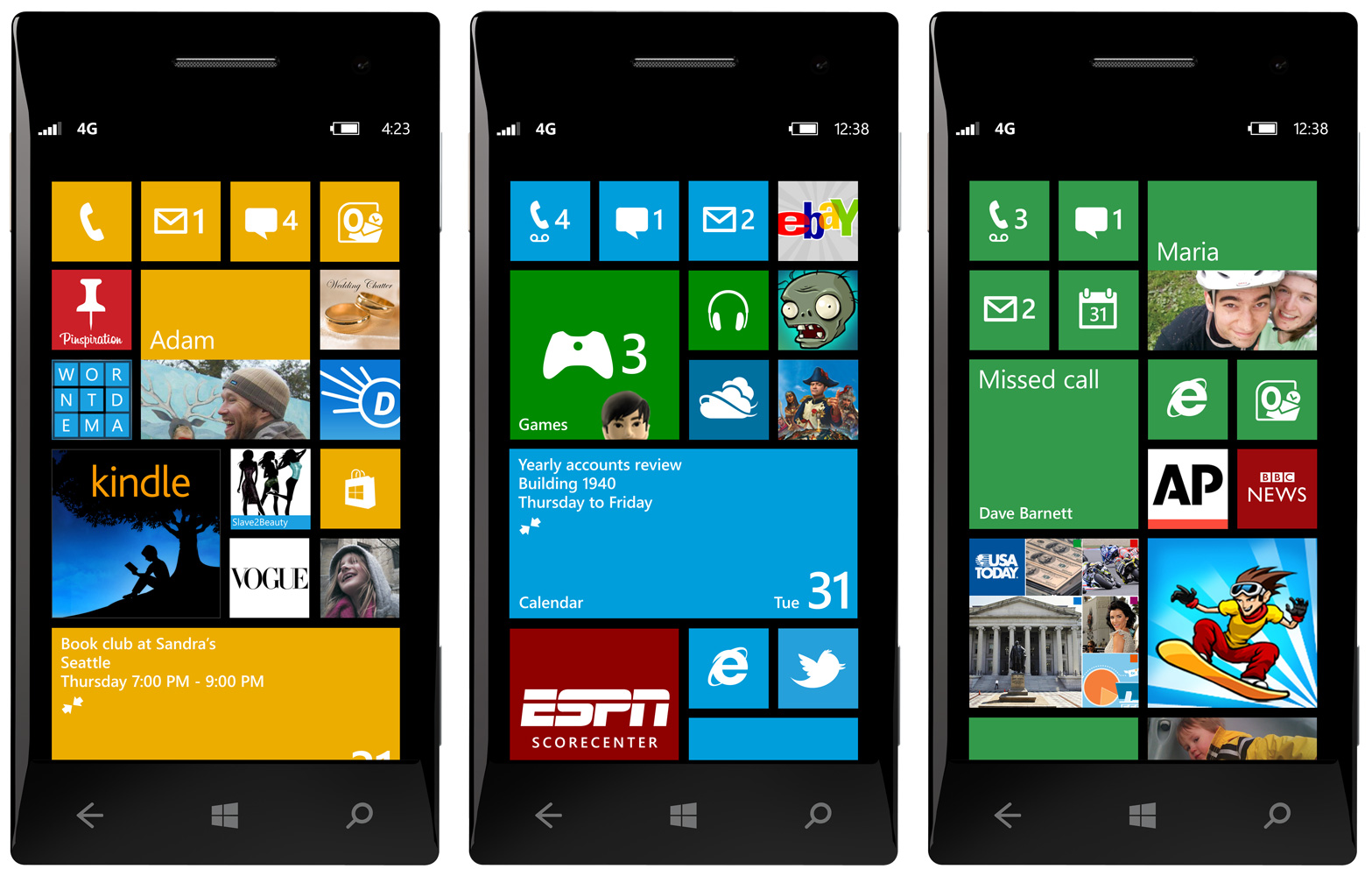
<a href="http://www.winbeta.org/news/microsoft-reveals-new-windows-phone-8-start-screen">Windows Phone UI</a>
“Flat” design is based on simplicity and pushes aside heavy textures and digital metaphors of real-life objects found in skeumorphic interfaces. “Flatness” could also point to a more streamlined interface across the entire system that can stand the test of time.
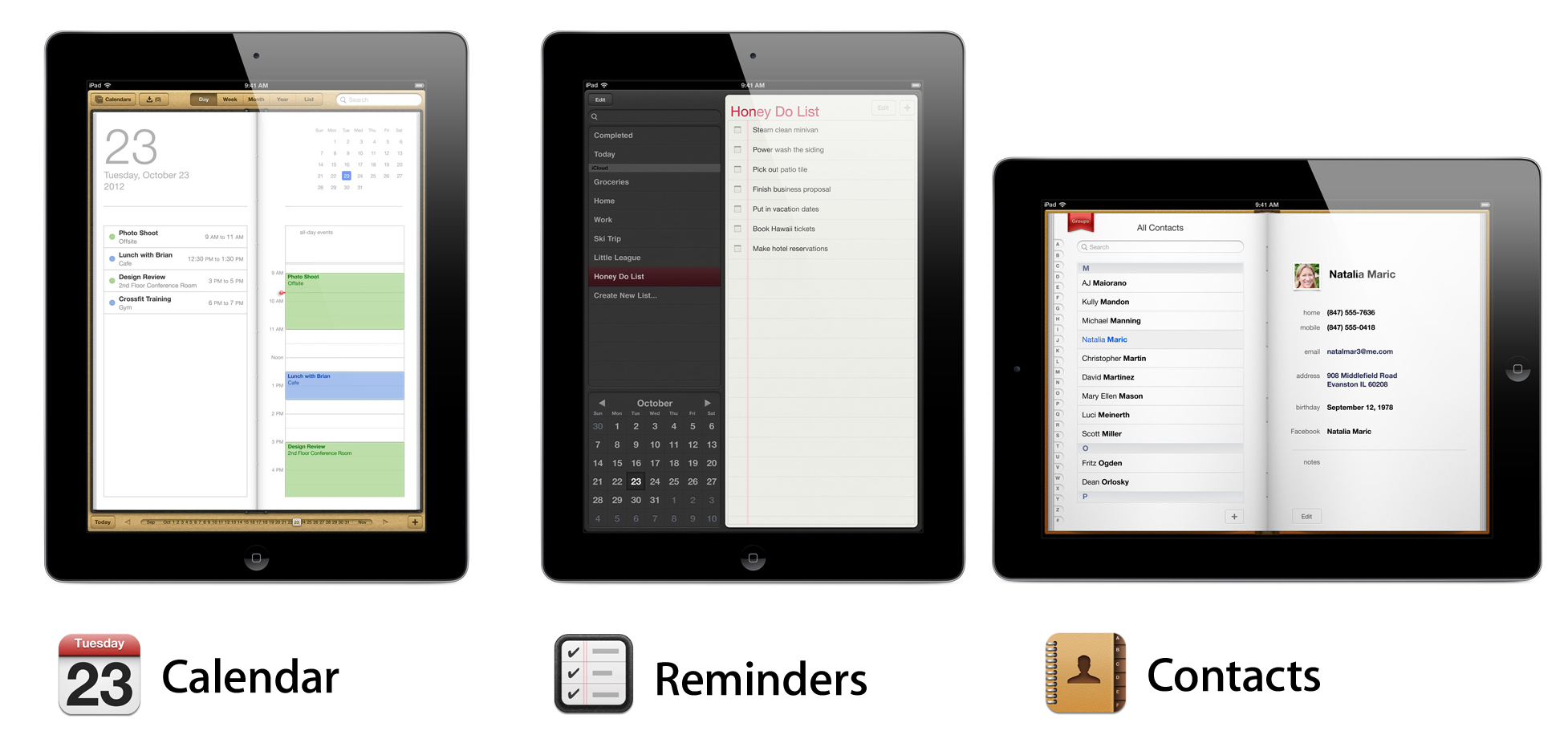
iPad’s Calendar, Reminders, and Contacts apps
For example, younger generations of iOS users may not resonate well with a yellow notepad (as found in the current iOS Notes app) or the leather-bound calendar app.
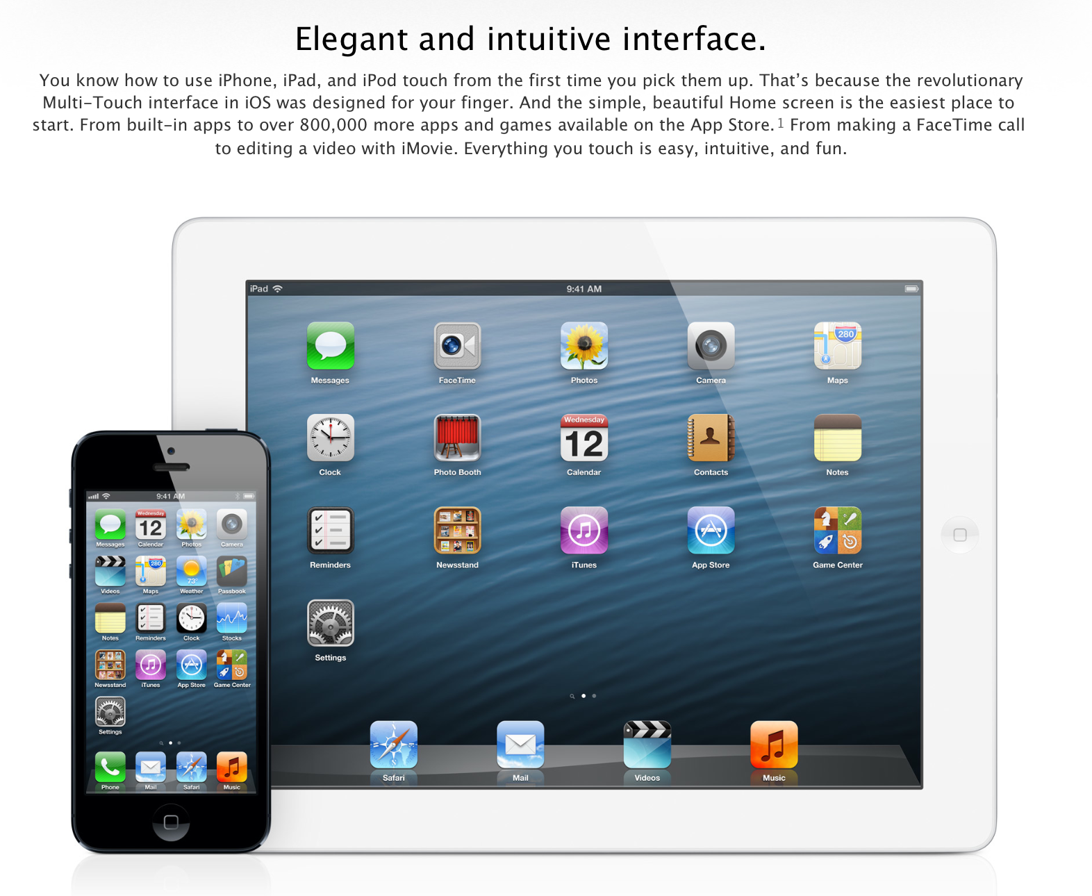
iOS has typically been regarded as an easy-to-use, intuitive operating system. The Company even seems to say as much on its iOS webpage (shown directly below). With its large user-base and market attraction, Apple obviously does not want to make any design changes that make the software more difficult to use.
Apple’s iOS site
While the look of the updated system may be surprising to some, iOS 7 is reportedly not more difficult to use than earlier versions of software platform. There is apparently no new learning curve in the same way there was no learning curve when the iPods went color. While iOS 7 does look different, its core apps and system fundamentals (like the Lock and Home screens) mostly operate in a similar fashion to how they do today.
iOS 7 is codenamed “Innsbruck,” according to three people familiar with the OS. The interface changes include an all-new icon set for Apple’s native apps in addition to newly designed tool bars, tab bars, and other fundamental interface features across the system. iOS devices running the next-generation software reportedly have polarizing filters to decrease viewing angles of on-lookers.

OS X Notifications panel
In addition to losing the complex interface design characteristics from earlier versions of iOS, Apple has been discussing and testing ways to add more ‘glance-able’ information and system options panels, like Notification Center, to the software. While it is still uncertain if Apple will end up including such new functionality in iOS 7, or how the Company will implement the potential addition, one of the early ideas was to implement the new panels via swipes from the left and right side of an iOS device’s display. This would be similar to the gesture on Apple’s Mac trackpads for accessing Notification Center in Mountain Lion, but what, specifically, the iOS gesture could access is uncertain.
Test version of iOS 4 multitasking from 2010
Prior to announcing and launching new versions of iOS, Apple tests many various implementations for features. For example, Apple had toyed with the idea of having an Expose-like Multitasking interface for iOS 4, but ended up choosing the linen-backed bottom drawer that we are now accustomed to.
Apple’s redesigned iOS experience stems from Apple Senior Vice President of Industrial Design Jony Ive now spearheading interface design. With former Senior Vice President of iOS Scott Forstall leaving Apple late last year, influence on software design was handed over to Ive. Ive is long-known as the king behind Apple’s many hardware successes like the iPad, iPhone, iPod, and Mac computers.
In an interview early last year, Ive shared his lack of connection to the software that runs on his hardware.
When I mention the fake stitching, Ive offers a wince but it’s a gesture of sympathy rather than a suggestion that he dislikes such things. At least, that’s how I read it. He refuses to be drawn on the matter, offering a diplomatic reply: “My focus is very much working with the other teams on the product ideas and then developing the hardware and so that’s our focus and that’s our responsibility. In terms of those elements you’re talking about, I’m not really connected to that.”
Matching the information about iOS 7 gaining a “flatter” interface design, a profile of Apple’s internal software design work paints Ive as against flashy, skeumorphic interfaces:
Inside Apple, tension has brewed for years over the issue. Apple iOS SVP Scott Forstall is said to push for skeuomorphic design, while industrial designer Jony Ive and other Apple higher-ups are said to oppose the direction. “You could tell who did the product based on how much glitz was in the UI,” says one source intimately familiar with Apple’s design process.
Apple’s change in interface philosophy under Jony Ive and Tim Cook is also a radical departure from Apple under Steve Jobs.

Jobs and Forstall (Image via Getty)
Jobs, according to the same profile of Apple’s design work, was, like Forstall, a proponent of life-like interfaces.
But before Forstall, it was Steve Jobs who encouraged the skeuomorphic approach, some say. “iCal’s leather-stitching was literally based on a texture in his Gulfstream jet,” says the former senior UI designer. “There was lots of internal email among UI designers at Apple saying this was just embarrassing, just terrible.”
While one of our sources paints the iOS 7 design changes as changes that will gain the appreciation of some and the surprise of others, Apple CEO Tim Cook seems excited and confident about what the company has in store. During the question-and-answer session of the Q1 2013 earnings call, responding to a question regarding Apple’s software updates for 2013, Cook said, “we feel great about what we have got in store.”
Based on Cook’s past comments and moves to further integrate both Apple’s products and its internal culture, Cook’s choice to put Ive in charge of software design also seems to stem from Cook’s admiration of integrated experiences. In a wide-ranging interview with Bloomberg BusinessWeek earlier this year, Cook addressed Forstall’s ousting from Apple and Ive’s new work on software design as a way to further unify Apple’s hardware and software:
Jony [Ive, senior vice president of industrial design], who I think has the best taste of anyone in the world and the best design skills, now has responsibility for the human interface. I mean, look at our products. (Cook reaches for his iPhone.) The face of this is the software, right? And the face of this iPad is the software. So it’s saying, Jony has done a remarkable job leading our hardware design, so let’s also have Jony responsible for the software and the look and feel of the software, not the underlying architecture and so forth, but the look and feel.
Over the past couple of months, Apple seems to have been hinting at an impending shift in its software design philosophy.

Before (left) and after (right) look at Apple’s Podcasts app (<a href="http://about.me/zachkahn">Comparison by Zach Kahn</a>/<a href="https://twitter.com/zkahn94">@zkahn94</a>)
Earlier this year, Apple released an updated version of its Podcasts app for iPhone and iPad in order to simplify some design elements (comparison shown above). Prior to that recent update, the application included a physical “tape deck” interface for the user to manipulate in order to move through a podcast.
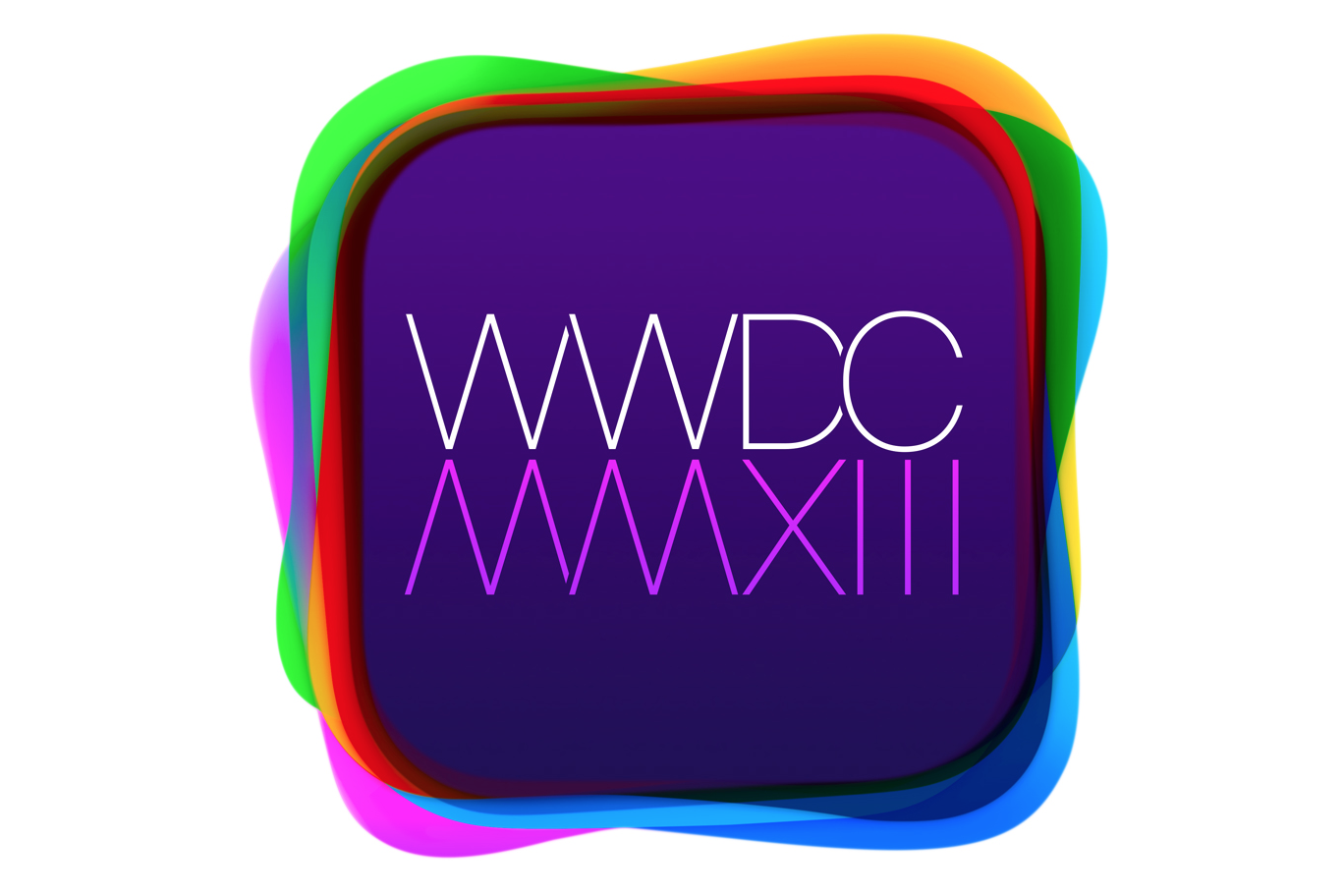
WWDC 2013 logo
Additionally, Apple’s WWDC 2013 logo, the art for the conference in which iOS 7 will be announced, has sparked speculation about flat interface design with its modern, lightweight text and other elements. Indeed, one source claims that Apple’s Game Center icon and interface materials will be somewhat akin to the colorful nature of the WWDC 2013 logo. Because of its casino-like, green-felt design, Apple’s current Game Center app has been widely panned by proponents of flat software interface design.
Apple’s homepage
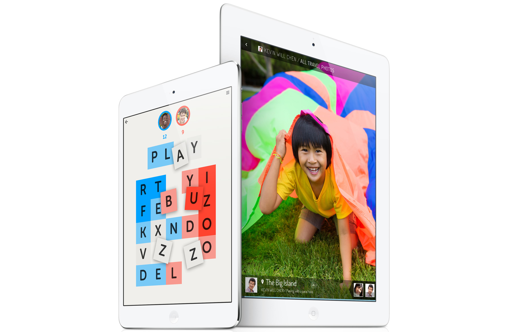
Also, Apple highlights iPad and iPhone applications on its homepage that include flat-interface designs. For example, the home page touting the full-sized iPad and iPad mini highlights former Apple employee Loren Brichter’s popular Letterpress game. Letterpress has been regarded by many as a simple to use, “easy-on-the-eyes” game for its flat textured interface.
With Apple’s vibrant iOS application development community, the prospects of a redesigned iOS go beyond Apple’s apps and core interface functions. Internal to the third-party iOS app community, some fear that Apple’s interface changes could deem App Store apps, that are currently built to look consistent with Apple’s own interface, outdated.
AppHero’s Jordan Satok, who has a comprehensive view of the App Store ecosystem, points out that iOS interface changes will likely not pose challenges for all developers.
“When we started building iOS apps almost 5 years ago, most apps looked the same. Apple did an amazing job designing UIKit to provide a really consistent user experience across apps,” he said. “As the App Store has grown, and the types of apps being built have evolved, designers and developers have pioneered new interface styles and concepts.”
Because many apps are picking up unique interface designs, Apple’s changes to its core software will likely not make much of a difference to these developers. Nonetheless, it is likely that once iOS 7 is announced, developers that have followed Apple’s own past iOS design trends will quickly move to enhance their App Store apps to follow some of Apple’s changes.
Apple’s next version of OS X will include some design changes, but the changes will not be as notable as the aforementioned enhancements to iOS.
FTC: We use income earning auto affiliate links. More.

Comments