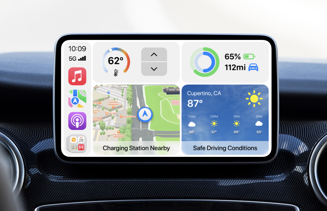
CarPlay has always been a temporary way for Apple to get its software into existing cars while they work on something far more innovative. Everyone under the sun knows that Apple is building its own car. When we will see the rumored “Project Titan” though, nobody knows. In the meantime, Apple appears to be expanding its efforts to integrate into more aspects of existing cars from other manufacturers. Bloomberg has reported on Apple’s plans to connect CarPlay with things like air conditioning, batteries, seats, and more. Here’s what we think CarPlay could look like with deeper car integration.
It starts with an all-new Home Screen. The current CarPlay Home Screen introduced in iOS 14 has a more widget-like layout that lets you see your current location, media controls, and more. A simple swipe brings you over to large app icons. But what if this screen was more dynamic and far more powerful?
First off, Apple should allow for a fourth “widget.” The top two can be smaller and offer controls for car functions. In the example below, you can see a complication and toggle for changing the car’s internal temperature. Next to it, the car’s battery percentage and remaining mileage appear like Apple Watch fitness rings.

Below the two car controls, you can see your current location on the new Apple Maps. It can show pertinent information like nearby charging stations, your proximity to a frequent location, and more. To the right of the map, we’ve got weather conditions. It also shows the next few hours, something that can be quite useful if you’re driving a long distance. Weather can also notify you of dangerous or safe driving conditions.
This new Home Screen is smart and dynamic so it can intelligently switch out and move widgets based on what you’re doing. For example, if you are playing a podcast or some music, a media player widget will appear and shift the current location one over to the right. It has larger controls for forward, backward, and play/pause.

You may have noticed that in the bottom left there’s an App Library icon instead of a home button. Since this is the Home Screen now, there’s no reason to have a home button here. Tapping the App Library icon brings up the large app grid.
There are also now buttons for editing the arrangement and for sorting apps. Sorting apps can give you a layout similar to that of the App Library on iPadOS 15, organizing your apps by category. In the bottom left, the App Library button has changed over to the dashboard icon. Tapping that will return you to the new Home Screen.

Since this concept is primarily about the way CarPlay can cleanly integrate with car functions, I wanted to go beyond buttons and widgets. What if Siri could do simple things like adjust your seat, change the temperature, turn on lights, and more?
You could simply tell Siri to “move the driver’s seat back a bit” or say things like “bring me closer to the wheel.” This could be useful for cars that have tricky to reach or oddly placed controls for the seats. Drivers wouldn’t need to fiddle with them.

Another car control that CarPlay could integrate with better is volume. This is necessary for everything from calls to podcasts to audiobooks to music. When important, CarPlay would contextually show a large volume slider. In the example we have here, you can see a redesigned call screen with larger buttons, a new more prominent microphone indicator, and the contact’s Memoji.
But below all of the expected controls, you can see the large volume slider. You could tap on either side of it to change the volume or swipe on it like you would on your iPhone. You may also notice that the button in the lower left changed to a dashboard icon, letting you go home.

Since CarPlay can present information about your car’s charge, it could also notify you of a low battery. It could show a large fullscreen notification with the existing battery and how many miles you have left.
CarPlay can offer the driver two large buttons. One for searching for a charger in Maps and starting an immediate route navigation or to call emergency services for help if you’re in a bind.

In addition to deeper car controls, CarPlay could benefit from deeper HomeKit controls. A new Home app in CarPlay could give drivers easy access to opening and closing their smart garage doors. On the far right, Apple could display your three most used scenes.
A driver could be on their way and activate a scene from their car. When they get home, all of their lights are turned on and their place is ready for them.

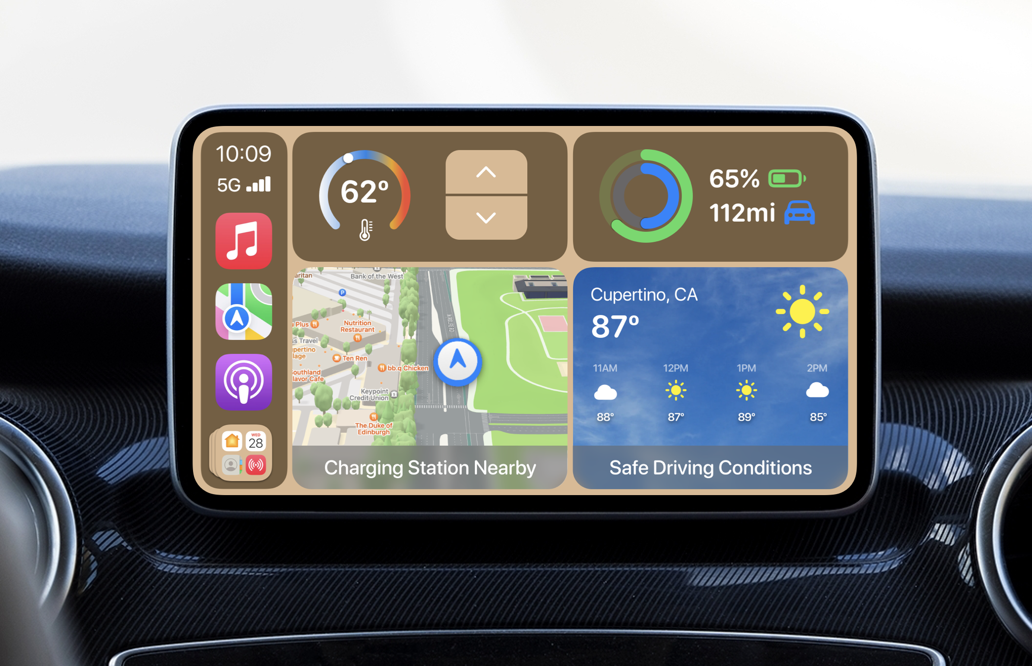
CarPlay could also use some visual tweaking. I’ve always thought wallpapers were unnecessary for CarPlay and frankly a little distracting. I’d remove them entirely and offer the user just a few themes – a light mode, a dark mode, and a new beige mode. Beige mode would fit nicely inside of cars with light brown interiors.
I’ve also changed all text over to SF Rounded to make text look smoother and more comfortable on rounded displays.


What do you think about our ideas for improving CarPlay? Do you think Apple will follow through and add new car integrations? Let us know in the comments below!
FTC: We use income earning auto affiliate links. More.


Comments