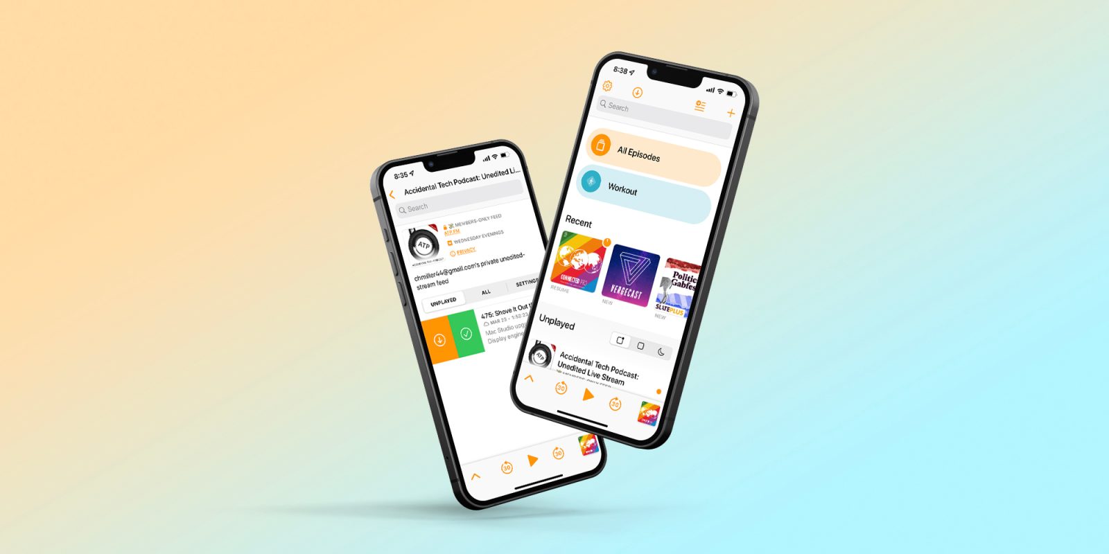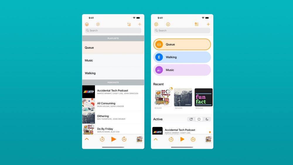
Overcast, the popular podcast player from developer Marco Arment, has gotten a major new update today with a design overhaul and new features. Arment describes this as “part one” of the Overcast redesign he’s been working on, with the focus this time being on the home screen, playlist screen, typography, and spacing.
You’ll see the new design immediately when you open the app for the first time after updating. The home screen in Overcast now features a far more modern design, with an emphasis on new colors, rounded corners, and customization. Arment describes this as the “largest redesign” in the nearly eight-year history of Overcast.
The Overcast home screen features your playlists at the top, which are now fully customizable in terms of colors and icons. Below that, you’ll find a new section for recently played and newly published podcast episodes.
Overcast also now features a revamped way of viewing podcasts in your library, with three different options. Arment explained this change in a blog post detailing today’s update:
I’ve also rethought the old stacked “Podcasts” and “Played Podcasts” sections to better match people’s needs and expectations. Now, the toggle atop the podcast list switches between three modes: podcasts with current episodes, all followed podcasts, and inactive podcasts (those that you don’t follow and therefore won’t get any more episodes from, or haven’t posted a new episode in a long time).
Overcast is also adding a number of new features with today’s update. Most importantly, this includes a new Mark as Played capability. You’ll now find a checkmark button on episode rows and a left-side swipe action, both of which allow you to quickly mark an episode as played.
Other new features in this update:
- The second-most-requested feature is a way to view all starred episodes. Special playlists for Starred, Downloaded, and In Progress can now be created.
- The light and dark themes now each have a customizable tint color from the modern iOS UI-color palette.
- Notifications and background downloads are now much more reliable.
- Episode downloads can now be individually deleted or re-downloaded.
- Links can now be opened in Safari (under Nitpicky Details).
- Performance is now significantly better with very large playlists and collections.
- Fixed bugs with episode-duration detection, CarPlay lists, Mac-app sharing, and much more. So much is better in this update that I can’t even remember it all.

9to5Mac’s Take
As someone who uses Overcast everyday, for multiple hours a day, I find this new design to be the perfect combination of being familiar and being a fresh take on that familiarity. The new home screen design feels far more personal with this update, thanks to the playlist personalization options and the ability to fine-tune pinned podcasts.
I’m also very glad to see that this update goes beyond a visual redesign, with a really nice collection of new features as well. The addition of features like Mark as Played and additional smart playlist options will be useful additions for any podcast power user.
Arment describes this as “part one” of his ongoing, broader Overcast redesign. I’m excited to see what comes next, where the focus will be on the “now-playing and individual podcast screens.” The app was due for a fresh coat of paint, and so far the new design is proving to have been well worth the wait.
Overcast is available on the App Store as a free download. There’s an optional $9.99 per year in-app subscription to remove ads. The app works on iPhone, iPad, Apple Watch, and Apple Silicon-powered Macs.
Overcast is my podcast player of choice for iOS, and we have more details in our complete rundown of podcast players for iOS right here.
FTC: We use income earning auto affiliate links. More.


Comments