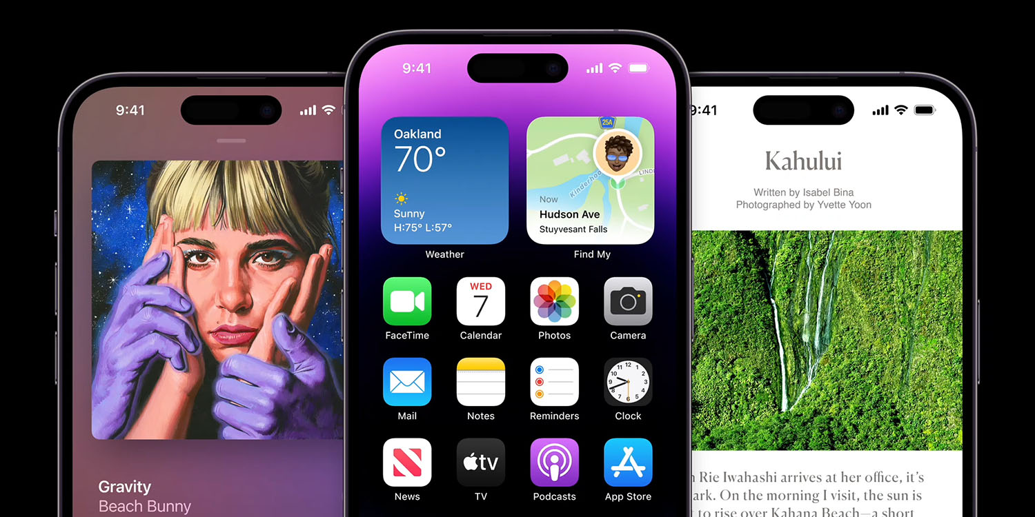
The first reviews of the iPhone 14 and iPhone 14 Pro are here. Ahead of pre-orders arriving to buyers on Friday, these early reviews provide our first in-depth look at the iPhone 14 Pro camera upgrades, the new Dynamic Island design, the Always-On Display, and much more.
The consensus among early reviews is that the Dynamic Island proves impressive despite still being in its early days. The camera upgrades also appear to live up to Apple’s hype, but some people have issue with the Always-On display.
Table of contents
Reviews: iPhone 14 Pro and iPhone 14 Pro Max
Display
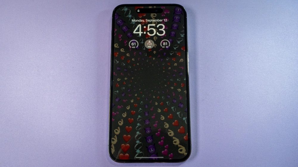
The Verge has some interesting thoughts on the iPhone 14 Pro’s new Always-On display. Interestingly, Nilay Patel says that the Always-On display is … “a little too on,” and it looks like his phone is “awake all the time.”
At long last, Apple added an always-on display mode to the iPhone 14 Pro, which, well, Android phones have had always-on displays for a long time now. It’s fine! The display refresh rate drops to just one hertz, and the brightness goes extremely low to save battery life. Apple’s done some nice work to keep wallpaper colors accurate in the low-power always-on mode, but honestly, I would prefer a Pixel-style black and white clock to something that sort of looks like my phone is awake all the time. I hope we see some customization options here in the future.
CNBC also points out that the Apple TV Remote within iOS when the iPhone 14 Pro is idle, thanks to the the Always-On display.
Joanna Stern at The Wall Street Journal says that she didn’t notice any impact on battery life with the Always-On display, particularly on the iPhone 14 Pro Max:
For those of us who use our phones as a watch, I predict thousands of phone taps a year saved. Plus, it didn’t impact battery life in a noticeable way. After a long, harsh day shooting my review video on an actual island—nonstop camera and video use—the Pro conked out around 7:30 p.m. The Pro Max was still kicking when I went to bed. You can turn off the always-on display to eke out even more battery.

Dynamic Island
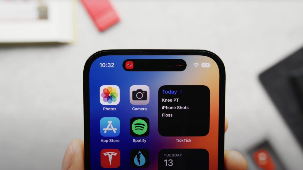
Gizmodo has high praise for the iPhone 14 Pro and its new Dynamic Island, saying it makes “ditching Android mode tempting than ever.” The review also confirms that while most third-party apps don’t yet integrate with the Dynamic Island, media apps like Spotify can because it’s based on the existing Now Playing feature. More support will come from third-party apps later this year when Live Activities launch.
You can concurrently access two apps at a time from the Dynamic Island. Simply tap to expand it. The process is quite fluid, and it’s nice not to worry about swiping down when trying to access something, as I would on an Android device with its notification shade. You can also use it to determine if something is playing in the background or through your headphones.
Would I like Apple to figure out how to shrink that part of the screen so there’s nothing there? Absolutely. Remember, I come from the land of hole-punch cameras, so I’m used to seeing most of the screen when I’m scrolling vertically. When used in landscape mode, apps like YouTube will letterbox the video so that the Dynamic Island doesn’t block out part of the view. But in portrait mode, the pill-shaped island is extremely obvious.
In his video review, Marques Brownlee also has a cool breakdown of everything the Dynamic Island is capable of today:

System alerts and notifications:
- Incoming call
- AirPods connected
- Face ID
- Apple Pay
- CarKey
- AirDrop
- Watch unlock
- Low battery
- Charging
- Silent switch ON/OFF
- NFC interactions
- AirPlay
- Focus changes
- Shortcuts
- Airplane mode/no data alert
- SIM card alerts
- Accessories connect
- Find My
Live Activities:
- Ongoing call
- SharePlay
- Music/Now playing apps
- Timer
- Maps directions
- Voice memos
- Screen Recording
- Personal Hotspot
- Indicators:
- Microphone
- Camera
Now Playing:
- Spotify
- Stitcher
- Audible
- Amazon Music
- NPR One
- Overcast
- Pandora
- YouTube Music
- SoundCloud
CallKit:
- Google Voice
- Skype
Writing for The Street, Jake Krol likens the new Dynamic Island to “a command center” for quick access to key information:
It feels like a command central of sorts that gives you access to key information, while within other apps or just navigating around the interface. Say you start a timer to know when your covid antigen test is ready, you can start the timer, and see it at the top with the time going down at the top while you’ve moving between apps. Same goes for playing music within Apple Music, but also within Spotify or Apple Music. iOS 16 and the Dynamic Island will even place multiple apps together at the top.
And when Live Activities launch in a later version of iOS 16, you can expect some more third-party applications to take advantage and make use of the dynamic island. Think sport scores up-top, monitoring a flight’s path, or even tracking a driver coming to pick you up. The opticians are literally endless.
Deep purple and space black
Gizmodo also praises the new Deep Purple color of the iPhone 14 Pro and iPhone 14 Pro Max:
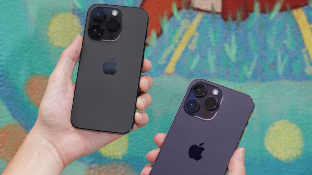
Apple sent me the Pro Max in Deep Purple, and I am in love. Several times, I’ve commented that this is the smartphone color for goth girls worldwide. It’s not as purple as the photos I’ve included here depict it being. It’s more of a subdued violet compared to, for example, the lavender-purple casing on the Samsung Galaxy Z Flip 4.

As for the new space black color, here’s what Raymond Wong at Input has to say:
My iPhone 14 Pro review unit is Space Black. I love it. The glass back and the stainless steel frame are noticeably darker than the gray Graphite iPhone 13 Pro; like a mix between the black and Jet Black iPhone 7. My iPhone 14 Pro Max review unit is Deep Purple; it’s a dark purple that sometimes looks gray or black. Both look sleek in person; both are still fingerprint magnets. You can also get them in silver and gold.
Performance
Tom’s Guide has some in-depth benchmark results from the new A16 Bionic chip inside the iPhone 14 Pro and iPhone 14 Pro Max, starting with Geekbench numbers:
| Single-core | Multi-core | ||
| iPhone 14 Pro Max | A16 Bionic | 1,882 | 5,333 |
|---|---|---|---|
| iPhone 13 Pro Max | A15 Bionic | 1,720 | 4,549 |
Here are results from 3D Mark:
| Single-core | Multi-core | ||
| iPhone 14 Pro Max | A16 Bionic | 12,363 | 74 |
|---|---|---|---|
| iPhone 13 Pro Max | A15 Bionic | 11,418 | 68.3 |
Camera upgrades


Image samples courtesy of Engadget
The iPhone 14 Pro and iPhone 14 Pro Max feature major upgrades to the camera, including a new Main camera with a 48MP sensor. Apple then uses pixel binning to combine these pixels into groups of four. Engadget isn’t quite sold on the camera upgrades, though:
In fact, most of the photos I took from the iPhone 14 Pro and 13 Pro are basically indistinguishable. Sometimes images from the newer phone were brighter, sometimes they weren’t. The 13 Pro delivers pictures that are slightly cooler with more saturated colors, and I frequently preferred its results.
All three phones were adept at keeping details crisp even in shadows. The lines inside the roof of a shelter were sharp when I magnified the pictures. When I used the telephoto lens to zoom in to 3x, though, the iPhone 14 Pro produced the brightest image. It also delivered the punchiest colors on some graffiti under an overpass.
However, sometimes the iPhone 14 Pro actually does worse than the 13 Pro and Pixel. In my shots of a park, the 14 Pro had the least saturated greens. In general, the quad-binning of the 48-MP sensor doesn’t seem to drastically improve image quality, at least in daylight.
A similar story can be told of the cameras in low light. In one example, the iPhone 14 Pro’s shots had the most accurate color and cleanest details, beating the Pixel 6 Pro at capturing the individual lines on a leaf. But Google’s flagship did a better job with a picture of a bright bar in a dim restaurant. It clearly captured individual leaves on a potted plant on a shelf, while the same part of the picture was shrouded in shadow when shot with the iPhone 14 Pro.
CNET says this results in a “12-megapixel photo that’s brighter, has less image noise and better detail.”
The main camera takes excellent photos: The image quality and details are great for a phone. I noticed the most improvement is in medium and low-light situations: Colors look good and textures are great. Check out the photo below, which I took on a foggy morning in San Francisco. Notice the textures in the buildings’ bricks and the gradual way the 14 Pro captured the fog engulfing the top of Salesforce Tower.
If you enable ProRaw to capture full 48MP images, CNET says there’s an incredible amount of detail in the images, but the file sizes clock in at around 48MB.
eSIM-only in the United States
TechCrunch’s Matthew Panzarino has some details on the process of setting up an eSIM-only iPhone 14 in the United States:
This year, Apple shipped test iPhones to reviewers with a line of service attached. This meant that when I booted up the devices for the first time I was presented with the option of activating that line or adding my own. I added both to get the full dual-line experience and it went smoothly. Apple has had eSIM in iPhones since 2018 so they’ve had some practice at this but it was overall aggressively pleasant.
Adding my line even though I was ‘converting’ from a physical SIM was painless. Once I added it I was taken through a nicely designed flow to choose which number I would use as primary, which data plan I would use and whether I wanted to blend the plans to use whatever data was faster at the moment. The new signal indicator which shows both services on it takes some getting used to but otherwise nicely done.
iPhone 14 Pro video reviews
FTC: We use income earning auto affiliate links. More.


Comments