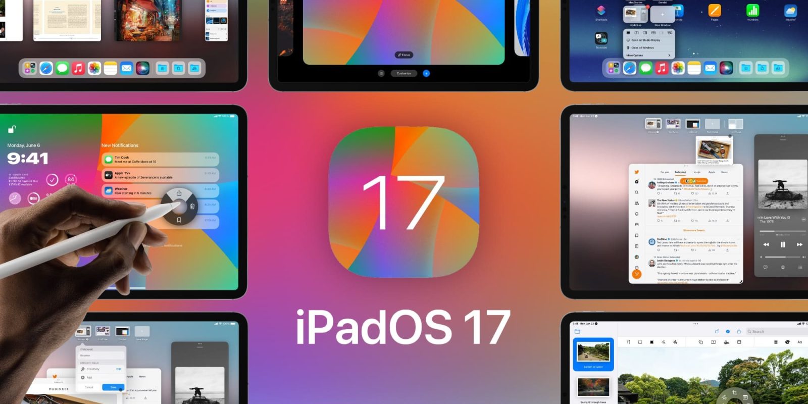
Apple released iPadOS 16 at the end of October 2022, one full month after iOS 16 was released to the public; there was good reason for this. Apple finally made some worthwhile features available to the iPad like Stage Manager, secondary monitor support, a new weather app, and much more. After finally giving iPad users some sort of external monitor support, what else could Apple be working on for this amazing tablet? Parker Ortolani created a concept that illustrates how Apple could approach iPadOS 17, with a focus on simplicity, ease of use, and leveling up the features that iPadOS 16 brought!
iPadOS 17
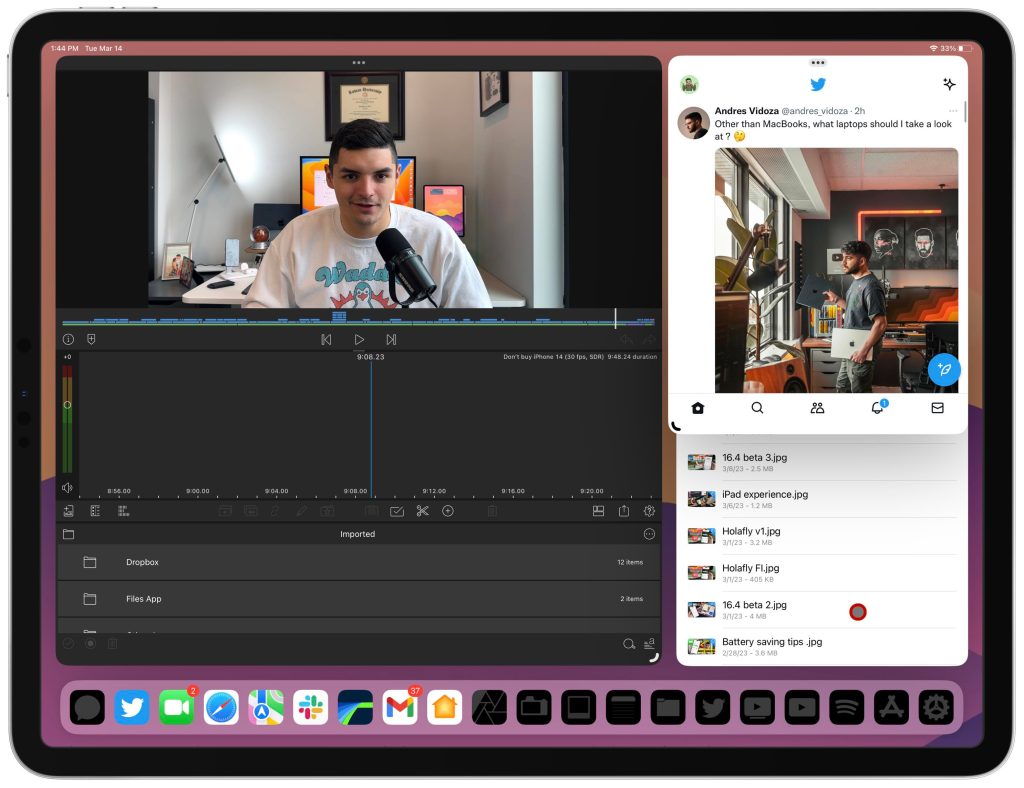
As an iPad first user, Apple did provide a lot of new functionality and features to iPadOS 16. After years of begging and pleading, we finally got a version of floating windows as well as true external monitor support; for years, we were stuck with Split View and then mirroring your display on the monitor. But with these new features and improvements, some users said it still was not there and that the learning curve was too great, so I think iPadOS 17 is going to take those features and make it usable to the masses.
Improved Stage Manager
Stage Manager was a bit confusing to people that jumped in without knowing what the intent was. Stage Manager gave you the ability to have up to four free-flowing windows that could be resizable. Now, they were not infinitely resizable and the floating aspect was still a bit different than traditional desktop-class operating systems. There is still a type of grid that needs to be followed, like the app grid. There was also the aspect of the app shelf, which was also a strange implementation of multitasking. The intent and idea were there, Apple just needs to hone it in a bit.
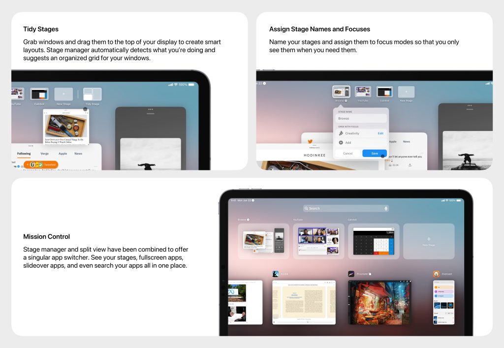
Parker’s reimagined Stage Manager brings some great quality-of-life improvements to the UI.
More user-friendly Stage Manager
Parker imagines an experience that combines both split view and Stage Manager. The idea would be to create full-screen grid layouts while still being able to open more than two apps and be able to resize. He also brought forth a few new features like Tidy Stages, creating unique Focus modes, and having a Mission Control type interface that allows you to manage all of your apps.
Mission Control would be a great addition to iPadOS; being able to have a full and at-a-glance view of all of your open apps and stages would be ideal. Again, Stage Manager was a wonderful addition to iPadOS, but some people were deterred because the usability was not easy. Enhancing the usability of Stage Manager is going to be key moving forward.
Redesigned Lock Screen experience
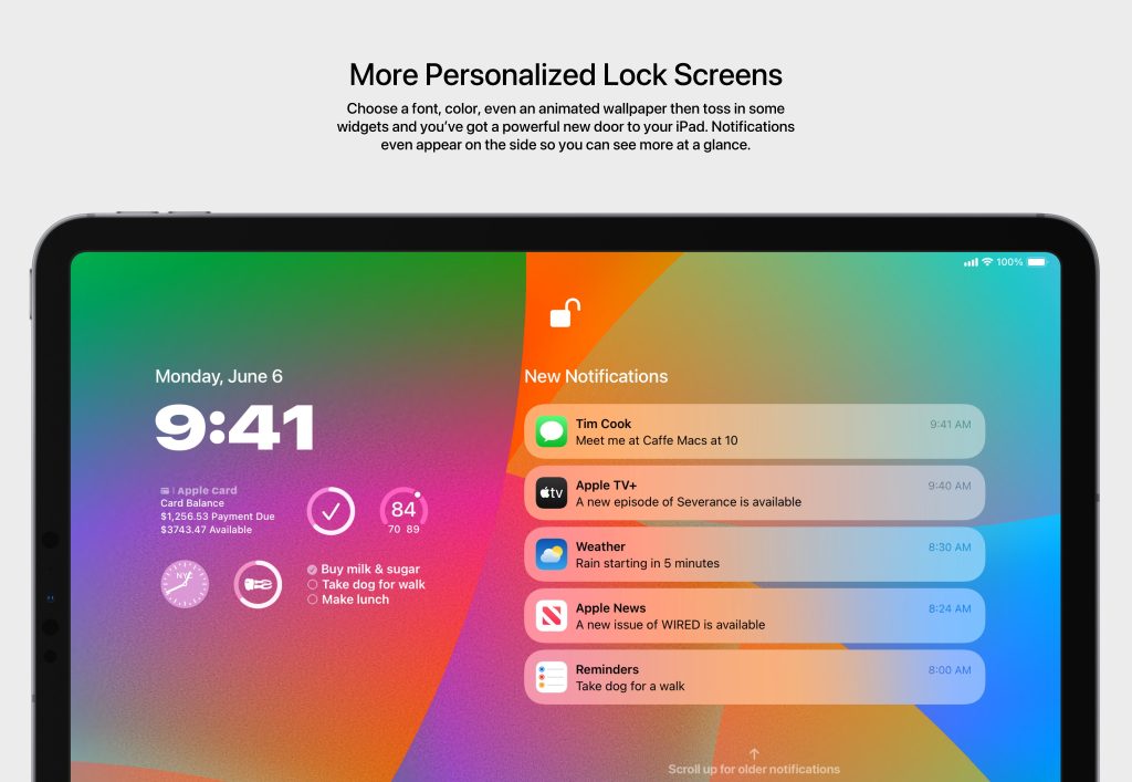
The Lock Screen is an aspect of the iPad that has been heavily neglected. The current state of the Lock Screen is boring, it has zero function. Apple even got rid of the today view, which was my favorite aspect of iPadOS 13.
The way Parker laid out what a revamped Lock Screen could look like makes the most sense. It requires very little innovation from Apple’s side, so it’s a simple ask. Bring the today view back to the iPad, allow us to add the new iOS Lock Screen widgets, and give us the same customization features we got with iOS 16! Let us use different fonts for time, have certain Lock Screens for focus modes and give use live activities!
Evolution of the Home Screen
Over the last few years, the home screen for the iPad has actually regressed in my opinion. Again, having the Today View pinned on the home screen made you feel like your iPad was different from your iPhone. It gave it a differentiator that we no longer have. We have gotten the ability to add widgets, but we still have to follow that grid format that Apple loves to implement.

Apple could easily expand the functionality of iPadOS 17 and give users more of a desktop-like feel. Firstly, Apple could bring back an enhanced version of the Today View. This new Today View could allow you to pin your favorite widgets or apps. You could add something like quick notes onto the Today View and so much more.
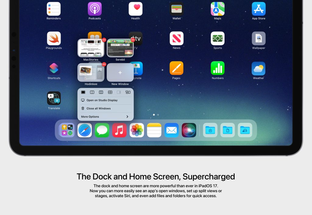
Parker sees Apple allowing us to also have the ability to add files and folders onto the home screen. This would be a welcome addition. I have always wanted to have a recently worked-on file easily accessible on my homescreen. Also, an improved context menu is something that is needed. Being able to start a new tab, start a new split view, or start a new window directly from long-pressing an app on the dock would be great!
New Apple Pencil features
Now let’s talk about the Apple Pencil. I use my Apple Pencil on a daily basis, and it has been an essential tool to my iPad Pro workflow; but this version of the Apple Pencil was released in 2018, meaning it’s been five years since it’s been updated. Yes, we did get the new Hover feature, but that was a small enhancement and only applies to users that have the M2 iPad Pro. Parker portrays a feature that would allow the Apple Pencil to have S-Pen-type features. He is introducing the Dial.
Apple Pencil Dial is something that would come to the iPad Pro lineup, but even the older ones. Parker states:
iPad Pro gains the Apple Pencil dial. The dial will pop up when you hold Apple Pencil above certain elements of apps. It offers shortcuts and quick access to tools on the fly. And combined with the new Preview for iPad, it enables snappier and more efficient document editing.
https://twitter.com/ParkerOrtolani
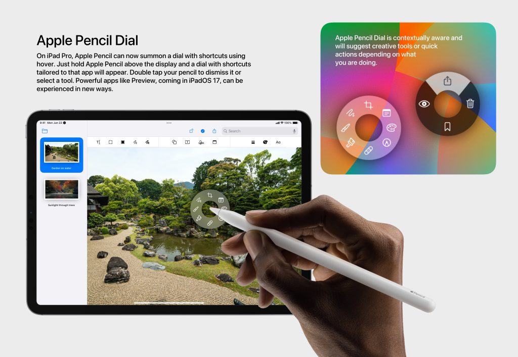
This would be a logical next step to the Hover feature; Hover adds some functionality but not many can take advantage of it. So adding a dial that gives you contextually relevant shortcuts would be amazing. I can imagine my Affinity photo shortcuts being front and center without having to go through menus to access them.
Wrap-up
Although iPadOS 16 brought a ton of new features that really helped show people that the iPad can be your computer, there is still room for improvement. Features like Stage Manager, extended monitor support, and Freeform were great additions that just need to be refined and enhanced so it’s usable by everyone. Also adding familiar iOS features like a new lock screen and home screen will help customers transition into iPadOS much easier.
What do you think of these new potential feature upgrades? Are you excited about iPadOS 17? What’s one feature that you want to see added to the iPad? Lastly, how do you use your current iPad? Is it your computer or is it just a tablet for you? Let’s discuss in the comments!
FTC: We use income earning auto affiliate links. More.


Comments