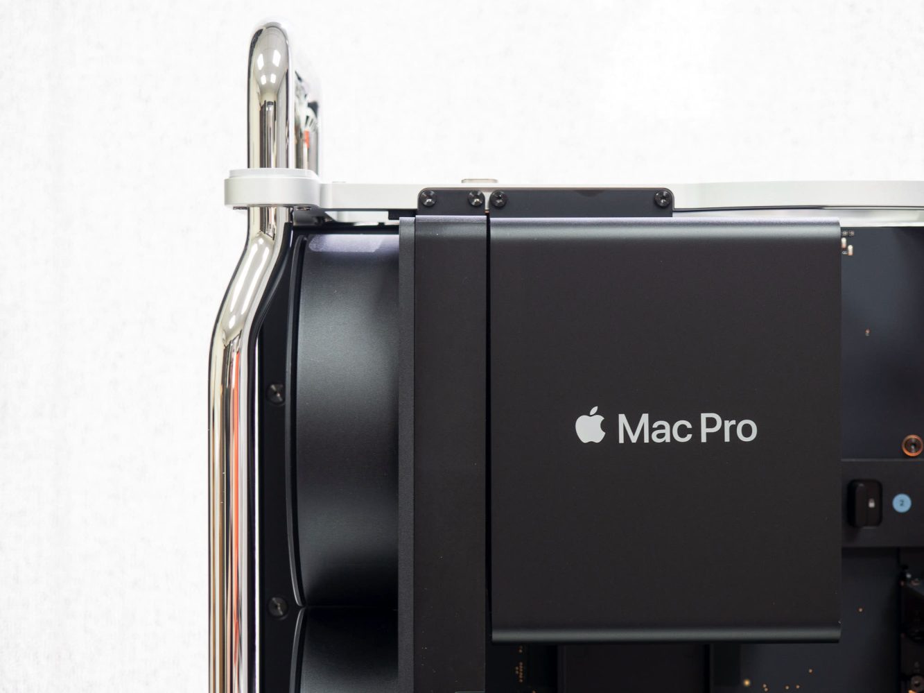
Say what you will about the expansion limits of the first Apple silicon Mac Pro, but there’s no denying that Apple designed one helluva machine. While the M2 Ultra Mac Pro is virtually identical to the last Intel Xeon Mac Pro, MacGeneration has captured what it’s like to unbox the most expensive Mac in the lineup.
Apple certainly knocked the 2019 Mac Pro case design out of the park, and now the first Apple silicon Mac Pro has inherited that awesome case. The difference now is that there’s a generous amount of empty space inside the casing, even if you fill each PCIe card slot.
I think it’s fair to say that a case with these dimensions is not what Apple would design from scratch if it were building an expandable tower computer with the M2 Ultra chip.
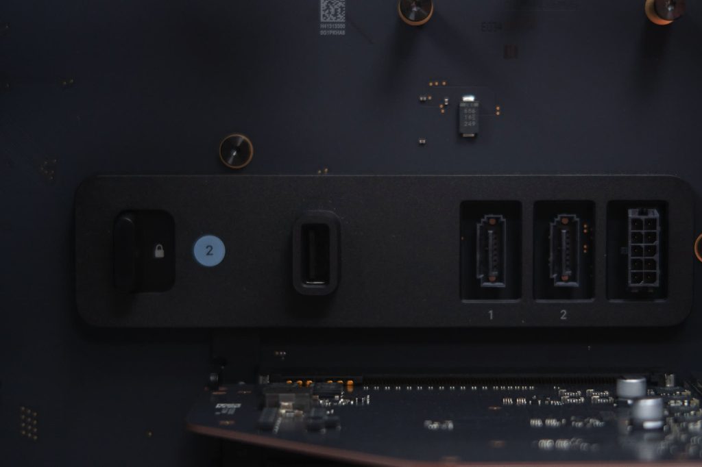
Maybe an M2 Extreme would benefit from inheriting this case.
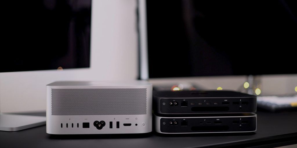
The Mac Studio shows how compact an M2 Ultra machine can be. Even with those six PCIe card slots, this particular Mac Pro could probably get by with half the depth that it has today.
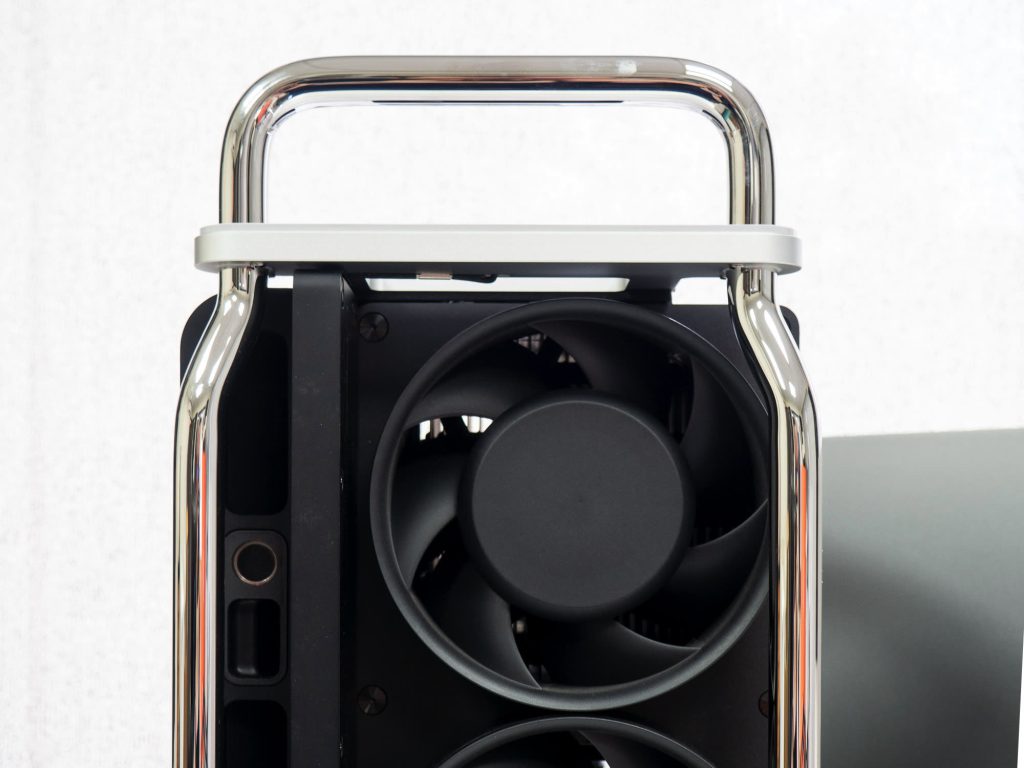
Reusing this very attractive case for the Apple silicon Mac Pro makes sense – especially if you ignore the price bump from $5,999 to $6.999. Engineering a whole new case would add cost to developing this Mac Pro, and retiring the case design after one generation would be a waste. Perhaps a future Mac Pro could even take better advantage of all this available space.
There is one beautiful Mac Pro case design that Apple did retire after just one generation. Thermal corners aside, the 2013 cylindrical Mac Pro had a powerful appearance.
Top comment by Tim
I would say the Mac Pro is perfectly fine at the size it is. Making it more compact would just result in some expansions not fitting anymore. This way, pretty much no matter what you put in there, will fit.
“Can’t innovate anymore, my ass,” quipped Phil Schiller after unveiling it on stage at WWDC 2013.

Today’s Mac Pro still serves a market that the 2013 Mac Pro could not, but how cool would it be if the Mac Studio adopted that Darth Vader-worthy case from 2013?
The Mac Studio ties the Mac Pro in stock performance now, but the block of aluminum design isn’t considered worthy of displaying next to a monitor for many. Stick the guts of a Mac Studio inside the body of the 2013 Mac Pro and we’ve got a flagship Mac that would make me drool.
Anyway, back to reality, here’s another window into the world of M2 Ultra Mac Pro unboxing:
More on 2023 Mac Pro
- Mac Pro PCI card slots: Here’s what you can plug into them
- 2023 Mac Pro is a ‘product of Thailand’ – likely a forced change
- 2023 Mac Pro versus 2023 Mac Studio? There are four differences
- The Apple Silicon Mac Pro is here, but it still can’t replace my custom PC
- Mac Studio M2 Ultra reviews: ‘Champion’ desktop despite Apple silicon Mac Pro, cooling fixed
FTC: We use income earning auto affiliate links. More.


Comments