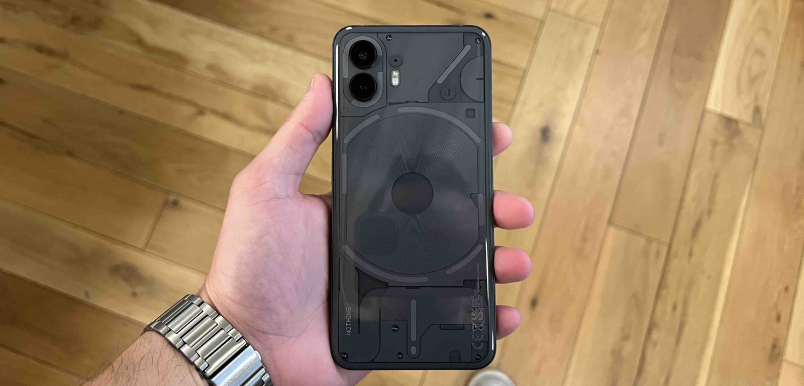
I have been using the new Nothing Phone (2) for about a week. I put my sim card in it, and I am slowly learning all the nuances that make this phone unique in such a saturated market. We have a video in the works on my experience with the Nothing Phone (2) from an Apple user’s perspective, so get subscribed to our Youtube Channel if you haven’t yet! But one of the main things I noticed using it is just how much more comfortable it is in the hand versus my 13 Pro Max. Apple is, supposedly, making some small design tweaks to the iPhone 15 lineup. So it had me thinking that the Nothing Phone (2) is giving me a nice preview of what the iPhone 15 design will yield.
iPhone 15 anticipated design update
Apple’s more recent design change happened when Apple went from the iPhone 11 lineup that featured a more rounded design to the iPhone 12 lineup that went much more industrial and squared-off. From a visual standpoint, everyone loved the new design. It took people back to when Apple “perfected” the iPhone with the iPhone 4 and iPhone 5. It had a squared-off design, could stand on its own, and felt extremely premium. After the new change to the iPhone 12, 13, and 14 lineup, people began to complain that it was tedious to hold these iPhones for an extended period. The sharp corners felt like it was digging into your hands and fingers. This is something that no one complained about with the softly rounded railing of the iPhone X and 11 lineups.
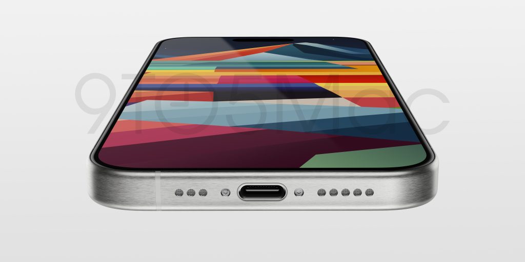
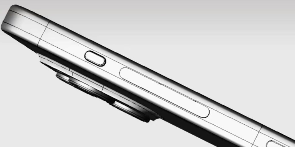
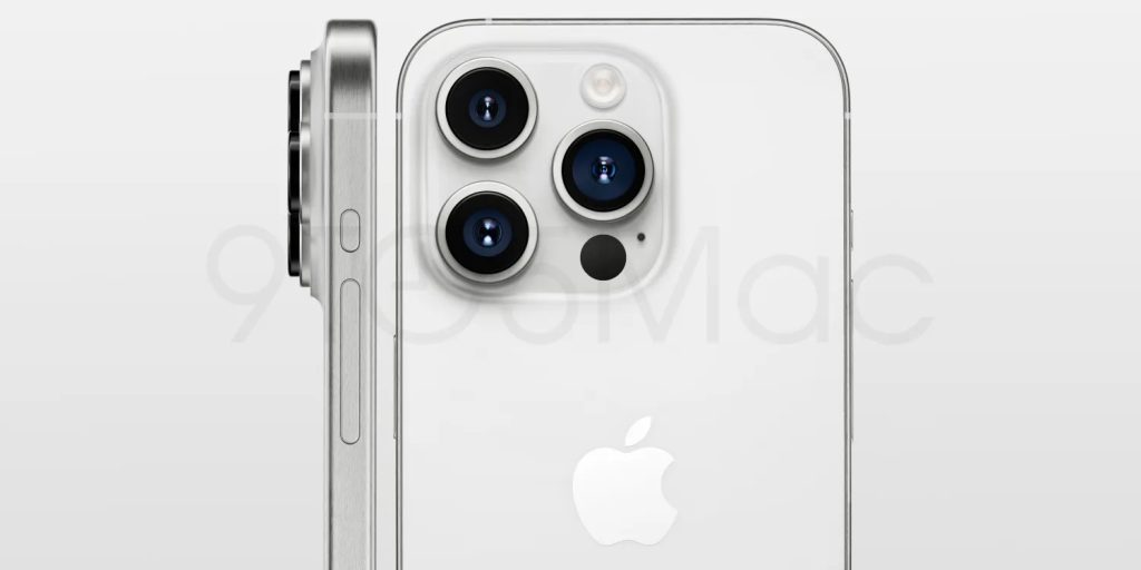
With the iPhone 15, Apple is set to change the design once again. It won’t be drastic, but Apple is planning on rounding the edges of the iPhone just slightly, for a more comfortable feel. It will still have that industrial railing, but the back and front glass will add a slight curve around it to reduce that “sharp” edge feeling. The last design rumor we have is that since Apple is switching to titanium, for the Pro Models, it should also be lighter in the hand compared to the 14 Pro and Pro Max.

Nothing Phone (2) design and feel
As I mentioned, the first thing I noticed about the Nothing Phone (2) was the feel of it in my hand. It has roughly the same size and footprint as the Pro Max, and it is also made of glass and metal. So why was did the Nothing Phone feel so much better? It was two things – the first was the weight. The 14 Pro Max is about 240g, and the Nothing Phone (2) is 201g.
Secondly is the design and finish. If you saw the Nothing Phone (1), you might have noticed it took a lot of inspiration from the iPhone 12 lineup. It had the same camera placement, the same glass and metal finish, and it also had those sharp edges and industrial design. The Nothing Phone (2) made some slight changes by making the rear glass a bit more curved so the edges aren’t digging into your hand like the iPhone does. I love the feel of the phone.
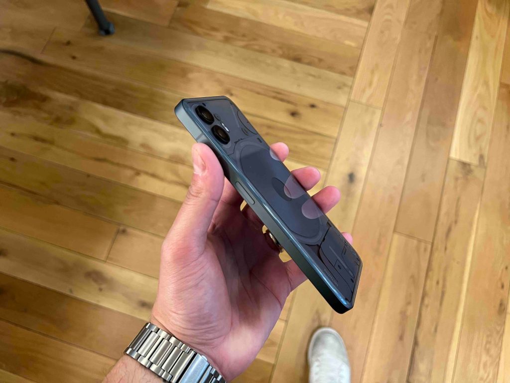
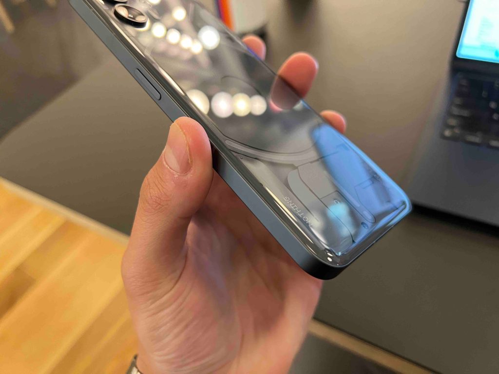
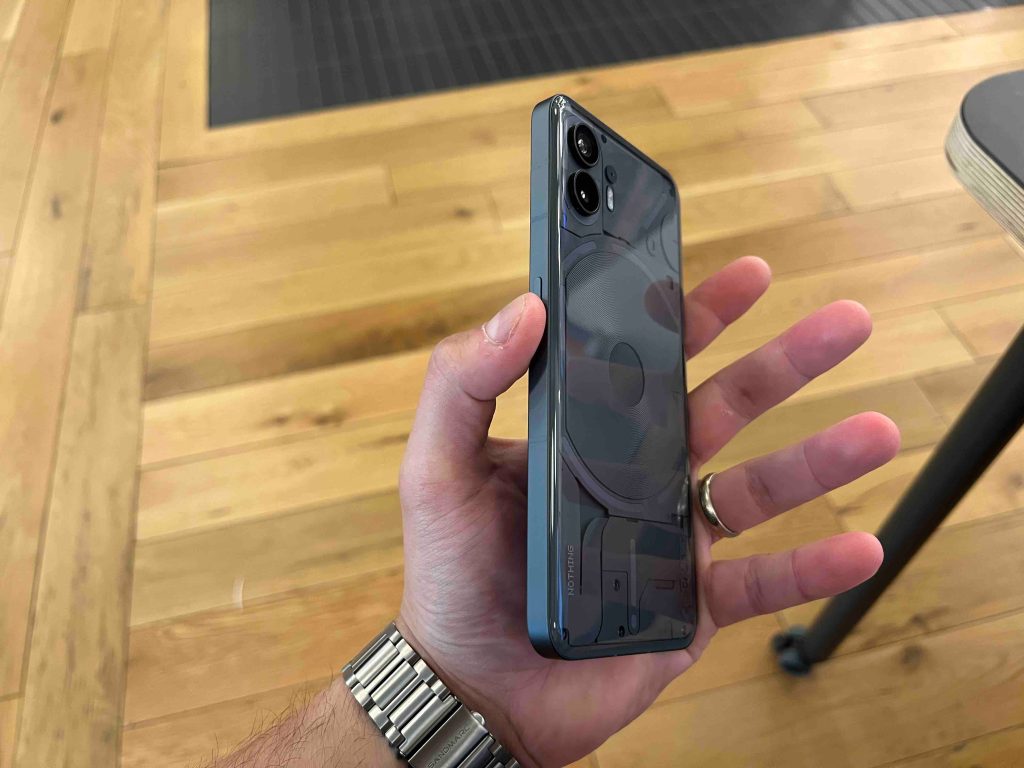
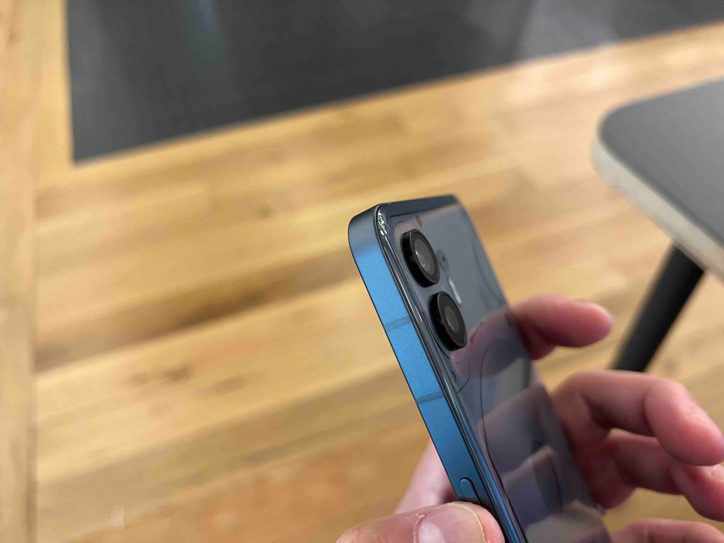
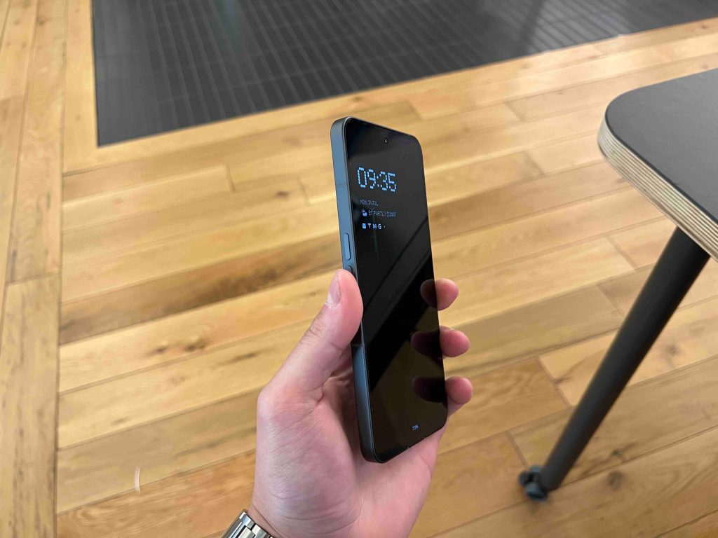
As you can see, the rear glass bubbles up ever so slightly, and the edges of the metal railing are just a tad bit curved. This small detail makes a world of difference when holding this phone and I think this will translate well with the iPhone 15 lineup. If you want a hands-on written review of the Nothing Phone (2) check out Ben’s post on 9to5Google, it’s a fantastic read.
Wrap-up
I have high expectations for the iPhone 15 lineup, but the design and feel is the first thing people will notice. I am hoping to have the same feeling I got with the Nothing Phone (2) with the new iPhone 15 Pro Max.
Let me know your thoughts in the comments. Are you planning on getting the iPhone 15? Which iPhone 15 is on your wish list? Would you be interested in seeing a hands-on review of the Nothing Phone(2)? Let’s discuss down below!
FTC: We use income earning auto affiliate links. More.


Comments