
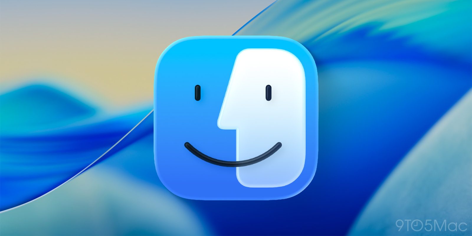
Apple has restored decades of precedent and restored color balance to the Finder icon in macOS Tahoe 26 beta 2. A controversial change in beta 1 was met with a healthy dose of criticism.
Top comment by Rizi Naseer
Apple should enhance its App Library functionality. The current interface presents a minor inconvenience, particularly in terms of app discovery. Launchpad interface was significantly better for searching the app.
The issue? Finder has a dark side and a light side. The dark side is located on the left half of the face while the light side makes up the right half. Finder in macOS Tahoe 26 reversed this arrangement (while using an outline effect around the right side).
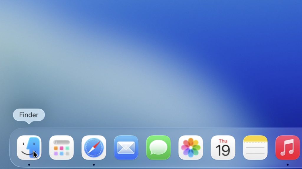
The new version restores balance to the universe (while still using the outline effect in a less offensive manner).
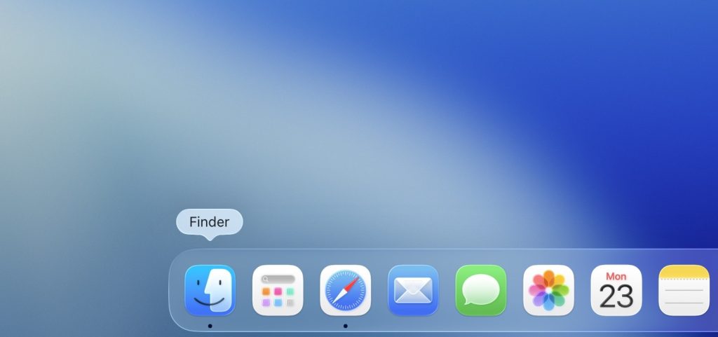
It certainly looks more like the Finder that we know and love — even if it’s still wearing half a mask instead of fully creating the two faces facing each other effect.
Do more with your Apple products
AirPods 5 | Apple’s newest wireless headphones
Apple AirTag 2 | Add Find My tracking to keys, bags, bikes, more
AirPods Pro 3 | Apple’s best wireless headphones


FTC: We use income earning auto affiliate links. More.



Comments