CarPlay is Apple’s popular in-car infotainment system that brings your iPhone apps and interface to your car’s display. It’s gone through multiple different design iterations over the years, the most recent of which features a dashboard, tile-based design to give you access to quite a bit of information at once.
As our colleagues at 9to5Google have reported, Google is testing a new version of its own Android Auto in-car system, and many of the new design elements may look familiar to long-time CarPlay users.
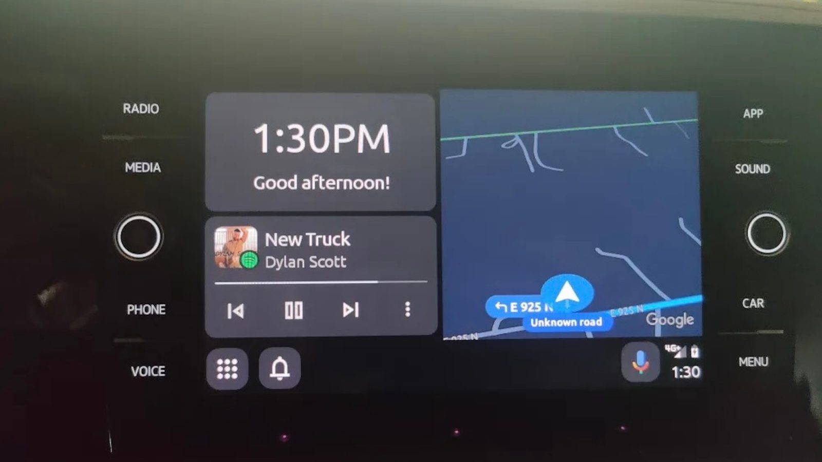
The new Android Auto interface, which is still in development, adopts a tile- and dashboard-based interface similar to CarPlay. On the home screen, you can see different tiles for Google Maps, a Now Playing widget, and the current time. There’s also quick access to all of your available applications as well as Google Assistant.
All of this is quite similar to CarPlay, which features a widget-based home screen with Apple Maps, a now-playing widget, and quick access to all of your apps, Siri, and upcoming destinations.
Some more details on the upcoming redesign for Android Auto, courtesy of our friends at 9to5Google:
The folks over at AndroidWorld enabled the latest version of “Coolwalk,” showing some of Google’s progress on the feature. This includes removing a dedicated button that pulls up the widgets on the side, instead putting that functionality under a long-press of the “Apps” button. A notification icon lives next to that button, and this new UI also eliminates the status bar at the top of the screen. Instead, information regarding signal strength, battery, and the time are pushed to the bottom corner of the interface.
9to5Mac’s Take
It’s pretty clear that this upcoming Android Auto redesign has taken some cues from CarPlay, which isn’t necessarily a bad thing. The goal of both Android Auto and CarPlay is to make your car’s infotainment display distraction free and easy to use at a glance. The large, tile-based design is clearly a winner in this regard.
In the future, there are certainly ways we’d like to see Apple embrace additional functionality for CarPlay, including easier access to HomeKit controls. There are also plenty of ways Apple could revamp the CarPlay experience with a focus on electric vehicles and deeper integration with in-car climate systems, seats, and other controls.
What’s on your wishlist for CarPlay in the future? Let us know down in the comments.
FTC: We use income earning auto affiliate links. More.


Comments