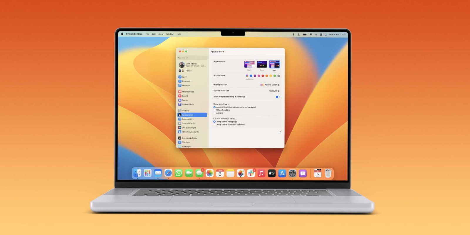
Apple just previewed macOS 13 Ventura. One of its new features is a redesigned System Settings that looks closer to what users would find on iOS devices’ Settings app. Here’s a first look at it.
System Settings on macOS 13 Ventura has five central point:
Refreshed design: System Preferences got a refreshed design that’s easier to navigate and a new name: System Settings. In addition, this new look gives a more iOS feel to the Mac, something users are experiencing since macOS Big Sur.
Simpler navigation: Just like iPadOS, macOS 13 Ventura brings a sidebar to the System Settings. It makes it easy to move through different settings panes, so users can quickly configure their device without having to drill into and out of views.
Organized by category: Settings are organized by categories, such as Appearance, Control Center, and Desktop. And similar categories are grouped close together – providing more consistency across macOS, iOS, and iPadOS.
Powerful search: If you don’t know where to find an option in System Settings, you can search for it by dragging it from the top of the window to reveal the search field. Options that match your search appear in the sidebar.
More spacious panes: With more space in each settings pane, it’s simple to find the settings you want right away.
In the next few weeks, Apple will make available a preview of macOS 13 Ventura to public testers. The general public will have this software later in the fall.
As of now, what do you think of the redesigned System Settings on the operating system? What do you want to know about macOS Ventura? Share your thoughts in the comment section below.


Read more:
FTC: We use income earning auto affiliate links. More.


Comments