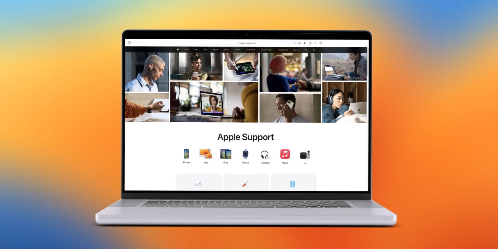
Apple has given the Apple Support website a nice overhaul this week. The new design is much more modern with large images, new icons, and easy access to some of the most common Apple Support issues. Head below for a closer look.
This story is supported by Mosyle, the only Apple Unified Platform. Mosyle is the only solution that fully integrates five different applications on a single Apple-only platform, allowing businesses and schools to easily and automatically deploy, manage, and protect all their Apple devices. Over 35,000 organizations leverage Mosyle solutions to automate the deployment, management, and security of millions of Apple devices daily. Request a FREE account today and discover how you can put your Apple fleet on auto-pilot at a price point that is hard to believe.

The overhauled Apple Support website was spotted by developer Mario Guzman on Mastodon, who pointed out that the update replaces “the boring, flat icons” and is now “using actual images and colorful icons.” There are large, real-world images of Apple products at the top, with quick links to the company’s different product categories right below.
As always, the new design also offers three high-level links to some of the most common Apple Support topics:
- Forgot Apple ID or password
- Apple Repair
- Billing and subscriptions

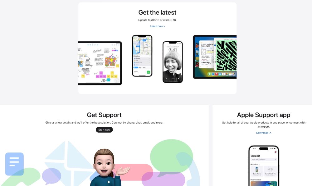
From there, Apple encourages users to search for more topics, “get the latest” by updating to iOS 16, and to contact Apple support by phone, chat, or email. There are also warnings about counterfeit parts, as well as a reiteration of Apple’s commitment to “access to safe, reliable, and secure repairs with genuine Apple parts.”
The new Apple Support website also puts an emphasis on AppleCare+, with the company touting that this gives you “unlimited repairs for accidental damage protection, 24/7 priority access to Apple experts, and more.”
All in all, this is a nice redesign that brings the Apple Support website into the modern Apple design era; the previous design was starting to look pretty dated in comparison to the rest of Apple’s website. Even some of the images on the previous design showed previous-generation devices running outdated software.
You can check out the new design for the Apple Support website yourself right here.
FTC: We use income earning auto affiliate links. More.


Comments