Apple Watch has been out for over three weeks and I’ve been using mine now for most of that time, from the moment I wake up to just before bed each night. While my colleague Ben Lovejoy previously journaled his experience in his excellent “A skeptic’s Apple Watch diary” series, I’ve been sold on the appeal of Apple Watch since the first day I paired a Pebble smartwatch with my iPhone and discovered its potential…and potential pitfalls.
Apple Watch faces new limitations different than Pebble or traditional watches, digital or analog, but it’s arguably the best smartwatch for iPhone owners with the coin to drop. It’s usefulness depends largely on your own needs — in some cases that’s the need to tinker with a new gadget — just as its drawbacks depend on your priorities. Below I walk through my Apple Watch evaluation including what I think Apple gets right and where I feel Apple Watch can grow going forward, and don’t miss Dom’s own hands-on video review just below the fold as well.
Apple Watch battery life was probably the biggest concern for everyone. We already have to charge our iPhones daily and sometimes throughout the day, and Apple Watch does a lot of iPhone-like stuff with a much smaller battery. The general consensus after several weeks, though, is that if you can get behind charging Apple Watch nightly, then battery life is fine. Apple probably went too conservative on some of Apple Watch’s energy saving behaviors if anything.
While battery life is surprisingly a non-issue, using Apple Watch purely as a watch to check the time has its limits.
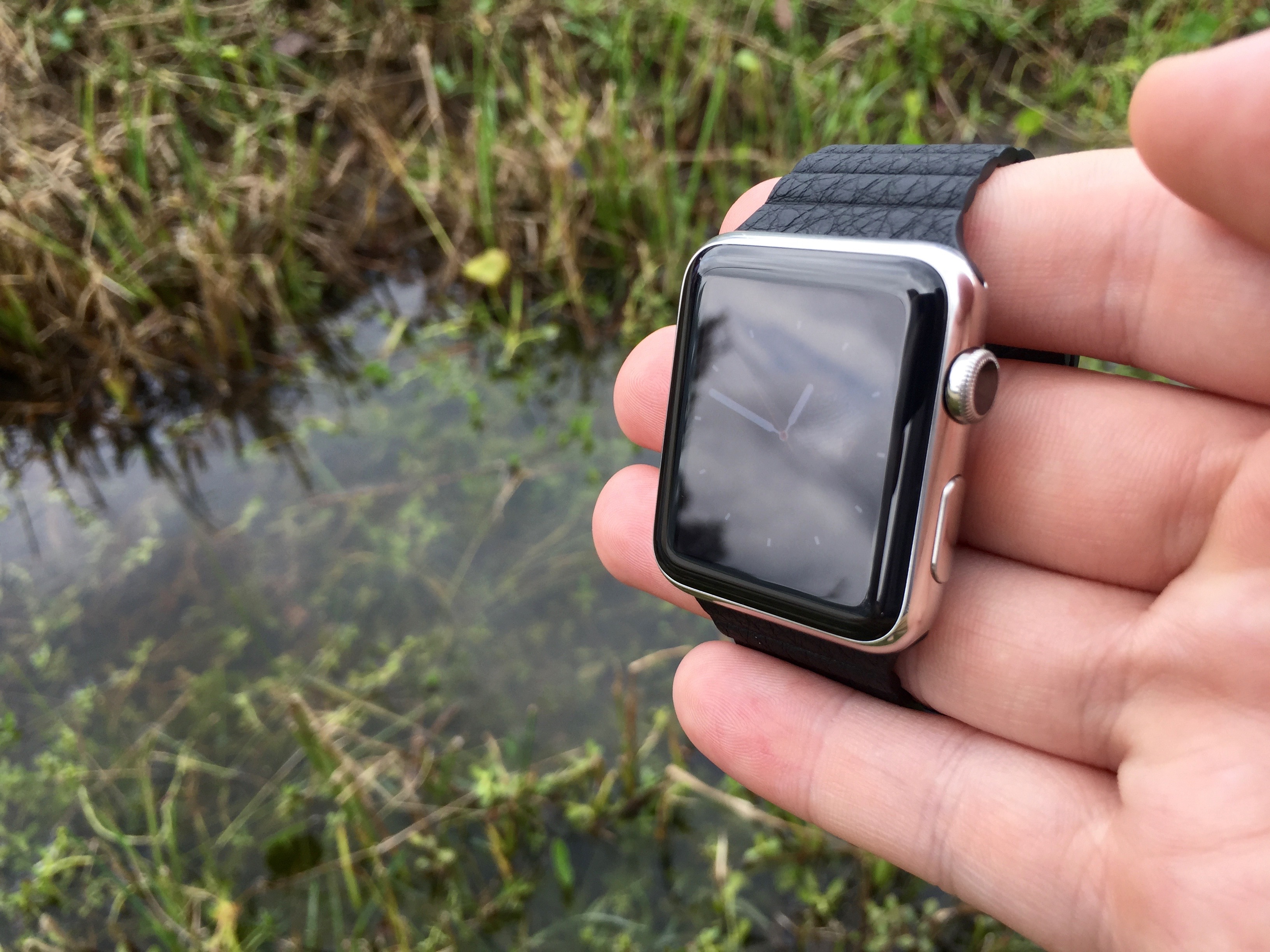
Difficulty reading the display outdoors is easily my biggest complaint with the first version. Checking the time (or any information on the screen) in direct sunlight can be nearly impossible.
In one instance, I found it easier to check the time on my iPhone than with Apple Watch because of this issue. In another situation, I glanced at Apple Watch to check the time in the car, but found the dashboard clock easier to read. Under a cloudy sky or any amount of shade, though, the outdoor readability issue mostly goes away.
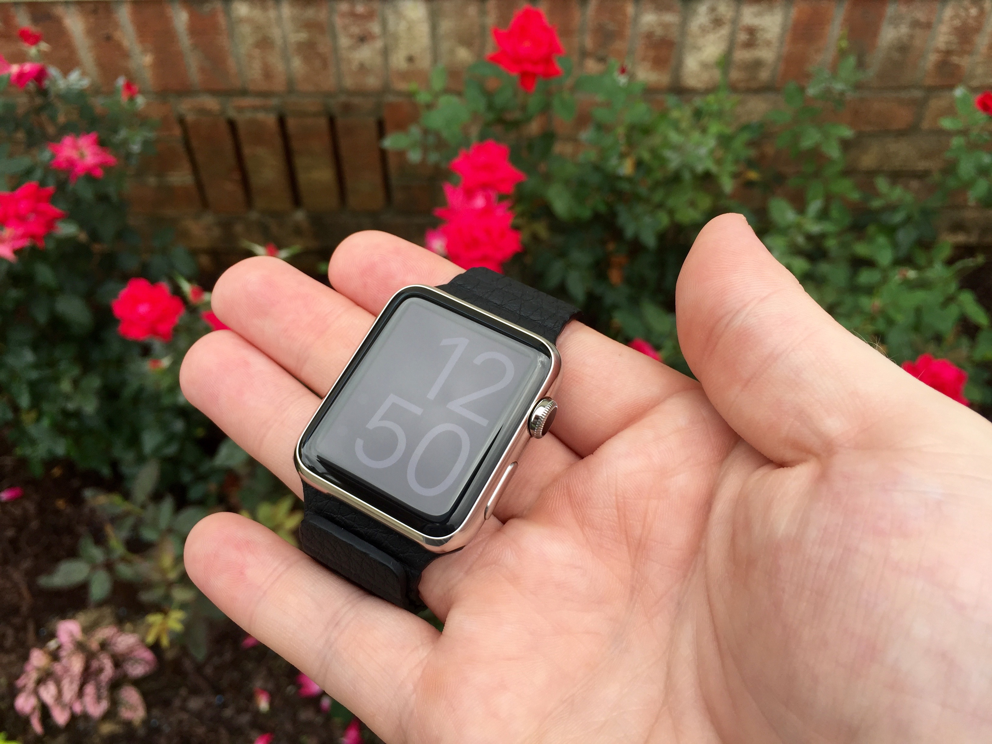
Some watch faces like X-Large are more legible in bright environments than others like Chronograph and you can adjust Apple Watch’s brightness in the settings, but this is a definite area where future versions should improve just as recent iPhones and iPads have.
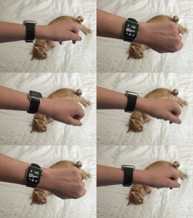
You do have to learn how to activate Apple Watch as the screen isn’t always on and can’t yet be for battery life reasons, but Apple makes this mostly natural considering the challenge. You can activate the display in one of three ways. Raise your wrist, click either the side button or crown, or lightly tap the screen and Apple Watch will awake.

Apple Watch’s wrist detection is fine for standing or sitting positions, but it’s not ideal if you’re laying in bed and reading the watch upside down or in similar positions. Screen activation is quick enough that it’s not an issue when you want to read the time quickly, but it’s definitely a frustration when raising your wrist doesn’t wake up the display.
Clicking the crown or side button is the most sure but least traditional watch way to activate the display. Aside from the benefit of working every time regardless of your physical position, Apple Watch will remain active for about 16 seconds rather than the shorter 6 seconds when activated by wrist detection.
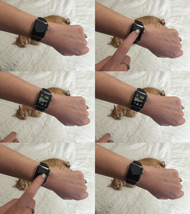
Tapping the display is the least obvious activation method, and it presents the least amount of friction. Personally, I’m more impressed by tapping the display to turn on the display than I am from the wrist detection. Wrist detection is the most natural, but tapping the display is a new habit I’m trying to form. (I completely missed that I could tap the display to wake it up for the first three or four days of use.)
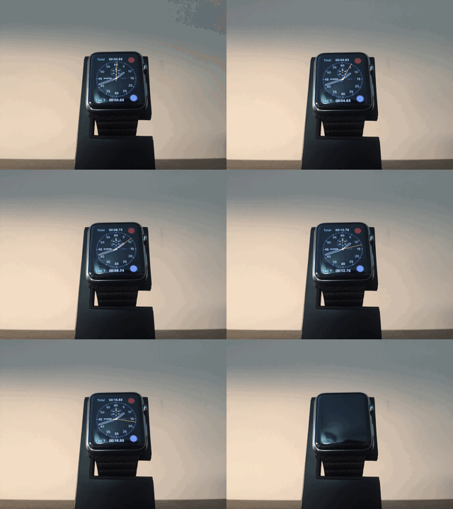
I do wish there was a method (or even setting) that would allow the watch face to stay active for longer periods of time. Even the stop watch goes to sleep after 20 or so seconds without being engaged. Sometimes it’s handy if not necessary to be able to stare at your watch and see the time pass. To do this with Apple Watch, you need to tap the display or rotate the crown every 10 seconds or so.
As I mentioned at the top, battery life is surprisingly a non-issue and charging happens very quickly. Hopefully now that Apple Watch is out and the verdict is mostly in, Apple will loosen the constraints of on-screen time. My active usage was highest during week one when I was still checking out every corner of the features and functionality. I only hit Power Reserve once during that period at around 10 PM following a day of demoing and general tinkering. I’d willingly give the sometimes 30% battery left at the very end of the day in exchange for longer on-screen time when waking up the display.
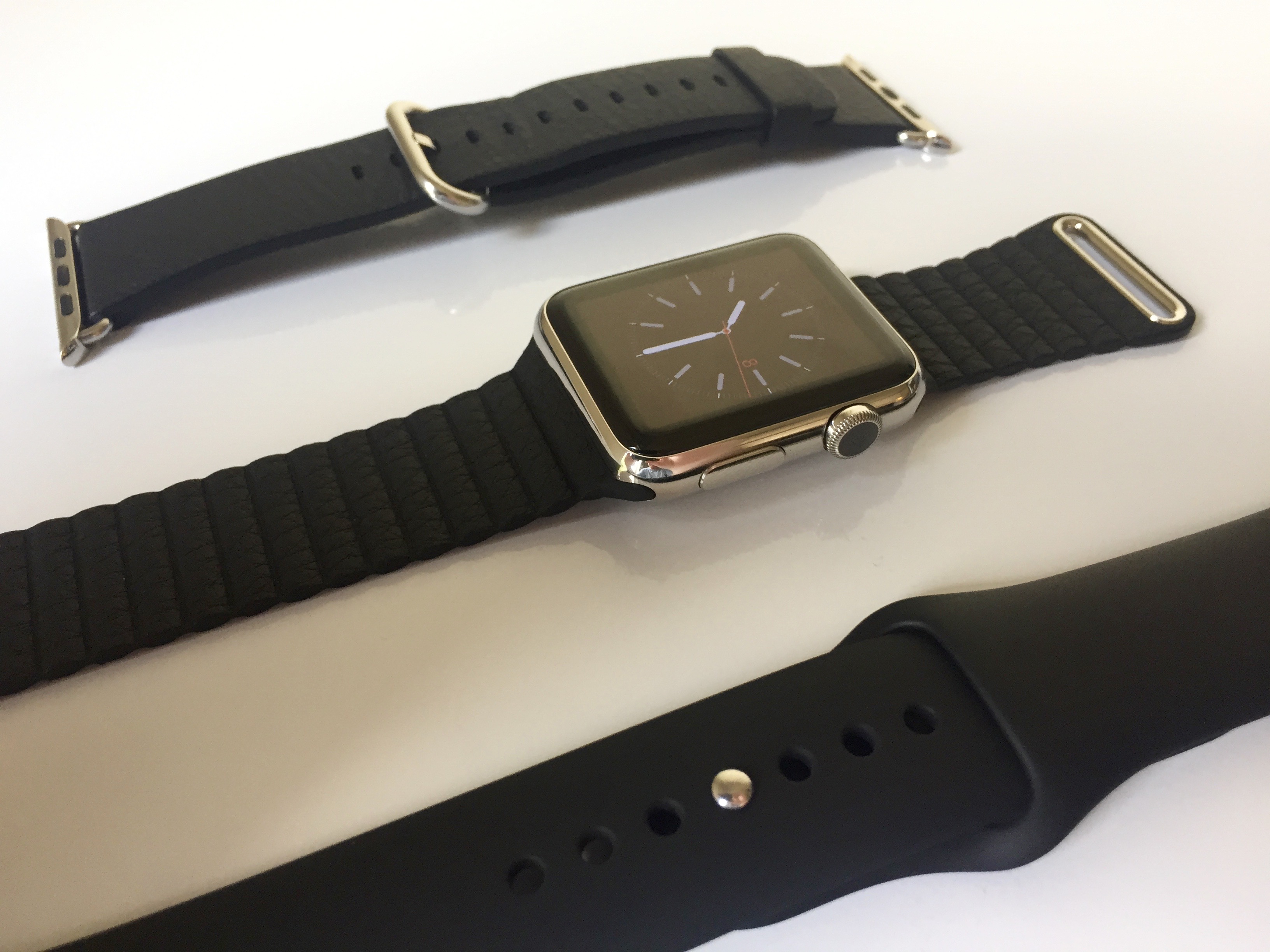
I’ve been very impressed with Apple Watch band options, the swapping process, and the effect they have on the wearing experience. With my 42mm stainless steel Apple Watch, I bought Classic Buckle which feels like a traditional watch, black Leather Loop which feels a little more casual but still nice, and black Sport which is the most versatile option.
So far I’m frequently switching between a leather band and the fluoroelastomer band depending on the occasion. The Sport band is best for workouts or yard work and any time I’m testing the water resistance of Apple Watch; the Leather Loop band is my favorite in terms of comfort, style, and adjustability. The swapping process — holding down a button on the back and sliding the bands in and out — is simple enough that I’m changing between the two daily based on the activity.
Aside from making Apple Watch fit your personal style, which can vary widely from person to person, band swapping adds the effect of feeling like you’re actually wearing a different watch since it makes up so much of the overall hardware.
As a very casual watch wearer, Apple Watch does feel like a nice watch. The battery died a few years ago in my metal link bracelet watch, and I’d never wear my $15 digital watch to dinner. If you don’t wear a watch, you’ll be surprised at just how useful being able to check the time without using your iPhone is.
Of course Apple Watch isn’t just a watch, it’s an extension of the iPhone experience placed on the wrist with some features unique to it. While it’s hardly the first product to qualify as a smartwatch, Apple Watch is easily the best smartwatch for iPhone users, and probably the most capable watch for that matter.
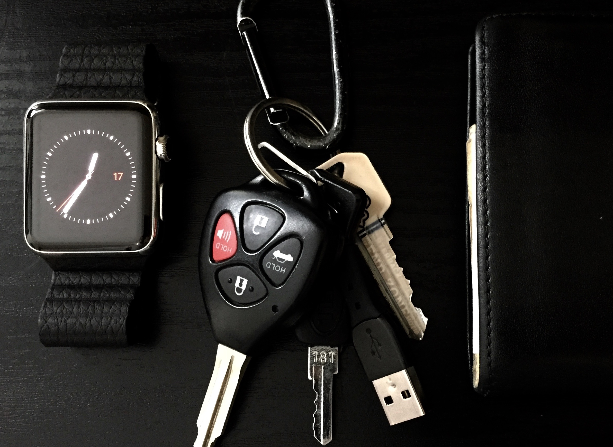
I spent a year regularly using the then-$150 e-ink display Pebble smartwatch ($99) and liked a lot of what it had to offer, but it was clear from day one that Apple would need to open a lot more of iOS to developers for third-party smartwatches to go beyond a few limited functions.
I could read notifications without looking at my phone, but I couldn’t act on them. I could control currently playing audio, but I couldn’t pick the song or podcast from the watch. Apps came but were extremely limited and not memorable; current Apple Watch apps from third party developers are limited, but it’s nowhere near the same degree. iPhone features like Siri and Apple Pay would never be on a non-Apple device.
Aside from excellent visibility in direct sunlight and multi-day battery life, Apple Watch picks up where Pebble left off and goes light years ahead for me. (This is largely because Apple tightly controls iOS, only opening up pieces strategically, and the Pebble is a much cheaper product at $99 now while Apple Watch starts at $349.)
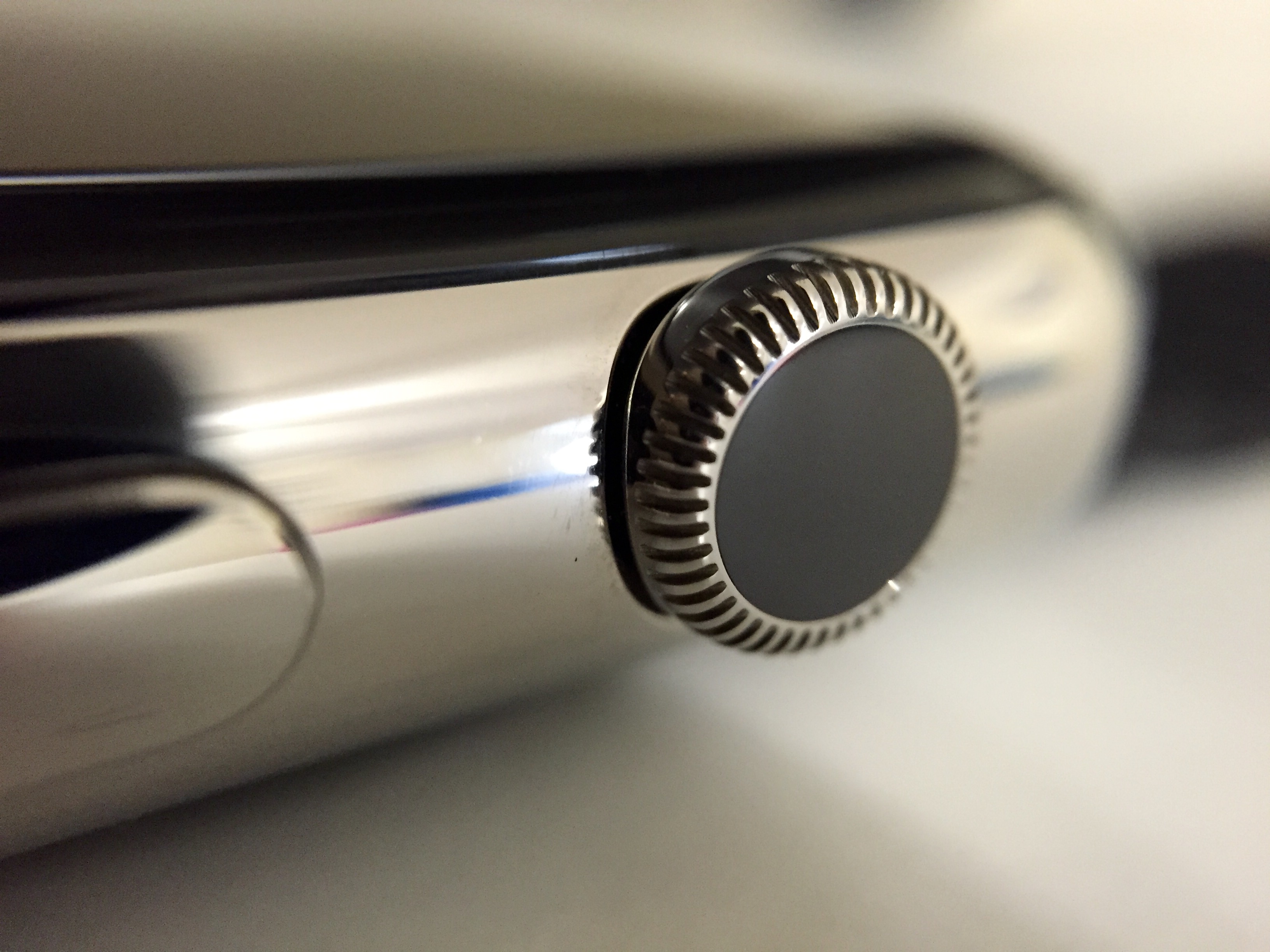
Apple Watch’s hardware is very impressive. The Digital Crown on the right side serves as a very natural scroll wheel and an effective way to navigate without obscuring the display with your finger. The display attracts fingerprints as much as the iPhone, so any chance to use the Digital Crown is appreciated.
Navigating around the Apple Watch software, it acts as a bit of a Home button. Click from the watch face to enter the honeycomb of apps. Swipe around to see more apps then click to return to the clock icon in the center. Double click to jump between the two most recently used apps. Press down to activate Siri.

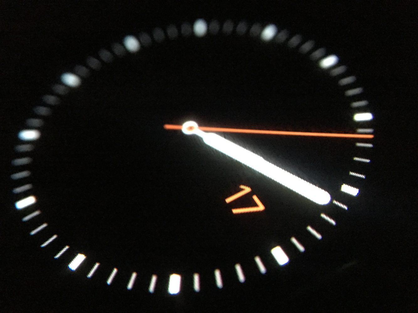
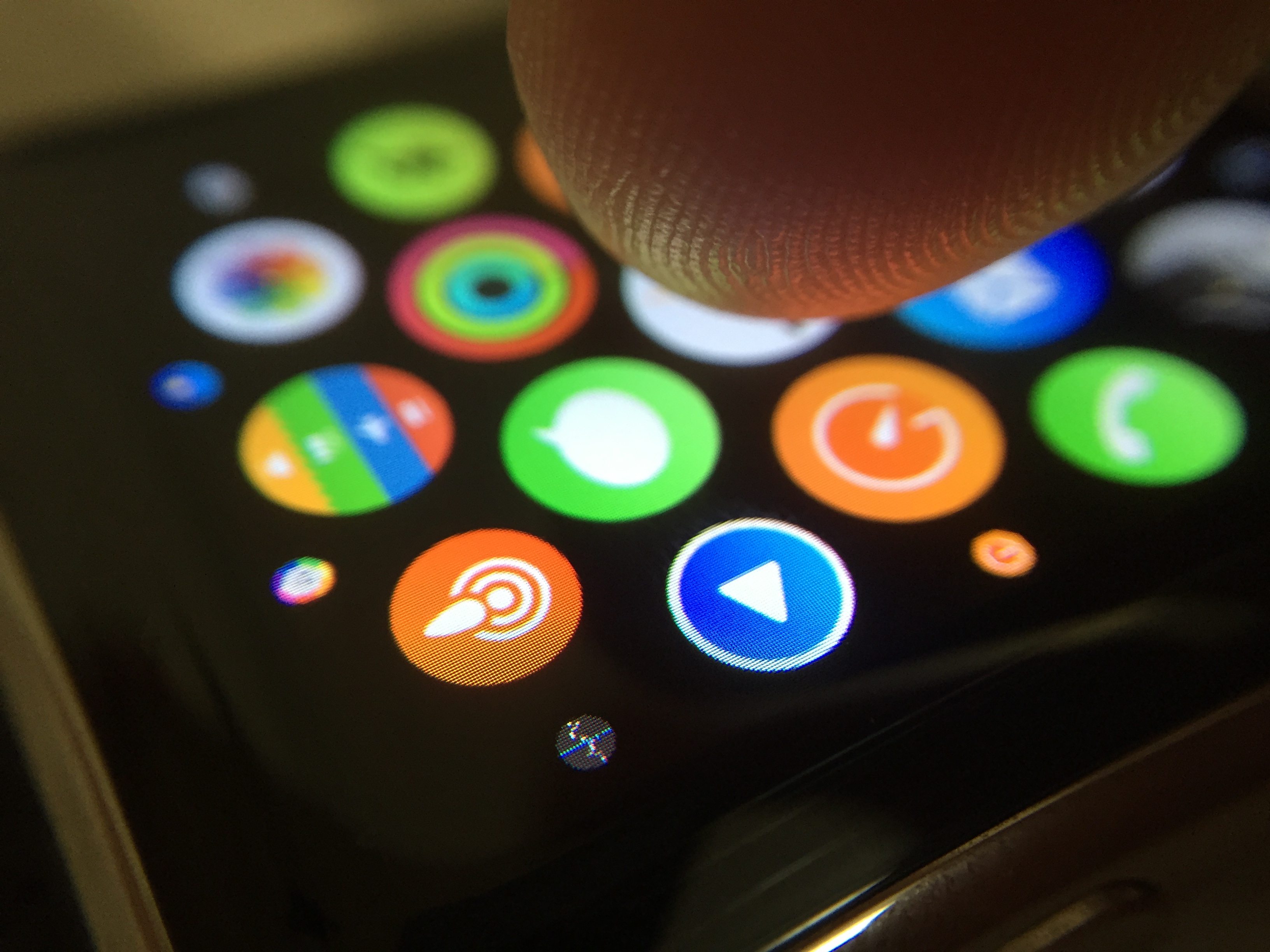
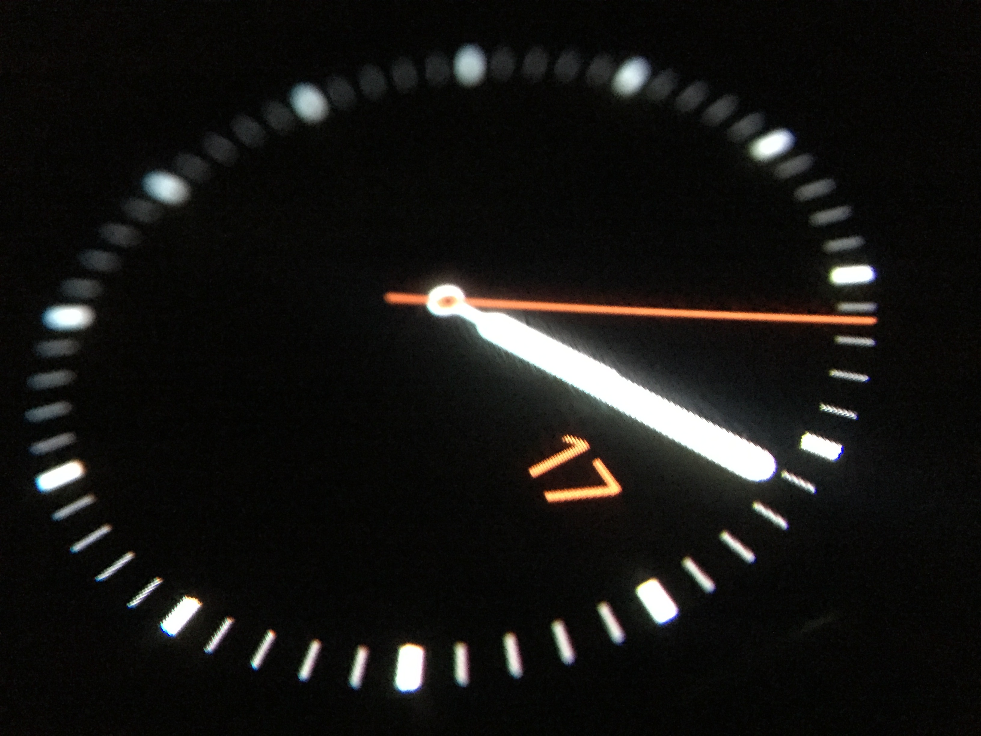
Apple Watch’s display is phenomenal in all but extremely bright conditions. Black elements blend right into the bezel and simply disappear in dark environments; text and images pop just as you would expect from a Retina-class display. Open the Compass app on your iPhone and you can see the type of design elements that work well on Apple Watch: black backgrounds that disappear into the hardware, thin linear elements that highlight detail, and restrained use of color to your attention to activity. The shot above was taken in complete darkness. You cannot discern where the bezel begins in this environment.
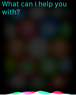
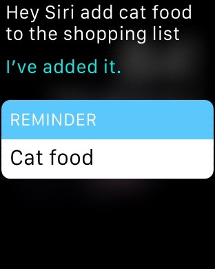

The convenience of having Siri on my wrist is one of the things I most appreciate about Apple Watch. Siri is great on the iPhone for a lot of tasks, but asking Siri to do a quick task like add an item to my shopping list is lightning fast on Apple Watch. Raise your wrist and say Hey Siri, then give the command completely hands-free. Pulling out my phone to do this isn’t a major task, but it’s potential for distraction. Oh, a lock screen full of notifications. What did I want to remind myself to remember? Silly but it happens.
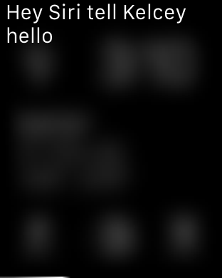
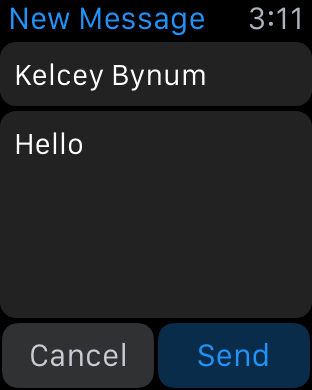
Siri isn’t perfect on Apple Watch though. A lot of commands seem to require a tap to complete or actually picking up your iPhone to complete. Something like sending a message requires activating Siri each time you want to go a step forward, as Siri on Apple Watch is designed not to just listen for the next step. Maybe another one of those battery conservation decisions?
Siri also doesn’t provide audio feedback on Apple Watch without using the VoiceOver accessibility feature; this would be fine as a setting, but I would prefer the option to have a more engaging Siri experience on Apple Watch. Maybe not always, but sometimes.
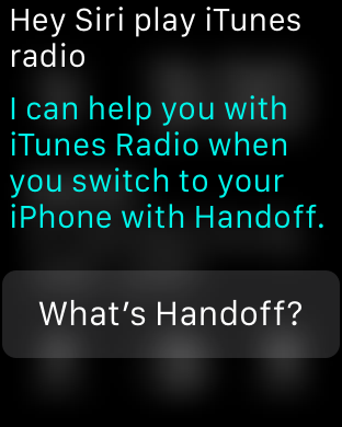
As for the things that Siri can’t do on Apple Watch, you quickly learn the boundaries and don’t bother repeating anything that needs Handoff. Hey Siri, play The Beatles is an okay command, but Hey Siri, play iTunes Radio prompts you to complete the job on your iPhone. Hopefully this evolves over time.

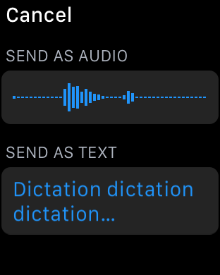
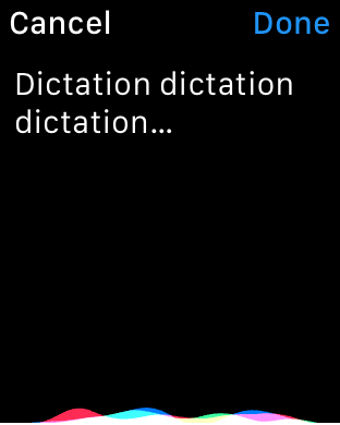
Dictation is essentially the keyboard on Apple Watch. If you’re opposed to dictating text into a gadget, don’t expect to get much text input done on Apple Watch. You can make a few pre-canned text replies to messages you receive, but any unique response is speech-to-text. The good thing is that it works well if you speak clearly.
When replying to a text in Messages, Apple Watch lets you choose between a voice recording reply or the speech-to-text dictated response. The only hitch for me here is that my dictation voice is much more robotic than my natural speaking voice. If dictation goofs up my response, I probably don’t want to send the recorded version either.
You also can’t correct your dictation without just starting over; the iPhone is good about knowing which phrases are questionable and offering tap-to-correct options so we know how this could be better.
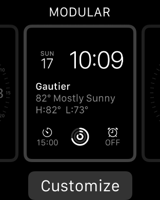
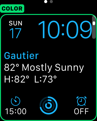

The ability to choose between 10 different watch faces is a great plus for Apple Watch. The combination of digital and analog style faces offers variety in the same way band swapping does, and the ability to add widget-like “complications” for weather, calendar, timers, and more is a win for customization and utility. In the three weeks I’ve been using Apple Watch, I don’t believe I’ve used the same watch face for more than a day as there’s so many ways to change them. I’m certain I’ll settle on a few favorites, but they’re all very well done.
A few watch faces like Solar and Astronomy do tricks to show time movement when you scroll the Digital Crown, though, which I wish could be turned off as I like these faces but don’t enjoy accidentally engaging that activity. The Chronograph face is the most compass-like with fine details that I appreciate, but it includes a stopwatch complication that I frequently accidentally tap and start when swiping down for notifications. The Mickey Mouse face is both fun and a terrific demo; kids really get it too. Look, it’s Mickey as you pose for a photo. Useful.
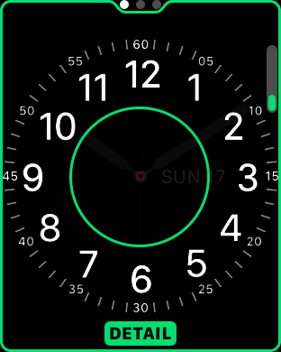

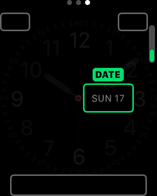
I’m settling on mostly using one of two versions of Utility as my analog option while the complication-heavy Modular is my go-to digital watch face. You can create and save more versions of the same watch face so you don’t have to toggle it too much.
I like using Utility with all the hours and even seconds turned on, no complications aside from the date, and whichever color matches my mood or clothing, but I also like how Utility looks with all the numbers removed for a cleaner look. In both cases, I prefer turning off all the complications.
Modular is loaded with data from complications so I use it when I want to process in my brain less and just see the time and other information. With the analog faces, I prefer actively using Glances rather than seeing all that data when I check the time.
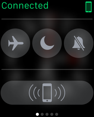
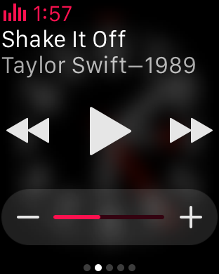
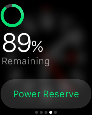
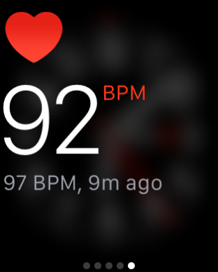
Glances are card-like screens activated when swiping up from any watch face. Just like my preference for toning down watch face complications, I find that using an extremely limited number of Glances adds to their utility. You can add as many as 40 I believe, and Apple turns on more out of the box than I find useful.
My current Glances setup includes the Settings glance for toggling airplane mode, Do Not Disturb, mute, and pinging your iPhone (hold this down to also engage the iPhone flash), the Now Playing glance for controlling any audio playback as well as volume level, the Activity glance for following your daily move, stand, and workout goal progress, the Battery glance for seeing total charge and optionally engaging Power Reserve mode, and finally the Heart Rate glance for manually checking your heart’s beats per minute.
I think using a lot of Glances in place of always jumping into apps is a popular thing with a lot of Apple Watch users I’ve seen so far, but I don’t love swiping through multiple cards to find the one I’m looking for at any given time; I’d much rather jump into the app honeycomb, but maybe this will change as more capable Glances become available.
Customizing these currently means opening the Apple Watch app on the iPhone, but I don’t see anything keeping the Apple Watch itself from being able to manage these.
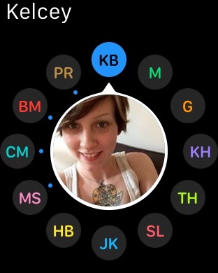
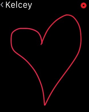
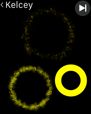
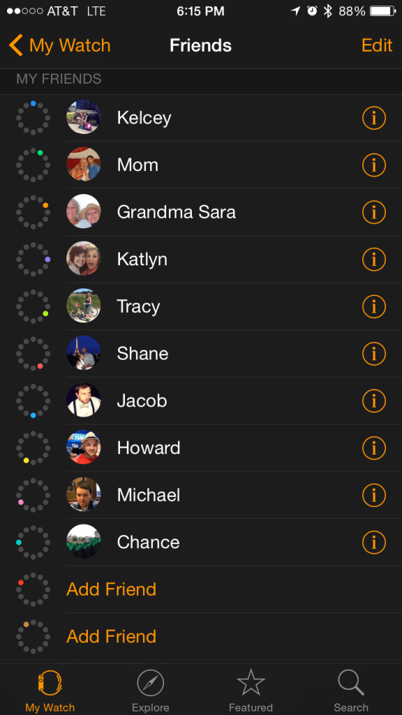
Managing your Friends list is the same story. You have access to your full list of contacts within the Phone app, but you have to add or remove friends on Apple Watch from the iPhone app unless someone uses Digital Touch with you and you have a spare slot for them. You can have as many as 12 friends at any given time, which sounds like plenty until you treat it like a Favorites list for quickly calling or messaging your family and need to use it to manage using Digital Touch with other Apple Watch users.
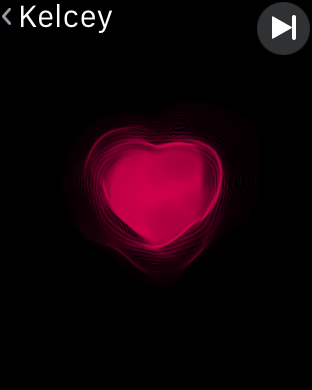
Digital Touch is Apple Watch-specific form of communication. You can sketch or tap in various colors, or send your heart beat to other Apple Watch wearers. Because it’s one of the few functions unique to Apple Watch, every new owner wants to try out all three ways of using Digital Touch. The result is me experiencing loads of heartbeats from friends across the Internet, so now all heartbeats feel the same. I think this behavior will dwindle in time, though, and using Digital Touch to send sketches, taps, and yes, heartbeats with my girlfriend will be a fun or sentimental thing.

Aside from the wonky Friends setup process, Digital Touch has its own imperfections for now. Sometimes taps, sketches, and heartbeats don’t send and it’s unclear how to resolve any issues aside from trying again. There’s also latency between sending something using Digital Touch and the recipient being notified or seeing it. Sometimes this latency can be seconds, sometimes several minutes.
The lack of delivered and read receipts that we’re familiar with on iMessage makes this form of communication feel shaky at times, but even sketches disappear after seconds when viewed so it’s clearly not meant for any sort of very serious use.
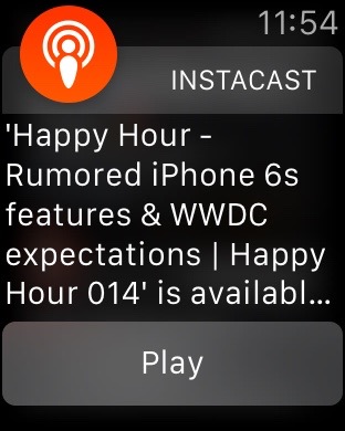

Notifications on Apple Watch pick up where Pebble left off. Apps can feature actions in notifications like archiving an email from the Gmail app or starting playback for a new podcast on your iPhone as soon as the alert hits the watch. If the iPhone display is on, notifications route and alert there. If the iPhone display is off and you’re wearing a connected Apple Watch, that’s where the alerts will go.
The Mac and iPad, however, are ignored for now even though you can Handoff tasks from apps like Calendar and other apps to those devices sometimes. I see most of my relevant notifications on my Mac while I’m working, but muting Apple Watch means I’ll miss stand alerts and Digital Touch notifications. This Mac+Watch space needs more attention.
You can toggle sounds on or off, but you can’t customize tones for specific alerts. On my iPhone, I have a different tone if either my girlfriend or my mom texts me so I know I should read it soon. Apple Watch has the same tone and the same tap for all messages from all contacts. This is sort of a set back functionally for me, but hopefully this changes in future software updates.
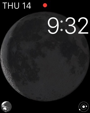
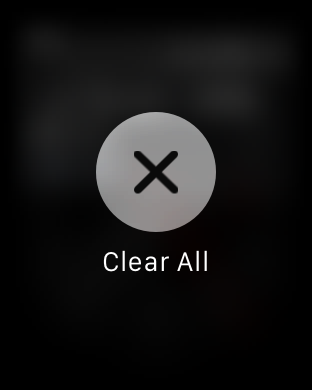
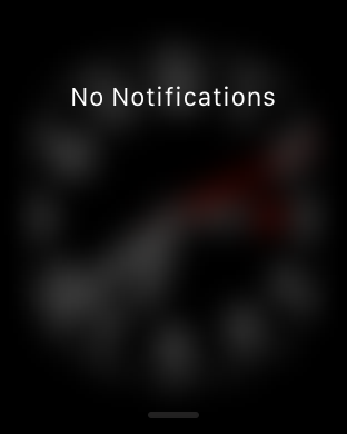
The red dot to notify you of unread notifications is very useful as is the Clear All button for knocking out lists of alerts at once. The iPhone, iPad, and Mac would all benefit from a similar button. Haptic feedback driven by the Taptic Engine is also a big part of notifications on Apple Watch, although I’m convinced I’m a little numb to most taps or my motor is weaker than it should be.
If my Apple Watch is muted, it’s likely that I’ll see the red dot for notifications without having noticed a tap on my wrist. Tightening the band or turning on the setting for prominent taps can remedy this to a degree, but I think I’d be more sensitive to taps below my wrist rather than above. I’ve only used the rubber and leather bands so far, but I also imagine the metal bands may carry the vibration around the wrist more than the other materials do.
Overall, though, I much prefer keeping notifications on my wrist rather than in my pocket or elsewhere. I feel more connected, more tuned in, and less anxious about missing the big stuff that occasionally flies by. This sense of being further connected to my family is a big appeal of Apple Watch’s long term value. Perhaps more measurably important is Apple Watch’s fitness and activity tracking…
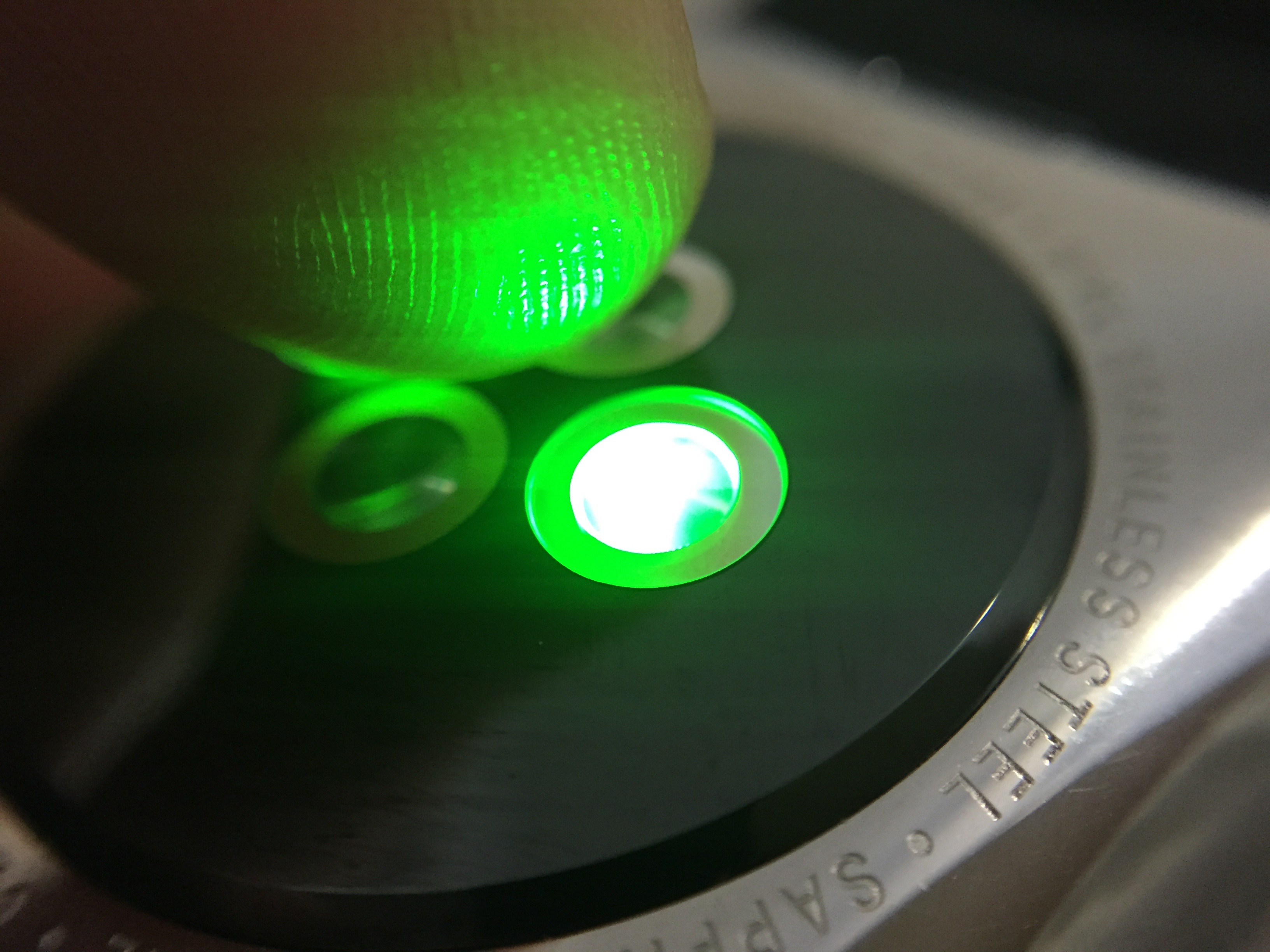
Apple Watch as a fitness tracker is like iPhone as a camera. Devices solely dedicated to tracking specific activity may be better for die hard athletes just like expensive DSLR cameras are appropriate for professional photographers, but Apple Watch’s fitness tracking features will make health tracking more accessible just like the iPhone’s ever-improving camera makes us all better and more frequent photographers.

Apple Watch wants you to move more throughout your day and uses activity tracking and notifications to help you achieve this. Your move goal helps you burn a set amount of calories each day. Your stand goal wants you to move around for at least one minute of twelve different hours in the day. The exercise goal recommends 30 minutes of activity at or above a brisk walk. My first thought is that the bar is set low enough that these goals are achievable, but as someone who writes for a living, each goal proves more challenging in practice.


The use of progress rings to visualize these goals is a terrific design, though, and the encouragement and progress alerts you can receive throughout the day are very effective. My only real complaint here is that Apple Watch far too often reminds me to stand up at 10 minutes before the end of the hour despite me having stood and moved during that hour.
Sometimes these alerts come while I’m standing which is most frustrating because it might mean an incomplete circle. Stand detection can improve, of course, but I’d also like to be able to respond to a stand reminder by overriding it and saying that I have stood, especially if I’m standing. It would be up to the user to use the honor system, but there’s little incentive to cheating…
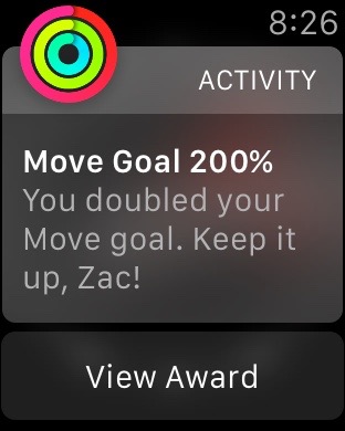
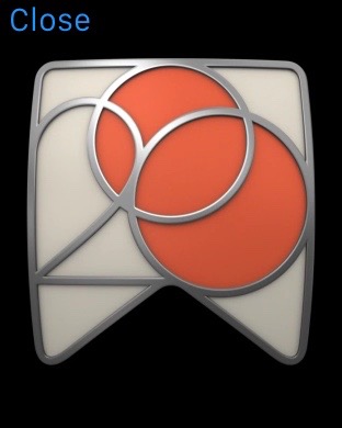
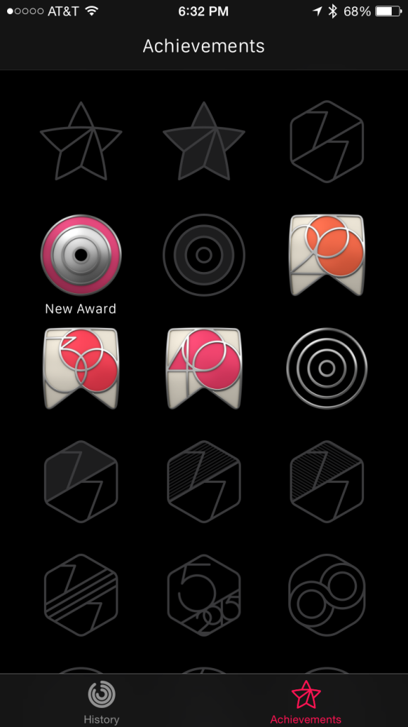
That is unless you’re collecting achievements. These awards are fun and competitive and make a bit of a sport about activity tracking among Apple Watch users, especially between friends.

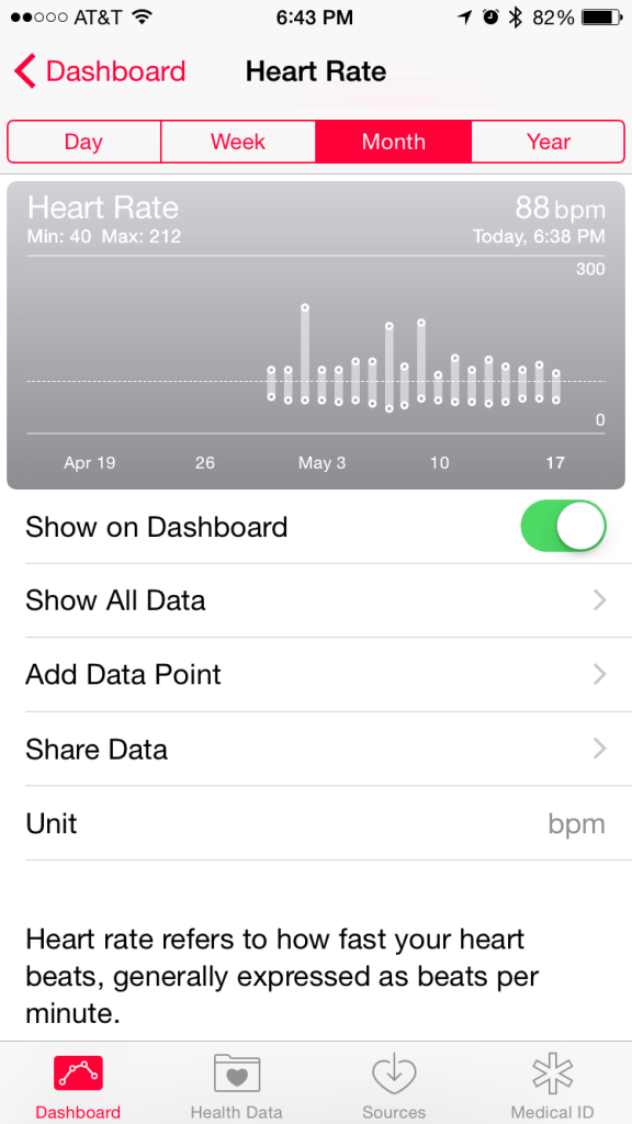
Wearing Apple Watch can also add new data points to the Health app on your iPhone. For example, you can see heart rate data, active calories burned, and workout data that previously required manually logging or other solutions. Resting calories, while tracked and viewable in the Activity app on iPhone, curiously aren’t shared with the Health app yet. I’m much more likely to be wearing Apple Watch throughout my whole day so it’s a much more ideal device for step tracking and enables passive heart rate tracking for me that was previously unavailable.


While apps are a thing on Apple Watch with some 3,500+ ones on the App Store at launch, they’ve mostly got a bad reputation for not being very useful so far. That’s partly because developers can’t do much with Apple Watch and have to rely on a parent iPhone app for most functionality. Apple says developers will be able to do more by creating native apps using tools it will release later this year. For now, though, only Apple can create apps that run on Apple Watch without a connected iPhone.
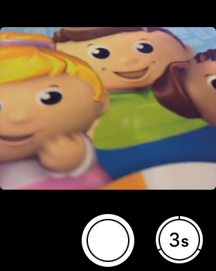
Still, some of Apple’s best apps are essentially remotes for the iPhone. The Camera app lets you use Apple Watch as a viewfinder while you can snap a photo from your wrist. The Remote app lest you navigate your Apple TV easily and conveniently with a remote you’ll never lose. Any audio app like Music or NPR One or Instapaper lets you playback audio from your iPhone with controls from Apple Watch, and you can even change audio playback to connected AirPlay speakers wirelessly by pressing firmly within the Music app’s Now Playing screen and selecting the desired speaker.


Apple’s Photos app lets you sync an album of photos on Apple Watch. They’re small but it’s a neat way to browse your favorite photos similar to carrying wallet shots.
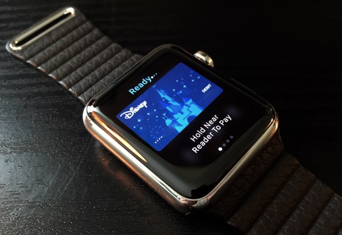
Apple Pay on Apple Watch is another convenience. Paying with your iPhone enjoyed the period between September and April as being the easiest way to checkout, but paying with Apple Watch is really that much cooler and a little more discrete.

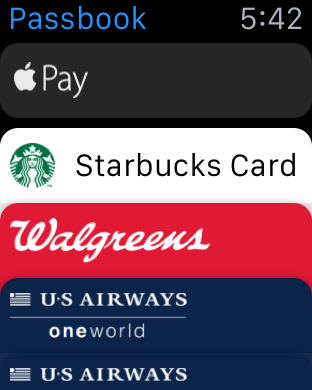
Passbook is also super handy on Apple Watch. If a pass is location sensitive, you’ll get a notification when you’re near the right place so you can quickly bring it up. Otherwise you can jump into the Passbook app and tap the right pass when you need it. Using the Walgreens Rewards pass has been a fun way to gauge responses to Apple Watch, or iWatch, or iPhone Watch… reactions are wide ranging of course.

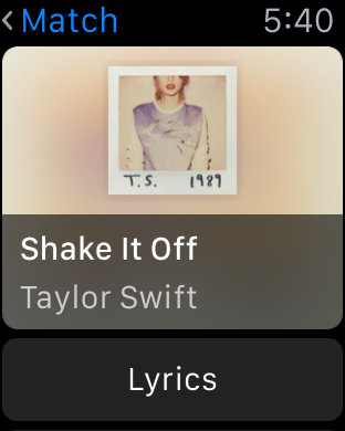

There are some gems among the thousands of Apple Watch apps available so far if you explore what’s out there. I started by installing all of the available Apple Watch apps that had iPhone apps already on my phone, then scaled way back after evaluating each app during the first week. Shazam’s app is an easy recommendation with its song recognition and lyrics presentation abilities.
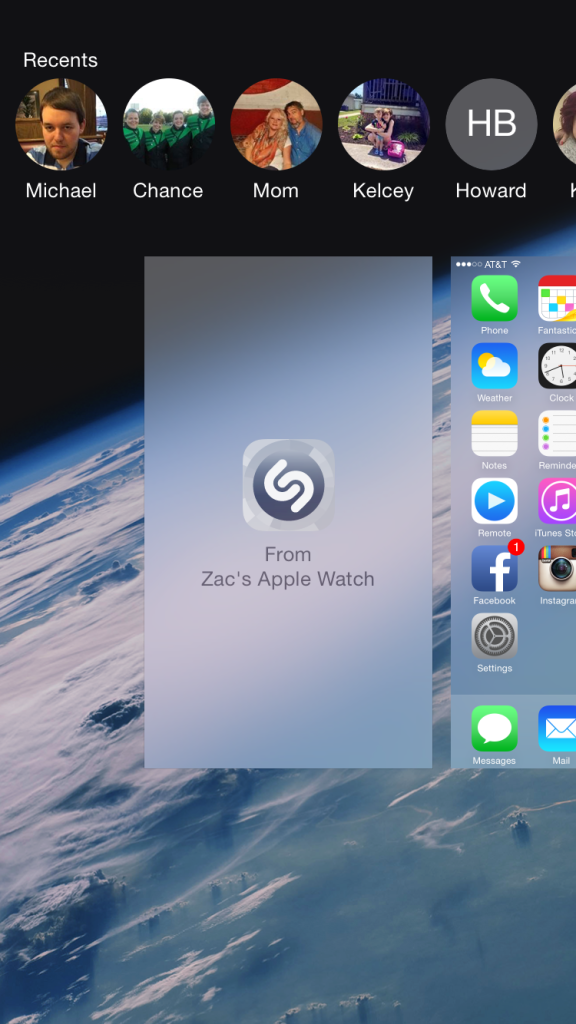

Its use of Handoff is really cool as well. Tapping the Buy button when tagging a song prompts you to use your iPhone to complete the task. This is reasonable since the iTunes Store isn’t on Apple Watch. Slide up from the lock screen or double click to multitask and check for the Handoff panel to the left of the Home screen panel. This lands you right into the correct place in the iTunes Store.


Other apps have purposes that are vague or nonexistent. Fandango’s Apple Watch app, for instance, served up movie quotes for me upon investigation. I’m a big fan of Lebowski and appreciated the image and quote, but without visiting the App Store listing, it’s utility wasn’t obvious. Remove the iPhone from the equation and most apps become even more useless. Not even a quote from The Dude, for example, when the iPhone is taken away and the Instagram app is launched on Apple Watch. How Apple Watch apps improve when Apple gives developers more tools will play a large role in Apple Watch’s growth going forward now that Apple has laid the foundation.
Apple Watch can do a million more things than anything I’ve mentioned so far. It’s an excellent speaker phone in a quiet environment and you can even record video on your iPhone during a call; this was surprisingly never possible before. You can ping Siri on Apple Watch without interrupting audio playback on the iPhone. The more time I spend with Apple Watch, the more of these minor but useful improvements to the iOS experience I discover, and I’m certain there are more to uncover. While the utility of Apple Watch may not be immediately obvious or applicable to everyone, I’m as enthusiastic about Apple Watch in practice as I was in theory before it arrived and became an actual tool in my life.
Apple Watch can improve with future versions by offering better outdoor usage and picking up GPS, but many of its drawbacks are decisions made in the software that can be remedied in the current version. Give Apple Watch permission to have longer screen-on time and use more of its battery. No one benefits from charging it at night and having 30 or 40% still left as you can’t make it through the next day with that, right? The real future of Apple Watch gaining new uses will come from third party developers creating experiences with Apple Watch apps; once Apple gives developers more access to use the hardware, this space should get even more interesting.
Anyone that stays connected to the iPhone — either by necessity or choice — should certainly consider Apple Watch; while it’s still a first-gen device, it benefits from sitting on top of a mature iPhone and iOS platform. As for model recommendations, the 38mm $349/42mm $399 Apple Watch Sport is fine for anyone wanting to get into the device; the extra $200+ for the stainless steel Apple Watch may prove to have a stronger display as it uses sapphire over Ion-X glass, but the decision is otherwise simply for the aesthetics as both have the same technology inside. I do appreciate the traditional watch look that the non-Sport bands provide, and paying more for nearly the same hardware is purely a personal decision.
FTC: We use income earning auto affiliate links. More.


By far my favorite Apple Watch review, because it is not running it down for no reason.
You’re the first one who gave the product an actual chance to show what it has to offer and it’s potential for the future.
Apple should hand you guys review units ahead of launch.
Apple hates 9to5Mac because they leak their secrets all the time.
Hate is a strong word. Let’s just say that sometimes we agree to disagree.
That sounds better. At any rate, I love both Apple and 9to5, so it’s like the best of both worlds.
It’s a choice for them.
They can either:
a) be well behaved and get their semi-exclusive reviews ahed of launch, that will only generate clicks 2 or 3 times
b) be “bad boys” and get more clicks all year long
Of course, “a” is not worth it.
That’s why you see many, many, Apple-bashing sites out there, it’s simply not worth it for a commercial standpoint.
Also, in the tech media world, the best way to arise in popularity it to BASH Apple as much as possible, so other Apple-bashing outlets (Armando Ferreira, Droid Life, MKBHD, TechNinja, etc…) will re-tweet, cite and link you.
Now, for the review, I’m an Apple Watch owner, I bought it with my own money, I would never buy it if it were sub-par (I would either get an alternative, even if it were more expensive, or waited for 2G or 3G, or whatever)
But no… seriously, the Watch is, technologically, as good as it gets, in terms of style, let me tell you one thing from a watch guy: simple and PURE (emphasis on “purity”) models, last for years after years: Rolex Submariner, Cartier Santos, Omega Speedmaster Professional (aka Speedy Pro), Patek Calatrava, Breguet Type XX, will never go out of style, you can buy one for sure, and I can guarantee you, that if you like it one day, you’ll like it for the rest of your life!
This design, looks simple, but it actually is well thought, and they didn’t take any shortcuts (how the case is expensively machined from a solid block of metal, that’s pretty much the most expensive thing you can do), I’m very impressed with it, and I display it with pride alongside my other watches that cost as much as 10X the price of a base stainless steel model!
I recommend you to get opinions from people WHO WERE ACTUALLY ON THE WATCH/SMARTWATCH MARKET, and actually have the pre-requisites (money and an iPhone), and bough the Watch for themselves.
Most people are very happy, and consider it being a good buy.
I’m very happy with mine too.
I absolutely love my Apple Watch. I think it’s hilarious seeing some people’s reactions to it. For example, I was paying with it in Starbucks, and the barista said, “Whoa, is that the iPhone Watch?!”
Great piece, Zac.
Nice review…. I agree with most of it – the Watch quickly became an unconscious addition to the daily grind so much so that now when I don’t wear it and instead wear one of my analog watches (only a couple times since I got the Watch 3 weeks ago), I’ve caught myself immediately and unconsciously glancing at my analog watch when my iPhone dings in my pocket, lol.
Battery life is better than expected, I too end the night around 9 to 10pm with 25 to 35% life left. Once I had a lighter than average day and the Watch ended the night at 48% battery! Always starting at 7am.
The UI lag is the only real issue I have with it, hopefully a software update will fix this soon, something I believe is the result of Apple underclocking the S1 to be extra conservative on the battery out of the gates.
I suspect this because I swear the base mounted demo units at the Apple Store are snappier and smoother with less or no lag. I bet there’s a big battery inside that base and it’s feeding the Watch through a hidden wire inside the half band. It’s the only way they could get the demo units to stay alive long enough to get through a day in retail, so it must be this way, and given that those demo units don’t have to worry about battery life thanks to that base, they are likely not underclocked.
http://i2.cdnds.net/15/15/618×346/p4100608.jpg
Hey Dom (& Zac)! You mentioned in the video the lack of being able to send messages hands-free. I learned that after you ask Siri to send a message and dictate its contents, wait for the Messages app to open, and then say “Hey Siri, send”. And boom! Hands free messaging! No more tapping send!
Thanks, yeah that’s one area where Siri is completely fragmented when it comes to commands. At minimum it should be in separate prompts like iOS devices. Even two commands is a bit silly if you’re actually busy with something.
This was an absolutely amazing review and anyone considering an Apple Watch should read it fully. Heck, it should be posted outside the Apple Stores (joke). Really, though, it’s a stellar review. One thing though:
“Difficulty reading the display outdoors is easily my biggest complaint with the first version. Checking the time (or any information on the screen) in direct sunlight can be nearly impossible.”
That’s because you’re using the model with Sapphire. I have the Sport with Ion glass (same as the iPhone 6, as you all are aware) and I think it’s damn-near perfect in direct sunlight. I keep my brighteness at the lowest setting because I found the display to be unnecessarily bright indoors, but even with me not switching settings outside it is still very easy to read the display and I can’t imagine it improving on the Sport.
I understand that some people want a stainless steel watch because that’s their preference and they’re looking for something less sporty-looking, but I have enough stainless steel and gold mechanical watches for casual or formal occasions where I had no desire to have my smartwatch be stainless steel. I bought it mostly to be my everyday watch/companion to iPhone, as well as for the fitness tracking capabilities. Even if I were looking for a more business-looking smartwatch I’d be skeptical about this first generation Watch because of the visibility issues. In short, I’d recommend early adopters, as I am, to get the Sport. You can change the band out if you don’t like the sport band.
Same here; IMHO the sport version is better than the stainless steel version in almost every aspect (DLC wins in terms of scratch protection)…I already have expensive watches, mostly mechanical / automatic chronographs…although the DLC version of the Apple watch is beautiful and provides scratch protection as well, it’s just too expensive to justify it. Maybe v2.0.
It will be very cool IMHO to see if any fashion houses come out with Apple watch bands; I wouldn’t mind a nice leather Prada saffiano band :). Or bottega veneta interraciato…that would be sweet!
I never found the sapphire in mine to be a problem, if you tilt it to an angle that’s doesn’t have as much incidence, there’s no problem, it’s not THAT reflective…
For scratches, Dom has posted a video, but I’m never going to buff mine, because I like the result of naturally scratched steel after long years, like the iPods… I
Zac – Outstanding review! Very open and honest, without coming across as either a fan boi or a hater! Thank you!
I can only hope that Apple continues on their tradition of building and improving, both in the software and hardware.
Great review, and I agree with you on all accounts. While I haven’t had mine for as long as you, it has already become a valuable daily asset. I’ve been a watch wearer all my life, so having something strapped to my wrist is not a foreign feeling. That seems to be one of the biggest hang ups with most of my friends – they haven’t worn a watch since they started carrying a phone and don’t see the need. And that brings me to the point that I try to make with most people that ask me about it – Do you need this? No. But you will want it. And as soon as you use for a few days, you won’t want to let it go.
Lag is probably my biggest issue. I rely mostly on the few glances I have selected and the limited notifications that come from the phone. And that’s where I think it shines. It’s helping me disconnect a bit from all the connections that I have. The phone has turned into such a time suck, and the watch is keeping it in the bag or my pocket more often. With a few select notifications (messages, FB messages, dark sky, calendar and Smartthings) I’m really only seeing what I need to see. I’m not using email at all. It’s nice not looking down at my phone all the time.
Until they gain more power, apps are pretty hit or miss. The remote apps are fantastic, Philips Hue and Smartthings both have great apps for home automation and Automatic has a nice parking spot reminder feature. Uber rarely loads for me, and the inability to select a car type kind of sucks.
I really hope to see more watch faces. It further backs the “most personal device” line and I could see it becoming a lucrative side business with companies like Tiffany, Omega, Louis Vuitton, etc – licensing digital watch faces and high fashion bands. If complications grow to include the option of displaying other app data, the watch face gets even better.
I typically keep my phone silenced or muted. And most of the time, I miss the vibration of an incoming call or message. With the taptic engine, that is no longer the issue, and it’s been a godsend for getting notifications when they come in. It’s one of my favorite features and I long for the day when people can finally shut off their ringers, bells, whistles, chimes, and campy ring tones for a simple unobtrusive tap on the wrist. Brilliant.
I picked up the 42mm stainless steel model with the sports band. As a long time watch enthusiast, I appreciate the sapphire glass display and I think the SS is easier to dress up for a night on the town. I’ve been pretty impressed with the comfort of the sport band, and the strap release system is just genius. Total Apple.
Zac, I really like your nail polish.
Haha thanks decided borrowing another hand was better than shooting my hairy arms. ;-)
My biggest problems with it have been the wrist detection and lack of the screen staying on when you want it to, just like you mentioned in the article. I think as well that Apple was *wayyy* to conservative with battery saving here; the screen should stay on a lot longer and they gotta do something to make wrist detection work when you’re sitting or laying down, and standing detection needs to work better as well.
IMO If you remove the apple polish you’ll end up something resembling the Pebble steel. Too bad the Pebble steel has ZERO of the apple polish but is close enough in price to consider buying the apple watch.
This is Apple Watch’s first release and we’re just guinea pigs for a bigger idea. Also, if you don’t care much about “fitness” and still want to consider getting an Apple Watch, I suggest you to check out this article:
https://testlio.com/blog/post/how-the-apple-watch-fits-in-a-sedentary-life
It seems like Zac Hall is supposed to be the author of this article, but the two GIFs seem to show female arms. Was she just an arm model or did she write part of the article and not get credited?
“restrained use of color to your attention to activity.”
I think it’s supposed to be “color to call your attention”?
“although I’m convinced I’m a little numb to most taps or my motor is weaker than it should be.”
Which setting do you have the Taptic Engine on?
Great review, and fair in constructive criticism. I did note that in the video Dom says he wishes he could make a phone call with the Apple Watch without having to have his iPhone with him, which may not be a fair criticism of the Apple Watch itself. I totally get that this would be cool, but I don’t think this really has anything to do with Apple. Essentially your saying that you want two phones… Your iPhone and the Apple Watch to be a separate phone. I am not aware of two phones being able to be ported to the same phone number at the same time- it would either take (1) having two separate phone numbers, (2) calling your CDMA carrier to port between devices each time you want to use a different one to make a call, or (3) switching out the SIM between iPhone and Apple Watch (which sounds like the most potentially possible option, but still a pain). Maybe if the carriers change how their networks function someday it might be possible to have two standalone devices using the same phone number, but this isn’t really anything it seems Apple can do (unless there is some tech thing I am not aware of).