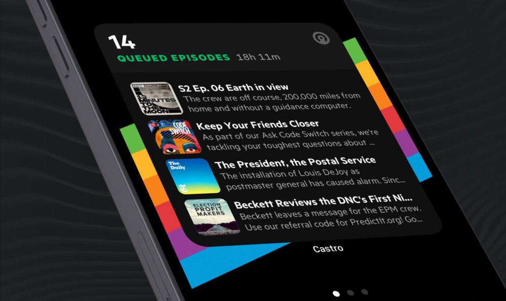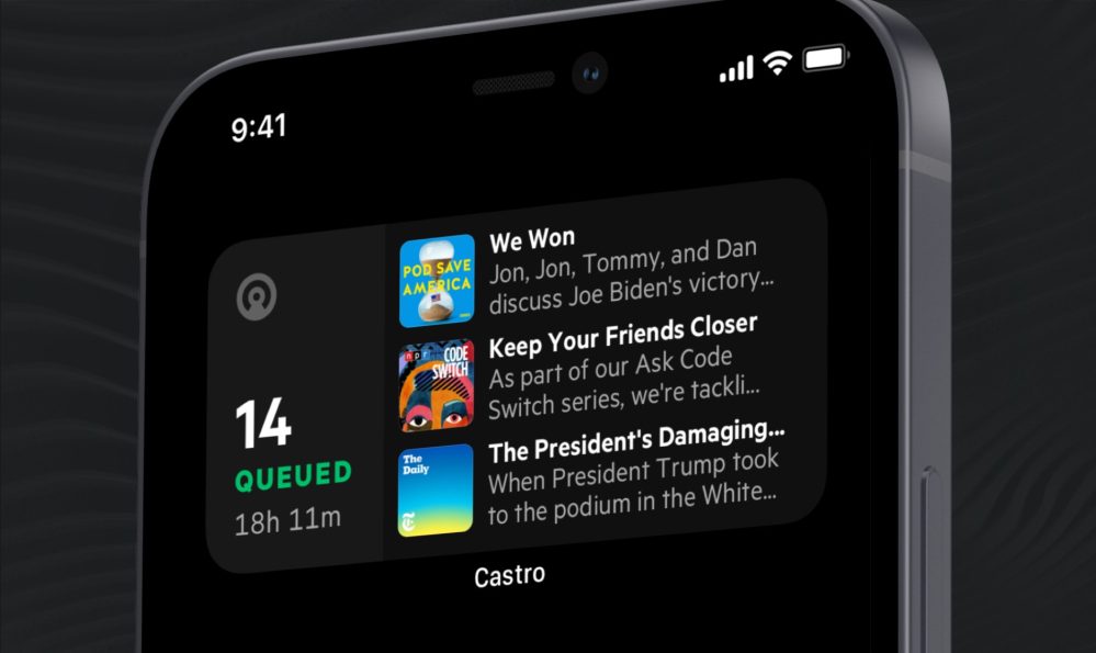
Popular iOS podcast client Castro has launched a new update today that brings widgets to your iPhone home screen in multiple sizes with support for dark/light mode, new custom icons, and more.
Castro shared the news in a blog post today: “Time to make some room on the old home screen friends, Castro is coming in hot with Queue widgets in 3 different sizes.”
Here’s how Castro describes the new small, medium, and large widgets that automatically adjust to dark or light mode:
First up is a small widget that shows off the artwork from the first four episodes in your queue. You’ll also see stats like, the number of episodes and total duration of audio in the queue. Tapping anywhere on this widget will launch Castro to the queue.
The medium sized widget has all of that, but also lets you see episode title and a hint of the show description. Tapping on an episode will launch Castro to the episode details page, while tapping anywhere else on the Widget will launch Castro to the queue. One little sneakret is that tapping the Castro logo is the same as tapping the app icon, and will launch you to whatever you had open on your last session.
The large sized widget has all the goodies from the medium sized widget, but you get one more episode preview and a little more breathing room for the episode descriptions.
Castro says that if you “magically get to the end of your queue” you’ll be able to add something new from the Inbox or Discover tab.
There are also new custom icons available for Castro Plus subscribers:
Castro version 2020.13 is available now as a free download from the App Store. Castro Plus goes from $2.99/month or $18.99/year.
FTC: We use income earning auto affiliate links. More.


Comments