iOS 14 saw the introduction of Home Screen widgets on the iPhone, and that alone was expected to cause a tsunami of creative customization on the platform. But that was just the tip of the iceberg. Even though it’s been possible for a few years now, regular consumers discovered that they could create custom icons using the Shortcuts app. We saw an explosion of custom icon packs, widget designer apps, and tutorials on how to make your iPhone look a very specific way. If Apple wants to lean into customization, it could do it in a few ways that still allow it to keep control of the platform’s core design.
I’ve selected three key features that Apple could implement to expand customization. They’re all dead simple and, frankly, really familiar to Apple.
Ambient theming
iOS now offers two distinct system themes: a light mode and a dark mode. It also offers a timed option that lets your iPhone switch between the two automatically on a schedule. But Apple has the technology to go deeper than that.

Apple already uses the ambient light sensor in iPhones to adjust the brightness of your screen. It could also use the ambient light sensor to switch between light and dark modes. If you turn your lights off, dark mode gets turned on automatically. When you open your blinds in the morning, light mode gets enabled. Even something as simple as stepping from a lit room into a dark room would change the theme.
Dark icons in dark mode
To complement the ambient and dark themes, you could enable dark icons in dark mode. Apple apps that use white backgrounds could finally earn black backgrounds when dark mode is enabled. It’s currently quite jarring to see so many bright white icons in dark mode.
Accent color
This is a feature Apple knows quite well. It’s been on the Mac for a while now, and it’s an incredibly simple but delightful customization feature. The Mac allows you to set a single color that is applied to menus, buttons, highlights, and more across your system. Apple should bring this to iOS, but with a unique take.

Instead of offering a slate of universal color options, Apple could offer colors that match the device family. It would make certain colors exclusive to certain devices and create incentives for customers to pick certain products.

Changing your accent color on iOS would change buttons in nav bars, tabs, switches, checkmarks, highlights, and more. You could choose to use the multicolor default system of colors as well. It would work well in light mode and dark mode.
Home Screen icons
This particular feature is tricky for several reasons. First and foremost, Apple likely doesn’t want to allow users to change its own iconography. I get that. Apple wants control and to promote its services and brands. Second, it doesn’t want to get hit with suits from brands that don’t want icon packs to alter logos. It also certainly doesn’t want to get hit with suits because designers start selling icon packs with brand logos that Apple doesn’t get a cut from.
But customers are already knee-deep in icon customization. It took off like a rocket as soon as people discovered they could set their own designs with Shortcuts. Apple has made it gradually easier for customers to set custom icons, like how Apple removed the need for a shortcut to launch the app before switching over to another. Now it just shows a short-term notification. But because this icon customization is now so pervasive, Apple might be considering ways to implement a controlled system.

What Apple could do is create a system even more strict than the App Store. It could treat it more like a designer program rather than a marketplace. Designers could submit icon packs to Apple for inclusion in the App Store and a Settings modal. Apple would need to review the icons all for legal issues and for aesthetics. They’d be easy to install, easy to preview, and, most importantly, easy to enable with a few taps.
Wallpapers
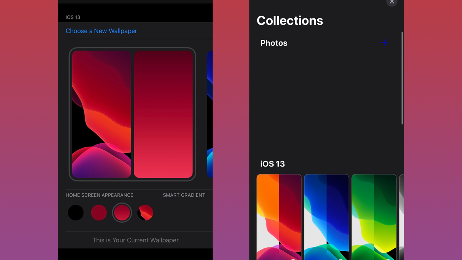
Last April, 9to5Mac shared leaked images of a new wallpaper picker and API that was originally slated for iOS 14. It would let you create ‘smart gradients’ out of images and organize your wallpapers by packs downloaded from the App Store.

This kind of extended wallpaper customization would be welcomed in iOS 15, and hopefully, it will finally see the light of day.
Demo
Check out a short video I made showing off some of these features and let us know what you think about them in the comments below! Make sure to tap to watch the video in fullscreen on your iPhone.
FTC: We use income earning auto affiliate links. More.


Comments