Earlier this year we correctly predicted that macOS 12 would be called “Monterey” and later discovered renewed Apple trademarks for places in California. The two renewed names were in fact “Monterey” and “Mammoth.” It’s only natural to assume that next year’s release of macOS will be called Mammoth with Monterey being chosen this year. So what might we see in macOS 13 in 2022? Well, we don’t know yet. But we do know what we want to see.
The name
First off, let’s talk about the name a bit. Mammoth Lakes, California, is a resort town in the Sierra mountains. Situated directly next to Mammoth Lake Basin is Mammoth Mountain. The area is also well known for Red Meadow, which is home to Rainbow Falls. Mammoth Lakes happens to be quite close to Yosemite and El Capitan. The town of Mammoth Lakes sits northeast of Monterey and is directly between Yosemite National Park and the Sierra National Forest. Suffice to say, it’s in the same neighborhood as other macOS names.
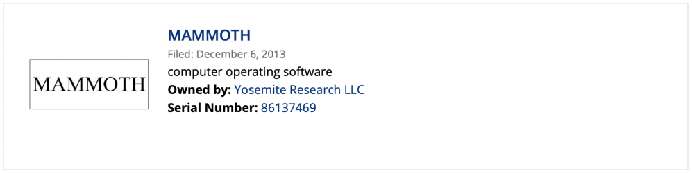
Apple’s trademark for Mammoth was originally filed in March of 2013 alongside other macOS names, but, unlike many of the others, Apple has continued to renew it on an ongoing basis. This is presumably because they’d like to use it for a future version of macOS. Apple, or more precisely, its “Yosemite Research LLC” shell company renewed the Mammoth name on May 1 of this year. It is currently active and listed under the “computer operating software” goods and services category. That’s pretty transparent. Of course, Apple could choose to use a different name over the course of the next year, and we’ll be keeping an eye on potential new trademarks, but at the moment Mammoth seems like a good bet.
Redesigned desktop
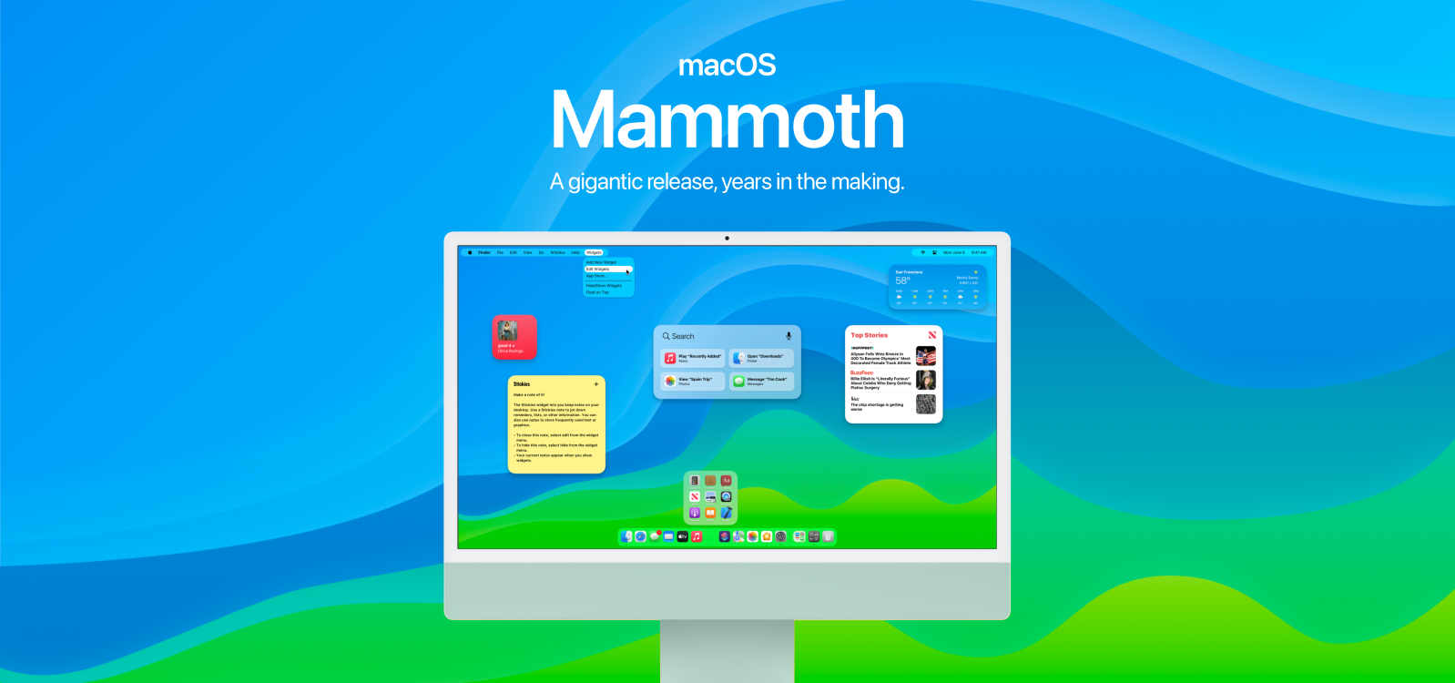
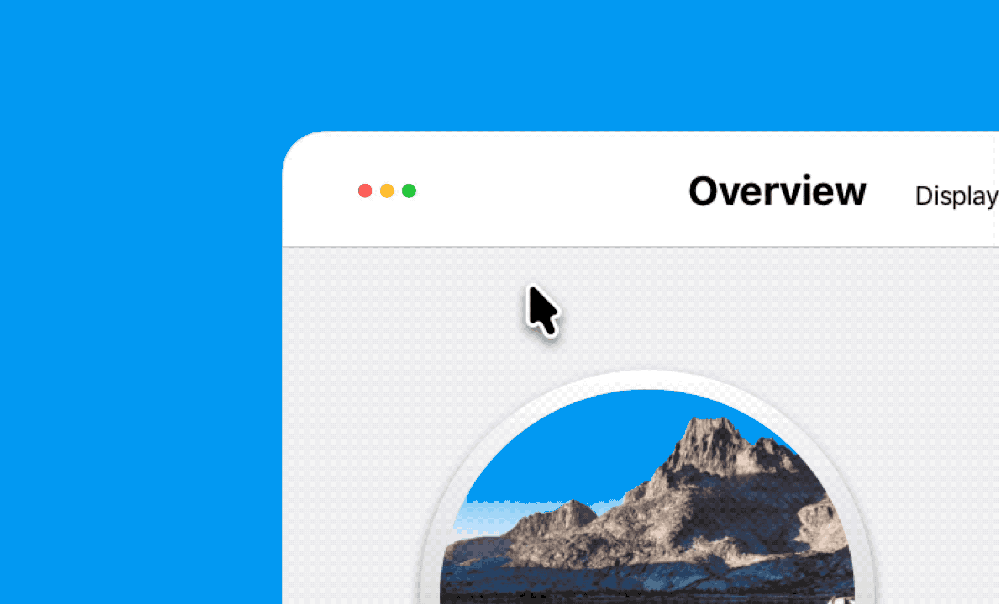
macOS Big Sur did a great job of refining the Mac desktop, but it didn’t fundamentally change any of its behavior. We’d like to see that change with the next version of macOS. With Monterey being mostly full of small refinements rather than big ideas, we’d expect Mammoth to be a monstrous release. Redesigning the desktop certainly fits the bill. Let’s start with the most crucial element of macOS, the menu bar. Since the inception of macOS in the mid ’80s, the menu bar has spanned the entire length of the top of your Mac’s display.
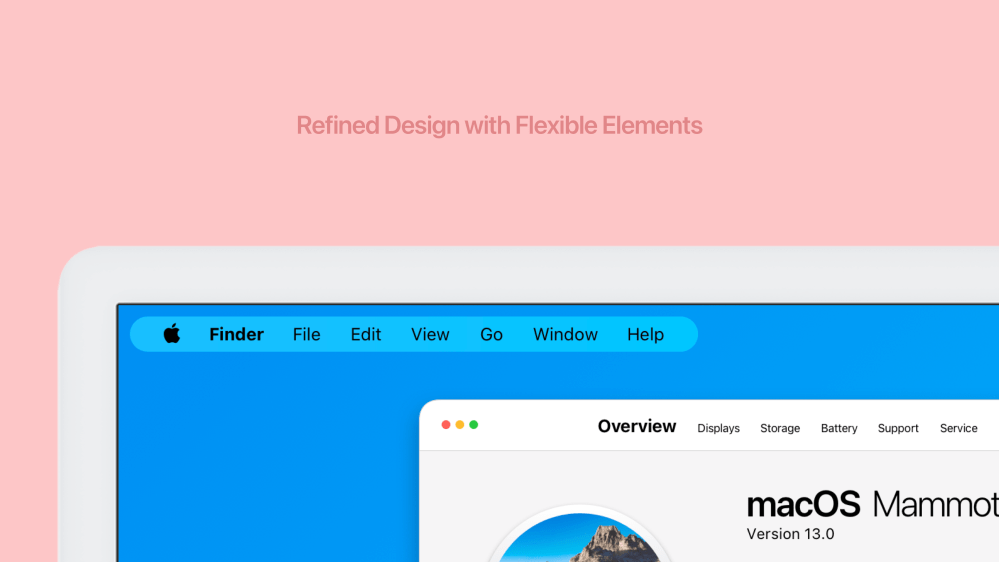
With Mammoth, we’d like to see a dynamic flexible menu bar that can shrink and grow at will. It reserves more space for windows at the top of your display and hides a giant section of the menu bar that often serves no purpose. Both the right and left sides of the menu bar would collapse into small pill-shaped boxes that float on top of your content rather than being locked to the corners. If an app has more menu bar items, the pill can expand and vice versa. Lots of modern Mac apps that are making their way over from iOS don’t even utilize the menu bar that much.
Refined UI elements would also make their debut across the system. A simpler, less intrusive tab bar could look and feel more like a header from iOS. You can even see a rounded arrow cursor.
All-new window buttons
The Mac’s stoplight buttons have remained mostly the same since Mac OS X was first introduced, aside from the green button being changed to trigger fullscreen in OS X Lion. Apple has recently added a new overlay that appears when you hover over the green button. It allows you to tile an app on either side of the display or move a window to a different display entirely. We think they can go further. First off, we’d love to see window buttons that shrink and expand on the fly. Why? Because it saves space and declutters title bars. It’s a feature in iPadOS 15 that we think would work really well on macOS.
Hovering over the green button would expand it into a green pill with several window layout options. You could split apps 50/50, create a grid of four windows, or split three apps vertically. If an external display or sidecar compatible iPad is connected, it could show an additional option for moving the window.
Update control center and do some sherlockin’
One of the most useful macOS utilities is Bartender, an app that lets you hide and show icons in the menu bar on the right side of your display. It helps manage lots of different icons if you have a ton of apps installed. It makes cleaning up your menu bar a breeze. With macOS Big Sur, Apple made it easy to add and remove items from the new control center to the menu bar. If you want a display button in the menu bar, just drag it out of control center. If you want to remove it, just drag it out. Apple should extend this to third-party menu bar icons natively.
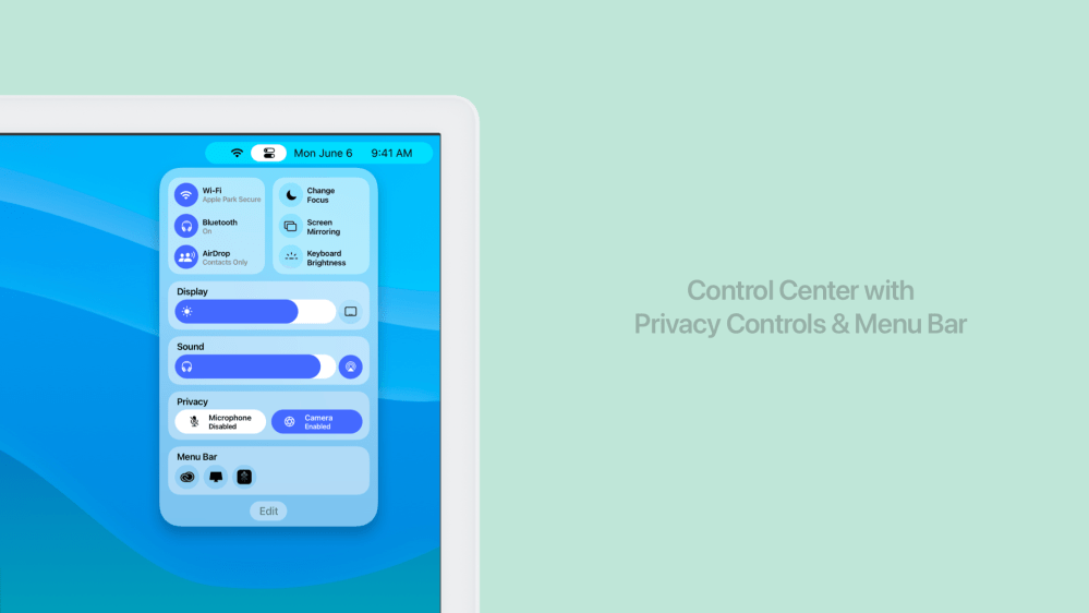
A new menu bar tray in control center should hold onto menu bar items you want to hide. You could drag them in and out of control center if you need them readily available too. Another change we’d love to see Apple make to the control center is add a new privacy platter. There could be two controls. One that enables and disables your Mac’s microphone and one that enables and disables your Mac’s built-in camera.
The right side of the dock expands
The right side of the macOS dock has always housed the trash can. With macOS Mammoth, we’d love to see some new icons introduced. The first is the App Library. Apple introduced the App Library in iOS 14 last year and is bringing it to the iPad this year with iPadOS 15. It’s only natural that it would make its way to the Mac as well.
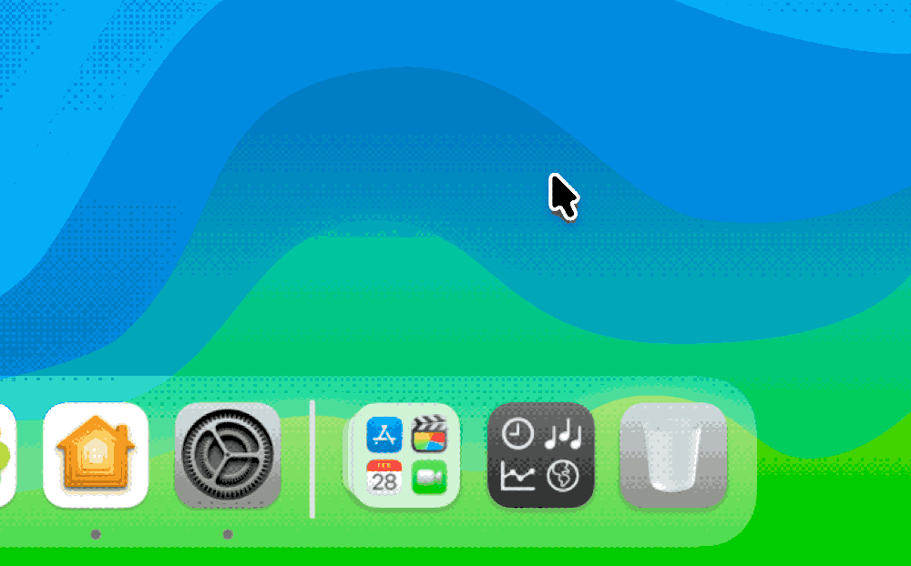
Another thing we’d like to see is a dedicated button to trigger widgets. Apple removed Dashboard from macOS with Catalina, and the new widgets introduced in Big Sur could use some more exposure.
Desktop widgets
Widgets are currently hidden offscreen to the right with your notifications. They deserve their own place to live, just like they have on iOS and iPadOS. Apple has moved widgets directly to the Home Screen on both of those platforms. With macOS Mammoth, we’d love to see them on the desktop.
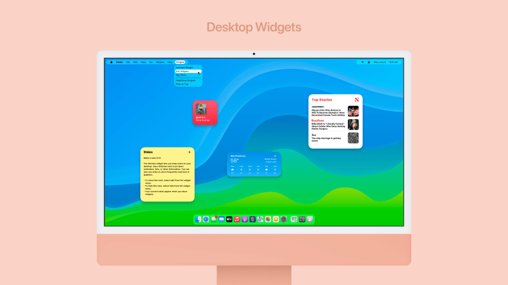
Clicking on the widgets icon in the dock could hide and show widgets on the desktop. You could position them anywhere you want to, even on different desktops using Mission Control. We’d love to see Apple combine the aging Stickies app into the new widget system. Stickies already can be placed anywhere on the desktop and can even be made to float on top of windows. The new widget system could do the same things.
App Library replaces launchpad
As Apple continues to unify features across their operating systems, we’re sure to see things like the App Library make their way to the Mac. Apple hasn’t iterated on Launchpad in years, and now that iPadOS has a more dynamic Home Screen it just doesn’t make much sense anymore. Lots of folks place the Applications folder in the dock as a stack. Why not just make it a built-in system default so everyone can easily find apps on their disk?
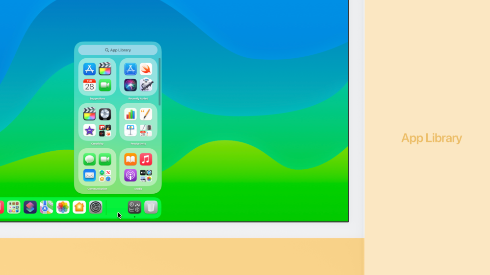
The App Library wouldn’t need to take up the entire screen, instead floating in a small translucent window above the dock. Your apps would be organized like they are on your iPhone or iPad into categories from the App Store. You could search and launch apps on the fly, too.
App folders in the dock
The left side of the dock has always been home to app icons exclusively. With macOS Mammoth, we’d love to see app folders. File folders can of course be placed on the right side of the dock, but app-specific folders have been on iOS and iPadOS in the dock since 2010. They’ve been in the Mac’s launchpad, but with that being deprecated, they need a new home.
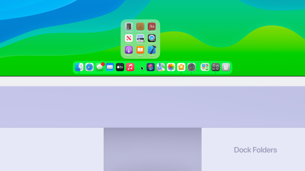
It should be as simple as dragging one app in the dock on top of another to create a folder. When you click to open a folder, it expands and floats above the dock.
Siri + Spotlight
Spotlight’s design from OS X Yosemite has remained for several years, and we’d love to see it get some love. First off, the large dictation button that has sat on the far right side of the window should be turned into a Siri button. Click it to ask command Siri rather than just dictate a search.
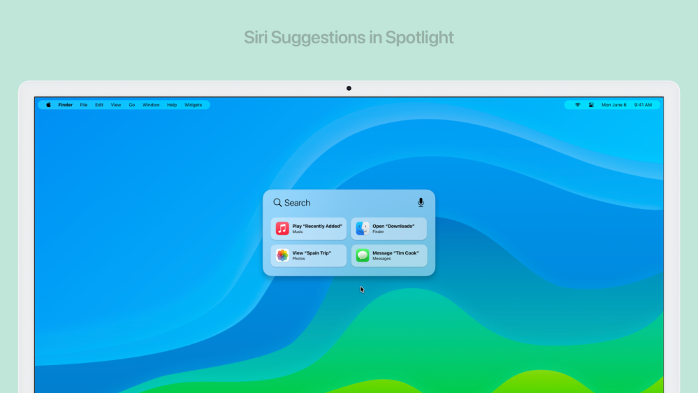
Second, add Siri suggestions. I used to loathe the suggestions that Siri would surface for me, but they’ve become incredibly useful as Siri has gotten smarter. Over the past year I’ve utilized them more than ever. The Siri suggestions widget has been the main place I’ve found them to be useful. What if that was integrated into the Spotlight search window? Just click command + space to find useful automations.
Scribble comes to the Mac
Scribble has been a really useful feature on the Apple Watch and the iPad. While it might seem like it’d be more of a novelty, we actually think it would be quite useful as an accessibility feature in macOS. Your Mac could suggest words it thinks you are typing directly above the visualized trackpad on screen.
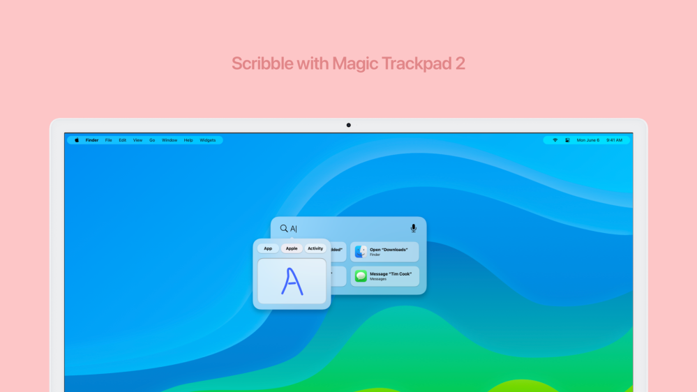
You’d be able to use Scribble with a built-in force touch trackpad on a modern MacBook model or using the Magic Trackpad 2 on a desktop Mac.
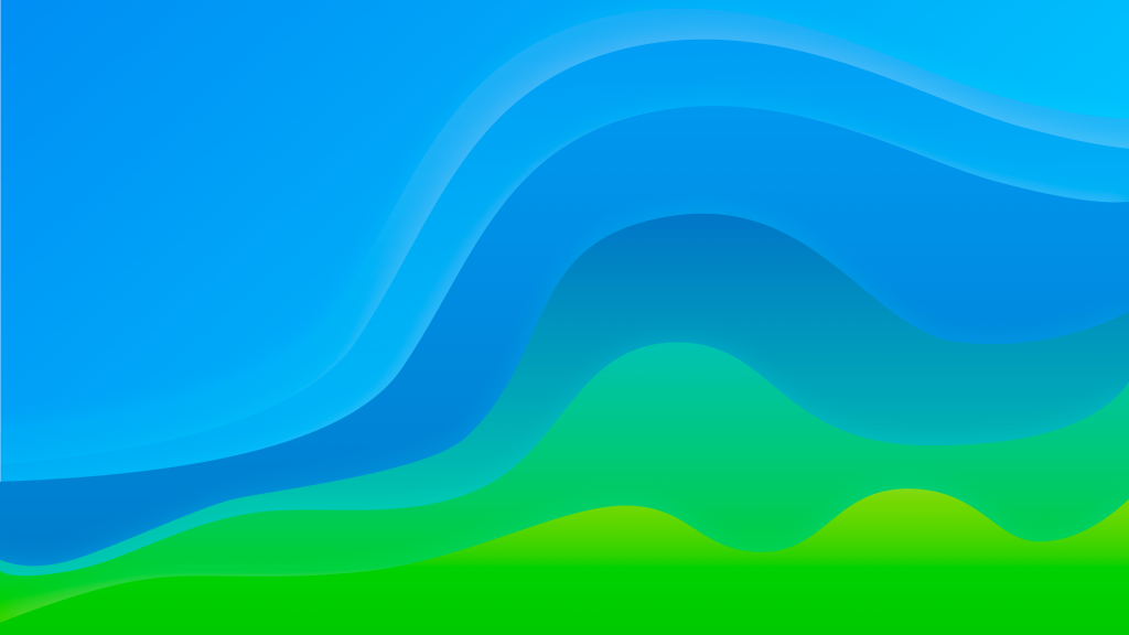
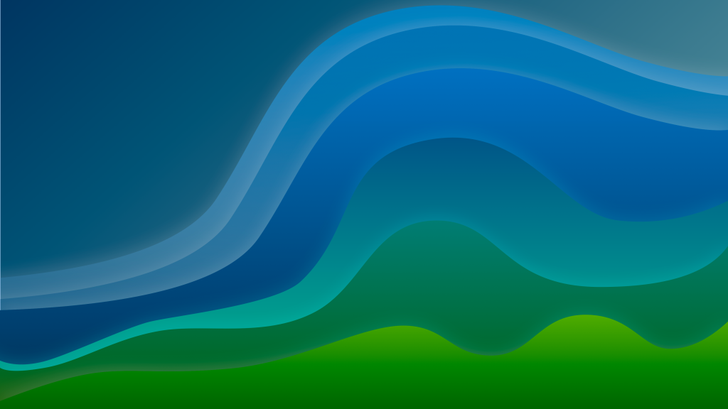
macOS Mammoth Wallpapers
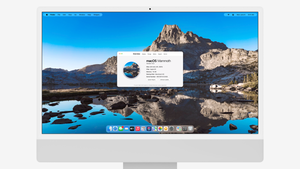
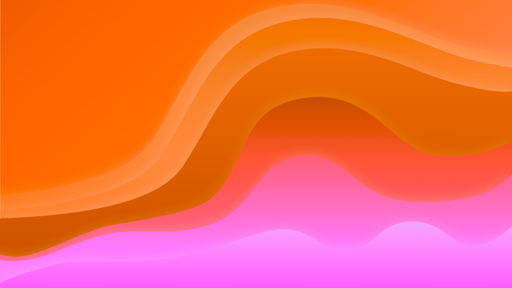
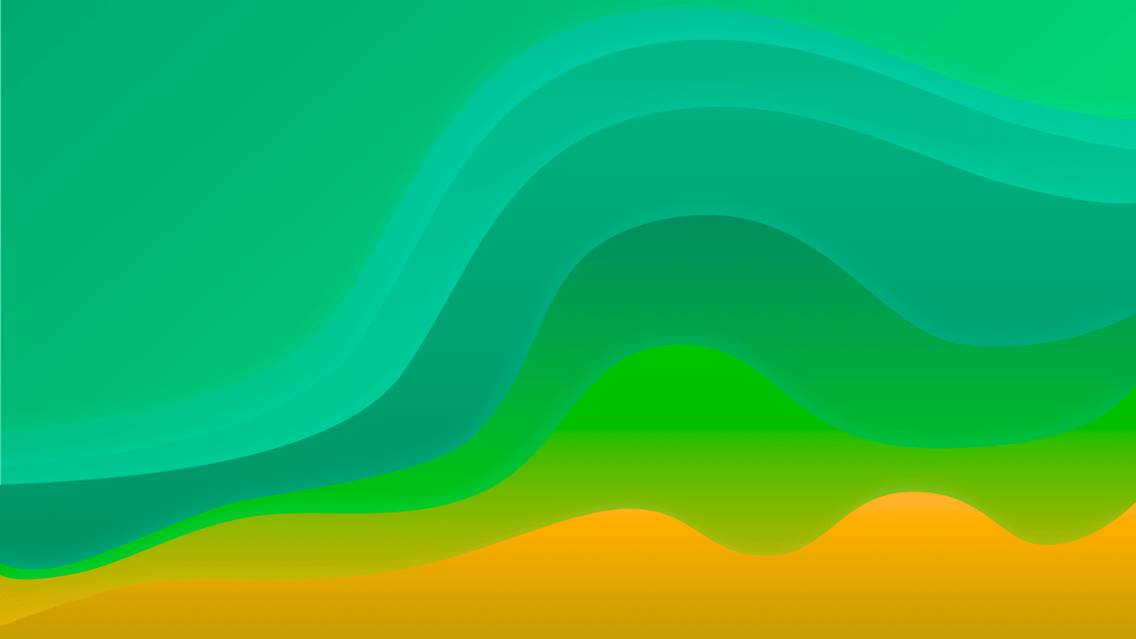
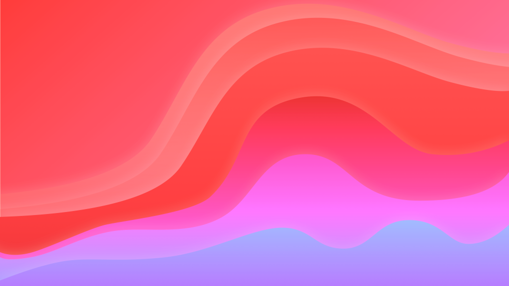
I am sure there are some of you who want to get your hands on the wallpaper we designed for this concept. Well, I have some good news for you. We designed a whole collection of them. The wallpaper’s design is supposed to be a natural evolution of the Big Sur and Monterey wallpaper style but adapted to feel like a mountain that meets water.
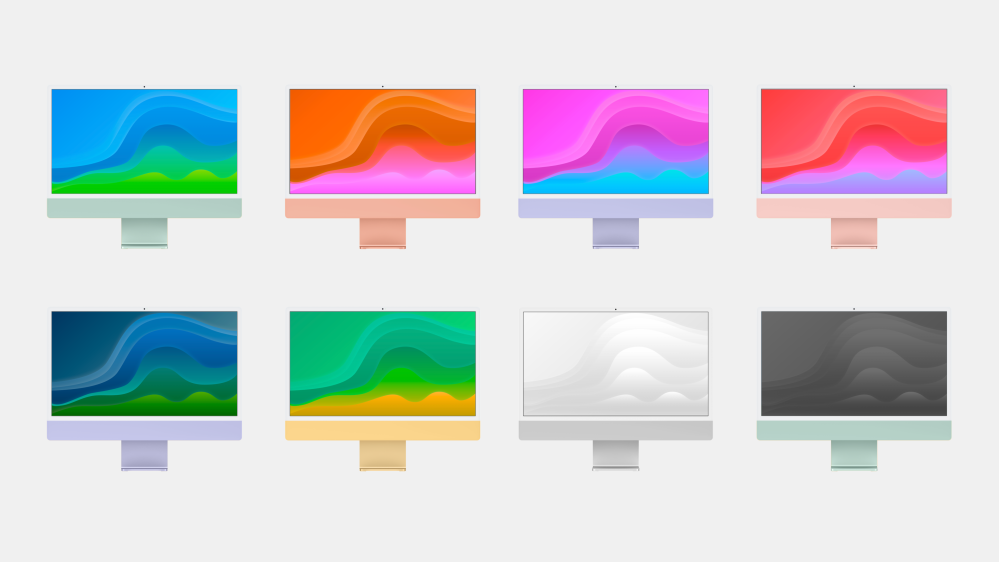
There are several variations of the macOS Mammoth wallpaper, including a dark mode version and two minimal ones. There are four other color combinations that go nicely with different iMac tones. You can find the wallpapers in the gallery below.


More to come
This is only the first half of our macOS Mammoth concept. We’re also hard at work on ideas for Apple’s built-in applications and even on some new ones. Stay tuned for part two with a redesigned Settings app and a built-in tool for managing junk on your Mac. In the meantime, let us know what you think about these ideas for refining the macOS system in the comments below!
“Release Notes”
macOS Mammoth introduces an all-new desktop design with dynamic menu bar, floating widgets that you can place anywhere, an App Library that organizes your installed apps, and windows with refined controls. Folders in the dock let you have more apps than ever before right at your fingertips. App Snap lets you configure windows in different grids with a single click. Spotlight now shows you Siri suggestions. Control Center has new privacy controls and support for third-party apps. Scribble lets you type by drawing characters with your finger on your Mac’s trackpad.
- Desktop
- Redesigned dynamic menu bar
- Resizes based on the number of options provided by the active app
- Rounded floating design sits on top of your content
- More space for your windows to be moved to the top of your display
- All-new window controls
- Stoplight buttons shrink and expand when you move your cursor over them
- Hover over the green button for new app snapping options with split view
- Redesigned dynamic menu bar
- Dock
- Place app folders on the left side of the dock
- Folders float above the dock when clicked
- Organize your apps in the dock by category
- Place as many apps in a folder as you’d like and swipe between pages
- App Library replaces Launchpad
- Click the App Library icon on the right side of the dock to see all apps on your disk
- Apps are organized by category from the App Store
- Search your App Library with a click
- Widgets icon hides and shows desktop widgets
- Place app folders on the left side of the dock
- Widgets
- Widgets have been freed from notification center
- Place a widget anywhere you’d like to on your desktop
- Hide and show them all with a click
- Move widgets between desktops in Mission Control
- Pin widgets to float above your app windows
- Widgets have been freed from notification center
- Control Center
- New privacy toggles give you more control
- Quickly turn your microphone or camera on and off on the fly
- Hide and show third-party menu bar items
- New menu bar tray holds items you don’t want always visible
- Drag and drop them in and out of control center
- New privacy toggles give you more control
- Spotlight
- Dedicated Siri button lets you make requests
- Siri suggestions available with a key stroke
- Below the spotlight text field are Siri suggestions
- Launch a shortcut, open an app, and more
- Scribble
- Draw characters with your finger on your Mac’s trackpad
- Your Mac suggests words it thinks you may be typing
- See your trackpad visualized on your Mac’s screen
- Draw characters with your finger on your Mac’s trackpad
FTC: We use income earning auto affiliate links. More.

Comments