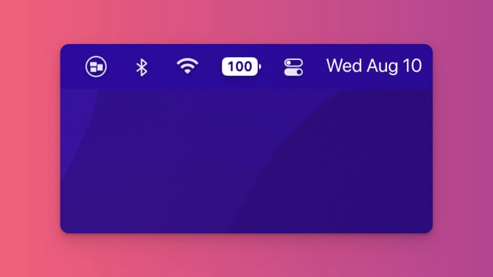
Perhaps the biggest Apple news of the week is that the battery percentage icon is finally back in the iPhone’s status bar with the release of iOS 16 beta 5. While it’s been a surprisingly controversial change, there’s already an app that can bring the same battery percentage design to your MacBook…
iOS 16 battery percentage icon for your Mac
The design of the new battery percentage icon in iOS 16 shows a full battery icon with the precise percentage right inside of it. The battery icon remains full until your iPhone hits 20%, then it drops down so it’s clear that you’re running low on battery.
The design has proven to be controversial, with some people arguing that it’s deceiving the battery icon stays full until that 20% threshold. Given the limited space in the status bar, however, this is likely the only option, and of course Apple isn’t forcing you to turn on the option.
But if you are a fan of this design (and I am), developer Rony Fadel has updated his popular Batteries app for macOS with an option to bring the same design to your MacBook. It works just as you’d expect it to and lets you see your battery percentage right inside the battery icon.
This design is actually quite nice on macOS. By default, macOS doesn’t show you the battery percentage. Instead you have to click on the battery icon or enable the always-visible percentage in System Preferences. When you enable that option, the battery percentage is located next to the battery icon, therefore taking up more space in your menu bar. This is not a huge deal, but it can be annoying on a MacBook with a notch where menu bar space is constrained.
You can download the Batteries for Mac app from Fadel’s website for $8.99. The app is also available via the Setapp subscription service, which bundles over 200 apps for a single monthly subscription.
What are you thoughts on the new battery percentage icon in iOS 16? Do you want Apple to also bring it to the Mac? Let us know down in the comments!
FTC: We use income earning auto affiliate links. More.


Comments