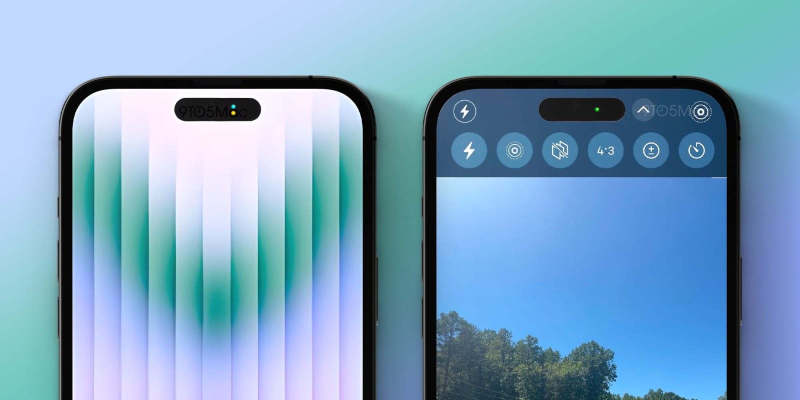
The big Apple news of the day is that the iPhone 14 Pro will apparently use software to make the two new display cutouts look like one seamless cutout.
Why is Apple making this change? A source with knowledge of Apple’s plans tells 9to5Mac that the space between the two cutouts will be used to show privacy indicators for the microphone and camera. The change will also help with a redesign for the Camera app itself.
The rumor today is that the pill and hole-shaped cutouts in the iPhone 14 Pro display will be bridged by software. Apple will essentially black out the area between the two cutouts. This will give the illusion that it’s “one wide pill-shaped cutout,” according to Bloomberg.
While it initially seemed like this would essentially be dead space, that’s not actually the case. According to a source familiar with Apple’s plans, the company will use this space to make its privacy indicators for the camera and microphone more visible.
Currently, Apple places a very small orange dot in the upper-right corner of the display when an application is using your iPhone’s microphone. A green dot appears when an app is using your iPhone’s camera. On the iPhone 14 Pro, Apple will move these indicators and make them far more visible.


The “dead space” between the two display cutouts on the iPhone 14 Pro will be used to show these green and yellow privacy indicators. Apple’s goal, according to our source, is to make the experience more similar to a MacBook, which features an always-visible green LED when the camera is in use.
This will also allow Apple to show both the green and orange dots at the same time when the camera and microphone are both in use. Currently, Apple only shows the green dot, even if an app is accessing the camera and microphone both.
Additionally, Apple currently plans to let users tap on these indicators to see a clear list of which applications are using (and perhaps have recently used) the microphone and the camera.
Finally, 9to5Mac’s source adds that Apple is also planning a redesign to the Camera app where most of the controls are moved to the top portion of the screen.
Top comment by bcom77
I'm curious to see if the cut out will be as easy to ignore as the notch is. The notch was a bit polarizing when the iPhone X came out but after a week or so it became easy to ignore. The pill cut out still has a few millimeters of visible screen above it so that will help the cut out stand out more and be more noticeable in some instances.
It'll be interesting to see this thing in the flesh.
Controls such as the flash button and Live Photo button are now positioned in the status bar, while more granular photo and video settings are directly below the display cutouts. This change will give users a larger view of the camera preview by shifting the controls upwards and moving some of them into the status bar.
The images above show these changes. They are mockups based on the information from our source.
These optimizations for the new iPhone 14 Pro display cutout are ones that Apple has tested and currently plans to implement. Given that they are software features rather than hardware features, however, they could be changed or scrapped altogether based on final testing. We’re told the Camera redesign in particular is still not entirely locked in.
Outside of these privacy indicators, Apple currently plans to have the dead space between the two cutouts show as pure black to create the illusion it is one continuous cutout.
FTC: We use income earning auto affiliate links. More.


Comments