Apple can never change anything without someone complaining, of course, but I think my complaint about “upgraded” watchOS 9 complications is fair. The Simple watch face used to offer a delightfully minimalist look, with only icons and minimal text, but has now turned into something way busier.
Indeed, I’d argue that Apple has completely ruined the Simple watch face in watchOS 9 …
I switched to the Simple face back in February, after realizing that the way I used my Watch had changed.
I initially saw the Watch as being all about at-a-glance information. For most of my Apple Watch ownership, then, I’ve almost exclusively used the Infographic Modular face.
But I realized recently that this isn’t really the way I use it these days. For weather, for example, I usually want to know that while getting ready to go out, so my usual approach is a “Hey Siri, what’s the weather?” question – and there’s always a HomePod within range to respond.
I do use my Watch for a variety of tasks, but none of the key ones are about displaying information. If I were to rank the roles my Watch plays in order of importance, it would look roughly like this:
- Express Transit for public transport
- Other Apple Pay (I can double-tap the button without uncovering the Watch)
- Wrist taps when following map directions
- Answering my phone if it rings while I’m in another room at home
- Siri requests if I need to speak quietly (otherwise HomePods respond)
The fact that I don’t need to see much information gives me much greater flexibility on Watch faces, so I’ve been experimenting with different – and much more minimalist – ones.
I settled on the most minimalist of the Simple face: all-white, with four small complications. (Well, okay, the most minimalist would have been no complications, but that was a touch too far!)
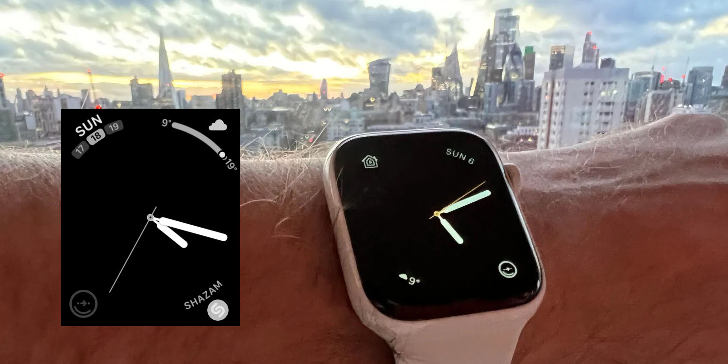
But I had a nasty surprise when I updated my Watch. Instead of that very minimalist look, the watchOS 9 complications are far from minimalist.
I’m sure they look great in some watch faces, but definitely not in the most pared-down Simple face. Instead of a simple day and date, there’s now three tiles with today’s date in the middle. Why?
What was a simple weather icon and a temperature now has a bigger icon and a curved bar with the temperature range for the day.
Top comment by PurpleApple
Shazam now has the icon plus text – like I’m going to forget the meaning of one of the four complications I’ve chosen to display permanently.
CityMapper has been left alone, but only, it appears, as a result of a bug. The icon is grayed-out (though it does still open the app when tapped).
Please, Apple, give back my minimalist complications. At the very least, give me the option to choose between simple and complex versions.
What are your views? Please let us know in the comments.
FTC: We use income earning auto affiliate links. More.


Comments