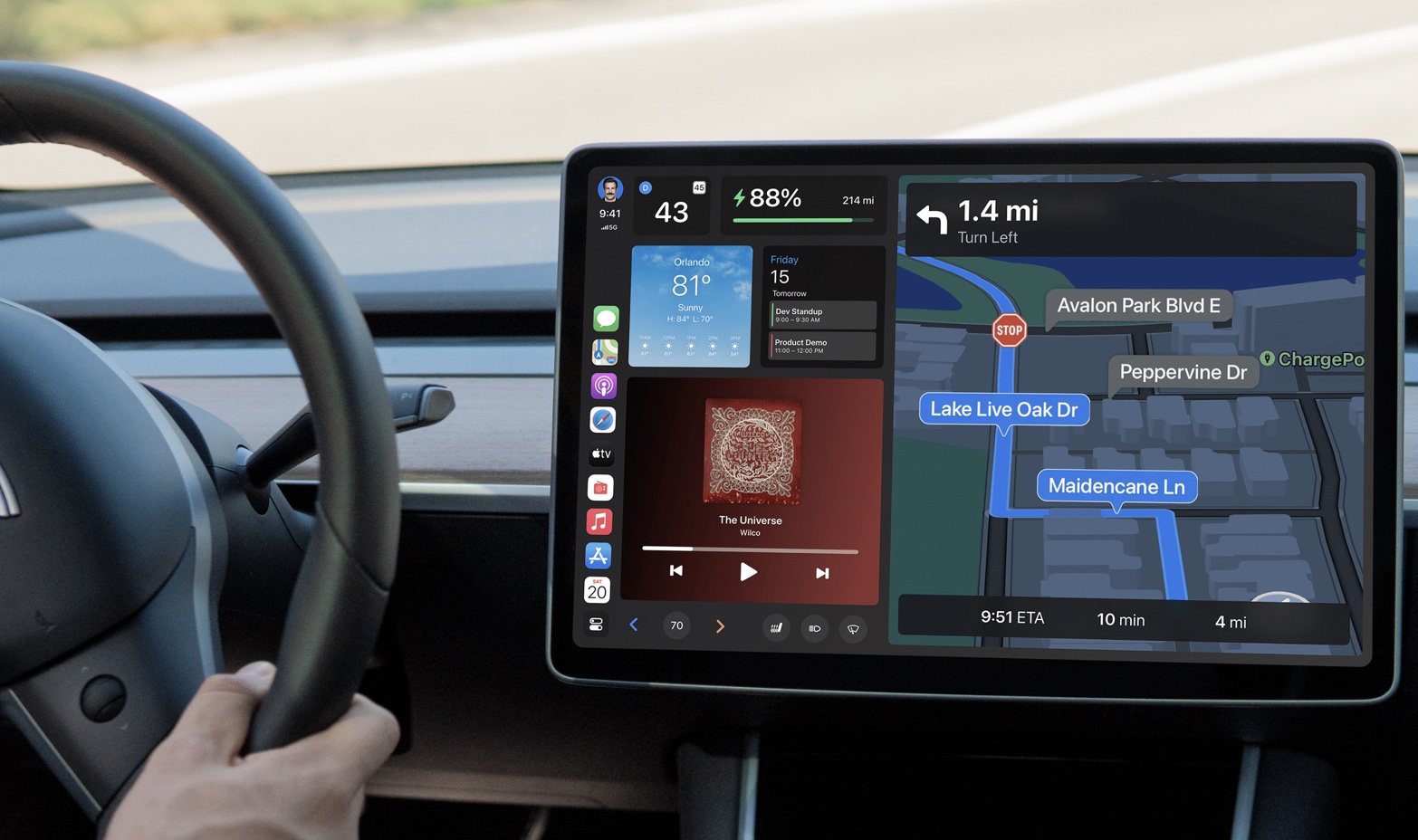
After sharing a sharp concept last year imagining what the future of CarPlay could look like in a Tesla Model 3/Y, designer John Calkins is back with another vision, this time a “modular, customizable layout.” Check out a closer look at this Tesla CarPlay UI that includes elements from the next-generation CarPlay Apple has teased.
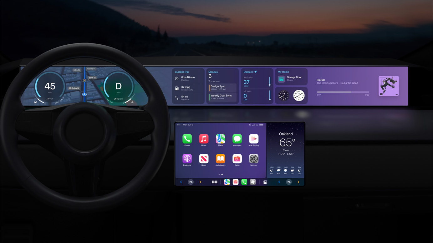
In the time since John shared his previous “Autos” concept, Apple actually previewed the “next generation” of CarPlay at WWDC 2022. While it was vague overall, the company shared some renderings of what it may look like when the first vehicles to use it are announced in late 2023 plus details around CarPlay being more customized for vehicles.
Apple also shared that the future of CarPlay will let users “personalize their driving experience by choosing different gauge cluster designs, and with added support for widgets, users will have at-a-glance information from Weather and Music right on their car’s dashboard.”
In the spirit of a modular, customizable CarPlay experience, John shared a new concept of what that could look like in a Tesla Model 3/Y (though the reality of it happening is not likely).
Here’s a look at some of the renderings from John’s Behance post titled “CarPlay is Coming.”
The app sidebar on the left remains from John’s previous concept, but the new UI includes content from Apple’s WWDC CarPlay tease like the trip meter, HomeKit tile, calendar, and more. Here are four different configurations with the modular design.
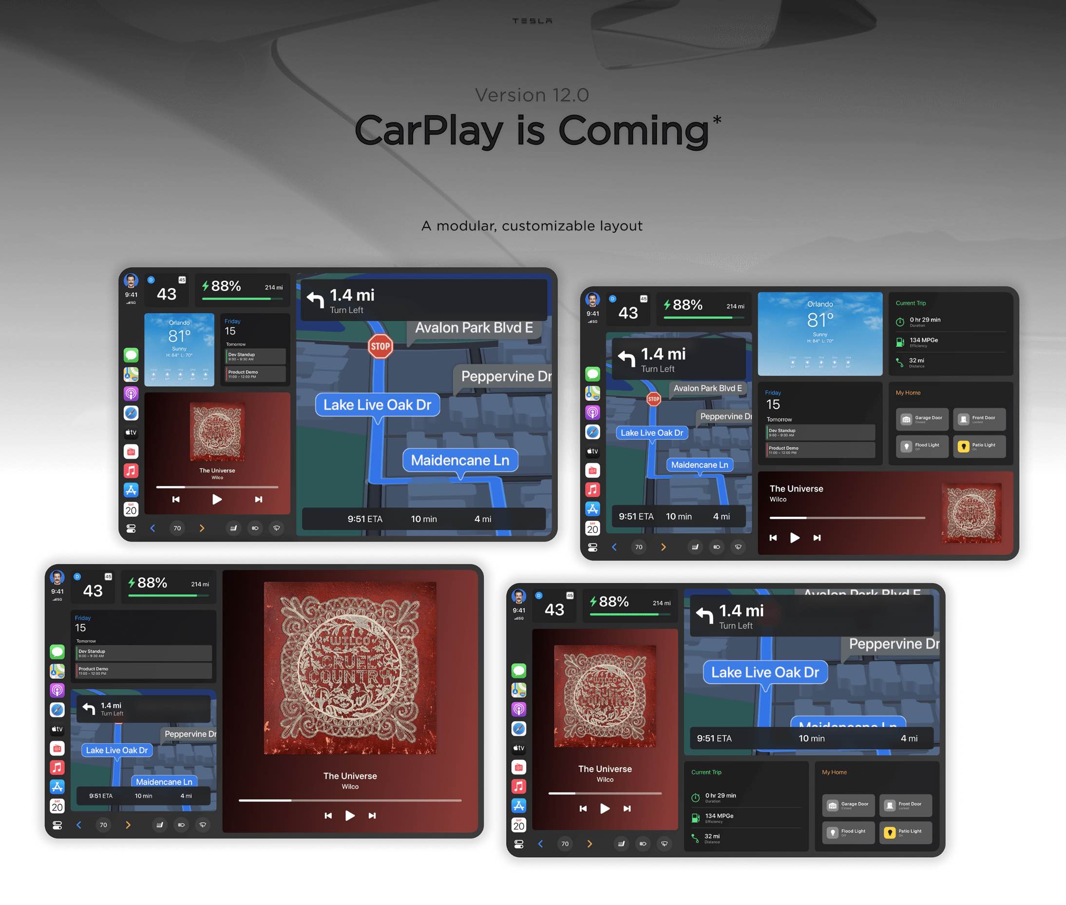
The top left corner shows the current driving speed (or P/R) with the battery status next to it. Climate controls are in the bottom left corner.
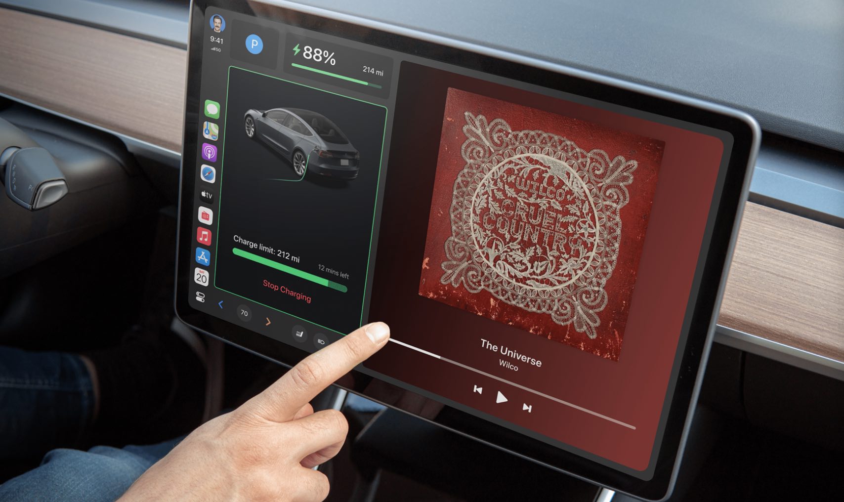
The concept includes one image of what it would look like to bring in Tesla-specific UI elements like the charging screen:
Top comment by Carnies Rubes
Why would Tesla give up control of the entertainment stack to another company? Way too much room for monetization to cede control.
Something not seen in the concept is what it would look like to include Tesla’s live camera and ultrasonic sensor visualizations with the CarPlay UI.
But here’s a closer look – with Ted Lasso and company – at what Apple’s apps could look like on a 15-inch Tesla 3/Y center screen.
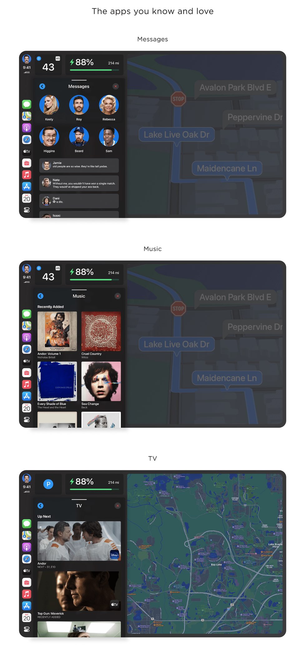
Check out John’s full concept here and you can see more of his work on his website.
And if you’re curious about how to try out CarPlay in your Tesla, there are a couple of options including a browser workaround and third-party add-on displays.
FTC: We use income earning auto affiliate links. More.


Comments