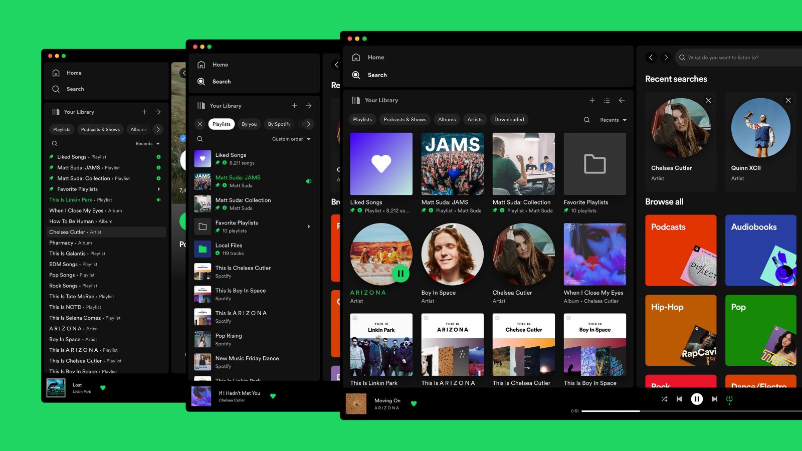
After rolling out a major update to Spotify for iPhone earlier this month, Spotify is now updating its desktop app for Mac a new navigation interface. In a blog post today, the company announced a new “Your Library sidebar” that it says is more customizable and makes it easier to access your Spotify collection.
Spotify for Mac’s all-new sidebar and navigation
“The new Your Library sidebar improves the collection and retrieval of all types of content, bringing new features to desktop that you’re already familiar with in the mobile app,” Spotify says. “The new sidebar is also more customizable than before to meet different preferences.”
The new sidebar lets you access all of the content from your Spotify library, including artists, playlists, albums, podcasts, and more. You can customize the order of what appears in the sidebar, pin your favorite content, and more.
The new sidebar also features “flexible sizing,” according to Spotify. “You can hover over and click on the right edge of the sidebar to drag it to your preferred width,” the company says. “You can also fully expand the sidebar by clicking the arrow button at the top, and fully collapse the sidebar by clicking on the ‘Your Library’ heading to see only art covers.”
Here’s a full rundown of what Spotify says you can expect from the new Your Library sidebar on the Mac, Windows, and web:
- See your entire collection and all of the content types (not just playlists)
- Filters for your collection (Playlists, Artists, Albums, Podcasts) that can be combined with other filters (By you, By Spotify, Downloaded)
- Sort options for your collection (Recents, Recently Added, Alphabetical, Creator, Custom Order)
- Chosen filters and sort options will be remembered in the sidebar across restarts of the desktop app
- Search through your collection in the sidebar
- Pinned library items to find your favorites, faster – current limit is 4 (Playlists, Playlist Folders, Artists, Albums, Podcasts)
- Art covers are now shown in the sidebar
- Compact library layout (no art covers) is available as an option in Settings to increase content density
- Dedicated + (plus) button to create Playlists and Playlist Folders
- Flexible Sizing: A collapsed library view (with only art covers) to maximize the browsing area, a regular width view, and an expanded view for more focused library management and curation. (you can also drag to customize the size)
- In the expanded library view, you have options for either a list view, or a grid view. The list view shows you more details in 2 columns, Date Added and Last Played, and the grid view allows you to see larger art covers.
- Playlist Folders can still be expanded into the sidebar in a tree view, and now when you click on them, the sidebar only shows the Playlist Folder and what’s inside for a more focused view.
- Menu option to move a playlist to a folder (with search)
One difference that Spotify does point out is that you can no longer view the Your Library page in the main browsing interface like you could before:
Unfortunately, the old Your Library page in the main browsing area is being discontinued with the release of the new Your Library sidebar. You can adjust the size of the Your Library sidebar to be bigger and you can also enable the “grid view” if you would like to see bigger art covers.
The new Spotify interface is rolling out starting today on the Mac, Windows, and web. You can learn more in Spotify’s full announcement post on its website.
Follow Chance: Twitter, Instagram, and Mastodon
FTC: We use income earning auto affiliate links. More.


Comments