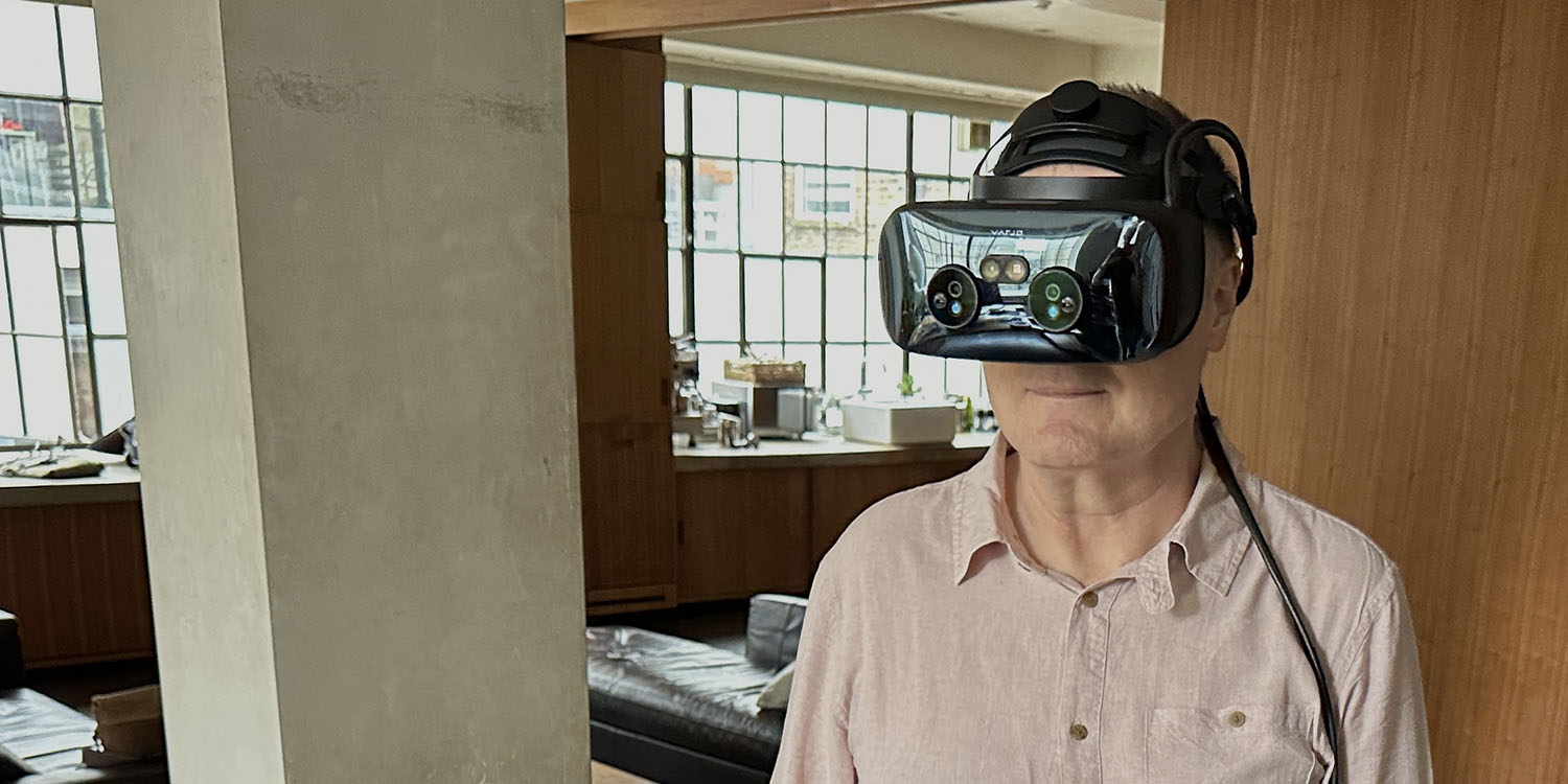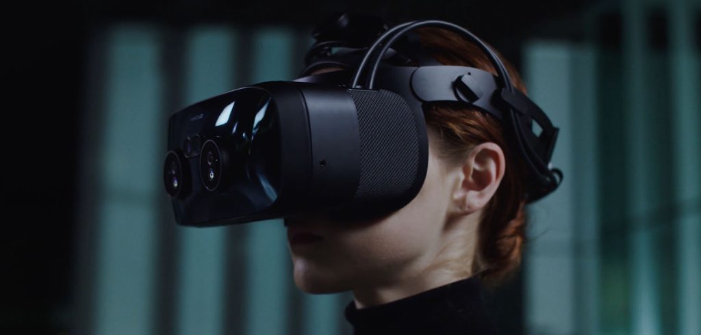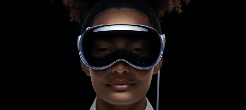
There aren’t many cases of another company charging more than Apple for a similar product, but the Varjo XR-3 mixed-reality headset is a rare example.
Not having been one of the chosen few to be invited to try Vision Pro (was it something I said?), I took advantage of an invitation to try what Varjo believes is the most advanced mixed-reality device available. In particular, I wanted to see whether it could change my view of the tech as something that doesn’t yet justify the steep price-tag when it comes to my own needs …
This story is supported by Mosyle, the only Apple Unified Platform. Mosyle is the only solution that fully integrates five different applications on a single Apple-only platform, allowing businesses and schools to easily and automatically deploy, manage, and protect all their Apple devices. Over 38,000 organizations leverage Mosyle solutions to automate the deployment, management, and security of millions of Apple devices daily. Request a FREE account today and discover how you can put your Apple fleet on auto-pilot at a price point that is hard to believe.

The Varjo XR-3
The Varjo XR-3 has a few things in common with Vision Pro. There’s a very strong focus on mixed reality, rather than the pure virtual reality tack of most existing headsets. It is hugely more capable than consumer-oriented devices like the Meta Quest 2 (and upcoming Quest 3). It has very similar resolution. And it’s very, very expensive.
There are, however, also many differences between the Vision Pro and XR-3 – of which the biggest is that the former is a standalone device, while the latter is tethered to a powerful PC.
That’s because Varjo is solely targeted at the business and government sectors, which want the maximum possible performance – and compatibility with existing industrial design software. The company doesn’t even attempt to sell the XR-3 to consumers.

Design
It has to be said that the XR-3 isn’t going to win any style awards when compared to the Vision Pro. It looks both chunky and geeky, compared to the sleek lines of the Vision Pro. There are definitely no cute/creepy eyes on this device!
But you don’t spend any time looking at the outside of it…
Comfort
When I plan a written piece in advance, I tend to at least put in place headings – even when I have no idea what will follow them. In this case, it seemed obvious that I was going to want to address the comfort of the headset. Only…
Despite having worn it for three separate demos in the course of 45 minutes or so, I really can’t tell you much about the comfort. That’s because the actual experiences were so completely immersive that I didn’t have any spare attention dollar to spend on thinking about the weight or feel of the headset.
That’s not to say that it’s so comfy you’d never have to think about it. Varjo tells me that a typical session is around 30 minutes, and that if you wear it for significantly longer, then fatigue can be an issue. The company said that military pilots sometimes use it for two hours per session, but these are people used to wearing flight helmets for hours at a time.
Using the Varjo XR-3
So let’s talk about the experience. I got to try three very different sessions with the device: one pure VR; one interactive AR; and one non-interactive(ish) AR experience.
Pure VR: A virtual home
The first – the pure VR experience – was a walk through a virtual house. The one seen above is a different model to the one I tried, but it gives a sense of the level of realism.
Walking around the home was my first big learning point about this tech. Namely, that physically moving in a virtual environment is great… but also greatly overrated.
To explain: It was entirely possible to physically walk through the virtual house. That is, when the entrance was in front of me, I could physically step forward, and I would walk through the virtual doorway – and then continue to walk through the home.
This is cool – there’s no doubt about it. The connection between the physicality of the real world, and the experience of the virtual world, does feel quite magical, and does initially enhance the realism of the experience. But…
When the experience itself is so immersive, that connection quickly becomes irrelevant. And in a pure VR setting, actually distracting, as you can’t see when you’re about to walk into a wall, or worse! I had someone to take care of that, but even his warnings proved a distraction, as I didn’t think I was facing the way he was telling me I was in the actual space, so it mentally pulled me out of the virtual world.
The alternative form of navigation was to point the controller at the spot on the floor to which I wanted to move, and click the trigger. I’d then get teleported there, whether it was a few feet in front of me, or on another floor, or even the other side of a window or wall. Once I was used to this, it felt just as natural (especially when only moving a few feet), and completely freed me from the need to think about the physical world outside the simulation.
I can now fully understand why Apple chooses to limit your physical freedom in a VR experience to a 10×10 foot box: It’s really not the drawback you might think it is.
The visual experience did have about a 5% feel of animation to it, but it felt 95% real. I really did feel afterwards like I’d walked through the home. Indeed, it was somewhat disorientating to remove the headset and see that the home was no longer there.
I said that this would be an incredible way for a client to experience an architect’s vision for a new-build home or a remodeling, but Varjo was careful to point out that the virtual home I had explored was an incredibly detailed model that took months of work. The reality for most architects would be a simpler visualization.
This is another example of how VR can be used to show home remodeling:
Interactive AR: A multi-layered human body
Next was a skeleton. Or a man. Or anything in between.
The model was of a human body, which let me add and subtract layers. I began with a skeleton, and was able to add muscles, then organs, then the central nervous system, then skin – or the other way around.
Each layer can be switched on and off, either using a virtual control panel, which I touched with my fingers, or a second control panel activated by facing my palm toward me, resulting in an iPhone-sized screen appearing in it, which I could press with the fingers of my other hand.
Because this was an AR experience, the skeleton and/or body appears suspended in mid-air, and I could walk all the way around it, to view it from any angle. I could also walk right up to it, and peer closely at any element. This felt incredibly real, like it really was there, and nothing at all like zooming in on a digital device.
The experience was very true to life, with both the viewing from different angles, and getting closer or further away, feeling very natural, and the detail accurately reflecting what I’d expect to see.
Oh, and I could reach in and remove organs, to then examine them in more detail. As you would. I reached out my hand, through the rib-cage, and closed my hand around a lung. It turned green to indicate that it had been successfully selected, and I was then able to extract it from the body and turn it around in my hand, to examine it from different angles. Cool. Also: eww!
The AR model also has an extra, uh, layer of realism: When I moved my hand behind the body, my hand was hidden from view by the model, just as would be the case in real life. This was somewhat glitchy, and would definitely need more work to feel real, but it’s a great indication of the sort of realism to come.
I did find both sets of virtual controls to be a little flakey, and I think this highlights one of the things Apple has to get right. If you touch a button, it needs to Just Work, rather than having to poke at it multiple times, or have the button next to it activate instead.
But that aside, the power of this type of educational experience speaks for itself. This type of tech is already being used by Varjo clients to train surgeons, for example.
Non-interactive AR: Concept car
Finally, I got to walk around – and into – an Aston Martin DBX, the SUV that doubles as a 700-horsepower sportscar. This was again an AR experience, so the car was situated inside the physical room in which I was standing (a spacious studio).
Aston is using this model as a car configurator, so that customers can get a full 3D experience of the options they are considering for their purchase. Given the value of the model as a sales tool for a very expensive car (starting at $192K), it’s not surprising that the company has put a huge amount of work into the model.
I did experience a few glitchy moments, where the car jumped in space a little, but 99% of the experience was super-smooth, and the detail is truly incredible. I could get up close to look at the stitching of the seats, for example, or step back to see the paintwork – which had actual reflections of the real room in which I was standing!
This model isn’t interactive. The doors can be opened, to allow me to move inside the car, but that has to be done by the dealer, at the PC. That felt slightly disappointing after the interactivity of the skeleton.
But that aside, the experience was truly mind-blowing. There was a concrete column in the room, and looking back and forth between the real column and the virtual car, it was almost hard to tell which was real and which wasn’t.
In a way, it felt a bit too real!
The illusions were very convincing. Intellectually I of course knew what was real and what wasn’t, but then I got close to a very comfy-looking sofa in the virtual home, it did feel very tempting to try to sit down in it!
Similarly, with the Aston, when I was in the driver’s seat, my brain was half-persuaded that I could sit back and turn the steering wheel.
But the most interesting moment was actually immediately after my XR-3 experiences, when I took off the headset and sat in a real sofa for a chat about the tech. I went to place my glass of water on the table in front of me, and… hesitated! I didn’t quite trust that the table was real!
I’m told that this kind of disorientation does wear off once you get used to switching between real, augmented, and virtual worlds, but to me it said a lot about just how visually persuasive it is.

How does Varjo think Vision Pro compares?
I asked the company for its own take on how the XR-3 compares to the Vision Pro.
A different market
Varjo said that a key difference is the target market. The Finnish company is selling to high-end enterprise teams, who are already using their own PC-based design apps, flight simulation software, and so on. The XR-3 is then used to provide a more immersive view of models created in these existing industry-standard apps.
The XR-3, then, is tethered to a powerful PC, and is effectively “just” a 3D output device. For Varjo customers, the tethering is a perfectly acceptable compromise for the power and compatibility.
Vision Pro, in contrast, is a fully standalone device, designed to run its own apps, including existing iPad AR ones. This means that it won’t run the standard apps used by design studios and so on. Varjo says it’s unclear exactly who Apple is targeting (more on this in a moment), but it isn’t the company’s own market.
I’d initially suspected Varjo of putting a brave face on Apple muscling in on its action, but I do now think the company is right: Vision Pro isn’t a direct competitor.
Display quality
As for spec comparisons, there is some guesswork involved, as Apple hasn’t shared all of the details. For example, with passthrough, Apple hasn’t given full details of the external cameras used to display the real world, but Varjo says it appears that the Vision Pro cameras are around 5MP, while the XR-3 ones are 12MP. That likely means that the real world will look less detailed in Vision Pro than it does on the XR-3.
In terms of resolution, Apple says each of the twin displays is 4K. Varjo says that a direct spec comparison is tricky, because what both companies do is to ensure that what you are looking at is sharp, while things in your peripheral vision are rendered at a lower resolution – until you look at them.
Vajro says the way it looks at this is to consider the number of pixels per degree of view. In other words, if you were to take a 1º slice of the centre of your view, the XR-3 has around 62 pixels per degree.
Apple hasn’t given comparative figures, but 4K displays would mean that on average across the entire display, Vision Pro has around 40 pixels per degree. But, crucially, we don’t know how Apple will split resolution between central and peripheral areas. Varjo does, though, think it has the edge here.
Power
Varjo relies on high-end PCs to run the actual models, and thinks that Apple’s own apps won’t be able to compete, because they need to run on the headset, meaning that power is constrained by both the chipset and thermal headway – Vision Pro can’t be allowed to get as hot as a PC!
But I do think competitors shouldn’t be complacent here. We’ve already seen the way Apple Silicon Macs have left other PCs for dead, and what would once have been seen as a mid-powered device – like the 16-inch MacBook Pro – is now directly competing with the Mac Pro.
So while Varjo may be right that it will lead on power and apps, there may yet be surprises in store!
Conclusions
As I mentioned at the outset, I haven’t yet had the chance to try Vision Pro, so can’t give a comparison between the two. Additionally, I used the XR-3 for less than an hour in total, so this is in no way intended as a review of the device.
My goal here was simply to get a sense of what it’s like to use a very powerful mixed-reality headset, and whether it in any way changed my view that this is incredibly impressive tech that I won’t be buying for several years yet.
Let’s start with that first question: What is the experience like? The short answer is: incredible! While you can tell the difference between reality and simulation, the gap between the two is a lot slimmer than I’d expected from my limited experience to date of Quest-level headsets.
I can see this tech revolutionizing all kinds of work – and not all of it obvious. For example, it could enable a jury to walk around a crime scene, without having to be physically transported to the location. I’ll write a later piece outlining some of the uses I could see for Vision Pro.
The second question: Do I still expect to wait several years before buying an Apple Vision product? Yes. I mean, I want one now. I really, really want one! This level of immersive experience is hugely enjoyable, and borderline addictive. If I could afford to casually lay out $3,500+ purely for the fun of it, I would.
But to me, there are many other things I can do with that kind of money. Spend a month or two in Buenos Aires, to pick a random example. The point when this becomes compelling to me is still some considerable way off.
I’m very glad to have experienced the XR-3, and I’m very much looking forward to whenever I’ll get the chance to try Vision Pro. But my wallet remains safe for now.
FTC: We use income earning auto affiliate links. More.


Comments