I’ve been using the iOS 17 developer beta for a few weeks now, and been meaning to write a roundup of the features I’ve found most useful. I will get around to that, but there’s one which stands out to me – and that’s StandBy.
Apple’s primary intention with this right now is to turn the iPhone into a handy nightstand clock, but this isn’t the only way to use it …
What is StandBy?
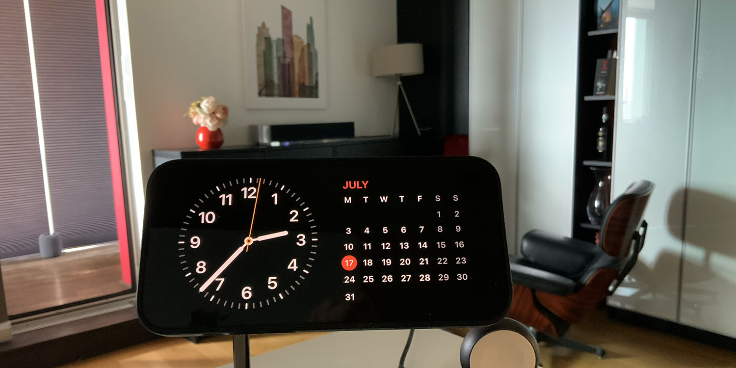
StandBy is a new feature in iOS 17. When your iPhone is switched off, and you place it on a charging dock in landscape orientation, a new display appears.
This comprises two large widgets, on left and right. StandBy defaults to a clock on the left-hand side and a calendar on the right, but you can customize these to your tastes.
Just today, Macworld ran a piece which argued that the feature is giving us a sneak peak at plans for a future Apple product, and I think that’s a smart take.
Using StandBy to reduce distractions
I do use StandBy as a nightstand feature, and it is useful in that role – especially for those like me, who barely know what day of the week it is when we first open our eyes in the morning. But I’ve found another use for it.
A lot of the time, if I’m relaxing at home, listening to music, or reading, my iPhone will be by my side. Mostly, I just have it there to keep an eye on chat notifications. But … it can be distracting. It’s very easy to just mindlessly pick up my iPhone for no particular reason, then get lost in something.
Five years ago, I reduced the temptation by putting my phone on an app, notifications, and app badge diet.
I decided initially to try a ‘notifications diet’ – dramatically cutting back on the number of apps allowed to send me notifications. But as I started going through the list in Settings, I realized I also had apps I never use [so I zapped those too]. I’ve also switched off badges on most apps.
The one thing I don’t want to miss are messages, so messaging apps got to keep the app badges (with some chats muted). Temporary banners alone are too easy to miss in my peripheral vision.
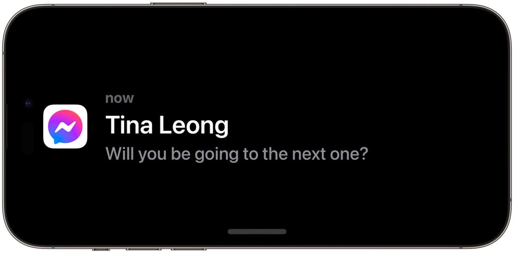
But I’ve found StandBy is perfect for this. When a message arrives, it’s displayed full-screen, with the actual message content:

That’s easily a big enough visual change to catch my eye, and because it displays the message itself, I can just leave it be when it’s purely informational.
So if you’re looking for a way to cut down on distractions or screen time at home (I don’t count my Kindle!), I can highly recommend giving StandBy a try.
FTC: We use income earning auto affiliate links. More.


Comments