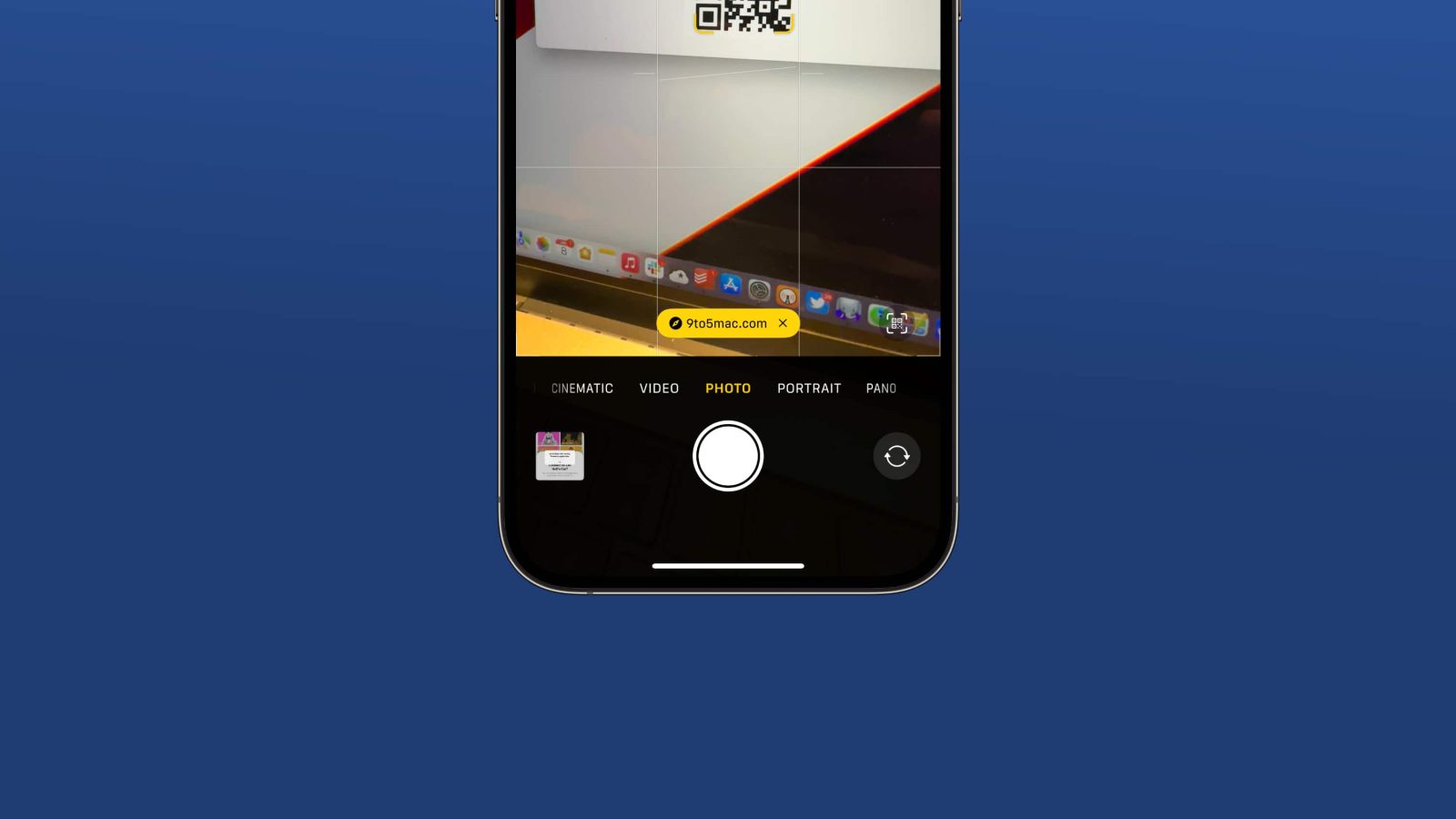
iOS 17 includes a small but much-needed change to the process of scanning QR codes via the Camera app. With this year’s update, the button that pops up when you scan a QR code now appears at the bottom of the Camera app, right above the shutter button, and it doesn’t move…
This story is supported by Mosyle, the only Apple Unified Platform. Mosyle is the only solution that fully integrates five different applications on a single Apple-only platform, allowing businesses and schools to easily and automatically deploy, manage, and protect all their Apple devices. Over 38,000 organizations leverage Mosyle solutions to automate the deployment, management, and security of millions of Apple devices daily. Request a FREE account today and discover how you can put your Apple fleet on auto-pilot at a price point that is hard to believe.

When Apple introduced support for scanning QR codes with the Camera app on iPhone in iOS 11, the popup would appear as if it were a push notification at the top of the interface. With iOS 13, Apple redesigned the interface to put a yellow button within the camera viewfinder itself. The problem? That yellow button would move around as you moved the camera around.
This design has been a sticking point for many users – especially as QR codes have rapidly grown in popularity since the pandemic. It is sort of like playing a game of cat and mouse trying to tap the QR code button.
In iOS 17, however, Apple has finally addressed this complaint. Now, when you scan a QR code, the linked button pops up at the bottom of the Camera interface, right above the camera shutter button. This makes it easy to tap with one hand, and you don’t have to chase the button as it moves around.
If I had one complaint, it’d be that the yellow button should be bigger and even easier to tap. Still, this is a step in the right direction.
iOS 17 is now out of beta and available to everyone, and you can learn more in our in-depth coverage of this year’s update. The update includes StandBy, interactive widgets, a completely revamped autocorrect engine, and more.
This is one of those small changes that’s going to be a big quality of life improvement. What do you think of the new design? Let us know in the comments.
Follow Chance: Threads, Twitter, Instagram, and Mastodon.
FTC: We use income earning auto affiliate links. More.


Comments