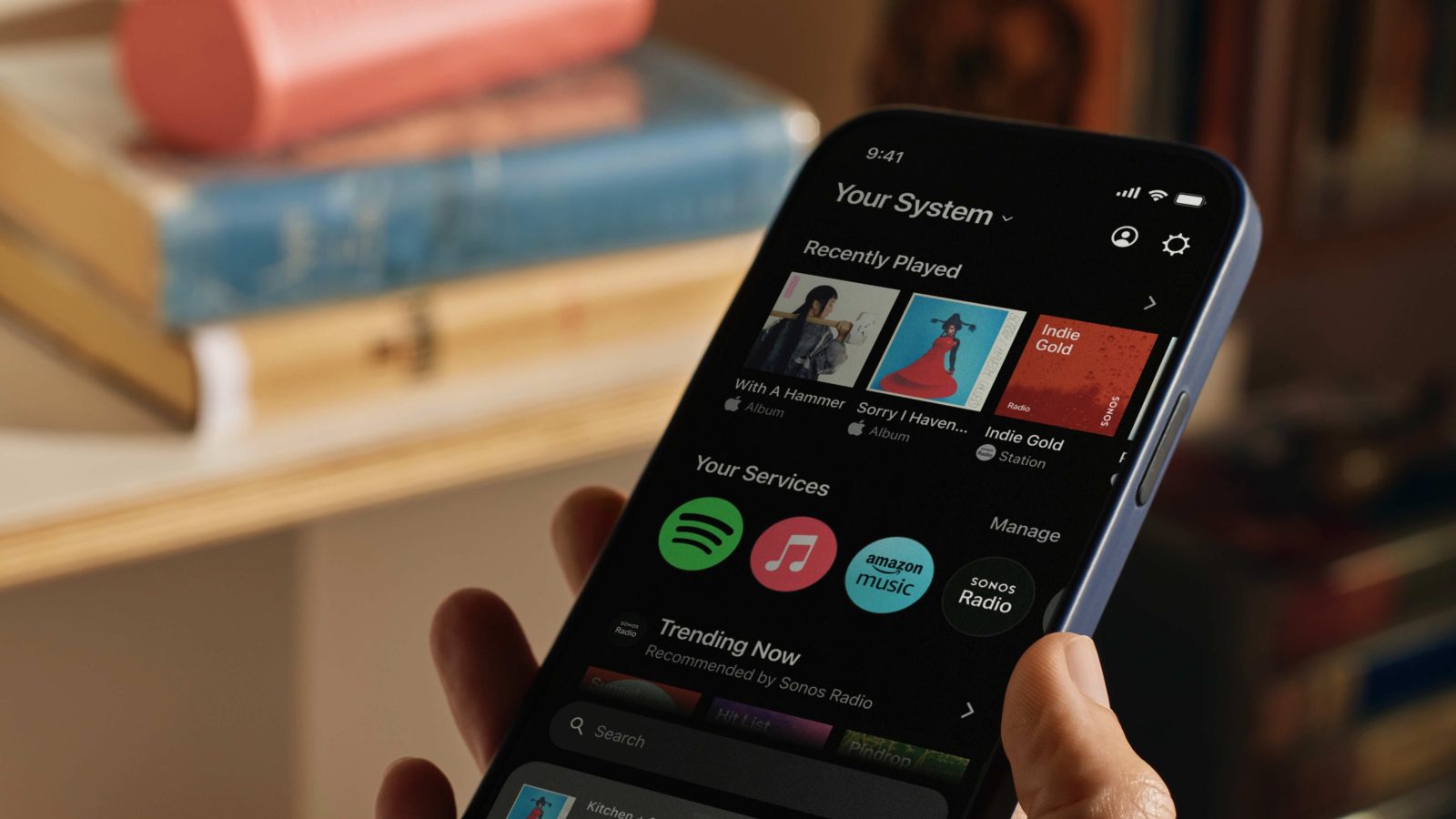
Sonos has revealed what it’s calling its “most extensive app redesign ever.” The new iOS and Android experience (plus web) does away with tabs and puts everything on a single Home screen that’s faster, customizable, has one search bar for all of your streaming services, features improved system control, and more.
Update 5/9/24: As it happens, Sonos has seen swift and intense backlash for removing many features and capabilities that long-standing customers value with this new update. You may want to wait to update if you haven’t already.
You can read about all the missing features and criticisms of the new Sonos app in this Reddit thread. Unfortunately, the app update also breaks accessibility for visually impaired users.
Sonos announced the upcoming major app update today in a press release with it set to launch on May 7:
“Today’s streaming experience has become fragmented across multiple platforms due to varied content offerings, algorithmic curation, or simply the desire to not recreate playlists in multiple locations,” said Maxime Bouvat-Merlin, Chief Product Officer of Sonos. “As the only audio brand with an open platform offering extensive choice, Sonos makes it easy to control your system and curate your favorite sounds all in one place. Our reimagined app delivers the industry’s most streamlined streaming experience by bringing a world of content and intuitive control to the Home screen.”
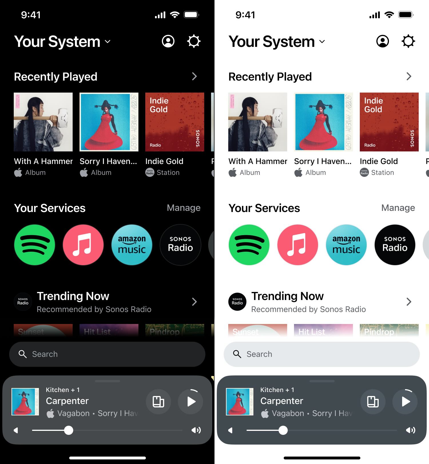
Here’s the overhauled Sonos app in dark and light mode on iOS:

New Sonos app features
The new app is built around four main features and benefits: access your music faster with a streamlined Home screen, “customize and curate” the UI to fit your needs, an easy-to-use search bar that has access to all of your streaming sources, and a simple swipe up from the bottom to get the improved system controls.
Here’s how Sonos describes its new app:
100+ streaming services, one Home screen
The redesigned Sonos app prioritizes a listening experience that’s human – allowing you to bring your true favorites front and center and giving you more control to make your streaming experience your own.
- Get into your music (and off the app) faster: No need to tap between tabs — the new Home screen serves up all your favorite content and controls, all in one place. Quickly jump back into your recently played, browse libraries and recommendations from your preferred services, and fill your home with music and all the sounds you love.
- Customize and curate: Enjoy unparalleled curation by designing your Home screen to reflect how you listen. Pin rows of your favorite content and services; then move, edit, or rearrange them to your liking.
- Search every streaming library: Look for an artist, song, podcast, or audiobook across all your preferred streaming apps at once via an easy-to-use search bar that’s always available right on your Home screen.
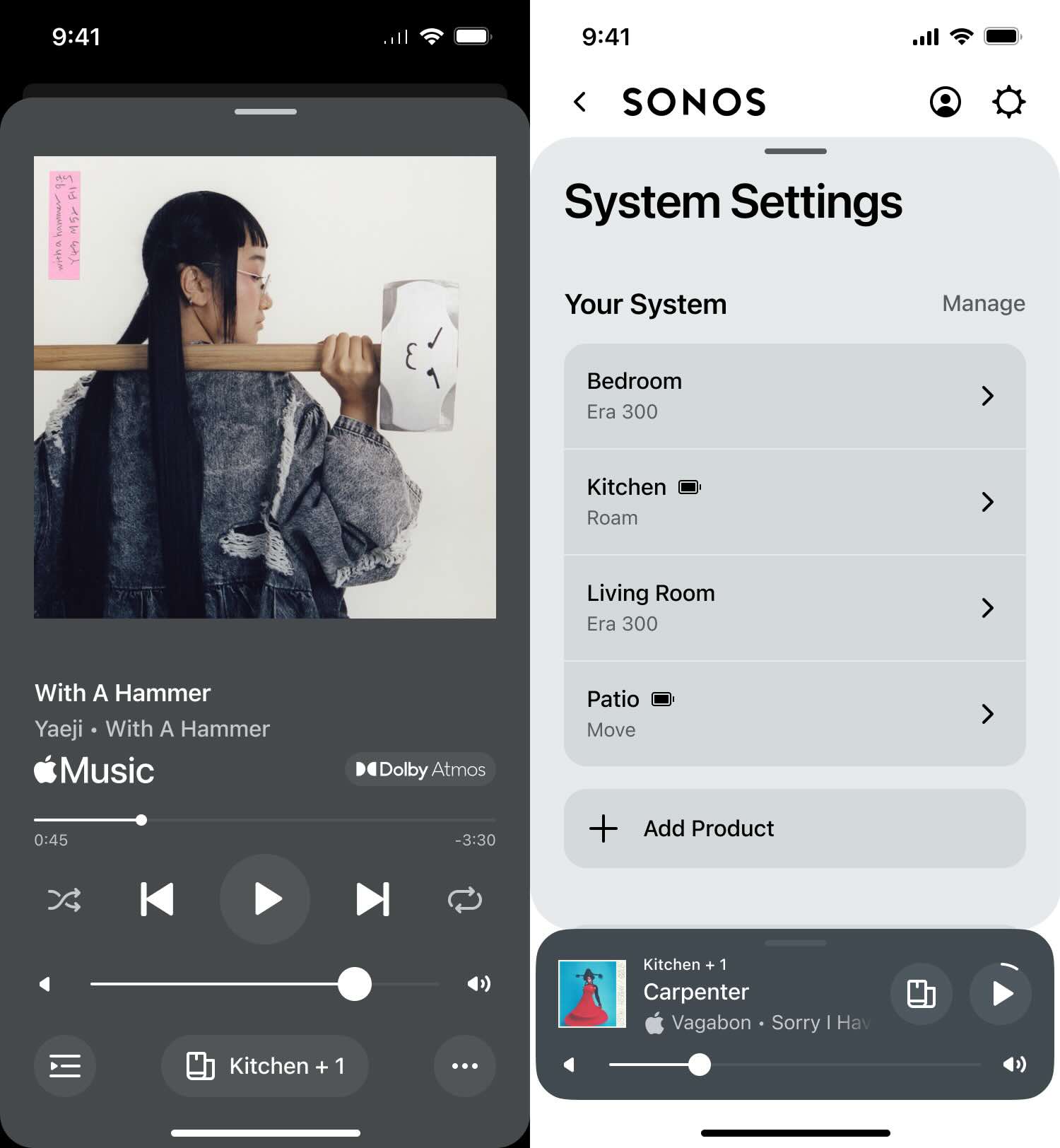
- Elevated system control: Swipe up from the bottom of your Home screen to seamlessly control your entire system and access a visual overview of what’s playing on each of your products, quickly group speakers, and dial in on the perfect volume from anywhere in the app.
Here’s a look at the new now playing screen on the left and the new system control on the right:

Sonos notes that the new web version of the streamlined app will replace the existing Sonos desktop controller. The new mobile and web experience will launch for all users on May 7.
What do you think about the app overhaul? Share your thoughts in the comments!
All images via Sonos
FTC: We use income earning auto affiliate links. More.


Comments