An interesting piece suggests that Apple’s AI logo* – along with the new Siri icon – is intended to look friendly, unthreatening, and is deliberately non-anthropomorphic.
*Yeah, that could be Apple Artificial Intelligence, or Apple Apple Intelligence. Thanks, Tim.
Other companies appear to have set themselves the same goals with their AI offerings, hence all the simple, colorful graphics …
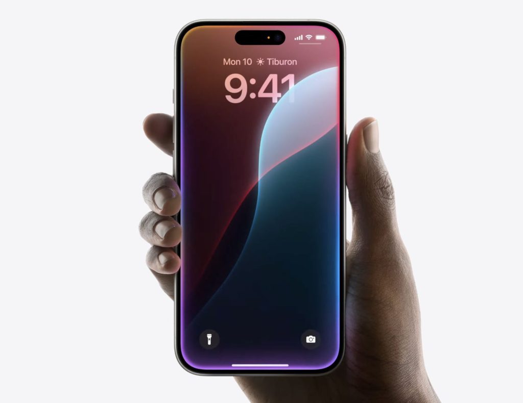
Apple unveiled two logos as part of its WWDC presentation: One for Apple Intelligence, the other for the new AI-powered Siri.
I was somewhat surprised by the decision. Since Siri is how we’ll access most AI features, I’m not entirely sure why Apple felt it needed two different logos – though they are very clearly part of the same family.
TechCrunch’s Devin Coldeway points to other AI logos, and notes that most have the same characteristics.
Although approaches differ to branding this purportedly all-seeing, all-knowing, all-doing intelligence, they have coalesced around the idea that the avatar of AI should be non-threatening, abstract, but relatively simple and non-anthropomorphic […]
Notice how four of the six (five of seven if you count Apple twice, and why shouldn’t we) use pleasant candy colors: colors that mean nothing but are cheery and approachable, leaning toward the feminine (as such things are considered in design language) or even the childlike. Soft gradients into pink, purple and turquoise; pastels, not hard colors; four are soft, never-ending shapes; Perplexity and Google have sharp edges, but the former suggests an endless book while the latter is a happy, symmetrical star with welcoming concavities.
Coldeway rejects potential accusations of over-thinking.
Think I’m overanalyzing? How many pages do you think the design treatment documents ran for each of these logos — over or under 20 pages? My money would be on the former. Companies obsess over these things.
His argument makes sense to me, especially the careful avoidance of anything suggestive of a person or a robot. OpenAI may have thought it was a good idea to reference Her during its recent presentation, but companies have mostly carefully avoided going down this route.
Oh, and I have to say, I absolutely adore the upcoming ‘colorful frame’ Siri animation!
All images: Apple
FTC: We use income earning auto affiliate links. More.


Comments