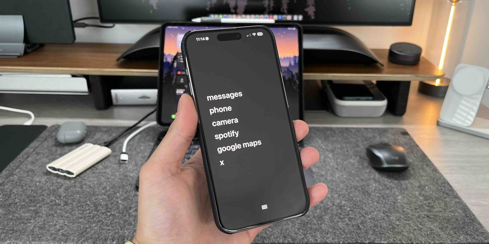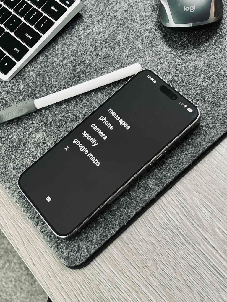
One of my favorite apps of the year is focusedOS. This app had one goal, and it was to reduce distraction during times of focus. It would basically put a block on apps that you chose and would not let you open them until you turned off that Focus. The same developer is back with another digital detox-style app called Dumb Phone, and I absolutely love the idea and how it was implemented.
One of my goals for 2024 was to really reduce the amount of screen time I have across my devices. I especially wanted to do this on the weekends to be more present and not let those pesky and insignificant notifications distract me. I have been a huge fan of companies like Lightphone. They made a dedicated phone that only gives you the essentials for communication and navigation, so distractions are limited, but you can still be reached when needed.
The Dumb Phone app does this but for your iPhone, and it works pretty perfectly.
What is Dumb Phone
Dumb Phone is designed to minimize cognitive distractions with a minimalist user interface. The goal is to make your phone a tool again instead of being a doom-scrolling device, which it is for many people. It also aims to reduce all friction for the apps and tools you choose to use by making everything reachable with one hand.


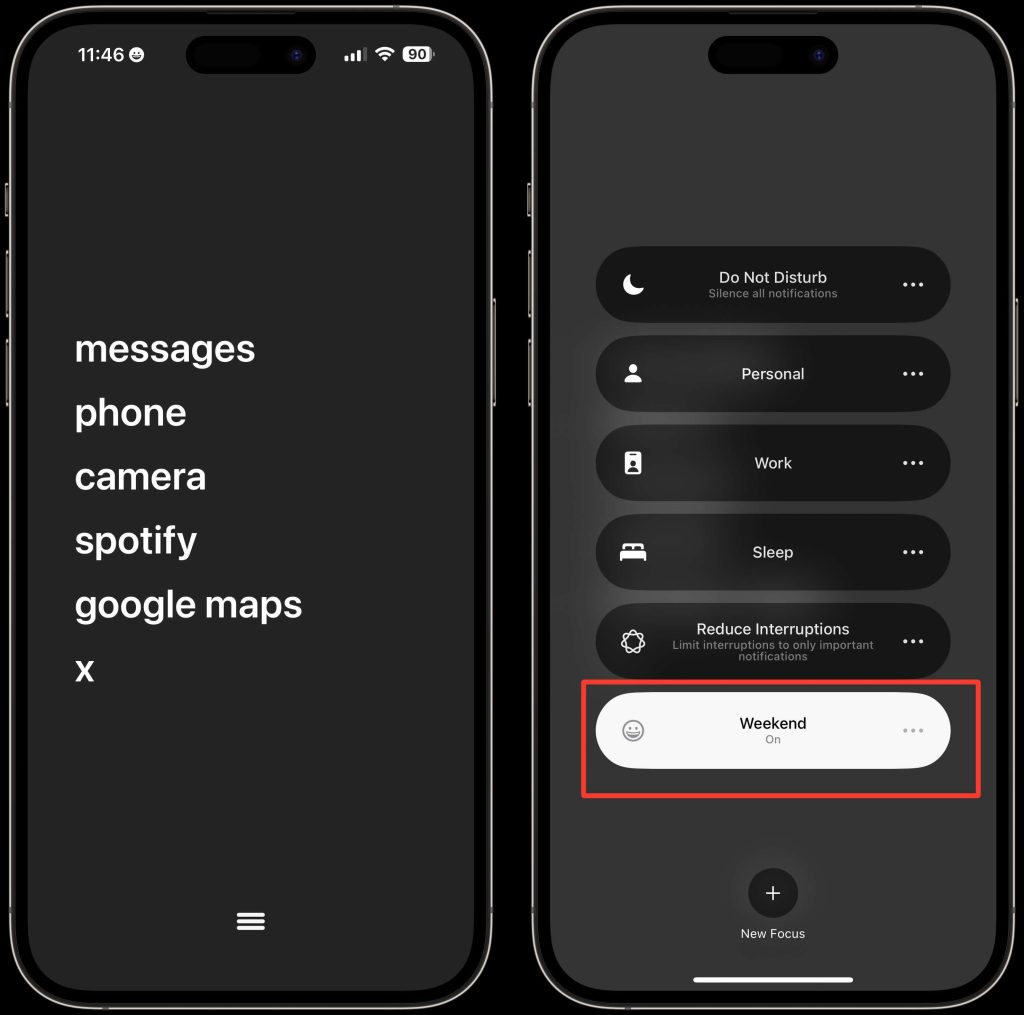
Setting up your Dumb Phone on your iPhone is very simple. There are how-to videos and get-started guides that are very easy to follow. What is happening here is that you are using the Dumb Phone app to create an interactive widget. You select one to six of the apps you want easy access to. Those apps get placed in a large widget. Then, you download the correct wallpaper (which is in the dumbphone app) to color-match the widget. This gives it that clean look, as if the words are just floating.
The last piece is the dock. Technically, you have to remove your dock apps from the dock. There is no way to remove them based on focus modes. This is an iOS limitation, not an app limitation. So, I just removed my dock apps and put the Dumb Phone app in the dock. That it was gives it that hamburger menu look.
As I said, if you follow the instructions in the app, you will be set up in less than 2 minutes!
How I use the Dumb Phone
Everyone’s needs and use cases for this will be different. Some people can use this setup all day, every day. While others will have this for certain instances. The way I am using this setup is for the weekend. I have a weekend focus mode, and when I turn it on, it turns my phone into a Dumb Phone!

The goal for me is to limit my distractions during family time. This has worked way better than I expected. The combination of the monotone colors, the lack of notification badges, and the friction added to get to other applications. All of that has made me use my phone so much less. But also, being able to access the camera, maps, or Spotify quickly still allows me to use my phone as the tool that it is.
Pricing, availability & final thoughts
Dumb Phone is available today in the app store. It is free to download and comes with a seven day free trial. So feel free to give it a shot and see if it’s something you would actually use. After the trial, it is $2.99 per month, $9.99 per year, or $24.99 for lifetime access.
Would you use something like this? Are you someone who uses their phone way too much? What are some of the changes you have made that have worked to reduce screen time? I cannot recommend this app enough if your goal is just to use your phone less. Let me know what you think!
FTC: We use income earning auto affiliate links. More.


Comments