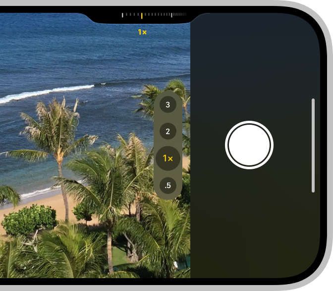
One piece of good news from the keynote is that the shiny new Camera Control button on the iPhone 16 will also be made available to developers of third-party camera apps.
Apple has published its guidelines for developers, which give us some idea of what we can expect when supported by our favorite photo and video apps …
Sliders and pickers
Apple says that developers can use the slide functionality in one of two ways:
- A slider provides a range of values to choose from, such as how much contrast to apply to the content.
- A picker offers discrete options, such as turning a grid on and off in the viewfinder.
When it comes to adjusting zoom and exposure compensation, you can expect the UI to look the same as in Apple’s camera app, as the API makes these available as standard controls.
Standard symbols
Developers can’t create their own symbols for the picker options – instead, they have to select from those made available by Apple. For example, selecting the flash, or choosing a filter, will be done using symbols designed by the Cupertino company.
This should make it easier if you use more than one camera app.
It doesn’t sound like this should place to much constraint on developers, as Apple says there are “thousands” of symbols available.
Clean viewfinder images
Apple emphasizes that users like to have a clean view of the thing they are photographing or filming, with as few overlays as possible.
Apple points out that the Camera Button UI notch is specifically designed to take up as little space as possible, so anything that can be tucked away into this should be, rather than taking up space elsewhere on the screen.
In other words, developers should do this:

Not this:

Thoughtful placement of settings
When using the button for a picker, developers should ensure that the initial view shows the most-used options, and that other frequently-used ones should be placed slightly to the left or right, to make them as quick to access as possible.
You should only have to slide your finger all the way to the left or right for less commonly-selected functions.
9to5Mac composite using images from Apple and Олег Мороз on Unsplash
FTC: We use income earning auto affiliate links. More.


Comments