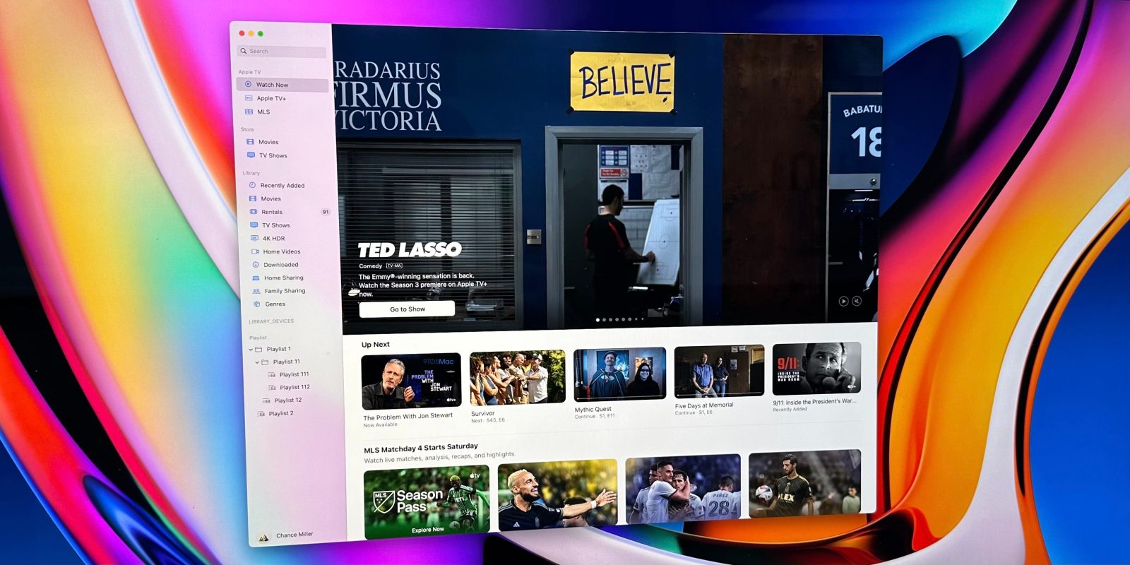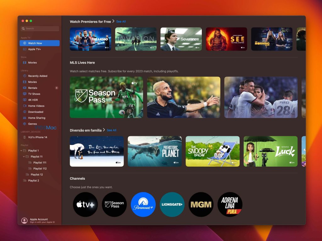
Apple is planning a redesign for the TV app on the Mac, 9to5Mac has learned. The redesign is included in the macOS 13.3 beta but is currently disabled. With a little bit of trickery, however, we were able to activate the new design and get a look at what’s new.
The primary change in this new design is the addition of a sidebar for navigation. This (finally) brings the Mac version of the TV app in lockstep with the iPad version, which added a sidebar with iOS 15.2. The sidebar is broken down into different sections for Apple TV, Store, Library, Devices, and Playlists.
The “Apple TV” section includes dedicated sections for “Watch Now” as well as Apple TV+. You’ll also see quick access to any Apple TV Channels to which your subscribed, such as MLS Season Pass, Showtime, or Starz.
The “Store” category gives you access to buy movies and TV shows via the iTunes Store. The “Library” category offers access to your previously-purchased content, rentals, home sharing, family sharing, and more.


Unfortunately, that’s about all there is to this new design. Those hoping for a major visual overhaul of the TV app will have to keep waiting. Nonetheless, the addition of a sidebar is a nice improvement to navigation throughout the app. Previously, the TV app offered just a tab bar for navigation at the top of the interface.
It’s unclear when Apple plans to ship this new TV app design to users. Again, it’s included in the latest macOS 13.3 beta but isn’t actually activated yet.
What do you think of this new design? What other changes would you like Apple to make to the TV app on Mac, iPhone, iPad, and Apple TV? Let us know in the comments.
Follow Chance: Twitter, Instagram, and Mastodon
FTC: We use income earning auto affiliate links. More.


Comments