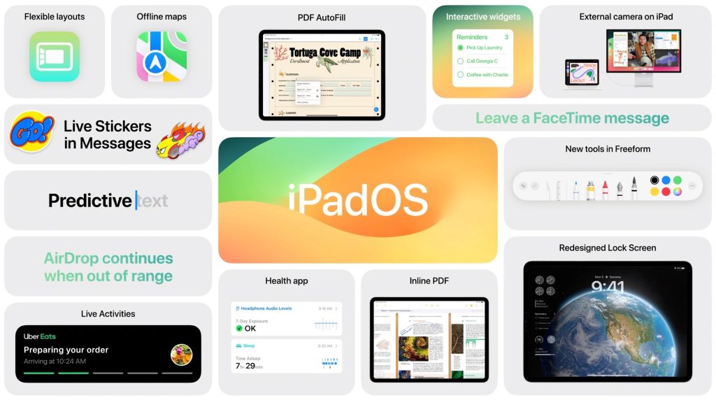
While much of the focus recently has been on iOS 17 and the iPhone 15, Apple also has a new update for iPad users that’s now available. I’ve been using iPadOS 17 on my iPad Pro, and there are two things that have stuck out so far.
This story is supported by Mosyle, the only Apple Unified Platform. Mosyle is the only solution that fully integrates five different applications on a single Apple-only platform, allowing businesses and schools to easily and automatically deploy, manage, and protect all their Apple devices.

Stage Manager updates
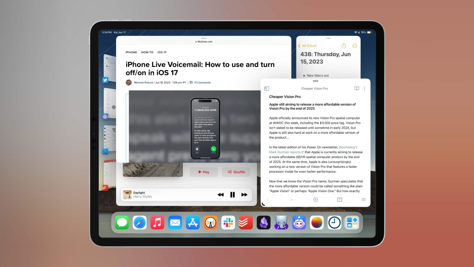
Apple unveiled Stage Manager as a new way to multitask as part of iPadOS 16 and macOS Ventura last year. While Apple only gave Stage Manager a passing mention during this year’s unveiling of iPadOS 17 at WWDC, it turns out the changes are actually quite well done.
The biggest change is that iPadOS 17 gives you far more freedom when arranging and resizing windows with Stage Manager. While there still isn’t as much freedom as on the Mac, it’s a far better system than what was offered in the initial version of Stage Manager. There’s considerably more flexibility and support for overlapping windows.
You can also Shift-click app icons to instantly add windows to your current workspace. This works from the iPad’s dock as well as via spotlight search. Honestly, this change alone is big enough to at least make the Stage Manager experience usable for me on iPad, let alone when combined with the freedom for resizing and placing windows.
The changes to Stage Manager in iPadOS 17 are so notable and so well done that it’s now a viable way for me to multitask on the iPad.
I also recommend checking out the MacStories write-up on Stage Manager changes in iPadOS 17.
More flexible Home Screen widgets
Apple brought Home Screen widgets to the iPad two years ago as part of iPadOS 15. This year’s update to the iPad brings more functionality and flexibility. First and foremost, widgets are interactive. This allows you to perform tasks like playing music, completing a to-do list task, and more without opening the corresponding app for that widget.

Image via @Willydoo on Twitter
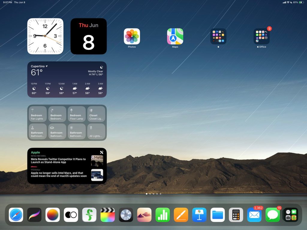
In addition to interactive widget support, iPadOS 17 also makes a big update to Home Screen customization. In iPadOS 15 and iPadOS 16, widgets could only be placed only around app icons and next to one another. For example, you couldn’t leave blank space between widgets and apps nor could you re-create the strip of widgets on the iPad Home Screen that many people enjoyed in iPadOS 14.
In iPadOS 17, however, this has changed. iPad users can now place widgets anywhere on the Home Screen for even more customization. This includes the ability to replicate the strip of widgets alongside the side of the iPad’s Home Screen.
The combination of added customization and interactivity for widgets makes them infinitely more useful. To me, interactivity for widgets is a far more useful change on iPad than it is on iPhone.
9to5Mac’s Take

If I had to sum up my first impressions of iPadOS 17 in a single word, I would say “flexibility.” Apple has finally removed some of the notable guardrails that previously restricted things like widgets and Stage Manager. It’s a big step in the right direction.
Top comment by Caesarrr
This –> “When I use my iPad Pro, I don’t want the macOS experience. I want the iPadOS experience, just with the power and flexibility of macOS.”
That’s the difference between iPad & Mac that makes so much sense.
iPadOS still isn’t as flexible as macOS, and it probably never will be. Slowly but surely, however, Apple is making changes that can help turn the iPad into a more robust and powerful platform for more people.
The end goal is that people can use the iPad without having to compromise their workflows as compared to what they do on the Mac. This doesn’t mean that iPadOS needs to offer every feature that macOS offers in the exact same manner. When I use my iPad Pro, I don’t want the macOS experience. I want the iPadOS experience, just with the power and flexibility of macOS.
In fact, the iPad should offer more flexibility than the Mac, given the focus on both touch and cursor input, different form factors, and cellular connectivity. We aren’t there yet, but the iPadOS 17 changes combined with the recent releases of Logic Pro and Final Cut Pro for iPad give me more hope than I’ve had in a long time.
Follow Chance: Twitter, Instagram, and Mastodon
FTC: We use income earning auto affiliate links. More.


Comments