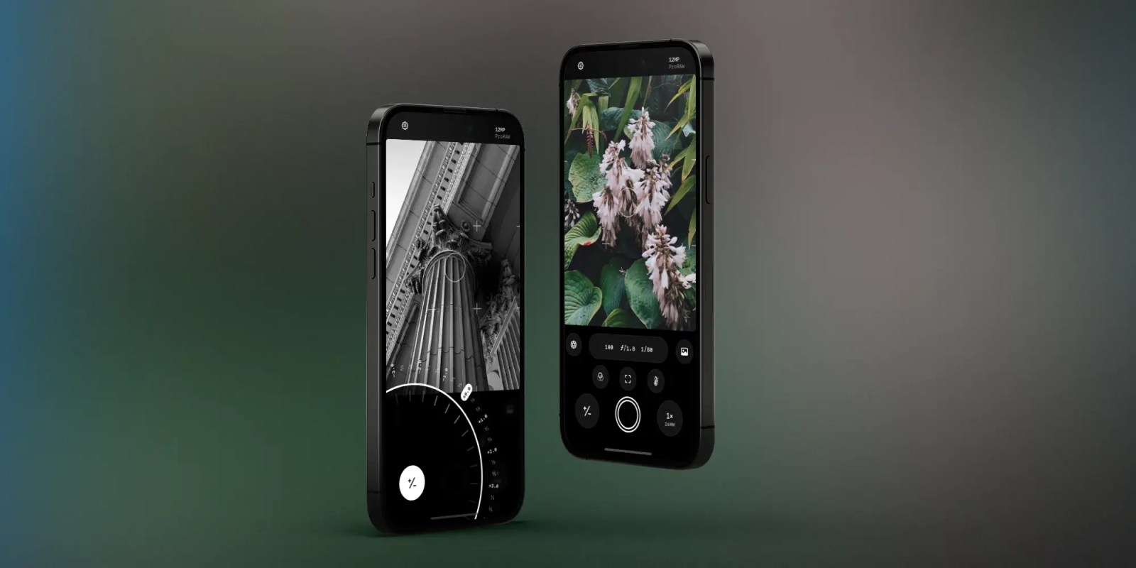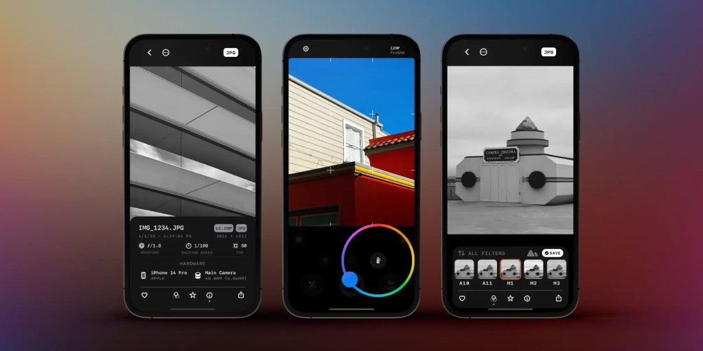
Developer Ben McCarthy is out with a new version of their excellent Obscura camera app for iPhone. Obscura is available via the App Store today with a number of new features, including interface changes aimed at making the app even more intuitive than before, easier access to your photo library, an iPad app, and more.
This story is supported by Mosyle, the only Apple Unified Platform. Mosyle is the only solution that fully integrates five different applications on a single Apple-only platform, allowing businesses and schools to easily and automatically deploy, manage, and protect all their Apple devices. Over 38,000 organizations leverage Mosyle solutions to automate the deployment, management, and security of millions of Apple devices daily. Request a FREE account today and discover how you can put your Apple fleet on auto-pilot at a price point that is hard to believe.

What’s always made Obscura really shine is how well McCarthy has struck the balance of packing powerful and pro-level features into an interface that’s accessible to anyone. Obscura 4 really does take this to the next level. The app has also been rebuilt almost entirely in SwiftUI, something that plays a huge role in the interface changes and optimizations McCarthy was able to make.
The goal of the Obscura design language is to make as many of the controls and tools within the reach of your thumb. In Obscura 4, there are a ton of design changes in line with that principle. The Focus and Zoom controls, for example, have swapped positions. As McCarthy explains, this change aligns with the fact that most iPhones now have multiple cameras and gives you easier access to zooming and changing cameras.
One thing that really highlights the attention to detail in Obscura 4 is the new Exposure Dial. It now adjusts in 1/3 stop increments, matching the behavior of most traditional cameras. A delightful part of this interface, however, is the haptic feedback you get when adjusting that setting.
Another point of focus for Obscura 4 is optimizing how you interact with your photo library. “You can drag your finger outwards from the photo library button (the rightmost control in the camera UI) to quickly scrub through your recent photos,” McCarthy explains. “It’s a super convenient way to quickly check that you just got the shot you were trying to get, without having to close the camera and open the library.”

There’s also more consistency between camera controls and their interactions. You can tap on a control to show details, use a gesture for quick access, and long-press on a control to reset it to the default settings.
The camera controls also now show changes in big and bold text over the viewfinder, giving you more detail on what exactly is happening while also keeping you focused on what you’re actually shooting. I found this change particularly useful as someone who’s very much a novice when it comes to camera controls and settings.
Building on the theme of giving users more context about what particular settings and controls offer, Obscura 4 also features redesigned Quick Settings that have clear labels.
The settings interface has also been simplified in Obscura 4, streamlining the experience and again focusing on improving the experience for the average users. The big change here is that the majority of preferences are now persistent across different camera modes.
Finally, Obscura 4 reimagines how you view and interact with image detail controls. “I did some wacky stuff with a regular modal card presentation, so it looks like it’s floating, and it expands to show more controls beautifully,” McCarthy says. “It’s a nice way to avoid covering the user’s image unless absolutely necessary, while still allowing for more UI for the users who need it.”
A change in business model

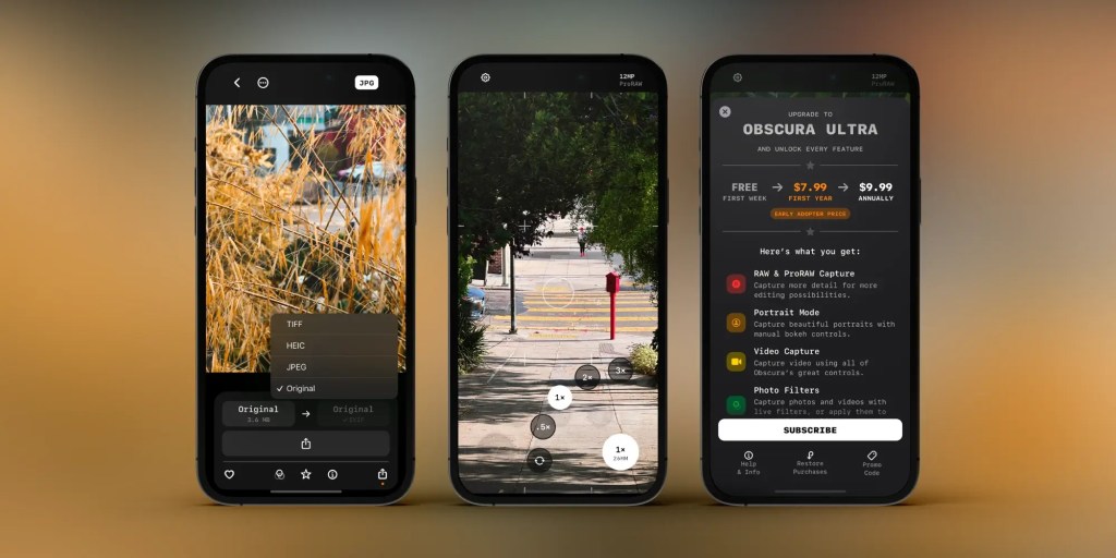
With the release of today’s update, Obscura 4 is now more accessible and available to a wider audience. Previously, the app was paid upfront, and each major version of the app was released as a new purchase. With Obscura 4, McCarthy has shifted to a subscription model.
What this means is that anyone can now download Obscura 4 from the App Store for free and access a number of the app’s features for free. You can then choose to upgrade to Obscura 4 as a monthly or yearly subscription. I’ve put the rundown of the free and premium features at the bottom of this story.
If you subscribe before September 11, you can lock in the annual subscription at $7.99, and it will renew annually at $9.99 per year. After September 11, new customers can subscribe at that $9.99 per year rate.
If you purchased Obscura 3, McCarthy is offering the first year of Obscura 4 at $4.99. One thing McCarthy also emphasizes is that Obscura 3 users will not lose access to any features they’ve already paid for and won’t be pressured to subscribe to Obscura Ultra.
The switch to a subscription model means that McCarthy can add new features to the app over time and make it a more sustainable and reliable business. The $9.99 per year pricing is very reasonable for an app as advanced and powerful as Obscura 4.
McCarthy showed me a little bit of what they were working on for Obscura 4 at WWDC in June, and I’m very excited that the app is now available to everyone.
Free Obscura features:
- Auto Photo
- Mode Manual Photo Mode
- Exposure dial
- Manual focus
- Camera switcher / zoom
- JPEG and HEIC capture Flash
- Timer
- Grid
- Saving Location metadata
- Browsing images in the library
- Sharing images Changing albums
Obscura Ultra features:
- Portrait Mode
- Live Photo Mode
- Video Mode
- RAW and ProRAW capture
- 48 Megapixel capture
- Filters
- Manual Exposure (ISO & Shutter Speed) Manual White Balance
- Peek at Recent Photos from the Camera Alternate Aspect Ratio Capture
- Spirit Level
- Histogram
- Focus Loupe
- Focus Peaking
- Exposure Clipping Indicator
- Apply Filters to Images in Library Rating Features (stars and flags)
- EXIF viewer
- Themes
- Alt App Icons
Follow Chance: Threads, Twitter, Instagram, and Mastodon. Donate to support St. Jude Children’s Research Hospital.
FTC: We use income earning auto affiliate links. More.


Comments