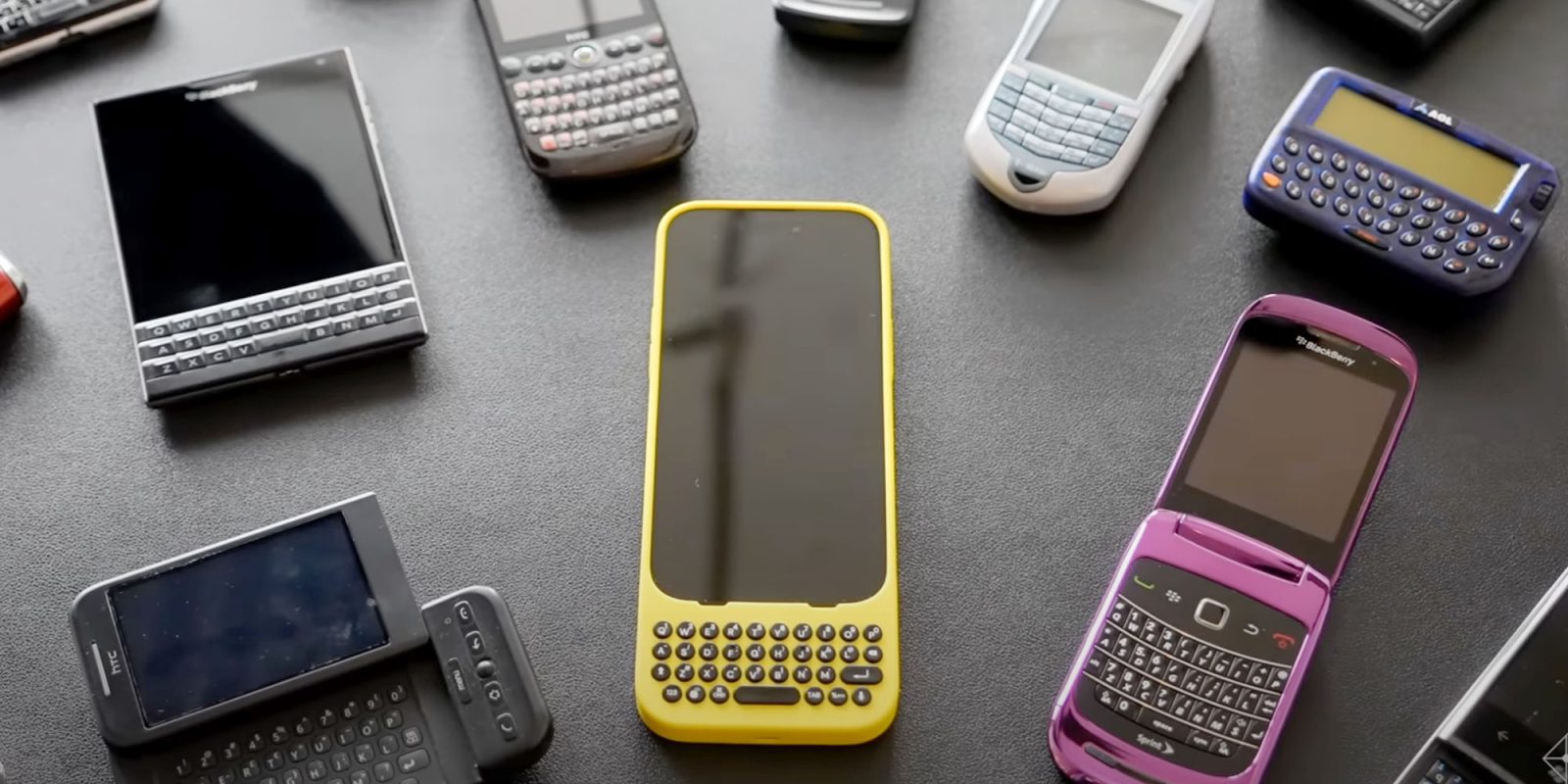
Last week saw the announcement of a new product that’s either genius or comedy: the Clicks iPhone keyboard case.
As someone who grew up with smartphones with hardware keyboards, I’m looking forward to trying it for myself. A tech writer who got a brief hands-on session at CES says that it does at least give reasonably good demo …
Apple co-founder Steve Jobs famously used the phrase ‘great demo’ to describe something which seems good when you try it for a short period, but may not prove as useful in extended use. In Steve’s case, he was responding to growing demand for a touchscreen Mac:
Touch surfaces don’t want to be vertical. It gives great demo, but after a short period of time, you start to fatigue. And after an extended period of time, your arm wants to fall off.
Whether the Clicks case will turn out to fall into this category remains to be seen, but Nick Wolny’s 20-minute hands-on for CNET certainly adds to my desire to try it.
First up, he says, fitting and removal was easy, making it practical to click on when you need it – and it automatically disables the on-screen keyboard.
It effectively gives you a much larger screen when typing.
The most immediate and obvious benefit to the Clicks case is the change in screen size when typing. Since the case already has a keyboard, the digital keyboard no longer appears on your screen while typing, giving you far more space.
It was weird in a good way, a real “wow” moment, and the extra screen real estate alone may be worth the investment. On the demos I saw, which showcased an in-progress Instagram Story draft, the difference was dramatic — certainly helpful for creators who don’t want to toggle back and forth to see how a draft post looks.
It may appeal most to iPhone 15 Pro Max owners.
On the iPhone 15 Pro model I demoed, the physical keyboard was smaller than your phone’s digital keyboard. It was hard to tell how long it would take for me to acclimate to the buttons, but on my maiden voyage things felt a bit crowded. I ended up tilting my fingertips forward so I could type with my nails instead. I’m not sure I’d want to write an article on my phone (As I’ve been doing with this very story while on the CES show floor), but it’s hard to say after spending only 20 minutes with the device. The iPhone 15 Pro Max model I tried had a more spacious keyboard.
His overall impressions were pretty positive.
As far as first impressions go, this case might be a good fit for iPhone Pro users seeking a physical keyboard experience.
We’ll bring you a review once it’s available.
FTC: We use income earning auto affiliate links. More.


Comments