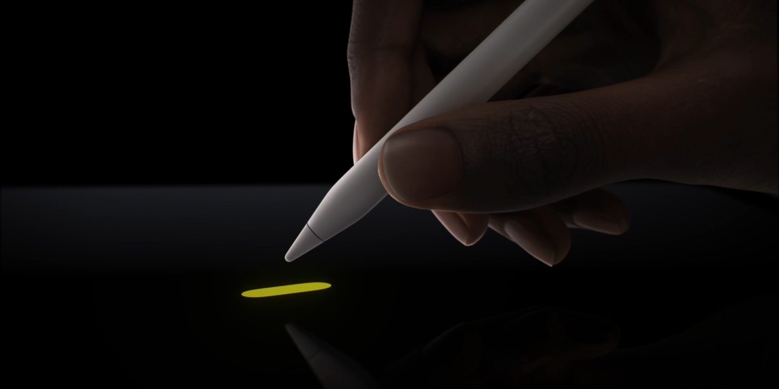
The Apple Pencil Pro is now arriving in users’ hands as of yesterday’s launch, and with it discoveries are being made about some of the finer details of the new product.
One especially noteworthy example comes from Quinn Nelson, who found that Apple has sprinkled a heaping dose of UI magic into the Pencil Pro interface when using the new M4 iPad Pro.
Apple shows off with digitally rendered shadows
When Apple first debuted the Pencil Pro, it highlighted some core new features. There’s a new sensor that grants the ability to squeeze the Pencil to bring up a contextual menu designed for switching tools. You can also rotate it to, thanks to a built-in gyroscope, make marks with greater precision.
What Apple didn’t highlight, that Nelson discovered, is the presence of a digital Pencil shadow that Apple built into iPadOS. Check out the video below.
The ability to hover over the iPad Pro and see a shadow of the tool you’re using is absolutely unnecessary, yet remarkably cool at the same time.
9to5Mac’s Take
Apple presents the iPad as a creative tool that can replace many traditional creative instruments. Little UI touches like this, though they may go unnoticed by many users, nonetheless help move the iPad and Apple Pencil closer to replicating the experience of physical pen and paper. That’s undoubtedly a good thing.
Have you tried the new Apple Pencil Pro yet? What do you think of the hover shadow? Let us know in the comments.
FTC: We use income earning auto affiliate links. More.


Comments