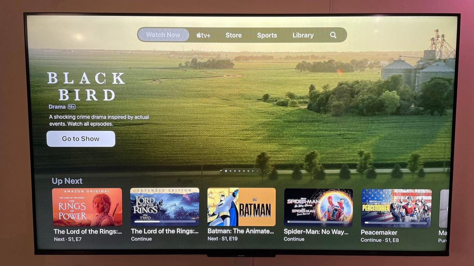
A redesign for Apple’s TV app that first surfaced in November is now broadly available for everyone, and users aren’t happy. The new design for the TV app overhauls the “Watch Now” tab with a massive new banner at the top with autoplaying video and audio, with no customization options…
This new design for the Watch Now feature of the TV app was first previewed back in November during tvOS 16.2 beta testing, and it was heavily criticized at the time. Interestingly, Apple listened to that feedback and made one notable tweak.
The first version of the new Watch Now design in the TV app added a new “Featured” row to the top of the design. This meant that the more useful “Up Next” row was pushed lower, requiring you to scroll down to view your queue.
In the version of the TV app that is now rolling out to Apple TV users, that “Featured” row is no longer present. Instead, the “Up Next” queue retains its top-level positioning for easy access. Unfortunately, Apple’s trade-off for this is an aggressive, monstrous banner at the top that cycles through so-called “Featured” content.
This “Featured” content appears to be editorially chosen. This means you’ll see content from apps that integrate with the TV app, like HBO Max and Hulu… and, of course, Apple TV+. Making matters worse, you’ll even see massive banners for content you’ve already watched. There’s no system in place to hide previews for things you’ve already seen.
This banner not only plays video previews of the featured TV shows and movies but also audio. If you allow your tvOS cursor to rest in this banner area for just one second, the preview video and audio will automatically kick in.
Lead image via Reddit user GnarlsD
9to5Mac’s Take
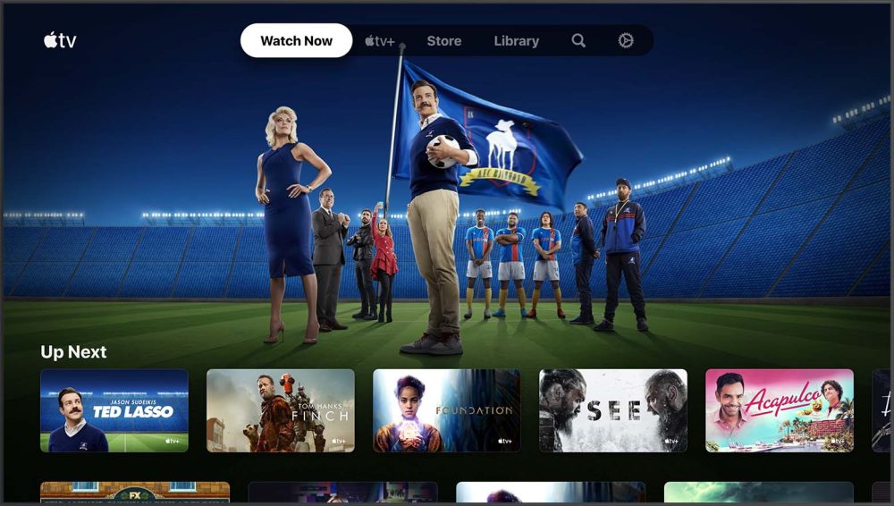
The previous design for the ‘Watch Now’ tab, which prominently featured your ‘Up Next’ queue without any banner ads or featured content.
This is a very disappointing change for Apple to make. While it’s encouraging that the company listened to feedback and didn’t push the “Up Next” queue all the way down the page, this new design is still a major step back.
In the new design, the “Up Next” queue is basically sandwiched between the massive banner previews above and a dedicated section for Apple TV+ content below. This makes it easy to overlook, which is certainly something Apple purposefully intended with this redesign.
The worst part about this new design is the complete lack of customization. You can’t rearrange the rows of content, disable the “Featured” content, or even customize the type of content that appears in that banner area.
In an ideal world, you’d be able to tick a box and revert to the previous design, but that’s not an option. Instead, you’ll be greeted with autoplaying audio and video every time you open the TV app on your Apple TV.
I’m not the only one frustrated by these changes, either. A thread on Reddit is full of complaints from Apple TV users who call this new design “positively, absolutely, decidedly horrible.”
Top comment by Blorft
Let's call this "featured" banner what it really is - massive, front-and-center, autoplaying advertisements.
I expect ads on cheaper products, like the $49 "Chromecast with Google TV," to offset the production costs of that hardware and software development. I do not expect ads on a $129+ Apple TV.
You can disable the autoplaying audio by going to the Settings app > Apps > TV Autoplay Video Sound. Unfortunately, this doesn’t solve the overall design problems nor does it stop video previews from automatically playing.
Most users aren’t going to know to go to the Settings app to disable autoplaying audio. So most Apple TV users will be forced to use the new “Watch Now” tab with a cluttered design that auto-plays not only video but also audio.
It’s disappointing, but perhaps not surprising, to see Apple emulate the user interface trickery of other streaming apps from companies like Netflix and Hulu.
There’s clearly data and user research that shows an increase in engagement with these types of designs. The question is whether it’s legitimate engagement or people being forced to “engage” by swiping a few more times to find the content they actually want to watch. My guess is it’s the latter.
FTC: We use income earning auto affiliate links. More.


Comments