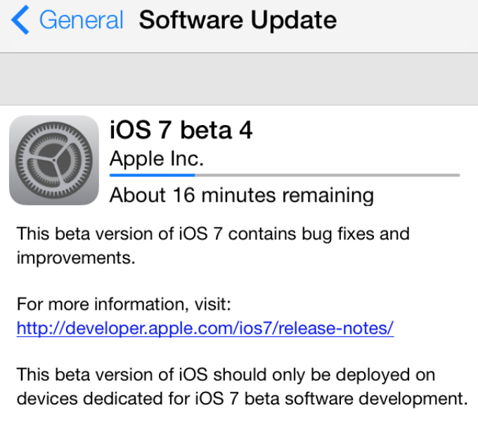
Three weeks following the previous seed, Apple has released iOS 7 beta 4 for iPhone, iPad, and iPod touch to registered developers. The release follows Apple’s Developer Portal going back online late last week following an 8 day outage. The new seed is available via the over-the-air Software Update function in the iOS Settings app.
The previous beta release brought several user-facing changes (video here), including a sharper system-wide font, interface enhancements to Safari, Calendar, App Store, and Music, as well as improvements to Home screen folder transparency, a functional built-in dictionary tool, and more improvements to Siri’s more realistic voices.
A download link and claims regarding this new beta emerged earlier this morning. As the public release of iOS 7 approaches this fall, it is likely that beta 4 will continue providing interface and stability enhancements.
If you find anything new in this beta, you can let us know at tips@9to5mac.com. We will keep updating this post with a running change log of findings (below):
Lock screen is no longer confusing:

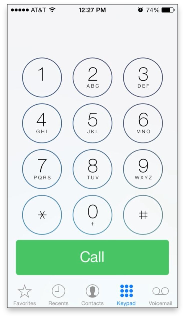
– Call button in Phone dialer is tweaked:
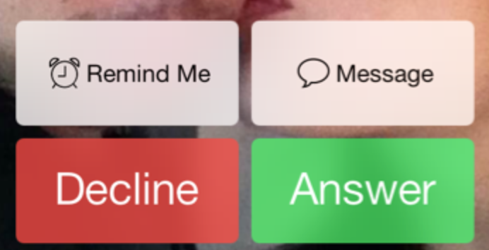
– Phone answer buttons tweaked:
Spotlight:
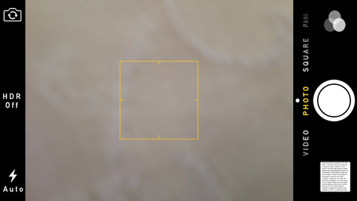
HDR in camera re-located:
– You can now swipe between panels in Notification Center
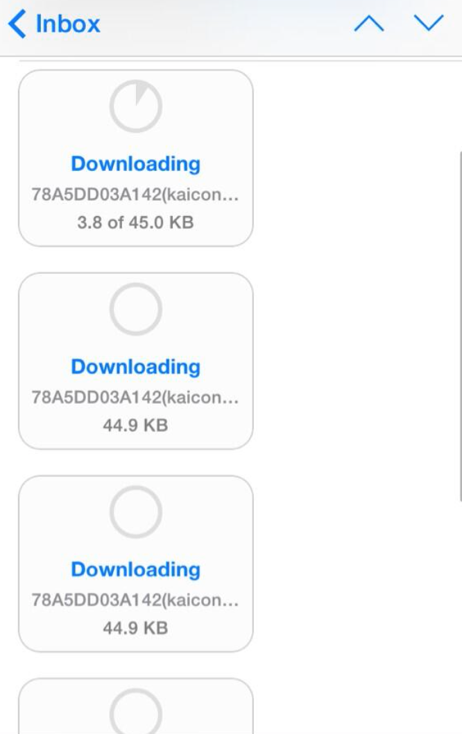
– Tweaks to image download in Mail.app:
– Safari graphics tweaks:
Tweaked filters UI (and added for some older iPhone models):

Search bar in Reminders:
– Readers reporting minor keyboard tweaks
– Improved back buttons in setup:

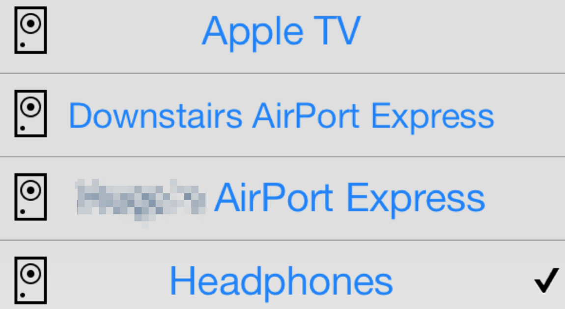
– New AirPlay icons:
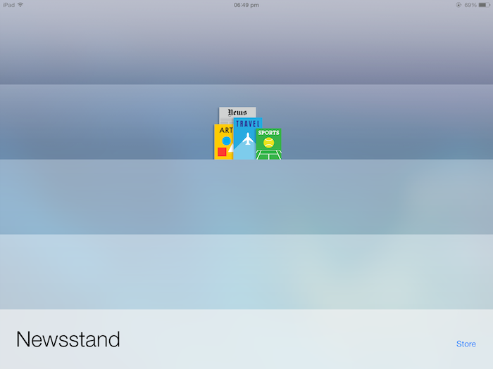
– Slight UI tweak to Newsstand:
– Shuffle all songs is back:

– Improved animations and transparency in folders on the Home screen.
– New iPad resolution changing button while running iPhone-only apps:
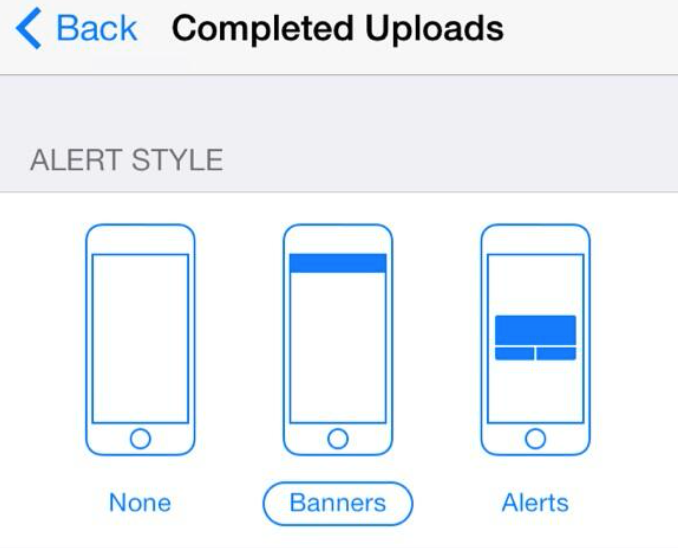
– Completed uploads notifications:
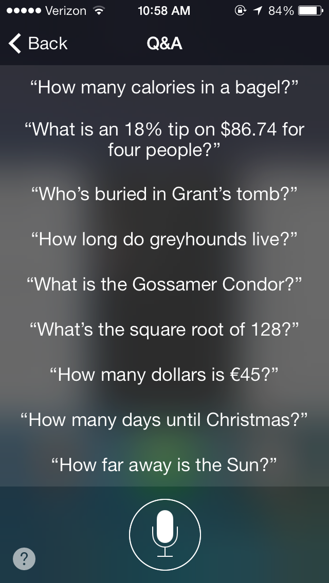
– Siri Q/A
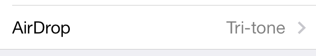
– Choose a sound for AirDrop alerts:
– Faster calibration in Compass.
– iPad multitasking now supports unlimited apps. Previous betas capped it at 10 open apps.
– Video of snappier animations
http://www.youtube.com/watch?v=AlL9l44eUsk
FTC: We use income earning auto affiliate links. More.


Finally!
It’s free!! (Included in the price of a new iOS device) come on! It’s not that long to wait!
there’s now a disclaimer about the pre-release nature blah blah blah before you’re able to download.
Where is the change log?
Its almost done installing, hopefully this takes care of the phone randomly rebooting when your making a phone call. So far I love iOS7 and I hope it keeps improving over time :)
all songs from a playlist can now be downloaded at once under itunes match.
The battery is now monochrome, instead of green like it was on previous betas (I’ve been waiting for this)
Sorry, spoke too soon. This is just on the Lock screen and in apps, but Home screen still shows green. False alarm.
I LOVE the green :)
Folders On Dock Animation Fixed
I can’t believe they changed the call button! That was one of the design changes that I absolutely loved.
Likewise. Though it was a little confusing when you had to “slide to answer”
I hated “slide to answer”…especially since it didn’t work when the incoming call screen first appeared.
Same here :(
I don’t like the new rounded corners for the call buttons. Looked better edge to edge without rounded corners. Also, is it just me or has anyone noticed they overcropped the hell out of wallpapers? They seem significantly more zoomed in than before and a large portion is missing (even if you bend your phone like a madman)
Yeah I hate how the wallpaper is all zoomed in now. Not sure if it’s a bug…I hope it’s not!
They may be over-cropped in order to improve the parallax effect. Try turning off Parallax in the settings and see if that does the trick. If not it’s most likely a bug
Turning parallax off “fixes” it. I did a quick measurement and it looks like they are zooming in wallpapers to 140%. Probably to give better horizontal movement. The downside is it’s now cropped off just over 200px on the top and bottom. For wallpapers with people in them, expect a lot of cut off heads.
Looking forward to see if they fixed the Music app. Until now it has been quite buggy.
Still no web/wikipedia search from Spotlight. I’m going to highly pissed if this feature doesn’t make it’s way back into the final version.
And there was also some orientation issues on the iPad.
Swipe left/right in Notification Centre.
I know that in previous versions of iOS 7 you couldn’t choose an option to play all the songs from a particular artist (if they were from different albums)… has this been fixed?
Also, I liked the old phone icons too but perhaps I’ll adjust to the new ones soon enough.
Really glad that they added the feature to swipe between panels…
Playing all songs from an artist has been fixed (finally)…if you scroll to the top of an artist page there’s a “Shuffle All Songs” button.
The Podcasts app took a long time to load up the podcasts in Beta 4.
i m not a developer, is it ok if i update ???
No
Camera App now has changed the white tap to focus square to a Yellow one and HDR has been integrated into the status bar.
Changes I have noticed in iOS 7 beta 4 so far:
“Swipe to unlock” now has a little arrow, and the shiny white animation on the letters is faster and more opaque (to make it more obvious for beginners)
“Today”, “All”, and “Missed” in notification center are now capitalized
Little arrows for notification and control centers on the lock screen are now lines instead of arrows
App folders in the dock FINALLY have the zoom-in animation that all the other non-docked app folders do
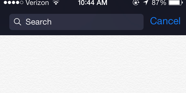
“Search iPhone” now has a Cancel button
Folder background transparency has changed yet again, they look a little more dulled down in color this time
“Today”, “All”, and “Missed” in notification center are not capitalized on my iPhone 5.
They are on my iPhone 5.
Just me or is the weather icon…bluer?
Settings app doesn’t crash when you swap background images
the new look of iOS 7 is really ugly, the feel should be minimal, but those colors are tacky.
Speed enhancements galore! At least this is what I am noticing…
Anyone notice moving between the home-connect-discover-me buttons on twitter are taking forever?
I’m having that issue as well…
YES.
Same here
Same here
Tap on the upper part of the icons.
you have to TAPSWIPE in order to switch. so gently tap and swipe at the same time to the left on the Home or Connect or Discover, whichever wanna you want to go to.
“Next” and “Back” buttons on Safari keyboard are replaced by arrows.
It’s almost like you have to hold your finger on those buttons longer to get it to switch
Yep.
I don’t know if its been posted, but when you get a notification and your screen is locked, if you select that notification it now only moves the one selected where as in beta 3 it moved the whole page.
It also seems that when text messaging someone, they now just show the last initial, as in “John D” instead of “John Doe” or “John D…”
go uncheck use short name in contacts settings
If the First Name + Last Name is too long at the top of the message, the “<Messages" button will turn into "< Back"
When you view an attachment in the Messages app, there’s now an icon in the bottom right to view all other attachments. Although it’s limited to the conversation history. i.e. to see more you need to first “Load Earlier Messages”
Safari now shows the URL in small type after the title bar disappears.
Unless I’m misunderstanding, it’s done this since beta 1, although it looks like they tweaked the UI in this release.
Do you know how to edit the square links to Apple, Disney, ESPN etc?
The ones that appear when you go to edit the URL, or when you save a shortcut to the home page? Either way, they’re based on icons provided by the respective web sites and can’t be edited.
If by edit you mean remove, I found the answer on Apple’s website. It would have driven me nuts if I couldn’t remove these four default shortcuts!
Go to Bookmarks -> Favourites and then edit your Favourites.
Deleting a favourite will delete one of the icons on the Welcome page.
Adding one will add an icon to the Welcome page.
So I’m logged in via twitter and can post a comment but it’s still asking me to log in via wordpress to reply? What’s up with that?
We’re looking into it. Thanks.
Update follows through for non-developer devices.
gmail icon in Mail app has been changed to show the actual google icon rather than gmail icon..
This is a HUUUUGE difference in speed, everything feels really slick now. All the tweens and animations are perfect.
Download all for playlists for users with iTunes Match is back. FINALLY!
Email Font looks much bigger now
yahoo mail icon in Mail app has been updated too
The latest lock screen looks great. I can already tell its going to be much more useful (and its done better than stock Android).
The Frequently visited “red dot” map in Privacy-Location Services-System Services-Frequent Locations is gone and replaced with “Improve Maps.”
Completed uploads to what?
Now, in a message, instead of showing the receivers entire name, it shows only there first name and the first initial of there last name at the top. “Tyler R” vs. “Tyler Romaro”
It’s honoring the short name setting for Contacts (configurable in Preferences).
Has anyone noticed that some of the buttons in apps (like Twitters tabs, or speedtest begin test button) seem to be misaligned or something, for example, pressing the middle/bottom of a tab in twitter doesn’t do anything, I have to press the top, or slightly above the button?
In the change log, Apple details this issue to developers and urges them to realign the buttons and text.
When Maps is launched ‘Help Improve Maps’ pop up shows requesting users to allow access to frequent locations..
You can download complete playlists in the Musik-App. Finally ;-)
Better compatibility with 3rd-party apps…I had a couple where lists didn’t scroll properly that are now working.
the ‘car’ icon when looking for directions has been udpated.. the font size of 3D label has been increased, zooming out when looking at directions has been removed
iTunes Radio seems to have new option in radio information and its called “Play Explicit Tracks”.
doesnt seem to work i have it on and still get edited tracks
Do apps still crash? Like Twitter or eBay, that is the only thing that keeps me from installing the beta. Please someone check it for me, I would appreciate it!
This has nothing to do with Apple, it’s because app developers haven’t updated their apps themselves to work with iOS 7 because they’re not allowed to yet.
You’re not supposed to install iOS 7 on your main phone; it even says you should only download it for software development. If you want a beta on your device but you aren’t a developer, it’s wise to keep quiet about it, because people aren’t going to be even slightly sympathetic if you screw up.
You have to decide whether you want it badly enough to sacrifice a couple apps. If you don’t, you’ll just have to wait until it’s released.
Actually, it does have to do with Apple…each iOS 7 beta release so far has provided greater compatibility with third party apps and, with beta 4, both Twitter and eBay seem to be working (along with others that didn’t work with beta 3).
You’re right, of course, that if you install the beta you should be prepared for things to not work.
The maps postion symbol is changed!
Did you notice, that the “Artist”-Tab in Music.app pulls artist-images from somewhere on the web? These images are NOT used from the Album-Covers…
On other news: Why do I need to login to comment on here.. thats lame! :(
Noticed that from b3
Because if you didn’t have to login these comments would be overrun with Windows fanboys.
I wonder when Apple will include more SFX and ringtones in their OS :P
Is the calls bug fixed? Like not receiving calls & 2 holds with the same caller when you answer the call?
What’s complete uploads?
Icons updated in Restrictions
It would be really nice to see real-size fullscreen screenshots instead of cropped, zoomed in (blurry) portions of the screen. Would give a good impression for those of us that don’t (or can’t) run iOS 7.
iTunes Store app UI is white for Music but changes to dark grey for Movies and TV Shows.
Was in Beta 3.
I’m receiving all notifications on my Pebble smartwatch with this software update! don’t know if it’s a bug…but I love it! :D
the chevron next to “slide to unlock” is crazy obnoxious now. Why does it blink instead of just use the same sheen that slide to unlock does? did it even need anything? the arrow at the bottom was enough to confuse people without blinking like crazy.
It’s not blinking, it’s pulsing as part of the same “sheen” animation as the “slide to unlock” text. Watch more closely.
Seems as if the issues with not receiving calls from Favorites has been resolved, finally!
I’m liking a lot of these updates.
Regarding the video, I’m not sure if its fair to compare the speeds of an iPhone 5 with a previous version.
It’s about the speed of the animation, not the actual speed of the phone.
IN THE MUSIC APPS RADIO THERE IS AN SETTING TO DISABLE / ABLE EXPLICIT MUSIC
I did see that. Quite a bonus.
Frequent Locations in Settings now displays History on same screen without having to tap.
This one’s a biggie: tapping the location icon twice in maps will rotate the map according to the direction you’re facing!
That’s always been there.
new:
HotSpot is even better now !
its light blue before it was dark blue !
No dictionary, and no dictionary to download. 😞
The dictionary is there, when I tried it on iPhone 5 dictionary came up. Went to manage dictionaries I could download the simplified Chinese dictionary among a few others.
Ooo, snappy!
In the music app when looking from a side point ( Portrait Orientation Unlocked) the control center and notification centers arrow are inside a box.
not only in the music app
Is there a way on the keypad view in the phone dialer to cancel a number. In iOS6 there was a <X] button to back up/delete an individual number. I don't see that on there keypad for iOS7. Has an alternative been created? Thanks
The delete button is on the same level as the number You’re typing. No longer on the keypad.
Yes, that same icon appears as soon as you start typing a number.
Animations still need to be faster. It’s sad that my friend’s iPhone 4 can wake up, unlock, and start launching an app before I can on an iphone 4s. I can tap the app I want to launch four times before the unlock animation eases in and finishes, finally recognizing the touch. I don’t want my phone to animate waking up, I want it to wake up instantly. If they want to fade out the screen while locking it thats fine, I’m not in a rush when I put my phone away.
You can scan in cards to Passbook. I didn’t see this in beta 3… That I recall.
It was there
Was stuck with an automatic game match in game center, couldn’t get it way, functionality to remove was now added.
-Apps still crash. Like Skype.
-Lyrics of songs are still messed up.
-Triple click home button, now working fine.
-Badge App Icon seems different.
BTW, How do I know if the device is fully charged? The battery icon always shows the lightning icon. :|
You can make the percentage show up next to the battery icon in order to know how much battery juice you’ve got :)
I’ve noticed the following when browsing in safari, when watching the snappier animations video.
When pulling up for control center. Just the arrow with the tab will appear, instead of the full width screen with the same motion. Didn’t replicate with keyboard open.
In messages app. The persons name above the thread you are in no longer overlaps when hopping in and out of your different text threads! Nice!
Anyone else noticed that when you use either the new or old Apple headphones, you can change the volume on the remote/mic but clicking to pause the song or double clicking to skip the song doesn’t work? Oddly enough when you hold it to activate Siri, it works just fine.
With my In-Ears from Apple the Buttons dont work at all. Nothing happens if i click any button on my headset.
Dictionary function disabled for this beta release. The option to tap define on a highlighted word still exists and I expect the dictionary to be added again in the next beta release.
I just checked, dictionary works on my iPhone 5. It did take a second to come up. It showed me Oxford definition and translation preferences.
New flat Twitter Icon in the Settings App & Share Button
My biggest complaint is that you cannot quick post to Twitter/Facebook from the home screen like you could in iOS 6
I want to see the Twitter and Facebook widgets back to Notifications Center!!!!…
A lot of things have been fixed/improved!
1- Messages doesn’t crash when you take a pic or choose an existing one to send.
2- When you kill the app you’re currently using from Multi-Tasking the background does not go black.
3- In Game Center you can now remove the turn based games if you arenot interested, which in turn makes the badge disappear.
A lot more stability fixes, still exploring :) Love the new UI tweaks and Maps etc etc… Love Playlists in Music app!
Bolder font! Check accesibility
Apparently I’m visually impaired, because I’m keeping it this way!
Trust currently connected computer http://t.co/nlv8s9iPFa
You can lock your notification in the control center
Not new
New App download icon has been updated with new graphic that shows the app icon with download clock overlay.
Not new
First time I plugged beta 4 into my computer after the phone rebooted it asked me if I wanted to “Trust this computer”. That seems new. Since I was at work I said no and while you can see the phone, the pictures folder is empty.
Not new
I’ve never seen it. Maybe it just never prompted me.
an awesome thing of this update, is that you can close active apps way, WAY faster.
I’m not sure if this change is new or from the previous beta, but overlay text is now solid instead of translucent, which makes it MUCH easier to read, especially over a light background.
My phone answer screen has lost the “Decline” button. Trying a restart to see if it comes back.
A really minor change, but the Weather app icon has a darker blue gradient:
http://iosguides.net/discover-ios-7-beta-4/
The Color Scheme Of Message and Facetime and Phone also changed. became darker and better. like it
I love the AirPlay Mirror Option for iPhone. Works great in portrait or landscape.
The center button on headphone remotes does not seem to be working to pause/resume playback or to take a picture.
Its volume up to take a pic I’m sure. I had headphone issues with beta 3. I’ll check it out later!
P.s. Be great if apple made bluetooth headphones!
You need to start the music app manually by clicking on the icon. Then those controls would work. Whenever I ask siri to play music, these controls do not work. I need to open the music app once then lock my phone for the earpod controls to work.
Me too facing the same problem i am unable to play/pause/stop music using headphones.
I’ve noticed that the Mail app, for example, will update while in the multitasking ‘card’ view – you’ll actually see a little flicker when a push email comes in and the ‘card’ will update in the background. A good little peak feature, this will clearly make its way to apps in the future so you can see new content from a quick glance in multitasking.
What is the use of having access to Camera in two places?
1. In lock screen bottom right corner, we have one camera
2. In control center we have one more camera (which is useless)
Makes sense to me. The lockscreen one is there so you can get to it without having to unlock first. The one in control center is there so you can use it when your in an app, or on the last page when your camera may be on the first.
Yeah I think Apple could kill the Lockscreen Camera if you have the Control Center enabled in Lockscreen.
Two reasons. The first is consistency (carry over from iOS 6, familiar territory for users). The second is less friction. In Control Center, the camera access is great for when you’re in an app or far from the camera app icon. However, on the lock screen, accessing the Camera app would mean swiping up for CC, then tapping on the button. It’s two motions vs. one. Those two motions are faster in others situations, but still the fastest access to the Camera app from lock screen would be the swipe up functionality.
Not really there fella. If it was only I the lock screen while you are using an app or just had your phone unlocked you would need to lock your phone them press the home button to get to the lock screen access. Visa versa; when in lock screen you would swipe up for control centre then tap the camera. Having both buttons available vastly reduces the moves required to get the camera ready.
It does look funny having the camera on these two places but when you have a two year old doing random stupid stuff with no notice, quick access makes for some great pics for the mother-in-law!
You can now change the default text size in Settings >> General >> Text Size.
That has been there even before beta 4
That’s been there since beta 1.
Thank god you brought back the music shuffle all!
Who are you referring to when you say “you”. Did you mistake this for the Apple Developer Forum?
Now you can use dynamics wallpaper in home screen also.
Not new
Since the developers forum is still down. I want to report that in Beta 4, functional built-in dictionary is no longer working.
my iPhone is restarted when i connected it to sync with iTunes on windows 7.
1. Observed phone restart when I accessed deleted event which was displayed under ‘Today’ section.
2. iphone is restarting after accessing notifications on lock screen (slide down).
In safari to close tabs swipe left…..
Not new
This doesn’t work on a 4s. I can however go back to the previous page by swiping right. Is that what you meant?
You have to have the tab view up first.
Lock Screen : ugly. Poor, there is no design at all. Anyone could do that. What work they did?
Phone Dialer: atrocious, simply awful! “minimalist” design they call that? It’s the same crap Microsoft did with the awful MetroUI. Thanks to Tim Cook the lame Microsoft nonsense infected Apple too. Where the heck is there any design at all? Where is the Apple style there ?
Safari: poor. How to ruin a working browser, even that they managed to mess up.
Image download in mail app: more minimalist nonsense. It’s a really really poor “design”.
Lock Screen and Phone Dialer need to be completely designed, because this crap is not a design at all, It’s crap.
Have you ever tried to design something…? Also do you even have iOS 7
I guess you’re not a very big fan of minimalist UIs (which is fine…different strokes for different folks). This is beautiful design in my opinion…very clean and modern. The only thing that I’m really not crazy about so far in the iOS 7 UI is the transparent rows on newstand and iBooks (just looks kinda cheap to me personally) and the similar transparent bar for the dock. I’m also not crazy about the safari and game center icons. Other than that though, I think this is an amazing update to the design and workflow of iOS. If you hate how something looks…state your reasons…we can all benefit from your thoughts that way. You are completely welcome to your own opinion…but please don’t just say everything is crap…nobody really wants to read that.
Dude…uninstall it then and shut the hell up.
Please leave this blog. I strongly advise you to set up a private blog or thread for these personal opinions. This is for pointing out additions to iOS 7 beta 4 not your thoughts on a white circle.
Ever wondered Jim Phong rhyming with Sams”o”ng??
This beta looks good… I think i should try it..
Hey, everyone! Just discovered this change to Messages! If you swipe and hold to the left in a conversation you can see the time at which a message was sent or received. I’ve been wanting this FOREVER!
not new
Which installment of iOS implemented this feature? I do believe that it was only every so often that the time stamp would show.
Added in b3
@markgurman The new iOs 7 beta 4 also removes Flashlight from Control center
Secondly this is the best iOS 7.. I really like the Lockscreen Improvements and ability to swipe the notification center as the iPhone 5 is tall, is harder to reach at top of the screen…
the flashlight toggle in her control center is there for me. using iphone 5 ios 7 beta 4
Same here.
@kalanhowse: stop trying to defend crap designs. Anyone can place a bunch of circles on a white screen. You don’t need a degree “to design” that. “Minimalist” approach meaning lazy it’s just what Steve Jobs didn’t like for a very good reason. The only minimalist thing Jobs wanted were the products boxes to reduce shipping costs and that’s it. But he never wanted any of Apple products to look poor and cheap.
iOS 7 has too many nonsense “minimalist” things that just look ugly like the atrocious Microsoft Metro/ModernUI and most Android UIs.
Where the heck is any design skill in something like that Phone Dialer ? There is nothing difficult to create there, there is nothing complex that looks simple to the end user. It looks poor and cheap to end user. It doesn’t even seem an alpha nor a concept of proof!
Steve Job’s whole philosophy was based on that which Leonardo Davinci first quoted “Simplicity is the ultimate sophistication”, You are completely incorrect in everything you have just said, I’d like to see you trying to design an interface as beautiful as any of the iOS’s have been. You don’t ‘need’ a degree to design, but most of the designers at Apple have, and it definitely helps, it helped me enormously, which is why i can appreciate that design is not just the way it looks, but the way it works also.
Another thing I have noticed is that when you press and hold the new email compose button it now will show you your drafts or give you the option of composing a new message
This feature was similarly present in iOS6
I think I’ve found a bug, my EarPods won’t let me pause or skip a track, i can change the volume up and down however. This occurs on my iPhone and iPad, but works on my MacBook. Strange.
If you started music using Siri this would not work. You need to once open the music app manually and let it run, then the earpod controls would work.
Nope, just does it no matter how I start the music. :-/
Not sure if you could do this in the previous betas but I just found out that you can play the YouTube video audio in the background again by just pressing play in control center after pressing home to leave the video. I have been waiting to do that for a long time.
This is indeed awesome. It only works for YouTube in the browser though (not the app).
You could do it before
@nolanhicks: I keep saying that it’s crap because it looks crap. A design that anyone could draw with ease it’s crap. Period. And don’t go on with “the artist’s touch” nonsense, please.
What the heck is the Phone Dialer page with those silly circles on a white background ? A 5 year old would design something better, at least give it some colour and shadows!
“minimalist” here it’s just lazy and bad. And when something is lazy looks cheap and ugly.
It’s a fact.
I don’t care if you work for Tim Cook. This UI design “minimalist” thing must be changed or Apple is in big trouble.
Ruining iOS all of a sudden from its excellent fine tuned UI design with many tiny features and textures, transparencies, patterns and 3D look turning it into this lazy “minimalistic” joke is beyond stupid.
Tim Cook must really work for the competition, ruining iOS trying to make it look like another bad Android UI or Microsoft Metro/ModernUI crap nonsense.
You’re being “that guy” don’t be “that guy” if you really hate it that much just don’t download it and leave it at that. Nothing you say about it will change the fact that they will release it in the fall. So keep your hate comments to yourself on this blog because it wasn’t meant for people like you. It was meant for people to understand what has been changed in the new beta and that’s it. No one wants to see your comments.
Agreed.
Shadows? Do you think design is done with word art? You have no taste, I sincerely hope you stick with windows or android because your opinion is completely off, and nobody agrees with you. I personally don’t think you understand what elegance is, the phone dialler is beautiful, and the colour is adaptable from the background you have on your phone, which glows through as you press it. I’m baffled by your views on this. Please design a better one and post it on here for us to see.
Has anyone else noticed better service reception on beta 4? I have never had this great of service at this location ever before I download beta 4.
Absolutely hate surname initial hope they change back, what if u have contact with same name and surname initial?
Why the hell the default wallpaper (stars above the universe) is different from the publicized one in the video during presentation?
I wish apple would implement a “choose default app” option in future updates. Most people now tend to use 3rd party apps instead of the pre installed ones like google maps instead of the apple maps, whatsapp instead of messages for instance. It would be nice to have the option to set the default apps within settings for various tasks.
My screen is not as responsive with this release. I’ve had iPhone for years and have always scrolled the same way and now the screen thinks I’m trying to click on something when I’m actually trying to scroll. And Safari is taking forever to load, even on fast connections. Battery use is much better though on Verizon iPhone 5.
Was very disappointed to see the change in the Accept and Decline buttons for the phone app. I was a huge fan of the edge to edge and transparent look of the buttons. I understand the compromise on the font thickening though in light of the usability issues people were facing–though the lighter font was certainly more refreshing and attractive.
In Safari on iPad, if you swipe from the leff or the right of the screen you go to the previous or next web page without having to tap the arrows up top!
Not new
Snapchat screenshot issue resolved.
Seems like a group of software devs talking about software releases in a positive light. Refreshing, and a lot of the comments on here were very helpful. Apart from ‘that guy’. Just wanted to say thanks.
How come they removed the possibility to call someone directly from the sms app? Having to click contacts first is an extra click too much.
Also – adding new contacts seem a bit more tricky than before. And when looking into a specific contact, the call or sms-buttons are way too small. ¨
Otherwise – a lot better in so many ways!
They did not remove the call button. Next to the name of the sender on the right side, there is a contact option in blue. Click on that to get call, voicecall and add contact options.
It seems that the “transparency” of the control center & notification center isn’t working, the Notification center is completely black, and the control center is gray, has anyone else noticed this?
The center button on headphone remotes does not seem to be working i am unable to play/pause/resume music it was working fine in ios 7 beta 3. But after the updated its not.
great update. my phone charges faster, but my recent contacts I added a few months ago and not there all the old ones are. -=/
The wallpaper size algorithm makes the images larger and pixelated when applied to the bg and ls
Agreed. I had to change both my lock screen and home screen wallpapers because it made the ones I had look stupid. :-(
@Jim Phong
“Perfection is achieved, not when there is nothing more to add, but when there is nothing left to take away.”
Minimalism is not “lazy” design. It takes work to strip something down to the bare essentials and not have to add anything more.
you’ve missed the translucent of folders. beautiful on beta 3. now back to ugly grey. hopefully fixed for beta 5
My folders blend with the color of my background in beta 4. Verizon iPhone 5
why the hell my camera flashlight is not working in beta 4